Excel Errors and Other Messages
Today is Spreadsheet Day, which commemorates the day when Visicalc, the first electronic spreadsheet program for personal computers, was released in 1979. My friend and colleague Debra Dalgleish, who seems to have a blog for everything, started Spreadsheet Day in 2010, and it gets bigger every year. For some of us, of course, every day is Spreadsheet Day. But in honor of the holiday, I thought I’d share some of the numerous Excel error messages I’ve encountered over the years. I don’t exactly know why I’ve saved them, although sometimes they have helped with debugging. They’re not all error messages, either, some just tell you what’s happening.
I’m not showing these messages to criticize Excel, but to poke a little fun. When you use Excel as much as I do, 24-7-365 (or so it seems), you will see many error messages.
These messages were captured while using numerous versions of Excel and Windows, on several computers, so there is no real consistency in their appearance. Some messages had to be reduced in size to fit the margins of this blog, but you can still read them if you squint.
Various Spreadsheet Error Messages
Formula Errors
Excel is full of formulas, so the likelihood of formula errors is high.

The above error message has been reworded: now Excel takes credit for finding the problem.

And now “We” have found the problem, I guess referring to the little green men inside Excel that make everything work.

This is a more detailed message telling you where to find the problem. You can tell they didn’t use PowerPoint, because the bullet text isn’t quite aligned.

Memory and Resources
This message tells you that your formula has blown up Excel.

This next Excel message usually happens when more than formulas are involved. Charts, Pivot Tables, who knows.
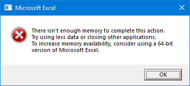
Despite what that last sentence implies, I have encountered this error while using both 32- and 64-bit Excel.
Clipboard
I get this Excel message sometimes when I select whole or partial rows or columns, and drag them around the worksheet. There’s nothing really wrong, as far as I can see and as far as anyone at Microsoft can tell me (I’ve asked); the selected range goes where I want and everything works fine afterwards. But it’s annoying, because I have to stop what I’m doing and click OK. This message will start appearing for no apparent reason, bother me for a few hours, then go away for a few days.

This is an old message that I used to see a lot in Excel 97 through 2003, when copying a large chart or range as a picture. I used to remember how many pixels would set off this one, but in 2007 and later I have not seen this message…

…except for once very recently, when I snapped this screenshot.
Every Message Tells a Story
It’s nice when a series of messages, when strung together, tell a story.
Saving Files
This is a story about a certain file, on which I’d worked for hours, then saved. Or tried to save. But “errors were detected.”

Errors were encountered, but Excel “was able to minimally save” my file.

“Damage to the file was so extensive” that I went into mourning.

The above message usually means that Excel saved the values in the spreadsheet, but any formulas, formatting, pivot tables, objects (shapes and charts), and VBA are lost.
This whole series of messages was common when Excel 2016 was first released, but fortunately I haven’t seen them for many months.
Not Even Minimally Saved
Sometimes when saving, though, there is a really unhappy ending.

Like the previous sequence, I have not seen this message for a long time.
Updating
When Office 365 and click to run became a thing, some messages got their own appearance, with a lot of red Office coloring.
Here we’re updating Office, something we all love to do.

Usually you can keep working while updates are in progress, at least until the downloads are finished, but not always.
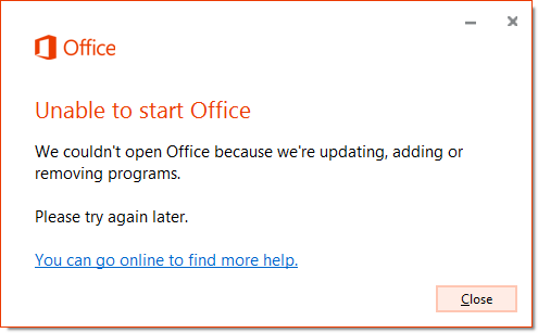
And sometimes you need to wait while Office fixes itself.
Updating Again
Here is a case when I was allowed to keep using Office during the downloads.

But unfortunately, something went wrong.

In recent months and years, the Office update and repair operations seem to have become more reliable and less prone to something going wrong.
Mac Interapplication Incommunication
While working on a VBA project to export Excel charts into PowerPoint (which still doesn’t work, grrrr), I got stuck in an interminable loop, where this Excel dialog…

…would appear, followed by this PowerPoint dialog…

…followed again by the Excel dialog, repeating the cycle until I force quit PowerPoint or Excel.
Something’s Wrong
Excel Has Stopped Working
Sometimes, Excel just gets tired and needs to take a break.

Windows checks for a solution (above) and may have to collect more information (below).

The Mac used to be rather polite about it, but a crash is still a crash.

Trifecta
One time after an unsuccessful Office update, I saw this perfect storm of dialogs.


Fortunately the repair was successful.
Repair
One time I got this sequence of messages. Again, something went wrong.

Excel wouldn’t start (above) so I tried the repair (below).

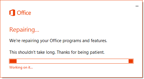
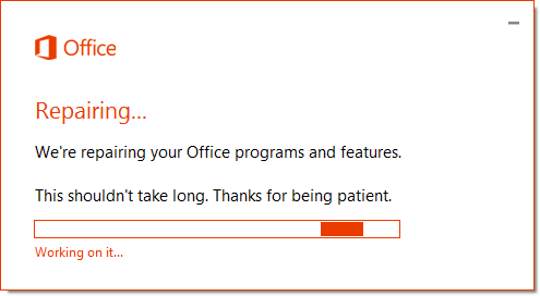
And the repair commenced.
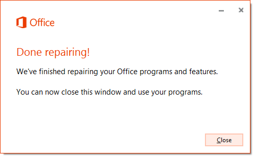
Phew! Done with the repair.
But after the repair, I still couldn’t start Excel.

As I recall, applying the Full Repair (not the Quick Repair above) fixed the issue.
Although I’ve shown a lot of repair dialogs, I really haven’t had to perform too many repairs.
Unhelpful Messages
Descriptions but not Descriptive
When you encounter an error in your VBA code, it typically has a number and description. For example, run-time error 9, Subscript out of Range, means you’re trying to reference the tenth element of a nine-element array, or a worksheet with a name that doesn’t exist.
If the description doesn’t make sense to you, at least you can Google it, and probably find hundreds of search results to help track it down. Helpful hint: if you’re describing an error to your coder, don’t give them the error number, read them the description, or send a screen shot. We can’t remember all the numbers, and sometimes errors with different descriptions will share a number.
I think half of all VBA errors produce this identical message, with unhelpful error number (1004) and description (application-defined or object-defined error), as if VBA is saying, “your guess is as good as mine.”

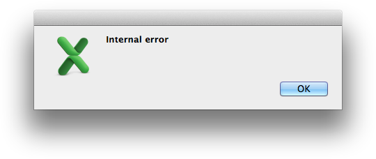
And there are numerous other unhelpful messages, like this “internal error”. How do I fix it without a crowbar?
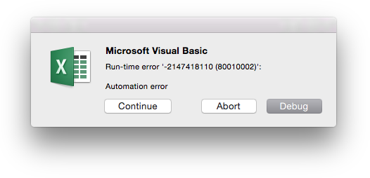
“Automation Error” literally means the code failed.
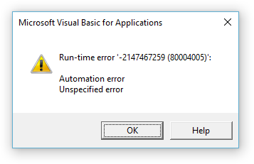
I just covered “automation error”, but “unspecified error”? That error number (80004005) is another popular one: Google returns about 444,000 results.
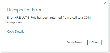
“Unexpected Error,” as opposed to all of those expected errors, eh?
Not Even Descriptions
This is a truly incomprehensible message. What is Object ‘~’, and what is its Method ‘~’? In fairness to Excel, the caption reads “VBA Code Cleaner”, so I suspect a VBA programmer wrote some code that called this dialog, probably in a routine called SaveBackup, and forgot to pass in the object and method names.
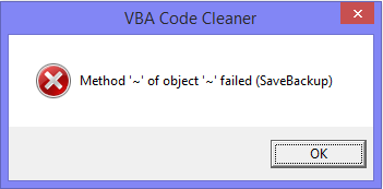
I’ve seen this Excel message in enough places to think it’s not just a wayward VBA programmer.
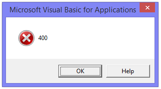
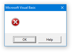
And there’s no explanation for this non-message.
Edit
Got a new one today (25 October 2018), well, not a new one, but one I haven’t seen for a while and thought I’d add it.
I was doing some VBA programming, and getting a bunch of compile errors and so forth. But I got the code working, then saved and closed the workbook. Then back in the VB Editor, I noticed that the workbook appeared in the Project Explorer, even though I had closed the workbook. This phantom project phenomenon used to happen a lot, but I rarely see it anymore.
I decided to close the phantom workbook by typing ThisWorkbook.Close False in the Immediate Window. When I clicked Enter, I got this message:

I wasn’t explicitly using ActiveX, but I suspect there’s a lot behind the scenes of the VB Editor, and some ActiveX element couldn’t create an object that referenced the phantom project. Whatever, it was a good excuse to restart Excel.
Bonus
You’ve read this far, so you deserve a bonus. Comment below with a link to your favorite error message on imgur or other file sharing service. I’ll include it in your comment.
The best message received before Halloween (31 October 2018) will earn a free license to Peltier Tech Charts for Excel 3.0B.


