In the microsoft.public.excel.programming newsgroup, ptheese asked for the following:
I need to chart three groups of two bars on a axis.
-Each group is a year, 2007, 2006, 2005 etc so we can compare data from previous years
-in each group of two there is a profit vertical bar and a combined ratio percentage bar, these bars are not related to each other (one going up has no impact on the other)
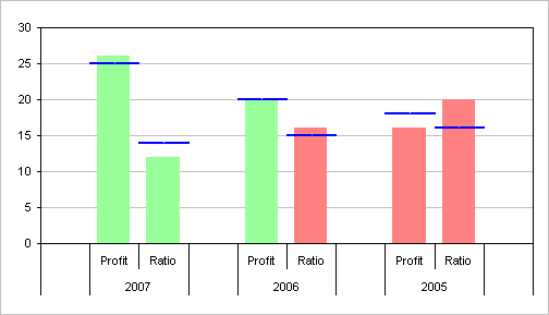
-For each of these bars, there needs to be a target indicator, a small horizontal line crossing over the bar (or above it if the target was not hit). This line does not go across the entire chart, there is a separate one for each individual bar.
-For the profit bar, if it crosses above the target bar, it should be green. otherwise red.
-For the ratio/percentage bar, if it crosses above the target bar, it should be red, otherwise green
I’ve come up with the following chart:
I don’t have the particular data, but presumably it’s something like this:
A | B | C | D | E | |
1 | Profit | Ratio | Profit Target | Ratio Target | |
2 | 2007 | 26 | 12 | 25 | 14 |
3 | 2006 | 20 | 16 | 20 | 15 |
4 | 2005 | 16 | 20 | 18 | 16 |
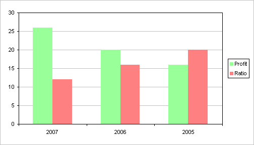
If I created a chart using A1:C4, I’d get something like the following, but I’d have to manually change the colors and somehow draw lines to represent the targets.
First we need to fix up the data, then we can build the chart. Since we want the bars to change colors automatically, we need stacked columns (see the conditional charts tutorial). Since we want clustered stacked columns, we need to stagger the data and insert appropriate blank rows (see the link to clustered stacked column charts). The data range will require one row for column headers, a blank row for the space to the left of the first cluster, two rows for the first cluster of two columns, a blank row for the space between clusters, two rows for the middle cluster of two columns, a blank row for the space between clusters, two rows for the last cluster of two columns, and a blank row for the space to the right of the last cluster. I’ve set up the data as shown below:
A | B | C | D | E | F | G | H | I | J | |
1 | Profit | Ratio | Profit Target | Profit Green | Profit Red | Ratio Target | Ratio Red | Ratio Green | ||
2 | a | a | ||||||||
3 | 2007 | Profit | 26 | 25 | 26 | 0 | ||||
4 | Ratio | 12 | 14 | 0 | 12 | |||||
5 | a | a | ||||||||
6 | 2006 | Profit | 20 | 20 | 20 | 0 | ||||
7 | Ratio | 16 | 15 | 16 | 0 | |||||
8 | a | a | ||||||||
9 | 2005 | Profit | 16 | 18 | 0 | 16 | ||||
10 | Ratio | 20 | 16 | 20 | 0 | |||||
11 | a | a |
The “a” in some cells in columns A and B are temporary placeholders, and will be hidden later. The actual data in columns C and D will not be plotted but are used in calculations. There are formulas in columns F, G, I, and J as follows:
F3: =IF(C3>=E3,C3,0)
G3: =IF(C3<E3,C3,0)
I4: =IF(D4>=H4,D4,0)
J4: =IF(D4<H4,D4,0)
I’ve color coded the cells in the table above. The blue cells are the actual plotted Y values, the green cells are used by the chart for series names, and the purple cells are used for the chart’s category axis labels. The yellow are not used in the chart, but they help Excel parse the data into Y values, series names, and category labels.
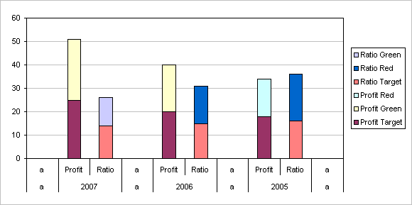
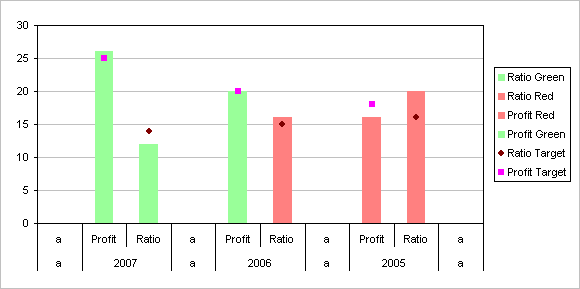
Now we can start working on the chart. Select the cells I’ve shaded in the table. Select A1:B11, then hold Ctrl and select E1:J11, so that both areas are highlighted. Create a stacked column chart:
The first thing I’ve done is colored the series: red and green as appropriate for the Profit and Ratio series, and blue for the targets.
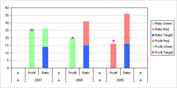
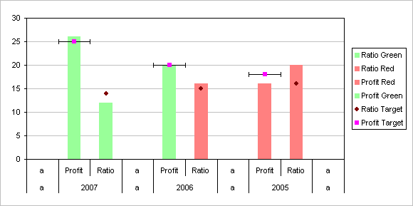
The target series don’t help us as columns. We’ll convert them to XY series, add X error bars, and hide the markers. First, right click the Profit Target series, select Chart Type, and select the XY type (not a Line type, because this type has no X error bars, only Y error bars).
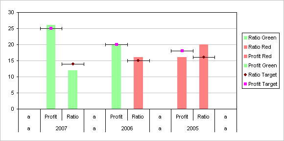
Do the same for the Ratio Target series. If you don’t do anything after changing the type of the first series, you can simply select the second and use the F4 shortcut key, to repeat the last action.
Right click on the Profit Target series, select Format Data Series, and on the X Error Bars tab, choose both directions, Fixed Value, and enter 0.5 in the box next to fixed value.
Do the same for the Ratio Target series.
Now you need a little formatting.
- Delete the legend.
- Format the error bars so they are thicker and don’t have the end caps. Color them if desired.
- Format the target series so they have no markers as well as no lines.
- Reduce the column gap width if desired (I use 50% in this chart).
- Change “a” in the table above to ” ” (a space character). Don’t completely clear the cells, or the category labels will be messed up.
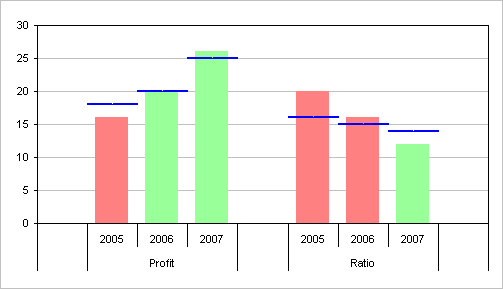
This chart isn’t too bad, and it meets the specs. But not knowing the particular usage, I think it makes more sense to put the profit values together and the ratio values together, as in the next chart. I’d also make a few other formatting changes; I might even be tempted to use area charts for the targets and line charts for the actual values, and let the reader see for himself which is good or bad without color coding the results.