Combination charts combine data using more than one chart type, for example columns and a line. Building a combination chart in Excel is usually pretty easy. But if one series type is horizontal bars, then combining this with another type can be tricky. I’m here to help with Bar-Line, or rather, Bar-XY combination charts in Excel.
Combination Charts in Excel
I’ll illustrate a simple combination chart with this simple data. The chart will use the first column for horizontal axis category labels, the second column for actual values plotted using lines with markers, and the third column using columns (vertical bars).
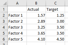
We start by selecting the data and inserting a column chart.
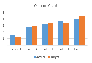
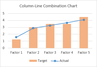
We finish by right clicking on the “Actual” data, choosing Change Series Chart Type from the pop-up menu, and selecting the new chart type we want. I’ve also used a lighter shade of orange for the columns, to make the markers stand out better.
Let’s do the same for a bar chart. Select the data, insert a bar chart.
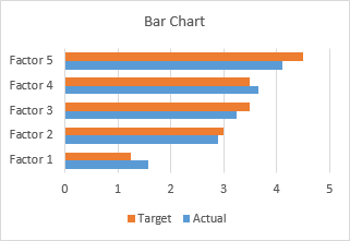
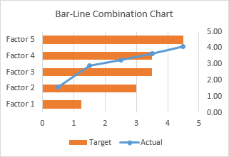
Okay, the category labels are along the vertical axis, but we’ll continue by changing the Actual data to a line chart series. That didn’t work out at all. The markers are not positioned vertically along the centers of the horizontal bars, nor horizontally where the data lies in the Actual column of the worksheet.
In the chart below I’ve shown all axis scales and axis titles to illustrate the problem. When we converted the Actual series to a line type, Excel assigned it to the secondary axis, and we have no ability to reassign it to the primary axis. The primary axes used for the bar chart are not aligned with the secondary axes used for the line chart: the X axis for the bars is vertical and the X axis for the line is horizontal; the Y axis for the bars is horizontal and the Y axis for the line is vertical.
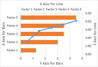
We can’t use a line chart at all. If we want to line up the markers horizontally with their proper position along the lengths of the bars, we need to use the Actual data as the X values of an XY series. We will need to generate some additional data for the Y values of the XY series.
Bar-XY Combination Chart
We will not try to make a Bar-Line combination chart, because the Line chart type does not position the markers where we want them. We will make a Bar-XY chart type, using an XY chart type (a/k/a Scatter chart type) to position markers.
Here is the new data needed for our Bar-XY combination chart. The factor labels and Target values will be used by the Bar chart series, and the Actual values and Heights for the XY series. Don’t worry about the Height values: I’ll show how they are derived in a moment. The nice thing is that we can use dummy values now and type in the proper values later and the chart will update.
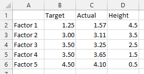
Select the first two columns of the data and insert a bar chart.
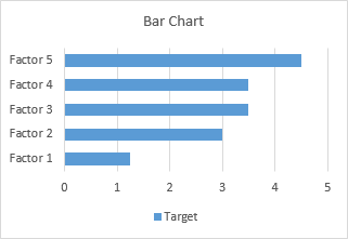
Since we probably want the categories listed in the same order as in the worksheet, let’s select the vertical axis (which in a bar chart is the X axis) and press Ctrl+1, the shortcut that opens the Format dialog or task pane for the selected object in Excel. Check the box for Categories in Reverse Order and also select Horizontal Axis Crosses at Maximum Category to move it next to Factor 5.
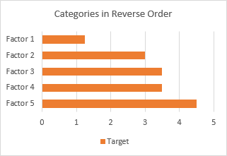
I’ve also recolored the bars orange, because blue markers show up better against light orange than orange markers against light blue.
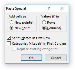
Now copy the last two columns (Actual and Height), select the chart, and on the Home tab of the ribbon, click the Paste dropdown arrow, choose the options in this dialog (add cells as new series, values in columns, series names in first row, categories in first column), and click OK.
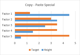
The data is added as another set of bars, which I’ve colored blue, but we’ll change that in a second.
Right-click on the added series, select Change Series Chart Type from the pop-up menu, and select XY with markers and lines.
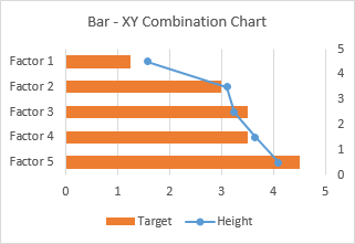
We see that the horizontal positions of the markers is just what we want to show.
Now we can see where the values in the Heights column comes from. The right hand vertical axis is used for the Y values of the XY series. Looking at the positions of the horizontal bars and the markers in their correct positions, we can see that the Factor 1 bar is centered on Y=4.5, the Factor 2 bar is centered on 3.5, etc. If you hadn’t guessed this at the beginning, type these values into your data range, and let the chart update.
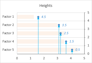
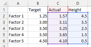
A few minor changes and we’ll be done. First, change the name of the XY series from Heights to Actual. The easiest way is to click on the series, then look at the highlighted ranges in the chart. The X values (C2:C6) are highlighted purple, the Y values (D2:D6) are highlighted blue, and the series name (cell D1) is highlighted red (highlight colors in Excel 2010 and earlier are different, but the concept is the same). Click on the red border of cell D2, and drag the highlighting rectangle to cover cell C2 to change the series name.
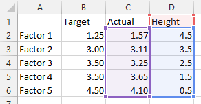
Click on the red border of cell D2, and drag the highlighting rectangle to cover cell C2 to change the series name.
Then, use a lighter shade of orange for the bars, so the blue markers stand out. Finally, hide the right-hand vertical axis: format it so it has no labels and no line color.
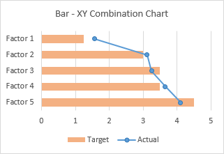
And there’s our completed Bar-XY Combination Chart.
More Combination Chart Articles on the Peltier Tech Blog
- Pareto Charts in Excel
- Clustered Column and Line Combination Chart
- Precision Positioning of XY Data Points
- Add a Horizontal Line to an Excel Chart
- Horizontal Line Behind Columns in an Excel Chart
- Salary Chart: Plot Markers on Floating Bars
- Fill Under or Between Series in an Excel XY Chart
- Fill Under a Plotted Line: The Standard Normal Curve
- Excel Chart With Colored Quadrant Background


Miguel says
Thank’s Jon for sharing with us your insights on how to show messages (about human activity) within data which is the ultimate purpose of charting.
I think there’s a typing error when you say : Paste dropdown arrow, choose the options in this dialog (add cells as new points,…), shouln’t be add cells as “new series”?
Onc again, Thanks
Jon Peltier says
Miguel –
Thanks for pointing that out. The dialog screenshot had it right, but I typed the wrong thing. It should be “add as new series”, and I’ve corrected it.
Erik LJ says
Hi Jon
Thanks for sharing the tips. though i have a challenge where i cannot find a solution
I have 4 grups of attributes (countries) each having 12 months in each group (total of 48 bars grouped in 4 attributes)
so far so good
And now i want to add a target (as a line) to each group of attributes, also covering the same (12 months)
I know how create a combo and have a combination of bars and lines in one graph, but the problem here is that i cannot get the target for ie. attribute 1 into the same 12 months/bars, it just messes up the whole graph.
Br, Erik from Denmark
Jon Peltier says
Erik –
Below is some dummy data, 4 categories (countries) and 12 series (monthly values); the bar chart; and the data needed to draw a vertical target line for each country.
Copy the target data, select the chart, paste special as new series by columns etc. (top left). Change added series to XY scatter with lines, no markers (top right). Adjust secondary Y axis (left vertical axis) so its scale is 0 to 4 (bottom left). Format secondary Y axis so it uses no line and shows no labels (bottom right).
Nagaraj P says
Hello Jon Peltier,
Its been long time I’m looking for this type of chart (putting line chart in vertical). I was amazed when I saw your tips.
But sorry to say, Its not working for me. I try the same data and steps mentioned by you.
First thing, I’m getting two separate bars for Actual & Height, where I’m getting stuck.
Second thing. I tried changing the chart type for Actual to XY, even the Target is changing.
Is there any add-ons required for this chart, please suggest.
Thanks
Nagaraj
Luke Novelli says
I am having the same problem as Nagaraj. I click on the actual series, select Lines with Markers under XY chart, However, I lose the bars from the chart and all of the series are in XY format. This worked with me for Excel 2013. Is there some change to Excel 365? Is there a work around?
Luke
Luke Novelli says
Oops forgot to add, vertical axis labels change to the Height values.
Kate E. says
Thank you so much for this blog post, it is amazing and exactly what I was trying to find. I’m comparing two forced pair survey questions and this very elegantly shows standard deviation, median, and now average, plus I can choose one individual person’s responses and showcase them against the rest. However, I wonder if it would be possible to label the secondary x axis instead of hiding it? Right now I have both of the pair labels in the primary x axis (each label in the format “Criteria 1: Criteria 2”) but it would be super helpful if I could have the primary x axis have Criteria 1 and the secondary x axis have Criteria 2, so readers could visually see which way the survey results tend. Thanks in advance!
Jon Peltier says
Kate –
The only secondary axis is the secondary vertical axis. This has no such labels as “Criteria X”, instead it has the 0.5, 1.5, etc. heights above the bottom of the chart where the XY series places its markers. You cannot put nonnumeric labels along this secondary axis.
Gill says
I am trying to create a combined chart for 4 years worth of sales and the GP% per quarter. creating the chart is not the problem. aligning the GP% per quarter is proving to be problematic as they are pretty similar in each quarter. can you please assist? thanks
Christina Wu says
Hello John,
My name is Christina. I found your article regarding Bar-Line (XY) Combination Chart in Excel. It is really helpful, however I got stuck in one of the steps. I am not sure if the current excel has changed or not. I am wondering if you can help me figure out the reason.
When I copy the last two columns ( actual and height ) and paste them in the chart, I’m getting two separate bars for Actual & Height instead of bar. I do not know what to do. Can you please help me?
Jon Peltier says
Hi Christina –
If you just Paste the data, Excel applies its own settings. But if you use Paste Special, you can apply settings, like Categories (X Values) in First Column and Series Names in First Row.
GORDON L LAWSON says
what if you want the horizontal bar chart as a primary axis, but the line chart as a secondary axis AT THE TOP rather than the side? is there a horizontal line chart option that works similary to the horizontal bar option?