A reader commented on another post, asking how to show a bar chart of percentages with a line chart showing a goal on the secondary axis. I responded with this quick procedure, then decided it made a good standalone tutorial.
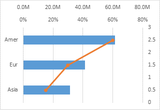
The bar chart is easy enough, but we can’t make a line chart along a vertical category axis. We’ll combine the bar chart with an XY chart instead.
The data is shown below. Column E has the computed percentages of Won/Open, column F has Y values that make the XY chart with our Goal line up with the regions. The dollar values are in millions, displayed with the number format 0.0,,"M" where each comma removes a set of three digits from the values so millions are displayed with one decimal digit and with the “M” appended.

Select A1:A4, then hold Ctrl while selecting E1:E4 so both areas are selected, and insert a bar chart.

I’ve already formatted the vertical axis so that the categories are plotted in reverse order.
Select B1:B4, then hold Ctrl while selecting F1:F4 so both areas are selected, and copy.
Select the chart, choose Paste Special from the Paste dropdown on the Home tab, and choose these options: Paste as New Series, Series in Columns, Series Names in First Row, Categories in First Column.

Right click on the new series, choose Change Chart Type, and select the XY with Markers and Lines option.

Add the Secondary Horizontal Axis using the Plus icon next to the chart in Excel 2013 or using the Axes dropdown on the Chart Tools > Layout tab in Excel 2007/2010.

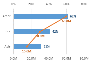
Format the Secondary Vertical Axis (right edge of the chart) so the horizontal axis crosses at the Automatic position (zero). Also format this axis so there are no labels or tick marks. Add data labels if desired.

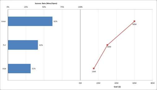
I always say that secondary axes confuse more than they elucidate, but this chart is easy enough to “panelize”; we just need to adjust the horizontal axis scales. Follow these steps to separate the plotted data into panels:
Primary Horizontal Axis (top of the chart):
Min=0, Max=1.6 (160%), custom number format [<=0.8]0%;;; which only shows labels less than or equal to 0.8 (80%) and removes the unneeded decimal.
Secondary Horizontal Axis (bottom of the chart):
Min=-80M, Max=80M, custom number format 0,,"M";;0,,"M"; which uses 0,,"M" for positive values, nothing for negative values (between the semicolons), 0,,"M" for zero, and nothing for text (after the third semicolon).
Also format so the vertical axis crosses at the Automatic position (zero) which is in the middle of the chart.
Primary and Secondary Vertical Axes:
Use a line color that’s darker than the gridlines.

Finally, add labels to the horizontal axes. I took the “M” out of the number formats for the Goal axis and data labels, since it was stated in the axis title. I should do the same with the percent signs on the other axis. I also decided to reduce the gap width to 75% to widen the bars.


lohhw3 says
thanks jon for the ever-so-refreshing post!
for my preference, i prefer 1 type of chart with 1 value (either % or absoute number).
then I merge both values into a single common label. e.g. “60.0M (62%)” for Amer.
both bar-line chart gives same slope perception anyway, so doing a 2 panel chart with same perception is redundant.
Giuseppe says
Excellent tip!
What if the Goals (Millions in this case) are in the range of 200-300M?
Any way to correctly rescale? Thank you!
Giuseppe
Jon Peltier says
Giuseppe –
Look for another set of axis limits that uses the same number of gridlines. Try min=-400M, max=400M, major unit 100M or 200M.
Mynda says
Great chart jiggery-pokery, Jon. I often struggle with the secondary axis. It seems to be a necessary evil but this is a nice alternative.
BTW, since you have data labels do you think the axis labels are superfluous?
Jon Peltier says
Mynda –
Sure, there are redundant labels in the chart. Many people would insist on removing one set or the other, but I don’t mind a little extra information, if it doesn’t result in clutter. Given a choice, I’d probably remove the labels from the data points and keep the axis labels intact, since that keeps the plot area cleaner.
Kai Lübbe says
Call me lazy, but I’d just create a second chart? Yep, I’m lazy.
Naomi B. Robbins says
Showing actual percentages for categories together with their goals is exactly what Stephen Few’s bullet charts are designed to do.
Jon Peltier says
Naomi –
That’s true. However, the percentages in the first panel are not of the goal. Rather they are percentages of attempts (at what I don’t know) that were successful. So the two panels really are independent.
Jacob says
Hi Jon,
This post is very helpful. I cannot seem to hide gridlines for the non-applicable area; e.g., the primary horizontal axis gridlines show in the right “panel.” Any advice?
Thanks,
Jacob
Jon Peltier says
Jacob –
Gridlines go all the way across the chart. This cannot be altered.
You could plot some points, hide them by using no lines or markers, then add custom error bars to them that extend only as far as you want them. The only problem is that gridlines are drawn behind other chart elements, but error bars are drawn in front of them.
Jacob says
Jon,
Thanks for your reply. Please see these images:


I was at first confused as to how your gridlines overlapped, avoiding any confusion, when I realized I had scaled the horizontal axes differently. The gridlines will be out of phase if the (range/major unit) is not equal for both horizontal axes. For my adjusted primary horizontal range, I also needed to adjust the major unit.
Jacob
Mitchell says
is it safe to assume that this technique will work in Office 2013? I would think so but just checking. It’s a really neat option and I’m thinking about upgrading to the next version. But you know MS. They tend to add and disable features and macros all the time. You think I’m relatively safe?
Jon Peltier says
Mitchell –
The images posted in this article were constructed in Excel 2013. General techniques do not usually change from version to version, though where you find the commands may migrate throughout the interface.
june says
Sir,
I have a problem of combining bar and line or xy scatter together. They are in the same scale of value. But when i tried combine them, it always come out with secondary axis for the line graph. I don’t want secondary axis cause they are in the same scale. What should i do? I use excel 2013.
Jon Peltier says
Horizontal bar charts cannot be combined with other chart types on the sane axis. In some cases you can delete the secondary axis and the secondary series will use the primary axis scale.
Chandu says
Very Useful article, Thanks For Sharing With Us