The three laws of great graphs contains Seth Godin’s guidelines for charts used in presentations:
1. One Story
2. No Bar Charts
3. Motion
In Seth’s Three Laws of Great Graphs, I agreed in principle, but suggested changing item 2 to “Choose Chart Types Intelligently”, because bar charts are not intrinsically worse than any other chart type.
In Bar graphs vs. Pie charts, Seth further explains his comments about bar charts:
[T]he purpose of a chart or graph is to make one point, vividly.
I think we’re in agreement on this point. Seth mentioned non-scientists, so I guess another underlying theme is “don’t make them think about this information”. I think we can agree that sometimes that’s also our intention.
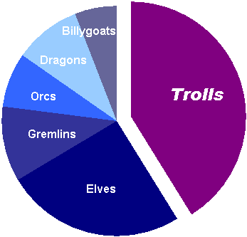
Seth showed a pie chart which is used to get the audience to agree that we need to address the issue of Trolls (the following is my recreation of Seth’s chart; it’s essentially the same using Excel 2003’s inferior formatting effects):

Yes, it clearly shows the dominance of Trolls over the other creatures, as Seth points out. As long as a pie chart is used in this context (“See, Trolls make up the largest sector of our target market”), then I guess it’s pretty innocuous.
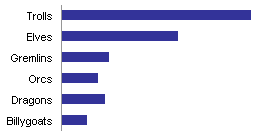
I guess it’s a matter of taste. I still prefer a bar chart to show the relative sizes of the categories:

In fact, using data from a bar chart Seth posted next to the pie, I’ve constructed a compound bar chart that readily shows that not only are Trolls a problem this year, but they were also a problem last year, and are projected to be a big problem next year, if we don’t act now.

This one will convince even the most numerically illiterate (“innumerate”?) in the audience. If you tried this with three pies, you’d only cause more confusion.
Seth finishes by saying
I can think of dozens of good uses of bar graphs… they’re not forbidden, they’re just overused and misused.
I can think of many good uses for several chart types, and no good uses for others. Charts with gratuitous 3D and formatting effects are among the most misused, abused, and overused of all chart types, and should be forbidden. Pie charts are also abused and overused, and if not forbidden, should be placed on probation. The major chart types I use (bar, line, and XY charts) are certainly abused and misused, but I wouldn’t say that well made ones are overused by any means.


Nat says
I would say that for the purposes of the “message” Seth wants to put across “focus on trolls” I think that the pie chart does a better job.
I agree with him, however Seth is not using the chart to transfer information, but to emphasise a message. In this case it is better to view the pie chart as not a chart but as an image or a graphic and its statistical accuracy is not then the compelling measure of it’s effectiveness.
derek says
Then a cartoon picture of a scary big troll would be even better at getting the message across. The dishonesty of using pie charts as a propaganda cartoon is that your audience comes out of the room thinking they’ve been shown some information. They’re wrong, but it’s a common and exploitable error, like bar charts that don’t start at zero.
jim says
I would argue it isn’t quite a matter of taste, but i say that with exactly the points you make. “Trolls are the most” is not quite the same point as “trolls are more than x, y, z” in a story. In the former, you care about the overall level relative to a whole versus comparison to others.
The biggest problem I see with pie charts is people use them just be graphical when they should in fact be using a table.
DaleW says
Even scientifically trained audiences can more quickly grasp certain facts from this pie chart than from this bar chart.
For instance, if the first faction which claims a sufficient majority will be the winner, the pie chart makes the troll threat (and potential alliances) much more obvious.
If % of total (population, resources, whatever) is irrelevant, don’t use a pie chart!!!
On the other hand, if we want to see trends, a trend line chart would seem to me to be more versatile and generally effective than a series of bar charts (or pie charts).
DaleW says
Jon,
In trying to imagine the data depicted in your pie chart, my best guess is that we have a D&D game where Trolls are one of several factions, and we have called up a graph showing power by faction. (If you have a better explanation, do share.)
According to a reference you cited elsewhere in your blog, Stephen Few’s “Save the Pies for Dessert”, there is a Secret Strength to Pies. While Few is certainly not a fan of pie charts, his paper concludes:
>> Regardless, the fact remains that a comparison of two sets of summed parts is rare in the real world. But, by all means, should you ever need to display data for this purpose, a pie chart would serve you well. Otherwise, save the pies for dessert.
http://www.perceptualedge.com/articles/08-21-07.pdf
It seems that you have created an example of just this type of scenario here — where the rational player would be concerned how to set up an alliance that might defeat the threating Trolls (Elves, Dragon, Orcs, and Gremlins would potentially work) — the scenario where even Stephen Few concedes that pie charts should be superior to bar charts. QED.
Psychologist says
Pie charts are good when you want to hide data. They are best when used to compare a trend and you show 2 or 3 periods – the user learns almost nothing – ideal when you are pretending to be helpful but in fact are trying to hide the reality.