A reader asked how to make an axis that had tick marks but no line. This gives a nice clean appearance to the chart, but unfortunately cannot be done with Excel’s native axis formatting. Of course, anyone who has read my blog or my web site knows that this does not bean it can’t be done. You just have to know how to fake out Excel.
I’ll use a column chart to illustrate this technique, and I’ll also start with a little dissertation on column chart styling.
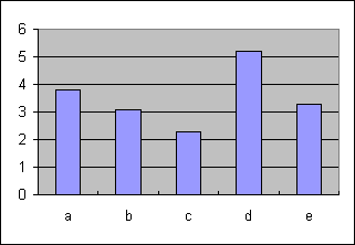
Behold the default Excel 97-2003 column chart. Functional yet oh so ugly. Muddy gray background, black border and line elements, and a nondistinct fill color.
The Excel 2007 default column chart is a little better, without the dreary background.

A few minor changes to the Excel 2003 chart bring a great improvement. The gray is gone, the bar fill color is a bit nicer and the bars are a bit wider, the font isn’t so huge, the gridlines are lightened a bit, the plot area has been expanded to fill the chart area, and the extraneous tick marks along the category axis are removed.

You can lighten the gridlines, borders, and axes a bit more to help emphasize the data.
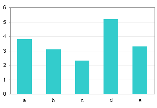
You can remove the border, leaving axes only, and you can remove the gridlines.

Some people like the gridlines, and if you keep them you can remove the Y axis line and tickmarks. This is a pretty nice style for a column chart
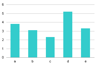
But how can you remove the axis line and the gridlines, and leave only tick marks? Excel doesn’t provide for tickmarks without the axis line too. But you can build your own set of tick marks.
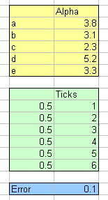
One way to do this is to add a helper XY series with hidden markers but visible error bars. Here is the data range for this example. The yellow range contains the column chart data. The green range contains the data needed for the XY series; The X values place the points along the left hand axis, and the Y values position a point at each axis tick location. The blue range contains the custom value for the error bars: adjustments can be made to the size of the error bars by editing this value, instead of using the Format Error Bars dialog.
Start by hiding the axis ticks and lines, but leaving the tick labels.
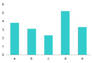
Copy the XY series data (green shaded range), select the chart, and use Paste Special to add the data as a new series. The series is initially formatted as another column series.
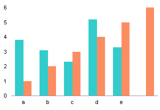
Right click on the new series, choose (Change) Chart Type, and select an XY chart type. Excel initially places it on the secondary axes, and adds nice dark axes to the chart.

Format the XY series. and place it on the primary axes. Now it is properly aligned in the chart.
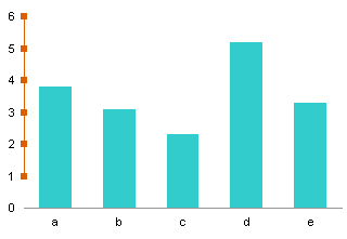
Add positive X error bars to the XY series, using the blue-shaded cell for the custom value.

Format the series to hide it: no lines and no markers.

Finally format the error bars: use a medium gray instead of black, and use the stule with a line only, no end cap. If you need to change the length of the error bars, simply fiddle with the value in the blue-shaded cell.

This is also a very clean style for a column chart. The same technique can be used on most other chart types.


Andy Pope says
You could use a custom number format such as
General” ─”
where the extra character is Box Drawings Light Horizontal, U+2500 found via the Character Map program.
Admittly it doesn’t quite reach the edge of the plot area.
Jon Peltier says
Andy – The dashes might also be offset vertically by a pixel or two. But for quick & dirty, it’s probably fine.
Danièle says
“quick and dirty”?! Perfectionists..!
I had used previously the dummy series trick, but Jon, how would you go about offsetting the ticks vertically ( or horizontally)”a pixel or 2″ ?
Thanks Andy for the format idea, but my character map does not have fonts Box Drawings Light Horizontal , and how do you use the Unicode U+2500?
Jon Peltier says
Danièle –
What I meant is that the dash is guaranteed not to be in the middle of the label, so it will be offset from the “actual” tick mark. For my dash, I’d probably use an en-dash (–) or an em-dash (—), which are Alt+0150 or Alt+0151 on the numeric keypad.
Here’s a sample using an en-dash:
If I include horizontal gridlines, you can see that the dashes are a pixel lower than the gridlines. For quick & dirty, I guess that’s close enough.
Andy Pope says
Danièle,
The font is Arial. The Box Drawing bit is the name of the specific glyph.
If you display Unicode character set it is about 4/5ths of the way down the list.
Jon’s right about the pixel offset. It’s more prominent if you use the standard keyboard dash character.
You could use this command in the Immediate window to create the character in the active cell. Then use copy/paste
activecell.Value = chrw(&H2500)
Jon Peltier says
Andy –
Your symbol is perfectly aligned:
derek says
Another quick and dirty method I often use is only slightly quicker and dirtier than Jon’s helper series, because it is itself and XY scatter series. But it’s slightly simpler:
xy
0.5 0
0.5 6
If it chooses the secondary value scale, choose the primary again, then format the line so it’s white and thick. It will cover up the scale line but leave the scale ticks visible.
Jon Peltier says
Just to clarify, because it took me 30 seconds to figure out your trick.
Derek is adding a new XY series which has its endpoints at the top and bottom of the Y axis. He is displaying no markers, and a white line which obscures the axis line.
Here’s the data, the initial chart, and the data added as a new (column) series.
Here the new series has been converted to an XY series, the XY series moved to the primary axis, and the series formatted to show no markers and a while line.
Danièle says
Thanks Jon and Andy. Your quick and dirty tips are as usual far from that, and thoroughly thought out for proportions and visual balance, and it is always great to see a graph where all fits well, and can be easily incorporated in a VBA module.
Derek, your trick is pretty quick, simple and effective too.
Great!
Danièle
ckz says
Jon,
Is it possible to have a Change Event work based on a cell formula? I have only read that the actual cell has to change.
I would like to have images appear, disappear on a summary worksheet based on the values being calculated on a different worksheet.
So far, the code only works if I change a specific value in a cell on the same worksheet.
Private Sub Worksheet_SelectionChange(ByVal Target As Range)
If Not Intersect(Range(“f4”), Target) Is Nothing Then
If Intersect(Range(“f4”), Target) < 5 Then
ActiveSheet.Shapes(“Object 2”).Visible = True
Else: ActiveSheet.Shapes(“Object 2”).Visible = False
End If
End If
End Sub
Any suggestions?
Jon Peltier says
The Change event needs an actual change to a cell’s contents: a changing value, or a change to the formula, not to its calculated value. But you could use the Calculate event to trigger the code you want to run.