My colleague Patrica McCarthy, the Excel Diva, wrote in 12 Months Data – 13 Months Data in a Chart last week about a problem with Excel charts. If you make a 12-month chart, as you shrink the chart, for example to fit it into a dashboard, Excel drops off the last month’s axis label. She mentions that plotting 13 months of data will avoid this problem.
That doesn’t make sense, I thought. Excel doesn’t drop off the last category axis label on a chart. But then I thought about it. When you shrink the chart, and the labels get close together, Excel does little things to prevent axis labels from overlapping.
I’ll illustrate by showing larger charts and a really simple data set.
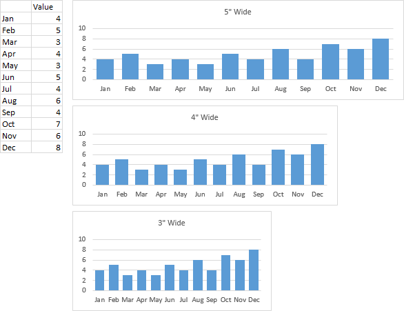
The default chart in US versions of Excel is 5 inches wide and 3 inches tall. The figure below shows three charts, each 1.5 inches tall, at widths of 5, 4, and 3 inches. The month labels all appear in these charts. It helps that I’ve used the three-letter abbreviations for the month names, and I’ve shrunk the axis label font size from 9 to 8 points (and I’ve also shrunk the chart title from a ridiculous default of 14 points down to 9 points).

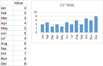
When I shrink the chart a bit further to 2.5 inches in width, Excel realizes that the axis labels won’t all fit, and it uses one of its favorite tricks: Excel has rotated the axis labels 90° (see chart below). They fit fine, but they are harder to read than horizontal labels.

You can format the labels so they are horizontal, but Excel uses another of its favorite tricks: it only shows alternating labels, starting with the first (left chart below). This is what Patricia was talking about, but when she said Excel hides the last label, I didn’t realize she meant Excel was hiding alternating axis labels. You can format the axis so that it shows every label (in other words, it uses a label interval unit of 1), but now we see that the labels are beginning to overlap (right chart below).

How about a 45° degree tilt to the labels? Starting with the first chart, if you change to 45° labels, Excel still decides to show only every second label (left chart below). If you show all of the axis labels, they really don’t overlap (right chart below). This isn’t terrible, but I find partially rotated text as distracting as fully rotated text, and hardly easier to read.

Patricia mentioned in her article that you can show 13 months of data to make the last month’s label visible. I’ve added the prior December’s data below, and now that we start the alternating axis labels with last December, this December also appears. We still miss every second label, but seeing the last one anchors the visual more effectively.

Showing both December’s gives insight into a year-over-year comparison, at least for December.
In addition to using Patricia’s workaround above, and using smaller font sizes and shorter axis labels as I’ve done from the start, there are a few other tricks you can try.
Here I’ve used one-letter abbreviations for the month names. Sure, there are 3 J’s, 2 M’s and 2 A’s, but within the context of the entire year, there’s little confusion about this, and it is done frequently.

Quick Number Format Tip #1: If you have a date in a cell, you can display just the three-letter abbreviation if you use a custom number format of MMM, and you can show the one-letter abbreviation if you use a custom number format of MMMMM. (A single M shows a one- or two-digit numerical month, 1 for January and 12 for December; a double MM shows a two-digit numerical month, 01 for January and 12 for December; and a quadruple MMMM spells out the entire name of the month.)
You can also show alternating month labels, ending with December, as follows. Make your chart as before with the full set of month abbreviations, set it to show every horizontal label, then delete every other month starting with January. Now at least the last month’s label is visible, even if you’re only showing half of the axis labels.

Finally, you can show all axis labels, but prevent overlapping them, if you stagger them, showing some higher and others lower. To do this, put the cursor at the beginning of some of the cells, and hold Alt while pressing the Enter key. This inserts a carriage return (or line feed, whichever) at that point in the cell’s text. I’ve set the cell’s Word Wrap to true, so you can see the taller two-line cells in every second row below, and these labels appear one line lower along the axis. This needs more space to display, so Excel shrinks the plot area slightly, but you get the benefit of seeing all of the axis labels.

Quick Number Format Tip #2: To get the carriage return in a cell containing a date, use a custom number format of MMM, but precede the MMM with Ctrl+J. This undocumented feature inserts a carriage return right in the number format. This undocumented feature also only works in the number format dialog for worksheet cells, not for chart elements, which is a total bummer, because they’re at least as useful in charts as in the worksheet.
Quick Formula Tip #1: If the labels are in a column of cells, say A2:A13, you can easily get a carriage return into alternate cells. Enter the formula =A2 in cell B2, enter =CHAR(10)&A3 in cell B3, then select B2:B3, and drag the square on the bottom right of the selection down to B13 to fill the range with these alternating formulas.
Quick Formula Tip #2: If you have dates in A2:A13 instead of labels, enter =TEXT(A2,"MMM") into B2, enter =CHAR(10)&TEXT(A3,"MMM") into B3, select B2:B3, and fill down as above to B13.


Patricia says
Thanks Jon. I knew you would find my post! I should have been a bit clearer so thank you for the additional insight and alternatives. As always, you are the master of charting.
Bryn Williams says
Nice article, just to add, I’ve been using 13 month charts by default for years, and not because of labels. The addition of a year on year comparison simply by extending the period gives a lot of value for very little effort. I recommend the practice to all (perhaps excel could make it default).