A reader of my post about Trendline Fitting Errors asked how to calculate area under a fitted curve. His stated problem was that when he tried to calculate points based on the fit, it didn’t come close to matching his measured data, even though the fit had a very high R² value. I suspect this problem was due to the tricky nature of the Excel formulas needed to make the various calculations.
Another problem, which is stated in the Trendline Fitting Errors post is that the reader had calculated a 6th order polynomial fit to his data. This is fine, I guess, if you only need the data for interpolation, the fit is close, and due to curvature the fit deviates from a straight line between points.
Despite the problems with using a sixth order fit, I’ve decided to work out the calculations and compute the area under the curve, both under the measured data and unser the calculated data based on the fit.
The Experimental Data
The measured data is shown in the table below. This represents the force needed to move a surface closer to a particular molecule starting at a distance of 1.22 (which is asymptotically close enough to infinity that we assume a force of zero). The units of force and distance are not stated, but it doesn’t matter for this exercise. As the surface approaches the molecule, the force increases, until it is close enough to start to distort the molecule, at which point the force tops out and even decreases at the closest measurement.

Here’s a plot of the data.
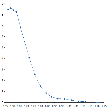
When I first saw the data, I mentioned to the reader that there appeared to be a bump in the curve near the bottom. I’ve zoomed in on this region below. The curve coming from the upper left doesn’t match up with the curve coming from the lower right, resulting in a zig-zag at about X=0.95.
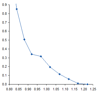
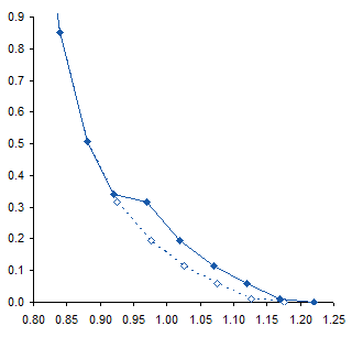
To me this means there may be some slippage in the mechanism that moves the surface, or some other experimental inconsistency. I would think that the actual curve would look like the dotted line below. If it were my experiment I would repeat the measurements, but the exercise below was performed on the unmodified data.
The Trendline
I added a 6th order polynomial trendline to the data. Then, since trendlines are bold black lines that blast your eyes and obscure the data being fitted, I formatted the fitted curve as a thin red line. For most of the range of data the trendline fits pretty closely to the measured data, and the R² value of 0.9996 is very close to a perfect 1.0.

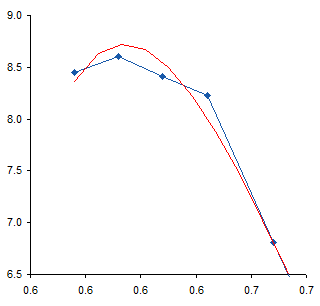
Near the top of the data, the trendline is not very accurate, overshooting the maximum of the measured data, then overcompensating for the decline in the last point.
The fit at the opposite end also isn’t very good. The red line careens back and forth like an out-of-control bobsled trying to hold a line. Note how the trendline is thrown off by the discontinuity I remarked about earlier. The trendline actually reaches a local minimum at about X=1.15, then a local maximum at about X=1.20, before continuing downward, but not quite to zero.
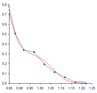
These deviations of the trendline from the measurements, particularly the serpentine behavior at the lower end of the data, illustrates the problem with high order polynomial fits. There’s really not a physical basis for choosing such a fit; it’s simply convenient and gives a high R². Of course, a high R² is not the only reason to select a particular mathematical model, and does not by itself mean the model is a good one. You have to decide whether you think the selected model or the actual measurements know more about your data.
We must take care using the trendline equation in the earlier chart. Its coefficients have only five digits, and with so many coefficients multiplied by so many powers of X, errors can accumulate. Here are the points calculated with these imprecise coefficients. Not very good agreement: the calculated points deviate somewhat more than the trendline at the top, and they go off in another direction entirely at the bottom.
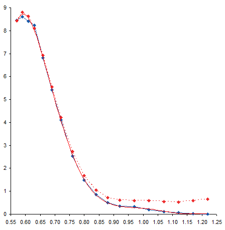
We can improve the precision of the coefficients by formatting the trendline formula in the chart to use scientific notation with 14 digits after the decimal point. It’s ugly, but it’s precise.

Calculating Coefficients
Now, we could then retype all of these coefficients into worksheet cells, but that would take a long time and leave us cross-eyed. The better approach is to let Excel make the calculations using its LINEST worksheet function. You need a range with five rows and one plus the order of the poly fit columns. For a sixth order fit, we need seven columns. Select the range with the active cell in the top left of the range, type in the formula below, then hold down CTRL and SHIFT while pressing ENTER. CTRL+SHIFT+ENTER produces an array formula, which is a topic that could cover dozens of blog posts.
=LINEST(B2:B19,A2:A19^{1,2,3,4,5,6},,TRUE)B2:B19 contains the Y values, A2:A19 contains the X values. We denote a six order poly fit with the ^{1,2,3,4,5,6} notation, which tells Excel to apply each of the exponents in brackets to X in its calculations. The third argument is left blank, because we don’t want to force the fit to go through the origin, and the last is TRUE because we do want to fill the entire selected range with calculations. (The first row of the output contains our coefficients. The second through fifth rows of the output contain information about the coefficients and the model, so we could have simply selected the first row of the range and not bothered with the rest.)

After pressing CTRL+SHIFT+ENTER we get the following table. I’ve inserted headers at the top to remind me which coefficient is which.

Calculating Points
Now we can calculate values at the X values of interest. In this case, I’ve used the same X values for which we have measured data. The formula in cell C2 is shown below, and it is filled down to C19.
=$N$2+$M$2*A2+$L$2*A2^2+$K$2*A2^3+$J$2*A2^4+$I$2*A2^5+$H$2*A2^6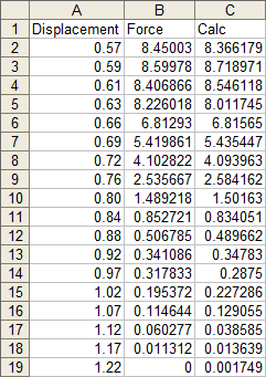
These points exactly fit the trendline, and are pretty close to the measured data.

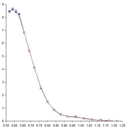
I’ve removed the curved trendline and connected the calculated points with straight lines. With this formatting it may be easier to see the deviation of the calculated points from the measured data.
Residuals
We can easily calculate the deviation between measured and calculated points. Column D simply shows the difference between columns C and B (calculated minus measured).
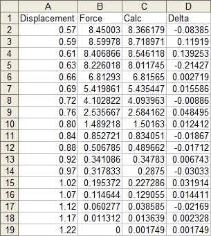
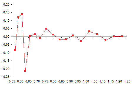
And here is a plot of the residuals, which is the fancy word statisticians use for this deviation. It’s particularly high at the left end of the data (the top, where the trendline overshot the maximum, then overcompensated on the rebound.
Calculating Areas
The original question the reader had was “What’s the area under the curve?” I think the whole polynomial overfit was really a distraction.
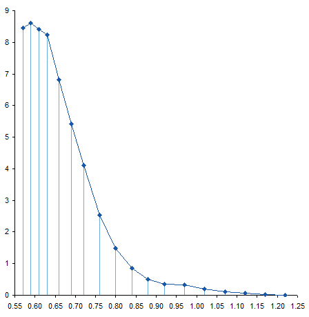
To calculate the area under a curve, we can cut the area into slices, figure out the area of each slice, then add them up to get the total area. We already have data points at certain intervals, so let’s slice the curve at each point. Here is the sliced up area under the measured curve.
Here’s the sliced up area under the calculated curve. Not too different.

The slices are trapezoids, and we know the area of a trapezoid: average height times thickness. In columns E and F I’ve calculated the areas under the measured and calculated curves. The formula in cell E2, filled down to E18, is
=(A3-A2)*(B2+B3)/2where A3-A2 is the thickness and (B2+B3)/2 is the average height. The formula in cell F2, filled down to F18, is
=(A3-A2)*(C2+C3)/2The total areas are summed in row 21.
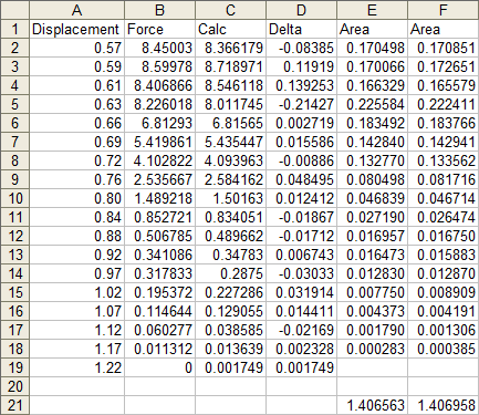
The two computed areas are unusually close, differing by less than 0.03%. In this case, there was no benefit to using a trendline to calculate this area.
You could make the case that trapezoids don’t accurately capture the area under a curve if the data shows lots of curvature. If we had taken measurements more frequently, our points would lie under or over the straight top segments of our trapezoids. If we believe our trendline, we could calculate values at closer intervals, as shown below. We might then say that the computed area was more accurate.
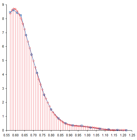
The area calculated for the thinner slices was 1.404070, which is about 0.2% less than the areas computed using thicker trapezoids. This difference is probably from the range between X=0.80 and X=0.97, where curvature in the trendline moved it below the straight line segments of the measured data. Is this a better value? It’s not substantially different from the calculation based on only the unmodified measurements, and I’m sure there are greater sources of error in the experimental setup.


ikkeman says
Aren’t we missing at least some indication of the error of the data points. How can you decide the fit is acceptable without determining within what bounds the result must lie.
The data from the previous post is up to 10 digits in accuracy – that would not leave any room for deviation.
Jon Peltier says
Ikkeman –
You’ve raised a very good point, which I touched on in the comments to the Trendline Fitting Errors where this data was first introduced. I questioned the physics behind the data, originally provided without context. I questioned the maximum and turnaround at the top left (which looks unnatural) and the bump/offset at the bottom right (which looks like machine-related error), and I’ve revisited the bump in this article. The Y data was given with huge precision, no discussion about accuracy (by “deviation”, did you mean inaccuracy?). The X data was given at blocks of uniform intervals: several spacings of 0.02 near the top, then blocks of 0.03 and 0.04, and finally several spacings of 0.05. Again, no mention of accuracy, though the bump/offset speaks loudly.
ikkeman says
By deviation I meant the acceptable difference between data points and interpolation points.
If this data set describes a physical measurement, I’d be very hesitant to use a arbitrarily high-order poly. Why not just go for broke and use the full 16 orders allowed by the linest function.
Come to think of it, why interpolate at all – you have data points, just calc the trapezoids in between the data points. If you want to find the physical rule behind the data, go no further than 3rd order (usually linear or quadratic is plenty) and think about cutting up the data range in two ranges. The right hand part <0.63 and beyond that.
two low-order poly's (or logs) should do.
then, why not take the integral of the poly?
Jon Peltier says
Ikkeman –
In the Trendline Fitting Errors post, I warned about polynomials higher than quadratic. It’s better to fit a physically meaningful model to the data. There must be a physical model of the repulsion between the molecule and the approaching surface. Repulsion inversely proportional to distance-squared, something like that.
I intended to suggest using just the original measured data for the area. Then I computed the area under the fitted points, and the values were very close.
I’m going to change the wording in the article, to incorporate these points into the text.
DaleW says
If you have them handy, cubic splines should work very nicely here.
ikkeman says
Jon,
I do apologize for being a bit of a nit picker. I do love this site and get a lot out of it, without requiring any effort on my side – I am grateful for that. Even this post is very informative in showing the trendline() function. I still need to explain to many colleagues that they don’t actually have to copy the text from the graph…
There is however a danger when using a tool like Excel without thought. It will perfectly and in great detail produce any result you ask of it, even when what you ask is BS.
Seeing this post linked to science data scared me a bit I guess. I should’ve known better and trusted you.
btw, definite integration of the 6th order poly provides x=0.57 : A=-372.5672 and x=1.22 : A=-371.1629. Thus A between 0.57<=x<=1.22 = -371.1629–372.5672 = 1.4044, or just about exactly in between the thin and thick slice results.
Stephen Druley says
You indicate, as an example, that the 6th order term for the polynomial is
-4469.71X^6
If we calculate the integral for this we get
(-4469.71X^7)/7 + C
The area under the polynomial would then be the sum of each of its terms as defined above. Have you explored this option?
Stephen Druley says
Using the above method the definite integral applied to the unaltered data is 1.40967. After checking the goodness of fit, it appears to be entirely reasonable to use a 6th order polynomial to characterize the data. My approach to this is to compute the area under the unaltered data first then run it again with the revised data in order to quantify the error associated with the test. Your efforts to uncover the root causes of variation in the assessment were notable and increase the value of the reported results. This is good work.
Jon Peltier says
Stephen –
With my misgivings about the poly fit, even with a high R², I’d be reluctant to use the integral form for my area calculation. The deviation isn’t great, but we can see the deviations of the fitted curve from the actual data, particularly at the high and low ends. Do we assume the positive errors in the integration balance out the negative errors?
Liam says
Hi Mr Peltier,
Please can you explain how you plotted the trapezoid lines. Displaying the workings is very valuable, especially when you reduce the width distance (by increasing the number of interpolated points) to increase accuracy.
Thank you so much.
Liam
Jon Peltier says
Liam –
To plot those trapezoids, I first plotted the points, with connecting lines. Then I added negative error bars, with a percentage of 100%. Finally I formatted the error bars to match the connecting lines.
Liam says
Thanks Jon!