A visitor to the Microsoft newsgroups wanted his area chart to show a different color for positive and negative values. This is easy enough to do in a column chart. One technique is simply to use the Invert if Negative formatting option, the other it to make a conditional chart with one series for positive values and the other for negative values. Neither of these techniques works for area charts, but it’s possible to adjust the data to make an area chart with two series, one for positive and one for negative.
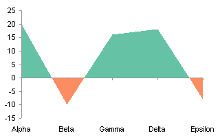
Del Cotter has written up a very similar approach in Excel area chart with colour invert if negative. It’s the first I’ve seen of his Information Ocean blog, but I’ve added its feed to my reader, and I’ll keep up with it.
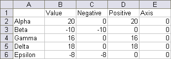
We’ll use the following sample data, selected because it crosses zero several times. The first two columns are the category labels and values, the second two columns have split out negative and positive values, and the fifth column will be used later in the exercise. The formulas that split out signed values are simple:
C2:   =MIN(0,B2)
D2:   =MAX(0,B2)
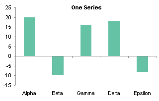
Here is a simple column chart of the original data:
Without too much trauma you can use Invert if Negative to format negative values differently than positive values:
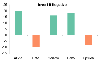
Excel 2007 partly breaks the Invert if Negative functionality described above: if you use solid fills, the negative column can only be filled with white. You’ll need to use the multiple-series approach shown below.
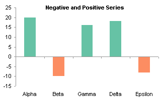
You can construct a conditional chart using the Positive and Negative values computed in columns C and D:
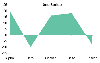
Here is a simple area chart of the original data, as boring as the column chart:
There’s no Invert if Negative setting for area chart fills, so the only apparent option is to plot the Negative and Positive series together. This chart uses the unstacked area chart; the stacked version is uglier and more confusing. The dotted line shows where the series is expected to go.
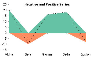
The problem is that each series goes to zero at the category where the other series has a nonzero value, rather then both meeting in between. What is needed is to interpolate between points that cross zero, in order to have a point at zero. Since this may occur anywhere between a given pair of original categories, we need to use a numerical scale, and a date scale axis is as close as we can get with an area (or line or column) chart. The following shows a second range of calculations in the worksheet.
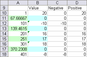
Cells B10, B12, B14, B16, and B18 link back to cells B2:B6. The blue cells in column B contain either a value of zero or a value midway between the surrounding values, according to this formula:
B11: =IF(B10*B12<0,0,(B10+B12)/2)
What this formula does is enter zero if the connecting line crosses zero (i.e., if the values on either side have a negative product), otherwise it returns the average of the two values.
Cells A10, A12, A14, A16, and A18 contain numerical values of 1, 101, 201, 301, and 401. These are the pseudo-dates for our date scale interpolated axis. These values start at 1, because the first date that is reliably recognized in a chart is 1/1/1900 (i.e., 1). The spacing is 100, which should give sufficient resolution for a chart of reasonable size. The green cells in column A contain a formula that interpolates between the numbers on either side according to the value in the corresponding blue cell. The formula is a simple interpolation:
A11: =(B11-B10)/(B12-B10)*(A12-A10)+A10
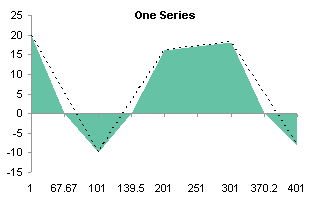
Here’s an area chart of the Values data, with a dotted line showing where it should go for a smooth interpolation. (Note for example that the category axis places 67.67 equidistant between 1 and 101.)
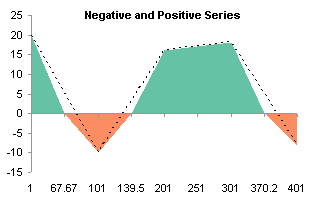
We can plot the Negative and Positive series on the chart (stacked or unstacked, they are identical), and almost get what we want, although the category axis spacing is still off, as shown by the dotted lines.
After the category axis is converted to a date scale, and the base unit changed to days, the alignment of the chart series is correct.
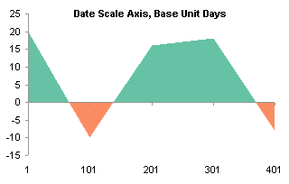
The axis labels are not what we need to clearly show the data. Add a series using the original category labels in A2:A6, and the zeros in cells E2:E6 as Y values. Convert the series to a line series. There are only five points, not nine, so the points are plotted at the first five category labels on the interpolated date scale.
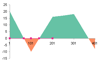
Move the new series to the secondary axis group. The new Y axis appears on the right, with a scale of zero to one.
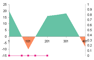
We need a secondary category axis, and Excel usually provides only the value axis when we first move a series to the secondary axis group. Add a secondary category axis, which appears at the top of the chart.
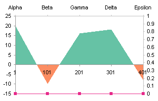
Format the scale of the secondary Y axis so the category axis no longer crosses at the maximum. This makes it cross at zero (the bottom of the chart.
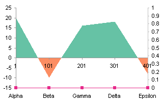
All that’s left is to hide what we don’t want to show. Format the primary category axis so it has no category tick labels. Format the secondary value (Y) axis so it shows no line, no tick marks, and no tick mark labels. Format the secondary category axis so it has no mile and no tick marks, but keep the labels.

An alternative labeling approach that doesn’t need to muck with secondary axes involves adding labels into column E of the second range. The labels are either the original category labels or blanks.
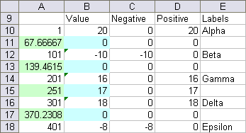
Start with the chart with Positive and Negative series that used the date scale axis to shape the area series correctly. Add a series using A10:A18 for X and B10:B18 for Y. It gets added as another area series (the chart below is a stacked area type).
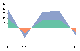
Convert the added series to a line type.
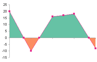
Use Rob Bovey’s Chart Labeler to add the labels from A10:A18 to the new series.
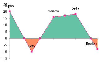
Format the line series so it uses no line and no marker to hide it, and adjust the position of the labels as appropriate.


derek says
With this technique, it’s now possible to go back to your chart challenge article with a new approach:
derek says
There was supposed to be a picture there, but I guess the comments don’t support that.
Jon Peltier says
Derek – It should support a picture, if you use the proper html. Give me the link and I’ll include it in the original comment.
I did post a follow-up to your first comment, but probably I forgot to submit it before navigating away.
derek says
Here’s a
tidied-up versionof the general “crossing any two lines” method, with RAND() data. Psychedelic shapes!Jon Peltier says
Pretty slick!
Keith says
I have tried to do the same thing to 3-D surface charts but with no luck. Any ideas?
Jon Peltier says
Keith –
Invert if negative? in a surface chart, the color of a region is already dependent on value. It’s a matter of formatting the ranges the way you want each value to be represented.
Matt says
Every time Mr Google brings me back here, and every time it blows my mind! Keep up the good work.
Random says
I was searching eveywhere to find out how to create a positive and negative bar chart, and i found this site. It was really useful and helped me to figure out how to work excel in this way. I recomend this site to anyone that wants to create these sorts of graphs.
Thank you for putting this on the web, it really helped with completing my coursework.
Kathryn Lambkin says
Thanks Jon,
I found your forum post mde last year saying getting this to work was near on impossible
Seems you didn’t give up on that challenge!
Thanks for a great workaround to a Microsoft flaw.
Kathryn
asad naqvi says
hi,
i have a web site designed in which i have to plot dynamic charts from the data that is also going to be sent to it dynamically from an external artificially intelligent instrument. the graph has successfully been plotted using jfree charts but now i have to use the same data to plot the graph in x,-y co-ordinates instead of the usual x,y co-ordinates i.e. the origin should be on top with the y axis pointing downwards. can anyone help me out with this?
Jon Peltier says
I’ve never used JFreeCharts, but Google informs me there is a forum at JFreeChart – General.
Jason says
Hi Jon,
Thanks for the great tutorial. I was wondering whether you could extend it a bit to shift the “zero” point on the Y-Axis. For example, I want to chart the number of incidents that occur every week. This will always be a non-negative number. But I have a specific target that I want to meet (e.g. 3). Is it possible to shift the Y-Axis cross over point from zero to 3?
TIA
Jason
Jon Peltier says
Jason –
You can format the Y axis so the X axis crosses at any value. What happens is that the areas (or bars) start with their base at the axis, and not at zero. You need to make this clear to the peole reading the chart.
Vincent says
I have been looking for an option in Excel 2007 to do the invert if negative option just like I did in 2003. On every website it states that it cannot be done unless you use two series. I couldn’t.
Then I found this:
http://www.hichert.com/de/community/foren?func=view&catid=6&id=150
It works! And I like to share this with all of you looking for this solution!
Jon Peltier says
Vincent –
Thanks for the link. I tried it myself, and despite not understanding where the funky gradient definitions came from, I have written my own tutorial on the subject: Invert if Negative in Excel 2007.
Vincent says
No thanks! It’s just a way of giving something back to you, which in no way can be equal to what you give to all excel users worldwide! Thank you!
Lukas says
Hi,
I tried the above technique on an area chart that has the 31 days of January as x-axis. However, when I interpolate between two days to get the chart right, it is not displayed in the Excel 2003. I know the base unit is days, so maybe Excel can’t manage a data point that lies between two dates?
Any suggestions to solve the problem would be great appreciated.
Many thanks,
lukas
Jon Peltier says
Lukas –
The area chart has to be on a different date axis with many more days. You don’t interpolate between two adjacent days on the line chart’s date, you interpolate between two far apart days on the area chart’s date axis, so you actually crss the axis at an intermediate date on the area chart’s axis.
Lukas says
Hi Jon,
Thanks for your comment, appreciate it. I was able to fix the problem after several hours. Once I converted the dates into numbers, and interpolated the numbers, the area chart finally looked correct.
Since the numbers wouldn’t make much sense to describe the x-axis values, I created an independent date column which then became the relevant dates to dexcribe the x-axis.
Thanks again for your response. This page is really awesome.
lukas
Angel Morales says
Hi John, I have learned so much but I am still struggling with a graph that is similar in principle to this type of charts but the threshold is not zero but another number. In my case I am trying to color the area above the 11% threshold red and green below it. What would change?
Tris says
Jon
Your site is my “go to site” whenever I can’t get something in Excel just so!!
However, I tried you way to solve this problem but found it complicated but was able to develop an alternative that works – or at least works well enough for me
Create a dummy data set that is some high value + each data point
Plot the data set and the dummy data as stacked area charts
Set the data set and plot area colour the same
Change the maximum vertical axis scale to crop away the unwanted data and viola!
I hope you find this of interest and thanks for you help in the past and no doubt future¬
Tris