An Enormous Infographic
In Anyone But Romney: The GOP race so far, the National Post shares an enormous infographic with us (click for full size image).
The bulk of the graphic is taken up with what remind me of snake skins laying out to dry. Apparently the widths indicate the relative popularity of each candidate along a vertically-oriented time axis.
The unorthodox alignment of the time axis is initially disorienting, but the blobs are big, they must be important. Hmm, are those all months delineated by the horizontal white lines? Apparently so, even though they differ by more than the days in each month would account for. The spacing must be dictated by the occurrence of each successive poll, not by the passage of days.
The snake skins are decorated with parallel arrows, which change direction in mid-January. Is it the dropping out of Perry or of Huntsman that this change indicates? Or nothing; probably that’s just where the fancy fill pattern changes.
Auxiliary Charts
Okay, I’ve feasted my eyes on this lovely rotated timeline blob thing, what is shown in these small charts added as an afterthought to the bottom of our infographic?
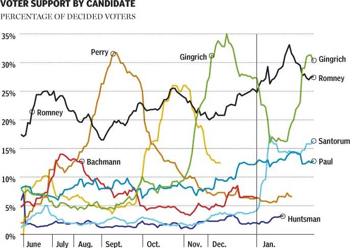
The small chart at bottom left shows the popularity of the candidates. Wait. That’s what the big paint drips also showed. The date axis here is horizontal, left to right, but the data is indistinguishable from that in the upper graph. The months have the same irregular spacing.
At first, the small round markers beside each candidate’s name appear to show a significant time point, because Huntsman’s line is labeled at the point he dropped out. But Santorum and Paul and Romney and Gingrich haven’t dropped out, so that’s not the purpose of the circles. On further inspection, they just seem to say, “This label goes with that line”. Some lines are labeled once, some twice, and . . . QUICK! Without referring to the large chart above, which candidate goes with the yellow line?

Poor Herman Cain, couldn’t buy any respect.
I think the only purpose of the line chart is to show what the monster paint blobs showed, but in easy to read fashion (except for the labeling issue). Conversely, the big blobchart seems to be shouting, “Look Maw, I made a info graffick!”
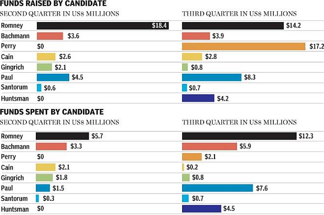
The remaining chart shows basically that Mitt Romney has raised a lot of money, much more than his competition, and he’s also spent more than they have.

Overall, this monstrous graphic would have been more informative with just the bottom two charts, without the distraction of the rattlesnake hides that occupy 85% of the original. Of course, if the intent was to get people to look at your page, the snake hides may have succeeded.
Apparently the National Post is waiting for anybody, even Newt Gingrich, to overtake Mitt Romney’s lead in the polls. But this article, even the updated edition, predates Gingrich’s poor showing in the Florida primary. The question that remains is, Can money buy election happiness?


Kevin Deegan-Krause says
Love this blog, but a few points above. I think the snakeskins are there to tell a story not just of rise and fall (visible in the line chart) but of shifts. It does a nice job of clarifying the serial bulges of non-Romney candidates because it is, in effect, simply an area chart with space between the entries. The biggest problem with it is that it is not clear that the story it tells–voters shifting from Bachman to Perry to Cain to Gingrich to Santorum (hence the arrow fill, which the designer needed to reverse in January because the flow away had stopped) is actually /true/ because we have no data on that and we don’t see here the “I don’t knows”. The chart implies that voters went from Bachman to Perry to Cain, etc, but most likely they went from in much more chaotic patterns: Bachman-I don’t know-Santorum, Perry-I don’t-know-Gingrich, and so on. And mixed up in here are all of the Romney-I don’t know-Pauls etc. So the data may be right, but it is insufficient, and the story may be right but it’s not easy to tell from the data we’ve got, and so this graphic ends up doing a disservice by telling a compelling narrative that will be frequently repeated may not quite be true.
Jon Peltier says
Kevin –
You may be right about the bulges. I was so distracted by the arrows, the irregular date spacing, the clever labels (“The Bachmann Bye-Bye”), and the hugeness of the snakeskin section of the graphic, that I missed it. I’m glad someone explained it to me; who’s going to explain it to the rest of the viewers?
To carry the snake metaphor further, we can see the bolus moving further along the digestive tract of the snake. By the convention, all we’re left with is… Well, let’s not carry the metaphor too far.
Another way to show the data would be filled area charts with a horizontal time axis. Each area would start at a horizontal baseline, and not be reflected about a vertical center. Don’t stack the areas, but put white space between them. Arrange the shaded areas in the same order top to bottom as the snakeskins are arranged left to right, except with Romney after the others instead of before them.
If I had the actual data, I’d do this one, but I’m not going to try to transcribe the numbers that comprise the snake vertebrae.
Thibaut says
Kevin,
Thanks for explaining those arrows. I too was confused at what were their actual purpose, and they now make sense. However I do believe a well constructed inforgraphic should not rely on posts to be explained.
Jon,
I actually prefer the idea of those blobs rather than the line chart to unclutter the candidates with polls < 15%. They show the transfer in voting intentions more clearly from the one to the other. However, while the principle and intent is very good, the details of the construction are indeed "floppy"which leads to misinterpretation. As you pointed out, the dates are unevenly spaced : gingrich seems to have the lead far longer than cain but that is mainly because of the distortion between nov and dec. The labelling in the bottom left chart is indeed confusing with some candidates labelled twice, and an unreadable stackof information. Moreover, there is a difference in horizontal scale in the bottom right bar charts between the funds raised and the funds spent. it's hard to notice, but when you look at the bar for romney in the thirs quarter, the 12M$ bar is actually longer than the 14m$ one which makes it look like he's spending more than he's raising which is not the case.
On a totally unrelated subject : I'm a big fan of your blog Jon even though I must admit I haven't contributed much to it by lack of time.
J.B. says
Hi Jon,
I like all of the comments above. I am an intermediate beginner of Excel. Can do some nested formulas, very little VBA, make simple charts, nothing to complicated.
One observation is the line chart is hard to read and confusing. The colors of the lines are to close in color to have a clear distinction between candidates. Would it have been better to have separate trend over timeline charts with no more than 2 or 3 candidates per chart, than one big clustered chart?
Jon Peltier says
JB –
If I had the data, I would have made a few charts to try to improve on that line chart. An area chart would be an improvement, with time horizontal and a flat baseline (one-sided area, not two-sided like the snakeskins), one area per candidate, separated vertically the way the snakeskins are separated horizontally. But I also think the line chart could be clarified.