A reader of this blog asked how to add a series to a 3D column chart, to show reference values. Excel doesn’t allow combination charts if one of the chart types is 3D (fortunately!), so she added lines from the Insert Shapes group on the ribbon. Here is the result.
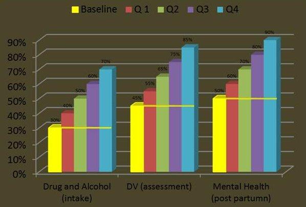
As a quick response I sent the following chart, which uses a hollow column on the secondary axis to indicate the baseline, and I wrote up the tutorial in Simple Baseline for Excel Column Chart.
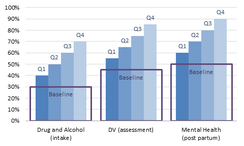
In a comment to that post, a reader suggested a horizontal line, rather than a whole box, as the baseline marker. The following protocol describes how to accomplish this
Here’s the data for these two examples.

The first step is to create a clustered column chart.
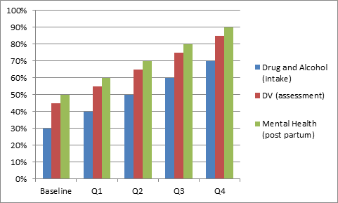
The second step is to switch rows and columns in the source data orientation if necessary (it was).

Now we’ll clean up the chart a bit. Let’s remove the chart area border, remove the line for the vertical axis, use lighter gray lines for the gridlines and horizontal axis, and remove the tick marks from the horizontal axis.
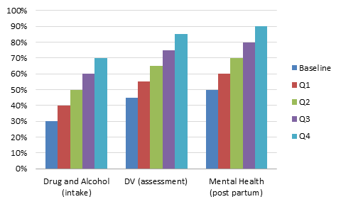
Change the Baseline series to the XY (Scatter) type, which also moves it to the secondary axis.
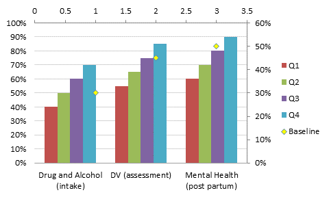
Reassign the Baseline XY series to the primary axis.

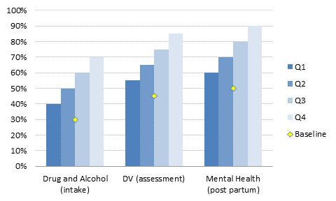
Apply a consistent set of colors to the Q1 through Q4 series.
Add error bars to the Baseline series. The default is horizontal and vertical error bars of length 1 in the positive and negative directions.

Select and delete the vertical error bars.
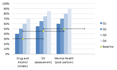
Resize the horizontal error bars. Use trial and error, or if you’re good at math:
Error bar total width (2 error bars) = 4 column widths
Total category width = 4 column widths + gap width
Gap width = 150, which means 1.5 column widths
Single error bar width = 4/5.5/2 = 0.364
Format the error bars as desired.
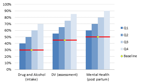
Add data labels. If you select the whole chart and then use the Data Labels command on the ribbon, all series will be labeled in one step. This saves a lot of time over labeling one series at a time.
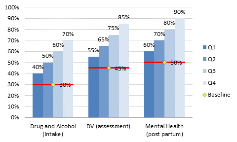
Change each set of labels from Value to Series Name, and change the Baseline label position to Below.
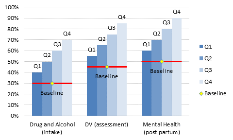
Finally, if desired, use a darker shade of the series colors for the labels. Change the Baseline marker style to none, and delete the legend
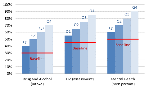
It’s a lot of steps, slightly more involved than the “hollow box” technique of the previous post, but it’s still quick and easy.


derek says
I like this one a lot better than the hollow box.
Michel Gerday says
Yes, much better than previous solution.
Best regards from Belgium.
Tamoghna says
Is it possible to show only the part of the columns above or below the baseline (felt the columns below the baseline is kind of redundant)?
Bob Phillips says
This is great Jon, but …
Pivot charts don’t allow XY Scatter. Do you have a technique for doing the same with a pivot chart?
Jon Peltier says
Bob –
One more reason not to like pivot charts. Make a regular chart from your pivot table, and if it’s going to change configuration, use dynamic range names in the chart series to keep up with the changes.
Bob Phillips says
That is what I have done Jon . But I do use Pivot charts as they are so easy, baselines are so useful, and so I was just hoping there was a technique.
Jon Peltier says
“One more reason not to like pivot charts.”
I should have said, one more thing that frustrates me about pivot charts. Yes, they are easy, but also not so flexible. There is no way to keep the pivot-ness of the chart and add data from outside the chart.
You could try to include the baseline data in the pivot table, and add it as another series, but in my experience (and I’m sure in yours), refreshing a pivot chart with more than minimal formatting causes the formatting to revert to the default.
Joey says
I use your hollow bar technique, but instead of making a border I use a gradient fill:
Stop 1 is Red, position 0%,transparent 0%,
Stop 2 is Red, pos 2%, trans 0%
Stop 3 color doesn’t matter, pos 3%, trans 100%
Stop 4 color doesn’t matter, pos 100%, trans 100%
Its easier to implement and creates a line almost exactly like your xy error bars, unless the ‘baselines’ are at wildly different heights on the chart in which case some of them look fatter than others.
Jon Peltier says
Joey –
A simpler approach would have a totally transparent bar, corresponding to the transparent 3% to 100% of your gradient, with a thin red bar on top, corresponding to the red 2%. The red part would be the same width no matter the height of the bar supporting it, and there’s not a lot of trial and error coming up with the exact gradient to make it work. Plus the line thickness could be linked to a value in a cell, which you couldn’t do with the gradient.
Joey says
Good point Jon. I quite like that idea. I’ll give it a try next time.
Gavin Lawrence says
Hi John,
Risk Density Strips are a type of graph type that I would find really useful to be able to produce in Excel when preparing reports on project risks when I have run a Monte Carlo simulation using either ModelRisk (vosesoftware.com) or @Risk (Palisade.com).
The big question every project director wants to know is what are the top ten risks!!!!
This is the ‘give me a number’ syndrome that accountants thrive on but it doesn’t apply to distributions.
So I want to show the distribution of risks.
Unfortunately the R code below is beyond my ability to turn into an useful Excel graph tool.
Please can you help?
Regards
Gavin Lawrence
Source code from: http://attwaterconsulting.com/codes/densitystrips.txt
Code in R
# Plots Density Strips for Monte Carlo Samples
# Vectors of MC samples to be
# plotted as density strips are in a single list “samples”
# Likewise, Titles for these density strips are concatenated into a single
# vector “stitles”; default is blank
# Likewise, smoothing bandwidth adjustments (~0.5-3) of these MC sample
# vectors are concatenated into a single vector “sadj”; defaults are 1 –
# must be determined outside by using phist or plogdens
# Likewise, plotted heights (1-100/# density strips) of these density strips are
# concatenated into a single vector “bh”; default is optimal height to
# fill the chart, centered otherwise
# Likewise, colors of the density strips of these MC sample vectors are
# concatenated into a single vector “bcolor”; default is all density
# strips are purple
# Other defaults are min and max plot x range (default is -1e20 -> 1e20),
# plot the mean line, mode line, 25th and 75th quantiles lines,
# plot on a log scale, no Y axis label,
# and X axis label is “Units”
#
# Author: Mark A. Powell, Attwater Consulting, 2012-10-16
#
#
# See the parameter list below for details
#
denstrips<-function(
samples=1, # List of vectors of MC samples
stitles="blank", # Vector of sample vector labels
sadj=-1, # Vector of bandwidth adjustments for density function
bh=-1, # Vector of density strip heights
bcolor="default", # Vector of Densest colors for density strips
numsteps=2^16, # of steps in density strip, increase if bars appear, 2^N
minq=0.05, # Minimum quantile for strips
maxq=0.95, # Maximum quantile for strips
minx=-1e20, # Minimum x plot area
maxx=1e20, # Maximum x plot area
main0="Density Strip Comparisons", # Main plot title
ylab0="", # Usually no Y label
xlab0="Units", # X label
smeanpl=TRUE, # plot mean line, solid dark grey
smodepl=TRUE, # plot mode line, solid black
smedianpl=TRUE, # plot Median line, dashed dark grey
s25pl=TRUE, # plot 25th quantile, dotted dark grey
s75pl=TRUE, # plot 75th quantile, dotted dark grey
logaxis=FALSE # plot on log scale
) {
nbands<-length(samples) # Compute number of density strips
# limited error checking on inputs
if ((length(stitles) != nbands) && (stitles[1]!="blank"))
stop("# of Strip Titles and # of Sample sets do not match! Stopped!")
if ((length(sadj) != nbands) && (sadj != -1))
stop("# of adj and number of Density Strips do not match! Stopped!")
if ((length(bh) != nbands) && (bh != -1))
stop("# of density strip heights and # of strips do not match! Stopped!")
if ((length(bcolor) != nbands) && (bcolor[1] != "default"))
if (length(bcolor)!=1)
stop("# of density strip colors and # of strips do not match! Stopped!")
if (!(minq=0)) stop(“Minimum Quantile not [0,1]! Stopped!”)
if (!(maxq=0)) stop(“Maximum Quantile not [0,1]! Stopped!”)
if (!(minq= Maximum Quantile! Stopped!”)
if (minx<(-1e20)) {
cat(" Minimum Density Strip value reset to -1e20")
minx1e20) {
cat(” Maximum Density Strip value reset to 1e20″)
maxx<-1e20
}
# set risk titles if default
if ((length(stitles) != nbands) && (stitles[1]="blank"))
for (i in 1:nbands) stitles[i]<-paste("Strip #",i,sep="")
# set adjustment parameters for density function
if (sadj == -1) stradj<-rep(1,times=nbands) # Set to unity
else stradj<-sadj # Set to input values
# Compute Optimal max Height of each density strip
topgap<-2
botgap<-2
textheight<-3
textgap<-1
bandoptheight<-(100-topgap-(botgap+textheight+textgap)*nbands)/nbands
# Set density strip height for optimal max height or normalize
if (bh[1]==-1) bandheightbandoptheight*nbands)
bandheight<-bh*(bandoptheight*nbands)/sum(bh)
else {
bandheight<-bh # heights are fine
}
}
# Set density strip colors
if (bcolor[1]=="default") bcolors<-rep("darkviolet",times=nbands)
else {
if (length(bcolor)==1) bcolors<-rep(bcolor[1],times=nbands)
else bcolors<-bcolor
}
# Set temp samples
br<-samples
# Set Min and Max Plot to min and max of samples
qxmin<-1e20
qxmax<-(-1e20)
for (i in 1:length(br)) {
mint<-quantile(br[[i]][1:length(br[[i]])],minq,names=FALSE)
maxt<-quantile(br[[i]][1:length(br[[i]])],maxq,names=FALSE)
if (mint<qxmin) qxminqxmax) qxmax<-maxt
}
if ((minx==(-1e20)) && (maxx==1e20)) { # No change, Optimize plot area
xmin<-max((-1e20),qxmin-(qxmax-qxmin)*0.01)
xmax<-min(1e20,qxmax+(qxmax-qxmin)*0.01)
}
else { # Changed so use inputs
xmin<-minx
xmax<-maxx
}
if (qxminxmax)
cat(“Warning: Some Strips maxima beyond Plot Area on Right.”,”\n”)
note<-paste("Strip Minimums: ",minq*100,"%; Strip Maximums: ",maxq*100,
"%",sep="")
# Minimum of less than zero defaults to non-log plot
logxax<-logaxis
if (xmin<=0 && logxax) {
cat(" Values <=0. Reset to linear plot.","\n")
logxax<-FALSE
}
# Center set of density strips on chart, set bottom of first
# density strip offset
ybstart<-(100-botgap*(nbands-1)-(textheight+textgap)*nbands
-sum(bandheight))/2-botgap
# Set up the base plot
oldpar<-par(lab=c(11,11,5),xaxs="i",yaxs="i") # Set plot parameters
if (logxax) { # Plot base plot for log x axis
plot(c(xmin,xmax),c(0,100),main=main0,xlab=xlab0,sub=note,
ylab=ylab0,lab=c(11,11,5),xlim=c(xmin,xmax),
ylim=c(0,100),type="n",yaxt="n",log="x",xaxs="i")
}
else { # Plot base plot for linear x axis
plot(c(xmin,xmax),c(0,100),main=main0,xlab=xlab0,sub=note,
ylab=ylab0,lab=c(11,11,5),xlim=c(xmin,xmax),
ylim=c(0,100),type="n",yaxt="n",xaxs="i")
}
grid(col="darkgray",ny=NA,equilogs=FALSE) # Plot grid
if (logxax) # minimum x position for density strip labels log
minxlp<-10^(log10(xmin)+0.01*(log10(xmax)-log10(xmin)))
else # minimum x position for density strip labels linear
minxlp<-0.01*(xmax-xmin)+xmin # minimum x position for density strip labels
# Plot density strips one at a time
for (i in 1:nbands) { # Plot each density strip
# Compute density strip plot bottom
yb<-ybstart+(botgap+textheight+textgap)*i+sum(bandheight[1:i-1])
# Plot density strip
plotgmcdensitystrip(x=br[[i]][1:length(br[[i]])],
nsteps=numsteps,
ybottom=yb,
ytop=yb+bandheight[i],
bandcol=bcolors[i],
adj=stradj[i],
meanpl=smeanpl,
modepl=smodepl,
medianpl=smedianpl,
q25pl=s25pl,
q75pl=s75pl,
qmin=minq,
qmax=maxq)
ylp<-yb-textheight-textgap # Compute density strip Label y position
# Compute limits on density strip label x position
titwidth<-strwidth(stitles[i],units="user")
# Compute min and max quantiles
sqmin<-quantile(br[[i]][1:length(br[[i]])],minq,names=FALSE)
sqmax<-quantile(br[[i]][1:length(br[[i]])],maxq,names=FALSE)
# Compute median
s50<-quantile(br[[i]][1:length(br[[i]])],0.5,names=FALSE)
if (logxax) { # Compute x label start position for log x
xlp
10^(log10(xmax)-(log10(xmax)-log10(xmin))*0.01-titwidth))
xlp<-10^(log10(xmax)-(log10(xmax)-log10(xmin))*0.01-titwidth)
}
else { # Compute x label start position for linear x
xlpxmax-(xmax-xmin)*0.01)
xlp<-xmax-(xmax-xmin)*0.01-titwidth
}
text(xlp,ylp,labels=stitles[i],adj=c(0,0)) # Label density strip
}
# Reset par parameters
par(oldpar)
}
# Adds a density strip to an already open plot
# based on a set of mcsamples
plotgmcdensitystrip<-function(
x, # Samples for density strip
adj=1, # bandwidth adjustment for density, from phist
qmin=0.05, # minimum quantile
qmax=0.95, # maximum quantile
ybottom=0, # bottom of density strip on plot
ytop=20, # top of bandid
nsteps=2^16, # # of steps in density call
bandcol="blue", # color of density strip
meanpl=TRUE, # plot mean line
modepl=TRUE, # plot mode line
medianpl=TRUE, # plot median line
q25pl=TRUE, # plot 25% line
q75pl=TRUE # plot 75% line
) {
# Create 1000 shades
bcols<-colorRampPalette(c("white",bandcol))
palette(bcols(1000))
# Plot a density strip on an open plot
xmin<-quantile(x,qmin,names=FALSE) # Compute lowest quantile
xmax<-quantile(x,qmax,names=FALSE) # Compute highest quantile
x50<-quantile(x,0.5,names=FALSE) # Compute median
dx<-density(x,n=nsteps,from=min(x),to=max(x),adjust=adj) # Get density curve
dxx<-dx$x # Separate x and y
dxy<-dx$y
# Compute rectangle boundaries
# Find indices for xmin and xmax
mini<-1
maxi<-length(dxx)
while (dxx[mini]<xmin && mini<length(dxx)) minixmax && maxi>1) maxi<-maxi-1
# Set up rectangles to plot
dxxx<-dxx[mini:maxi]
dxxy<-dxy[mini:maxi]
ldxx<-length(dxxx)
dxxl<-dxxx[1:ldxx-1]
dxyl<-dxxy[1:ldxx-1]
dxxr<-dxxx[2:ldxx]
dxyrxmin) { # mini =1, prepend a rectangle to xmin
dxxl<-append(xmin,dxxl)
dxyl<-append(dxyl[1],dxyl)
ldxx<-length(dxxl)
dxxr<-dxxx
dxyr<-dxxy
}
if (dxxr[length(dxxr)]<xmax) { # maxi must = length(dxx), append a rectangle to xmax
lt<-length(dxxr)
dxxl<-append(dxxl,dxxr[lt])
dxyl<-append(dxyl,dxyr[length(lt)])
dxxr<-append(dxxr,xmax)
dxyr<-append(dxyr,dxyr[length(lt)])
ldxx<-length(dxxl)
}
# Compute density strip top and bottom
yb<-rep(ybottom,times=ldxx-1)
yt<-rep(ytop,times=ldxx-1)
# Normalize for Max colors
mdxy<-min(dxy)
deldxy<-max(dxy)-min(dxy)
z<-round(1000*((dxyr+dxyl)/2-mdxy)/deldxy)
rect(dxxl,yb,dxxr,yt,col=z,border=FALSE) # Plot density strip
# Plot outline
rect(min(dxxl),ybottom,max(dxxr),ytop,border="black",col=NULL,lwd=2)
# Add mean line if true (heavy solid dark grey line)
meanxxmin && meanx<xmax)
lines(c(meanx,meanx),c(ybottom,ytop),col="darkgray",lwd=3,lty=1)
# Add mode line if true (heavy solid white line)
xdmax<-max(dxy) # Find the Mode
i<-1
ldxy<-length(dxy)
while ((dxy[i]<xdmax) && (i<ldxy)) i<-i+1
modexxmin && modex<xmax)
lines(c(modex,modex),c(ybottom,ytop),col="white",lwd=3,lty=1)
# Add 25th quantile line if true (heavy dotted dark grey line)
q25xxmin && q25x<xmax)
lines(c(q25x,q25x),c(ybottom,ytop),col="darkgray",lwd=3,lty=3)
# Add 75th quantile line (heavy dotted dark grey line)
q75xxmin && q75xxmin && x50<xmax)
lines(c(x50,x50),c(ybottom,ytop),col="darkgray",lwd=3,lty=2)
}
Jon Peltier says
Sorry, that looks like gibberish.
Gavin Lawrence says
Perhaps because it is in R but you can check it for yourself http://attwaterconsulting.com/codes/densitystrips.txt
Abhineet Shukla says
I am dealing with many kind of clients from different industries. At the end of every quarter, I have to give a presentation of the business growth seen in various clients. For this till now I just use separate column for each clients and then I use to analyse the data. But this is truly easy than that. A column chart can present your data quite easily and it becomes easy to understand and analyse too. Thanks Jon for this clean presentation.
Deni Garcia says
Hi,
How can I do this with a horizontal (100% stacked) bar graph? The secondary axis shows up horizontal, not vertical, hence does not allow for a vertical line. I need to use (horizontal) bar graphs for easy understanding as the intention is to show the progression of different data during the year. The vertical line would show how far in the year we are, that is, if it is June, then we are 50% of the year.
For some reason horizontal graphs act funny. Any help is greatly appreciated.
Thanks!
Deni
Jon Peltier says
Your indicator series has to be an XY type. You can delete the secondary horizontal axis, and Excel will use the primary horizontal axis for the XY series. But your secondary vertical axis and the XY’s Y values must be scaled so the line appears where intended compared to the horizontal bars.
Barbara Cima says
Your blog is so helpful and well-written. This baseline technique worked perfectly for adding target lines where each category has a different target. Thanks so much!