Over on Beyond the Box Score, Justin Bopp has treated us to a graphical analysis of attendance at major league baseball stadiums. Beyond the Box Score is a blog about baseball that follows the SABR (Society for American Baseball Research) tradition, which involves intensive statistical analysis. About the time physicists refine their Theory of Everything, the Sabermetricians will have derived a Statistic of Everything that will replace batting average, RBI, ERA, and fielding percentage. I like to keep an eye on baseball, so I’m glad I’ve found Justin’s informative and entertaining blog.
In this analysis, Justin has related attendance to the home team’s won-lost record. The season isn’t over yet, so the data covers games through the past weekend. Justin covers the National and American Leagues in two separate posts as part of his Graph of the Day series:
MLB 2009 Attendance Comparison I – National League – Graph of the Day
MLB 2009 Attendance Comparison II – American League – Graph of the Day
Justin’s analyses use some awkward charts and he introduces an awkward statistic.
Beyond the Box Score Charts
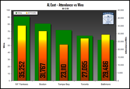
Here is Justin’s analysis of the American League’s Eastern Division, where my Sox play:

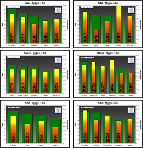
There are a total of six charts, since each league has three divisions. I’ve reduced them here:

The charts are dark, and the colors and gradients bold, so the charts weigh heavy on the eyes. There are only twelve data points per chart, six on each axis, and part of the analysis involves comparing the relative heights of the bars on primary and secondary axes. I’ve discussed the problems of comparing series on primary and secondary axes in Secondary Axes in Charts. Any conclusions you may reach are affected by the relative arbitrary scales on the primary and secondary axes.
It’s not easy to make comparisons among these charts, and you miss the opportunity to see how attendance and number of wins are correlated. In fact, you don’t even see attendance in these charts: Justin has introduced a statistic called Attendance Per Win, which he is comparing to the team’s wins.
Chart Busters Charts
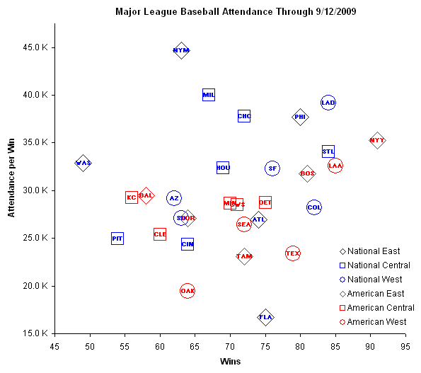
Rather than plot the two variables of interest on primary and secondary columns, Chart Busters have made an XY chart (or as statisticians and Microsoft call it, a scatter chart). All three divisions of both leagues fit onto the chart, which shows wins on the X axis and attendance along the Y axis. The teams are denoted by the data labels, and we only have one case of overlapping, the red squares for the Minnesota Twins and the Chicago White Sox, in the middle of the chart.

There is an obvious positive correlation between wins and attendance: makes sense, because teams love to cheer for a winner.
Justin’s use of the derived Attendance Per Win statistic initially makes some sense. But when Chart Busters replace the Y axis of the XY chart with Attendance Per Win, we lose the clear correlation. The National League looks purely random, while the American League has at best a slight positive trend.

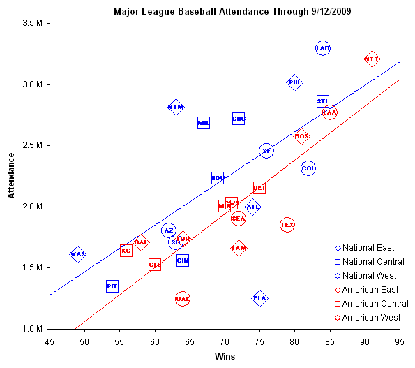
Justin’s intent was to show which teams gain more attendance than expected for the number of wins. Without inventing a new statistic, Chart Busters show this by simply drawing the lines of best fit. There are separate lines for each league, since there’s some difference in average attendance between leagues.

Linear regression supports our eyeballs: there is a positive correlation for each league. R² for the American League is 74%, and for the National League is 39%. Not a bad correlation, since it ignores such factors as weather, stadium size, and scheduling variations. The points Justin makes are visible in this chart: fans in Florida, Oakland, Texas, and Tampa do not support their teams, as shown by the distance of these points below the fitted lines. In fact, Florida has abysmal fan support.
The Mets, in contrast, have the strongest fan support. This in conjunction with their sub-mediocre win total shows that my previous statement, that fans love to see a winner, is not strictly true. The Brewers, Cubs, Phillies, and Dodgers also have stronger than expected fan support, but then, the Dodgers and Phillies are leading their respective divisions.
Let’s see how Justin’s Attendance Per Win stands up to best fits.

The American League shows a positive correlation, not very steep, and the National League has only a very slight positive slope. The R² values are 23% for the AL and 2% for the NL. We see the same teams with strong and weak fan support as in the previous chart, without clouding the analysis with an unnecessary derived statistic.


Pragmatic Cynic says
Jon, as baseball fan I love the post. But is one season enough. Obviously part of the Mets variation for the norm is the “newness” factor of CitiField. Likewise, next year my Twins will vary above the norm no matter their wins when Target Field opens.
Matt Healy says
Good analysis, I regularly use scatter plots (and fancier plots for high-dimensional data sets) to look for relationships. One thing I nearly always do as well is plot the residuals (Y value minus regression fit) to check for any pattern in the residuals. For instance a U-shaped pattern in the residuals suggests either a linearizing transformation or a quadratic fit. A more complex pattern in the residuals suggests either a higher-order fit or the existence of confounding factors.
The Regression tool in the Excel Data Analysis Toolpack has checkboxes to calculate and plot residuals, so it’s easy to look at them.
Matt says
I don’t agree that the derived attendance/win graph is of use. Isn’t the best fit (slope) of the attendance/win versus wins plot simply the 2nd derivative of the attendance versus wins plot. It seems to be an unnecessary complication as you indicate in your post. The bar charts hide this while the scatter plot at least gives you an almost flat line (the 2nd derivative of a straight line is zero).
When comparing two variables to look for a possible correlation, then the scatter plot is the most appropriate form of visualization to choose as you point out. A case of “Form follows Function”. (Information Visualization Manifesto).
An excellent chart busters example. The scatter plot is much easier to interpret (and critique) than the bar charts. I wonder whether the correlation coefficient of 39% for the National league is even statistically significant. If not, then even drawing the best fit line is a bit of misinformation.
Jon Peltier says
Prag –
That’s a good point, and something I thought about. The Yankees also have a new stadium, and they’ve had a contending team during the past decade. The Red Sox fall right on the line, but they have a small stadium, and have sold out the last 500+ games in a row.
You would have to look at each season independently, so you could see the effect of a new stadium wearing out, the effect of the previous season’s record, the acquisition of a star player, and other transient effects.
Jon Peltier says
Matt H –
I didn’t bother with the residuals because there are many other factors to take into account, and they would affect the residuals in ways I was not prepared to investigate. Rather than use the awkward Toolpak function, determining the residuals involves a relatively straightforward formula, once the regression coefficients are known. But the residuals plot more clearly shows the deviation from the fitted line.
Matt Cloves says
Hi jon,
Interesting post, good stuff.
bit of a spurious aside, but I would be interested to hear your views on ‘3d scatter plots’. do you think they have value?
Excel is perhaps not the best environment for one, but assuming you could quickly output a 3d model, the camera angle of which could be manipulated by the user, would you opt to give them full control to see the data from any angle, or would you rather restrict them to 3 views of the ‘front’, ‘top’ and ‘side’ of the ‘box’ (ie. 3 seperate xy charts).
would you chose another method entirely to display 3 things which do not share a common scale (unit).
-Matt
Michael Pierce says
Very interesting analysis, much improved over the original…and it supports what I’ve always heard, Mets, Cubbies and Brewers fans are fanatics and support their teams through thick and thin (all too often thin for them…).
In addition to the factors mentioned (new ballparks, stadium size, etc.), I also immediately thought of:
(1) What impact does the opponent have on attendance? I imagine this week’s games in San Francisco with the Rockies, teams that are neck-and-neck for a playoff position, is much different than the Giants normally see. I also know, regardless of how my Rockies are performing, if someone like the Yankees are in town, attendance is through the roof.
(2) What impact does the team’s position in the playoff race have and would there be a way to see that over time. Again, with my Rockies, I’ll be their attendance in the second half of the season when they started making a run for the playoffs is much better than when they looked dismal earlier in the year.
Just some thoughts.
Jon Peltier says
Matt –
Excel does not make native 3D XYZ charts. Andy Pope (http://andypope.info) has developed a system that uses a ton of trig to convert X-Y-Z coordinates to a 2D medium with the appearance of 3 dimensions. Sliders let the user change perspective. It’s a good hack
I have seen effective 3D scatter charts; they are dynamic and interactive. I’ve never seen anything meaningful done in Excel.
molly says
this is not useful