I received an email from a user of my Waterfall Chart Utility, who wanted to add a secondary axis showing percentages corresponding to the values on the primary axis. This is really just a matter of applying straightforward algebra to compute the secondary axis scale parameters from the primary axis scale parameters and the two values one wants to line up. I described a very similar problem in Align X Axis to Y=0 on Two Y Axes, which solved the special case where zero on the primary axis was to coincide with zero on the secondary axis.
The user’s data looks like this (I’ve changed the labels and values).

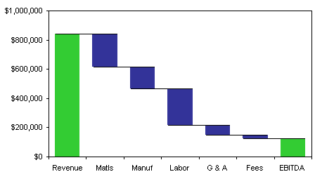
The waterfall chart looks like this, after minor modifications.

The user wanted the secondary axis to scale from 0% at $0, to 100% at the top of the revenue bar, or $840,000. The simplest way to do this is to set up a table like the one below, which contains the primary axis maximum and minimum, the primary and secondary axis values which have to line up, and spaces for the secondary axis maximum and minimum.

I changed the view to show formulas in the cells, by holding Ctrl and clicking the button with the tilde (~). The formulas in C12 and C14 are really straightforward once you’ve set up a table like this.

I’ve switched back to normal view, by again holding Ctrl and clicking the ~ button. The calculated secondary axis scale parameters are now shown.

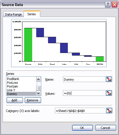
In order to have a secondary axis in an Excel chart, you need a series to put onto the secondary axis, in addition to any series that belong on the primary axis. The waterfall chart has a bunch of series on the primary axis, but we’ll add a new series for the secondary axis. Right click the chart, choose Source Data, and click on the Series tab. Click the Add button, enter a name (“Dummy”), and for values, enter ={0}, which is an array consisting of the single element zero. This results in a series which should remain hidden.

This new series is added to the primary axis. Select the new series, by using the Chart Menu’s Select Chart element dropdown, or simply by selecting any chart series (actually, any chart element) and cycling through all chart elements until the Dummy series is selected.

Once the Dummy series is selected, press Ctrl+1 (numeral one) to open the Format Series dialog. On the Axis tab, click Secondary. The chart now has a secondary axis.

Format the secondary axis: right click on the axis and choose Format Axis. On the Scale tab, enter the numbers calculated above. If necessary, adjust the number format of the axis labels on the Number tab.

You should also lock in the primary axis scale parameters, because any change Excel makes under Auto mode will break the calculations made above. Right click the axis, choose Format Axis, and on the scale tab, uncheck the Auto boxes in front of Minimum, Maximum, and Major Unit.

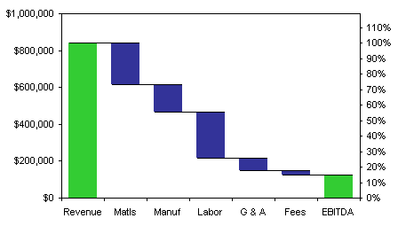
The result is a chart with percentages that line up as desired.

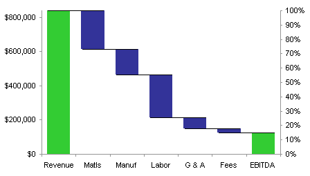
An alternative might be to scale the secondary axis from 0% to 100%, and the primary axis from $0 to $840,000.


John Mansfield says
Jon,
Assuming an entirely different data set, another issue might be . . . how do you account for the percent changes when there are positive and negative values? Or, for example, favorable and unfavorable variances to plan or greater than or less than changes to prior period? In my experience rarely are the components of change all positive or all negative. Perhaps rather than showing the percentages on an axis perhap each percent change could be individually tied to the differences between two bars.
As an example, an increase from 40 to 50 is 25%, but a decrease from 50 to 40 is 20%.
John Mansfield
Jon Peltier says
Hi John –
That’s a good point. In many cases this technique would be much more difficult to implement. In this specific case, the person wanted to see the changes with respect to the initial value, the gross revenues. Any case that referenced a single value, say, the initial value or the final value, would work simply like this.
If you wanted to see the percentage change corresponding to each value change, I think you would have to calculate the percentages in the worksheet and apply them to each bar in the chart as a data label.
Michael says
Hi Jon,
in https://peltiertech.com/link-excel-chart-axis-scale-to-values-in-cells/ you show how to link the axis scales to cell values. This works fine for primary axis?
How can I use this code for secondary axis? – I’ a VBA dummy ;-)
Thanks for your reply
Jon Peltier says
Hi Michael –
When you specify an axis, you use a syntax like this:
ActiveChart.Axes(xlValue, xlPrimary)
or
ActiveSheet.ChartObjects(“Chart 1”).Chart.Axes(xlCategory)
There are two arguments to the Axes() property. The first is xlCategory for the X axis and xlValue for the Y axis. The second is xlPrimary or xlSecondary, and the meaning is obvious. The second argument is optional, and assumed to be xlPrimary if missing. Simply insert the xlSecondary into the slot for thee second argument:
ActiveSheet.ChartObjects(“Chart 1”).Chart.Axes(xlCategory, xlSecondary)
Thom Mitchell says
I am trying to make the advanced Gantt chart —
https://peltiertech.com/Excel/pix5/AdvGantt08ax.gif —
responsive to spin buttons to change the MinimumScale and MaximumScale values for the time axes. The chart has its “Primary X Time Scale Axis” along the bottom and “Secondary Y Value Axis” along the top edge of the chart.
The following VBA code in a worksheet module has no effect:
Case “$C$33”
ActiveSheet.ChartObjects(“Chart 1”).Chart.Axes(xlCategory).MinimumScale = _
Target.Value + 39810
ActiveSheet.ChartObjects(“Chart 1”).Chart.Axes(xlValue, xlSecondary). _
MinimumScale = Target.Value + 39810
The spin button changes cell C33 (and other dependent cell values), but the chart does not change. I, too, am a VBA dummy…
Al Bentley says
This works well, but not if the data you are viewing changes, this means you have to go back into the axis scales and type number again.
The trick around this is to add another data series with values that match the right hand edge of the chart, then use data labels to show ‘100%’, ‘80%’ and so on. The actual value of each data point is the same as the maximum value on the primary axis
Jon Peltier says
Al –
That is a great trick, and I use it in many cases. But here it is not guaranteed to work: if the secondary tick spacing (major unit) isn’t the same proportion of the maximum as for the primary axis, you may not get the axes to match automatically.
Gregor says
I have been trying for 3 hours and I couldnt figure this out. Your article is the best!