Add Next Series in the Peltier Tech Ribbon
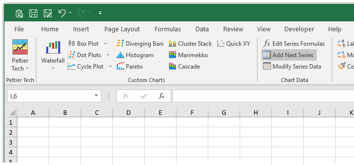
Edit Series Formulas is the second button in the Chart Data section of the Peltier Tech custom ribbon tab. Before clicking the button, you may select a chart, or a series in a chart, or multiple charts.
How the Feature Works
The program adds a series to the chart, using the next logical range for the series data. If a series is selected, then that series is used as a basis. If no series is selected, then the last series in the chart is used as a basis. If multiple charts are selected, then the last series of each chart is used as a basis for that chart.
If the ‘basis’ series is plotted by column, the next column to the right of the Y values of the ‘basis’ series is used for the Y values and name of the new series. If the ‘basis’ series is plotted by row, the next row below of the Y values of the ‘basis’ series is used for the Y values and name of the new series. The X values of the ‘basis’ series is used as Y values for the new series.
The added series has the same chart type as the ‘basis’ series, and it is put on the same axis (primary or secondary) as the ‘basis’ series. If possible (sometimes Excel VBA doesn’t cooperate), the new series is placed immediately after the ‘basis’ series in the plot order of the chart.
Examples
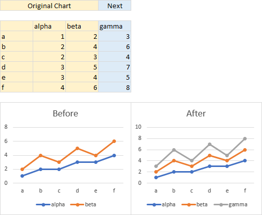
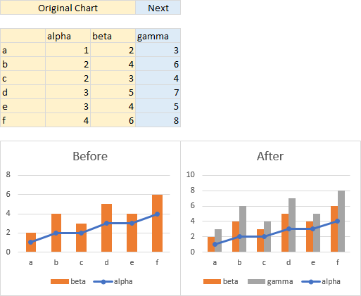
The chart below left is made from the gold shaded range. With no series selected, beta is the ‘basis’ series, so the next data added (in the chart below right) is for gamma, in the column next to beta.
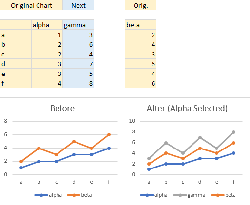
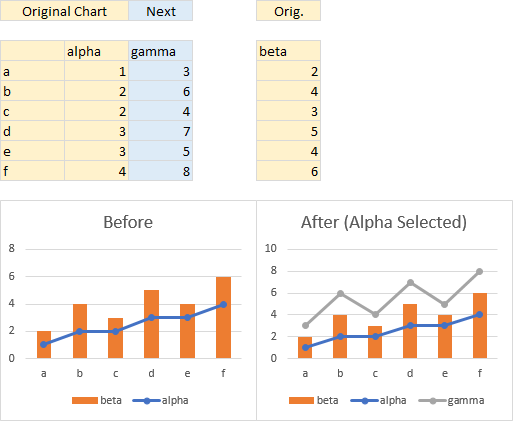
The chart below left is made from the gold shaded range. The selected series alpha is the ‘basis’ series, so the next data added (in the chart below right) is for gamma, in the column next to alpha. The resulting chart looks the same as above, but note in the legend, gamma is listed right after alpha, before beta.
The chart below left is made from the gold shaded range. With no series selected, beta is the ‘basis’ series, so the next data added (in the chart below right) is for gamma, in the column next to beta. The ‘basis’ series beta was a column type, and so is the added series gamma.
The chart below left is made from the gold shaded range. The selected series alpha is the ‘basis’ series, so the next data added (in the chart below right) is for gamma, in the column next to alpha. The ‘basis’ series alpha was a line and markers type, and so is the added series gamma.
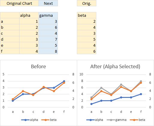
The chart below left is made from the gold shaded range. With no series selected, beta is the ‘basis’ series, so the next data added (in the chart below right) is for gamma, in the column next to beta. The ‘basis’ series beta was on the secondary axis, and so is the added series gamma.
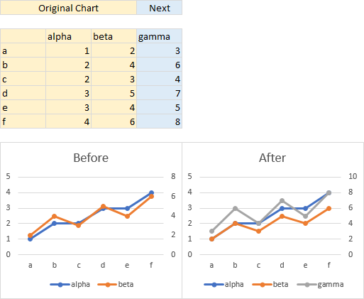
The chart below left is made from the gold shaded range. The selected series alpha is the ‘basis’ series, so the next data added (in the chart below right) is for gamma, in the column next to alpha. The ‘basis’ series alpha was on the primary axis, and so is the added series gamma.
