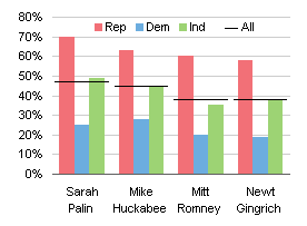
In I Keep Saying, Use Bar Charts, Not Pies, I described the process of making better column charts to replace a horrendous pie chart. At one point I said “Let’s add a weighted average of all responses, using a set of horizontal lines.” I neglected to share the technique for adding individual target lines, though I’ve shown similar techniques elsewhere.

Here is the data used in the chart, part of a larger pivot table.

The chart without error bars uses the first four columns: one column of category labels and three columns of favorable ratings data.

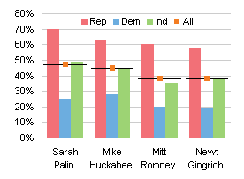
Step one is to add the fifth column (the fourth column of ratings). It is added as another column chart series.

The added series has to be converted to an XY chart type. Only XY series can have horizontal error bars, which we’ll use for the horizontal target lines. Be aware that changing the chart type is likely to add tick marks to the horizontal axis.

Having added the series and converted it to XY, we now add horizontal (X) error bars. The Excel 2003 Format Series dialog’s X Error Bars dialog is shown below; in Excel 2007 you have to add error bars from the Chart Tools > Layout tab. At first I used a Fixed Value of 0.45, but when I saw the resulting error bars, I realized they were not symmetrical. I changed the negative value to 0.48 to make the bars look the same. Excel 2007 may or may not need a similar correction.

Here is the chart with its error bars.

The end caps have to be removed from the ends of the error bars.

The XY series is hidden by choosing None for marker style (it already had None for line type). To provide a line symbol for the “All” legend entry, I inserted an em-dash at the start of the series name, changing “All” to “— All”. You can type an em-dash by holding Alt, typing 0151 on the numeric keypad, and releasing Alt.

Maybe next time I’ll show how to add target lines to a pie chart. Or not.


Haffy says
Thanks, Jon – a nice simple one!
FYI I noticed an article on the BBC website
http://news.bbc.co.uk/1/hi/magazine/8381597.stm
and the author’s site
http://www.informationisbeautiful.net/
I don’t think he’s been reading the PTS Blog!
Jon Peltier says
A lot of the “beautiful information” types are really too touchy-feely, too artistic to make numerically meaningful graphics. But those colors look nice, don’t they?
Tufte calls these people “chartoonists”.
gerdami says
Very nice and clean solution.
Thanks.
david says
hi jon,
if i use a cluster of bar charts, how to added a vertical error bar?
i.e. the target series should be changed to which chart type?
i’ve tried changing to XY chart, it doesnt seem to “work” :)
thanks!
Jon Peltier says
David –
For vertical error bars that cross a horizontal bar chart, you do in fact need to use an XY chart. The X value for the added XY series is the value of the indicator (which relates to the Y values of the bars), and the Y values of the XY series correspond to the heights of the clusters (i.e. first cluster is at Y=0.5, second at Y=1.5, etc., with the Y scale set to zero to number of clusters). Add the series (I like copy-paste-special), select the new series and change its chart type, adjust secondary axis scales, add error bars, format.
david says
hi jon,
in the xy chart, my x-value and y-value are reversed:
x-axis = height of the cluster (i have 3 clusters)
y-axis = value of the indicator
main bar charts:
x-axis = values
y-axis = number of series/clusters
so, on the xy chart, how do i reverse it to match with the bar chart?
very much appreciate your help here :)
Jon Peltier says
David –
If the XY series is already in the chart, select it (if you can’t see it, select a different series and use the up/down arrows to cycle through all items in the chart). You will see a series formula in the formula bar that looks like this:
=SERIES(Sheet1!$D$1,Sheet1!$C$2:$C$5,Sheet1!$D$2:$D$5,3)
This stands for
=SERIES(series-name,X-values,Y-values,plot-order)
edit the formula by switching the second and third arguments in this formula.
david says
hi jon, tried your methods.
the data points doesnt seem to ‘follow’ the axes.
chart1: fresh bar + xy charts:
chart2: fresh bar + xy charts (reversed x and y values):
i redo with column + xy charts; which works flawlessly as per this blog post’s tutorial.
fyi: Am using Office 2010.
thanks!
Jon Peltier says
David –
Chart 1 has the X and Y values mixed up.
Chart 2 looks like the Y values are all zero, and the secondary X axis (top of chart) needs the same scale as the primary Y axis (bottom of the chart), In 2003 and earlier, you needed to set it by hand, but in 2007 you can simply remove the secondary X axis (top) and the XY data points will use the primary Y axis. The secondary Y axis (right of chart) will have to be scaled so min=0.5 and max=3.5.
david says
back to Chart2:
that’s what bothers me. the Y yalues were all laid across 0.
also, changing secondary y axis to min=0.5 and max=3.5 is buggy.
[upon changing the y-axis value]
[recheck the y-axis value]
this bug only happens when the max value has 0.5 fraction (e.g. 0.5, 1.5, 2.5, etc.)
Jon Peltier says
Never had that problem, have you installed all the updates? Anyway, use 0.5, 1.5, 2.5 for XY series Y values, and set the axis scale to 0 min to 3 max.
david says
hi jon,
excel/office suite is fully updated ;)
no matter how/what i do, the Y yalues were all laid across 0 on th XY Chart.
it seems that the y-values are not “counted” (item 1, 2, 3), hence all 0.
nvm then, let me play around if i happen to bump onto other possible solutions :)
much appreciate your help!
Jon Peltier says
Are the Y values actually numbers? They aren’t numbers formatted as text?
Try to do this in a brand new workbook. There might be something weird going on in that one.
david says
hi jon,
my last screenshots were done on a new workbook.
number values are purely number (formatted as “General” or “Numbers” or “Accounting”).