Jorge Camoes wrote in Focus + Context (a Bar Chart Is Not a Skyscraper) that tall bar charts are a waste of space. If you plan to show everything (say, all fifty state names), you may as well just use a table. I’m not sure I completely agree, but part of his point is that you shouldn’t overwhelm a reader with too much data all at once, because it will obscure the information.
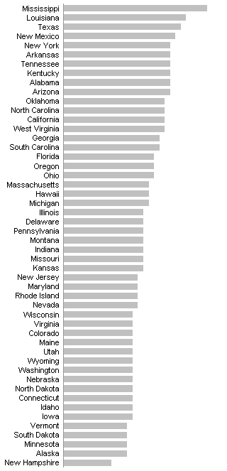
Jorge used a data set Nathan provided for his Poverty in the US visualization project. The chart Jorge dislikes looks like this:

It’s not really terrible, though I won’t deny it’s dull and maybe a bit cluttered. It’s more informative if less glossy than the infographic that was favored in Nathan’s challenge. But Jorge thinks that showing all of the state names was too much.
In some cases, an effective display might be to show two charts, the top five and the bottom five, and ignore the data in between.


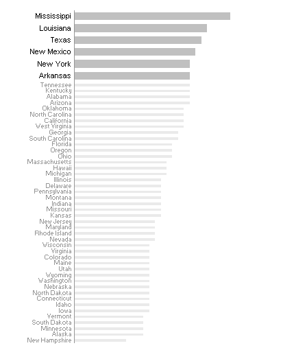
But Jorge also wanted something interactive. So I put together a little dynamic chart that had all fifty bars but highlights the five closest to the current mouse location. As you move the mouse up and down along the chart, the highlighted region moves with the mouse.

Pretty cool, and the actual chart (see below for a download) is cooler than the static image above.
Well, Jorge is a pretty tough customer. He doesn’t just want to highlight the bars under the mouse. He wants to expand them, and shrink the unhighlighted bars. The effect is rather like an accordion. It was all I could do to keep up with Jorge’s requirements, but I cobbled together an example that I think he’ll be happy with.
Not only are a handful of bars under the mouse highlighed, but the highlighted bars are big and fat, while the unhighlighted bars are small and unobtrusive. And it’s completely interactive.

Again, the dynamic chart in the sample download is way cooler than this screen shot. An advantage of the accordion chart is that the unhighlighted bars can be compressed, shrinking the chart without shrinking the highlighted region. This ability to fit the same dynamic information into a smaller space would make this a good candidate approach for an interactive dashboard.
You can download Accordion.zip, which contains two Excel 2003 worbooks. NoAccordion1.xls is the plain version, with highlighting but no accordion-like expansion and contraction. Accordion1.xls is the deluxe version, where the highlighted region expands to grab your attention, while the unhighlighted bars shrink into the background. Open each workbook with macros enabled, then click on the chart to activate the animation.
The data is on the second worksheet of each workbook, along with a set of helper columns with the calculations that make the charts work. The code is unlocked, and you’ll be surprised how simple it is. Hardly a dozen lines in each workbook.
Update – 12 February 2009
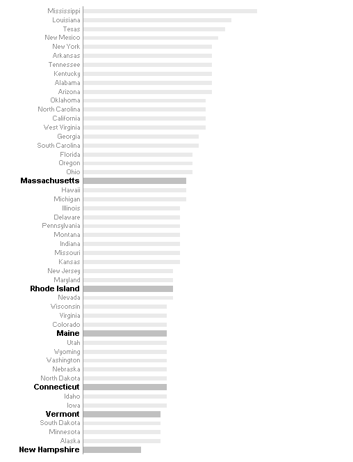
Colin has noted that the accordion chart above would be better if all bars were labeled. I’ve adjusted the Accordion chart so the unhighlighted bars have lighter labels.

I’ve added labels for unhighlighted bars in the NoAccordion chart. In response to Colin’s other suggestions, I’ve also changed the mouse actions so that mousing past the bars doesn’t move the highlighted region, but instead clicking on a bar or label toggles that bar between highlighted and unhighlighted status. In this chart I’ve highlighted the New England states.

These workbooks are Accordion2.xls and NoAccordion2.xls, found in Accordion2.zip.
Update 2 – 12 February 2009
Dick Kusleika has made an adaptation to this chart that always displays the user’s home state. As he so astutely points out, “Does anyone really look at the top or bottom five before he finds his own state?” Read about it in Ego Charts.


Mike Woodhouse says
For something like an analysis by state (or county here in the UK) I still like the good old heat map. That long barchart, sexy as the dynamic one is, doesn’t tell me enough about geographic distribution and any interesting anomalies that may exist: I just don’t seem to be able to extract much information from the data.
Even better than just colouring in a map would be to do so on a cartogram* (I just learned that word) that equalizes area for population density. Then I can not just get an idea of effects above the state level, but an appreciation of how large the problem is in absolute terms. After all, if 100% of the population of, I dunno, Wyoming, say, live in poverty, that’s a lot smaller problem in numbers of people affected than if it were California. Still wouldn’t make living in Wyoming much fun, I suppose.
Perhaps MS could put something like this into a future release of Excel? It would be more useful/fun than some “features” we’ve seen over the years…
* Some nice – and old – ones here: http://makingmaps.wordpress.com/2008/02/19/1911-cartogram-apportionment-map/
Jon Peltier says
Mike –
I became intrigued with these cartograms during the presidential election last year. I found the ones with distorted areas particularly interesting. The ones with varying shades of red and blue, or red and blue with various transparencies, were less interesting and harder to read.
Colin Banfield says
Jon, cool technique, but how do I see (for example) how Washington’s data compares with Mississippi’s? I like Naomi Robbins’ alternative for these long bar charts – the dot plot. The dot plot is far less cluttered and uses a paradigm (position along a common axis) that’s even easier for the brain to discern than a bar.
Can’t say I agree with Jorge’s suggestion of using a table (only). There’s just too much data to quickly see the relative contributions of each state.
I thought that cartograms made a lot of sense when I first saw them. I’ve always been intrigued by standard US election maps that show almost the entire inner states red and peripheral states blue (reminds me of lens chromatic aberration) but actual results being quite different form what the map suggests. The cartogram fixes the problem but creates another. Cartograms can become so distorted that the original geographical picture is lost (i.e. you no longer know which states are being represented).
Jon Peltier says
Colin –
Make up your mind: do you want cool, or do you want all the data?
Joking aside, that’s a good point. Version two of the accordion chart could have smaller light gray labels by the unhighlighted bars, to help you remember what you scrolled over a moment before.
I prefer a dot plot as well. Algorithmically it would be easier to apply the highlighting, but I’m not sure if the visual effect would be as striking. A dot plot has the distinct advantage of making multiple series possible, which in a bar chart is not so effective.
Colin Banfield says
“Make up your mind: do you want cool, or do you want all the data?”
How about both? ;) One possibility: Display all the labels (so you can see where each state location is on the chart) and click on the bars you want to compare. Click a selected bar to deselect it (a checkbox next to the label would work also). Admittedly, this isn’t as sexy, and serves a slightly different purpose than showing groups of bars at a time.
As for dot plots; some readers might be unfamiliar with this chart, so it would be useful to show this alternative (Usually, I start with a bar chart, “turn off” the bars and overlay an XY chart).
comptonator says
The interactivity you introduced is a definite improvement for the bar chart. Seeing the data points as tool-tips is better than seeing a table. I still question exactly what the chart is trying to say about poverty in the U.S. Perhaps if that were more specific it would provide some definition for the interactivity.
Jon Peltier says
Comptonator –
Taken by itself, the poverty data doesn’t show too much. The larger data set showed poverty among children, adults, and the elderly. This was a bit more informative, but when you compare this to such factors as state income or GDP, political leanings or religion, or any number of other things, you can gain a number of insights.
Colin –
The update at the end of the article is for you.
Colin Banfield says
Jon, slick modifications…but Accordian2.zip contains the Accordian1 charts!
Tim Mayes says
Jon,
This is incredibly cool. My thoughts when I read Jorge’s post were a bit different. I imagine that he wants the entire data set in the chart, but suppose that you just want to see a subset based on certain criteria.
In that case, you can create a Table (List in Excel 2003) and then a bar chart of it. That allows you to very easily filter the data, and only the data that survives the filter will be charted. So, if you want to see the top (worst) 10 states you can apply that filter. You can even define your own custom filters. Unfortunately, the custom filter definitions (in 2007 at least) cannot reference a cell so it isn’t quite as flexible as I would like.
On the subject of custom filters, do you know if it is possible to add your own filters to the list along with the predefined ones?
A pivot table and chart would also work. You can add a column of boolean formulas that test if the data meets the criteria. This can be used to filter the pivot table and chart.
Jon Peltier says
Oops, copied the link but forgot to insert a ‘2’. Try the download now.
Colin Banfield says
Jon:
Works fine in Excel 2003…Excel 2007 screws things up (although Accordian1 files work ok in 2007). No surprise here.
Jorge Camoes says
Great job, Jon , as usual. Thanks for improving the idea and making the file available.
Since I’m a “pretty tough customer”, here is another challenge: how can we generalize to any number of data points (a chart ranking countries by GDP, or even population by county), while keeping the chart small? If you use a standard bar chart at some point the labels will overlap.
I was trying to solve this with error bars in a scatter plot. This gives you all the flexibility you need, but requires more code, since the mouse move only recognizes the series if the cursor is over the (invisible) data point (correct me if I’m wrong).
I agree with comptonator, this (the original bar chart) is not very interesting. But the moment you add interaction you are creating interesting possibilities. For example, detail charts that change when the highlighted state changes.
Of course, if we plan to display just a subset probably the easiest way to do it is using the Autofilter and in-cell charts, via REPT() function.
Jon Peltier says
Colin –
Oh yeah, 2007. I forgot to check it out. I’ll put it on my list.
Jorge –
So you want this generalized to any size data set… I suppose it could be done, but that’s going to take more work. What’s the budget for this project?? ;-)
Liu 's chart blog says
So cool!
I would make the first 5 green, the bottom 5 red, and the middles gray .,it is more simple .
pi says
I have a question how do I change the light bar color to red and the dark bar color to green for instance. This is a great spreadsheet!
Jon Peltier says
Format series “Bold” to change the colors of the dark, thick bars. Format the “LightLow” and “LightHigh” series to change the light, thin bars.
Liu 's chart blog says
To : pi –
the following article may help you :
http://excelpro.blog.sohu.com/112324178.html
http://1812.img.pp.sohu.com.cn/images/blog/2009/3/15/20/15/120b4beeaebg215.jpg
Jon Peltier says
Liu –
I couldn’t read the articles, but the image you show in the middle link is a clever way to highlight “Good” and “Bad” with colors. Hope you don’t mind that I’ve displayed it here:
Liu 's chart blog says
Hi Jon-:
A more simple way to create a Accordion Chart for Jorge , is showed as the folloing image:
http://1853.img.pp.sohu.com.cn/images/blog/2009/5/30/20/17/1223d8b1de2g215.jpg
1. use rept function to create the bar , the font is set to Gautami.
2. then set height of the middle rows to 3 .
3. other formating . you can get a Accordion Chart.
Jon Peltier says
Jorge’s accordion chart is dynamic, so the handful of bars under the cursor is thicker and darker, while the others are de-emphasized. This chart and the previous one you showed are not exactly the same as the one I built for Jorge. They are, however, a nice way to highlight the top and bottom groups of results.