In A Gauge Chart That Works?, Clint describes his efforts to come up with a dial-type chart that isn’t as terrible as most. He comments that Stephen Few‘s Bullet Graphs are unfamiliar to most people, which is true, ans they’ve only been around for three or four years. Bullet graphs and most gauge-type charts are tricky to create and maintain, since they rely on a melange of chart types and additional chart elements to produce unusual visual effects. Clint’s boss wanted a gauge, but Clint didn’t want to work with ugly, bulky dial gauge replicas. Long story short, Clint designed the following gauge to show page views in a web site he was watching:

I’m not wild about the new gauge, but it isn’t totally awful. I’m not sure that a bullet-style graph with this color scheme couldn’t have been used (shown below without the text elements), but I’ll leave that discussion alone. I also won’t dwell on the observation that a bullet chart is really a gauge at heart.
![]()
On the positive side, Clint’s graph is linear instead of circular. Also, the new Excel 2007 feature is nice that allows arrowheads on series lines and error bars. (One of the few nice things about Excel 2007 charting, and not worth putting up with the problems.)
On the negative side, it’s a gauge. Gauges like this only show one point in time; there’s no historical context, and you can’t tell if your month to date numbers are on target to hit the total per month target. Also, what happens if the value goes to 11? Seriously, there is no provision for an out-of-scale measurement.
I’ve sworn off gauges myself. I’ve removed a speedometer tutorial from my web site, for at least a couple of reasons. First, it is a poor display device, for all the reasons stated above and elsewhere. Second, I would receive too many questions from people who didn’t understand enough math to customize it. It’s algebra and a little trig: find a tenth grader to help, people!
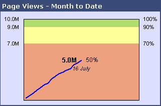
To overcome these issues, I returned to an old standby, the line chart. I use a category value to show days elapsed during the month, and vertical measures of page view targets and measurements. Colored backgrounds are made using stacked columns to provide a bad-medium-good scale across the chart, and dual scales, showing values and percentage of target, decorate the vertical sides of the chart. I also stuck with colors similar to Clint’s. Here is my non-gauge chart:

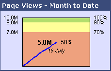
This chart takes up about as much space as Clint’s, but it adds the missing time component. I can visually extrapolate the line forward to the end of the month and estimate whether we’ll hit our target. Since Clint’s chart has some empty space, it can be shrunk; so can the line chart without too much difference in legibility:

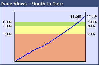
Through the use of (ahem!) clever formulas, these charts can be made to adapt when the value exceeds the target:

When I have a chance to pretty it up, I’ll post a tutorial showing how I created this chart.


Andreas Lipphardt says
You can show some vertical white stripes at the end of the performance bar to indicate an out-of-scale measurement. You can see how this works in practice in Wade’s Bank dashboard.
http://blog.xlcubed.com/2008-excel-dashboard-competition-winners/
The ‘Income Growth’ in the Strategic Goals sections exceeds the qualitative ranges of the bullet graph
Andreas
Jon Peltier says
Andreas – Thanks for pointing that out, I had yet to notice. That can be effective for a gauge, and perhaps Clint can implement a similar visual effect. For a line, I think I prefer the rescaling algorithm I’ve used, simply because it doesn’t disrupt the time series trend.
Greg says
I think it’s not as easy to “visually extrapolate the line forward to the end of the month and estimate whether we’ll hit our target” as you suggest. Looking at the mid-month versions of the chart I think it’s not entirely clear that the trend would get us into green. Also, if the ‘okay’ yellow range went up to 95% or some other value, it would be even harder.
What if the line that showed the actual result was drawn as a percentage of the interim goal? (( Actual To Date / Monthly Goal ) x ( Days to Date / Days in Month ))
http://cid-7b77643e2e9fc81a.skydrive.live.com/self.aspx/Public/gauge_gh.PNG
Jon Peltier says
Greg –
I agree, extrapolation is not necessarily easy, but the line chart does a better job than the gauge. I thought about investigating a “percent of month to date” chart, but put it on the back burner. Thanks for anticipating this and drawing your own version.
Clint says
John,
I really like your idea here, although obviously my color scheme isn’t necessarily appropriate to the concept (we could call it the watermelon chart otherwise ;~).
I’m torn between waiting for your “how to” and seeing if I can work it out on my own.
thanks for the feedback and re-think!
there’s an ad down here at the bottom for “IntelliVIEW” Dashboard Reporter and the featured charts are a dial gauge, a 3-D stacked column and a gradient & transparent area chart, that’s kinda funny!
Jon Peltier says
Clint – Watermelon chart, I like that. It needs some black data markers to spit out.
The chart isn’t really hard to work out. Primary axis has the line chart, secondary axis has the stacked columns for the background (that’s with one point per each stacked column series; you could use 31-point series and keep them on the primary axis, which is probably easier for everyone but me). Stacked columns need gap width of zero. Remove the secondary value axis.
I like Greg’s suggestion too, so I’ll include that in the tutorial.
Colin Banfield says
Jon, I’m missing something here. I don’t see the point of using a line chart if you’re measuring a value in relation to a target, unless you’re suggesting some importance of daily variations. The measurement is culumative, so a line will always head upwards towards the target.
I’m most cases, I prefer Stephen’s approach (we quote him a lot but ignore his recommendations). Use a sparkline that shows the trend for previous months (the more meaningful trend in the context of this example) and a bullet graph for the current month.
Jon Peltier says
Colin –
The weakness of a bullet or gauge graph here is the use of a month-to-date value in the chart. I used the line chart as a way to use the cumulative month-to-date values for the current month to give a sense whether the percentage shown on the gauge had a chance of becoming a good value by the end of the month. My line chart forces the user to extrapolate to the end of the month, but a gauge or bullet does not even provide that ability.
Greg’s normalization of month-to-date by expected-month-to-date improves on my line chart because a good value is always in the “good” zone. His normalized value could be displayed in a gauge or bullet if the day-to-day variability is of no consequence.
Colin Banfield says
Jon, good points.
Chandoo says
Hi Jon:
very good effort to better the gauge chart with trending info. Although the new chart provides very good info without any eyesore, I guess they could be slightly difficult to do, given the scripting part involved.
I have made a tutorial for simple bullet graphs (incell) for people who would like to shy away from any form of vba.. you can find it here: http://chandoo.org/wp/2008/07/21/dashboard-bullet-graphs-excel/
Let me know your comments :)
Agnelo says
Hi Jon,
Firstly, you have a brilliant website set up here .. great job!
I wanted to ask you if a tutorial for this particular graph is currently on your website …
Thanks, Agnelo