In a recent post, I showed a technique that allowed Repeated Tasks in an Excel Gantt Chart. An Excel Gantt chart consists of a bar chart series showing the duration of a task, stacked on a transparent bar that pushes the visible bar out to the start of the task. My technique added two more series for each repeated task, one for the gap between repeats, the other for the duration of the repeat.
More recently, in Easier Gantt Chart for Repeated Tasks, I followed the suggestion of Derek, a smart reader, and adjusted the approach so it did not need any extra series for repeated tasks.
Bob, another smart reader, suggested replacing the stacked bar chart with an XY chart that uses horizontal error bars to represent the duration of the tasks. This approach also does not need added series for repeated tasks. This will be our lesson for today.
Using an XY chart works with times, or with any duration if you aren’t concerned with the precise formatting of the horizontal (date-time) axis. If you want to make use of a line chart’s improved date formatting, you need to create a combination XY-Line chart. I’ll cover that precise technique in another post.
The Data
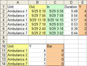
The data is the same as we’ve been using for these examples. Three columns are provided (A1:C7), with the unit, the time out, and the time in, one row per excursion. We add a column for duration (D1:D7), time in minus time out. We add another column for Y position (E1:E7): each unit will appear on its own row of points in the chart. The Y position comes from a second table, which has unit labels (without duplicates), the Y position for each, and a zero value for the bar chart series we’ll use for the unit labels along the vertical axis of the chart. The Y column in our main table looks up Y value for the appropriate unit in the second table. The formula in cell E2 is =INDEX($B$11:$B$14,MATCH(A2,$A$11:$A$14,0)). We could have used a lookup formula, but it would not work if the labels in column A of the lookup table were not sorted.
The Chart
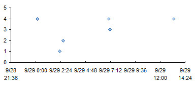
We start creating our chart by selecting the Time Out data (column B, yellow), holding Ctrl, and selecting the Y data (column E, tan), and inserting an XY chart.
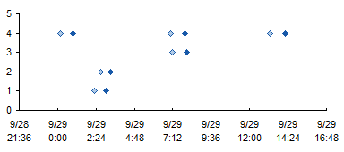
Next we select the in data (column C, green), hold Ctrl, and select the Y data (column E, tan),copy this, select the chart, and use Paste Special to add this data as a new series, categories in first column, series names in first row.
Now we need error bars to indicate the duration of each event. I’ve added negative X error bars to the later series.
In Excel 2003 and earlier, this is painless. Double click on the series to format it, click on the X Error Bars tab, click in the Custom Minus data box, and with the mouse select the Duration data.
In Excel 2007 adding error bars is much more difficult, as evidenced by the different lengths of this paragraph and the last one (see Custom Error Bars in Excel Charts for an illustrated description of the torture). Select the series, then on the Chart Tools > Layout tab, click on Error Bars, then choose More Error Bar Options at the bottom. This adds vertical and horizontal error bars with a default length of 1, so helpful, and opens a Format Error Bars dialog, but move it out of the way. Keep the Format Error Bars dialog open. Click on the vertical error bars in the chart and press Delete. Then click on the horizontal error bars, and on the Horizontal Error Bars tab of the dialog, select the Custom option under Error Amount, and click the Specify Value button. Clear the Positive data entry box, then enter zero. Clear the negative data entry box, then select the range with the Duration data with the mouse.

At this point I decided to fix up the time axis. In Excel 2003 I was able to enter the actual date and time for the min and max, and 3:00 and 1:00 for the major and minor units. In Excel 2007 I had to enter 40450 and 40450.75 for min and max, and 0.125 and 0.0416666667 for major and minor spacing.
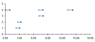
I lightened the error bar and made it thicker.

To start the process of adding labels to the vertical axis, I selected and copied the dual range, shaded yellow and tan, in the lower data table, selected the chart, and pasted special as a new series, by columns, labels in first row and column. The data doesn’t appear, because it’s way off scale.

I selected the new series (you can’t see it, but you can select a visible series and use the up and down arrows to select it), and changed its type to a horizontal bar chart. Excel adds the secondary value axis at the top of the chart.
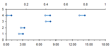
When you add the secondary category axis (secondary vertical axis in Excel 2007), it is placed on the right of the chart, and now the bar series appears, stretching from the axis on the right to its value of zero on the left. The labels are in upside-down order.

Format the scale of the left hand axis so it runs from 0.5 to 4.5, then format the scale of the right hand axis so the categories go in reverse order and the value axis does not cross at the maximum (Automatic in Excel 2007).
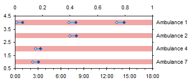
Format the bottom axis so the value axis crosses at the maximum value, and the top axis so the category axis does not cross at the maximum.

Now simply hide the top and right hand axes: no line, no tick marks, no tick labels.
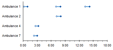
That finishes up the XY Gantt chart.
If you wanted, you could have made this chart with a single series, using the starting time with a positive error bar…
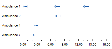
… or using the ending time with a negative error bar.


Bob says
Hi Jon,
Appreciate the kind words about being smart.
Smart people read your blog.
Cheers,
B
Katie says
Quite new to excels chart really liked the way in which we can add a new series to an existing chart by using paste special.
Kiril says
I am just wondering if it would be possible to add an extra dimension to the chart, for example a person’s name calling an ambulance in each case (displayed on top of each error bar)?
Jon Peltier says
Kiril –
You could add data labels to the markers to identify the caller. You could even use a differently-formatted series for each caller.
Luis Oliveira says
Hi Jon,
Just a quick question regarding Gantt charts.
In the example above, let’s say I wanted to highlight the text “Ambulance 1” in the category axis, with a different text color for instance.
How would I be able to achieve that? I’ve been struggling with this issue for ages.
Jon Peltier says
Luis –
Check out Individually Formatted Category Axis Labels.
Martin M says
Thanks so much for this. Very helpful instructions and excellent use of interspersed graphics.
Mike P says
Just found this article: “Gantt Chart with Repeated Tasks via Excel XY Chart”.
Is there an actual working version of this tutorial that I can download?