Last week I saw a link to Forecasting Your Traffic Growth Using Z-Chart, and thought I’d see what it had to say. The claim is that a Z-chart is a method of plotting data for single periods (monthly, for instance), along with cumulative totals (like year to date) and moving totals (12-month rolling total) in order to forecast the quantity being measured.
Sounds good. How does it work?
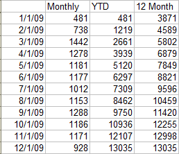
Construct a table like the one below (the data I used is in z-chart-data.csv). This shows monthly visits for a fictitious web site, along with year to date totals, and a twelve month running total, calculated using of the previous year’s data. (The table in the original article actually computed a 13-month moving average, but I think that was an oversight.)

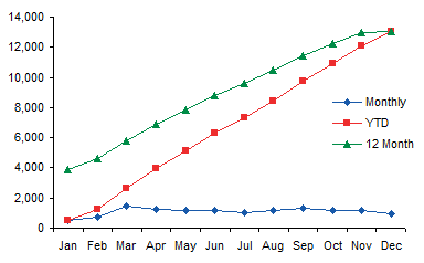
Here is the data in a Z-chart. Monthly along the bottom, YTD in a diagonal from lower left where it meets Monthly to upper right, and 12-Month Total above the other two until it meets YTD at the top right.

The 12-Month Total shows strong growth, but this chart only shows the second year. We don’t see that the statistics started in January of the previous year with 9 visits. Monthly looks steady, though.
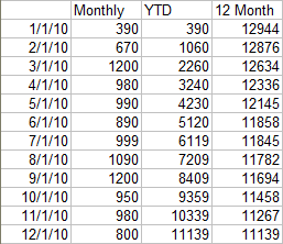
Here is the next year’s data.

Here’s the corresponding Z-chart. Here we see that the chart gets its name from the shape made by the three timelines. Again, Monthly along the bottom, looking as steady as before, YTD again diagonal, and Running Total along the top.

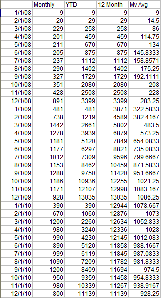
But this Z-chart approach is not as effective as it could be. First let’s show all the data, not just a year at a time. And let’s include a 12-month moving average.

Let’s remove the cumulative (YTD) series. It really doesn’t show anything, but its upward slope, a natural consequence of an increasing value, gives the false impression that all the data is increasing. So it’s best to leave it off. If you want to show month-by-month progress towards a goal, it should be plotted in its own chart.
Now let’s replace the moving total with a moving average. This puts the calculated (smoothed) value into the same axis range as the monthly values. This prevents the large 12-month totals from dwarfing the 1-month individual values.
Here is a non-Z-chart corresponding to the first Z-chart above. Without the distraction of the YTD sloping line, and with the smoothed line and individual values on the same scale, we see that the monthly values are not steady as we first thought, but in fact they experience a bit of variation. There are two important things to note: the moving average is sloping upwards, so web site visits are increasing, and the monthly values exceed the moving average for most of the chart’s duration, also indicating increasing monthly visits.

If we adjust the second Z chart the same way, we see that the moving average is steadily decreasing, indicating fewer monthly visits. The monthly values are mixed, above and below the moving average. If there were a systematic seasonal variation we could see it here, but a cursory look does not reveal a pattern.

The adjusted charting approach doesn’t have a fancy name like “Z-chart”, but it has some advantages:
- Improved clarity: no distracting cumulative timeline makes it look like values are increasing.
- Easier understanding: smoothed and individual values on the same scale makes it easier to see trends in both, variability in the individual values, and deviation of the individual values from the moving average.
There is another advantage:
- Immediate applicability: we can show this data starting from the first month, without waiting to accumulate the first year’s data.
This chart illustrates the immediacy of the simple two-series chart: data starts at the first month.

The first year shows slow but steady growth, the second year shows faster growth, with some variability in the monthly values, and the third year shows a slow decline, with continued variability in the monthly values.
We could try to extend the Z-chart approach to the three-year period, with little success.

The YTD for the first year doesn’t show clearly, and we might notice that YTD for the second year has a slightly steeper slope than YTD for the third year. But YTD is a distraction. The 12-month moving total shows the same shape as our moving average in the previous chart, slow then fast growth, followed by a slow decline. Because of the scale, we’ve lost any insight into the variability of the monthly values.


Dave Cogar says
Very interesting approach. Could you make the data you used available as a spreadsheet or as a HTML table instead of a picture? That would allow people to right click and save the data easily. I would like to work with this design a bit and I always like to replicate the original results first.
Many thanks.
dave
Jon Peltier says
Dave –
Good idea. I’ve added a link to z-chart-data.csv in the article above.
Matt Healy says
Stock market charts frequently plot various flavors of moving average (simple, exponential, etc.). In the world of technical stock analysis there are a plethora of metrics intended to highlight trends and deviations from them. Oddly enough, many of them were first invented in Japan during its period of isolation for tracking markets there. Lots and lots of books and websites cover these techniques.
Tushvin R says
Hello sir, I have the following data for the z-chart with a negative slope for moving total. what analysis and conclusion can I make from these data.
monthly cost Cum Moving annual total
2009june 199 1097 1731
july 34 1131 1721
august 65 1196 1712
september 80 1276 1745
october 18 1294 1463
november 37 1331 1367
december 22 1353 1353
2010january 58 58 1350
february 111 169 1249
march 110 279 1103
april 40 319 1070
may 123 442 897
june 87 529 785
Jon Peltier says
The point was that Z-charts just aren’t very effective. When you have some data that’s scaled to 1/12 of other data in the same chart, you will lose resolution and be confused by not comparing equivalent quantities.
I don’t know what this chart is trying to tell me. I see the moving total coming down, so I know the trend is negative. But I can’t see any detail in the monthly values. And the year to date is rising. Well, duh.
Remove the YTD, and divide the last 12 month total by 12 to give a last 12 month average. Plot the actual monthly values and the last 12 month average. The moving average smooths out some variation, giving you a lagging indicator that’s scaled to the monthly values it’s based on.
This shows that my monthly values have been in steady decline for some time. But in four of the past five months, the monthly values are greater than the moving average, which is a sign that the downward trend may be ready to change.
Tushvin R says
The values of monthly cost is the money spent to a department in a company.
From the downward trend of the last 12 avg, does it mean that the company is spending less money in that department?
Is there any other method to illustrate the movement of costs in the department?
thank you for your answer. I am very grateful to you Sir.
Jon Peltier says
I was able to reconstruct a few previous individual months of spending. Apparently the average started high because of several months with large values. And yes, the general trend of the average is decreasing.
Really, using monthly values and a moving average is a pretty good way to show this kind of trend. The Z-chart might look nice, and it shows more data, but the cumulative value is not useful, and forces the axis to be compressed.
Tushvin R says
thank you very much for your reply.
it was very helpful.
Kevin says
So, I noticed that the z-charting or non-z-charting method is deterministic. It just plots the data that you have. It doesn’t seem to give any forecast predictability except that you can kind of see that there is either a downward or upward slope in the moving averages. Is there a way to actually forecast using this method … say next year’s website visits?
Jon Peltier says
What’s forecasting predictability besides the ability to draw a line extending the data you have into a region where there’s no data yet? You use a moving average to smooth out the bumps and remove some seasonality, but you still have to extend a line somehow.
Ejobu Nicholas says
how can i calculate moving total?
samir says
how do i calculate the 12month column at the very beggining?