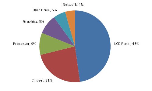
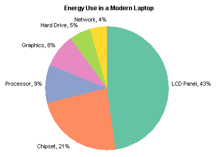
In the Engineering Windows 7 blog on MSDN, in Windows 7 Energy Efficiency, The Windows team posted a chart showing how energy is consumed in a modern laptop.

No surprise that almost half is spent lighting the display.
But wait, that looks a lot closer to 50% than 43%. Let me see what I get using their numbers.

Looks the same. Let’s do a quick check of the numbers. 43% + 21% + . . . look at that, 90%! Often the numbers are off by 1% or thereabouts, due to rounding effects in the labels (but see Pie Chart Rounding in Excel for a discussion of rounding errors in Excel pie charts). But in this case they’ve obviously left something out.

All the well-intentioned guidelines for charting say to use a pie chart to show how parts make up the whole. And yet, here we have only some of the parts making up 90% of the whole. The basic premise of a pie chart is violated by omitting this 10% of the total energy usage.
Pie charts are supposedly the best way to show proportions of this sort, although they are not really so good even at that. People mistake familiarity with effective information display.
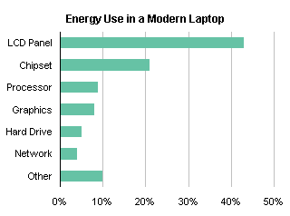
The same data is shown as effectively in a bar chart, either with the original values:

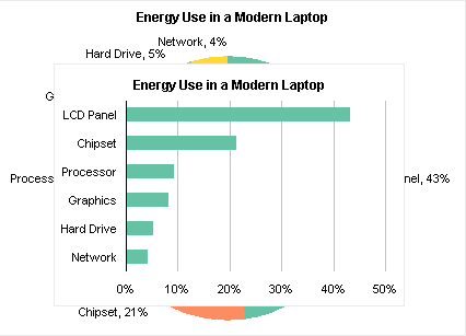
or with the missing 10% accounted for:

These charts are not distorted by exclusion of some of the data; no basic assumptions of bar charts have been violated.
In addition, at 320×221 pixels, the original bar chart uses only 54% of the space as my original pie chart (426×306 pixels).


Alex J says
Should/could there not be a line (on the bar chart) indicating culmulative % = Pareto? I confess, I have tried this on horizontal bar charts before in Excel without much success (works ok with vertical bar charts).
Tony Rose says
Great post Jon! This really drives home a few issues with pie charts. It seems they made a very common mistake I see a lot – the “other” category. Also, this is a good example of “How to Lie with Charts” made popular by a book written a long time ago.
I can see a lot of incoming links to this post.
Damir Sudarevic says
Masterpiece!
Jon Peltier says
Alex –
You could add such a line. Using data like this:
copy the last two columns, select the chart, use Paste Special to add a new series, categories in first column, names in top row. Change this new series to an XY chart. Set both horizontal axes to range from 0% to 100% and hide the upper one. You may or may not have to change the scale and appearance of a second vertical axis.
Jon Peltier says
You could also make a floating bar chart to show this. Here’s the data:
Make a stacked bar chart, then hide the Blank series by removing borders and fill.
Alex J says
Jon, thanks for the reply – I’ll use that.
BTW, I really like the idea of displaying “Other”, regardless of its amplitude, as the last bar on the graph. I make use of that when “Other” is not a category per se, but a collection of the values from all other items in all other categories not already displayed on the chart.
(oops – kind of like the difference between an “array of variants” and a “variant array”. oh well…)
Jon Peltier says
Alex –
It bothers me when Other is listed between N and P, or in numerical sequence in a sorted list, because Other is not a regular category like the rest. I even debated using a different shade of green for the Other bar in my charts, but you can see that laziness won out.
Alex J says
To support your approach for “other” – this is how I managed the data set given to me:
There is an item called “torDWG” which, in the legend, is listed as “OTHER DRAWINGS”. This is a category.
There is another item called “OthType”, which covers the ~150 items in 29 categories not listed on the chart.
DaleW says
Jon, to paraphrase your original post, you are pointing out that the Windows Team did not live up to the higher standards of a pie chart (all slices must sum to 100%), but their data would have made a perfectly legitimate bar chart, and anyone who went to the trouble of adding up percentages to find the discrepancy could have been told it was just a feature of their bar chart, not a bug?
Jon Peltier says
Dale –
I don’t understand your point. A pie chart leads to the assumption that all relevant data comprising the “whole” is included. A bar chart does not. It’s not a feature or bug in the chart, it’s how the chart maker populated the chart. In a pie chart, this usage is negligence by the chart maker.