This vintage post was written with Excel 2003 in mind. It has been rewritten to take into account changes in how chart axes are treated in Excel 2007 and later versions of Excel. Please visit Bar-Line (XY) Combination Chart in Excel.
When you have two series in a chart, and you want to show them using two different chart types, you have a broad array of choices. If you have target and actual data for a set of product attributes, for example, you can make a column-line combination chart readily.
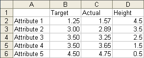
Suppose your data looks like this (ignore the “height” column for now):
Make a column chart with all of the data:

Right click the Actual series, choose Chart Type from the pop up menu, and select a Line Chart subtype:
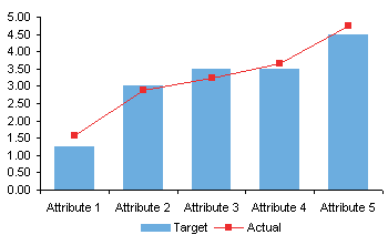
That was pretty easy.
What if you want to use horizontal bars? Perhaps the attribute labels are too long to make good category labels along the horizontal axis. Long ago I wrote a tutorial on Bar-Line Combination Charts on my web site, but that’s a complicated example. Here’s a new, simpler version of that tutorial.
Let’s try the same approach as above. Here’s a chart with both series as bars:
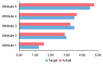
Right click on the Actual series, choose Chart Type, select the line with markers subtype. That’s no good. The bars increase in value from left to right, while the line values increase bottom to top.

So we need a new approach. Make a bar chart with the Target data.
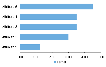
We want the attributes listed in the opposite order, so format the vertical axis, check Categories in Reverse Order and Value Axis Crosses at Maximum.
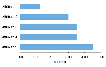
Copy the Actual and Height columns of data, select the chart, and use Paste Special to add the data as a new series, series in columns, series names in first row, and categories in first column.

Right click on the Actual series, choose Chart Type, then select the Lines with Markers version of the XY chart type. Since Actual is used for the X values of the XY series, both series show Target and Actual increasing from left to right.
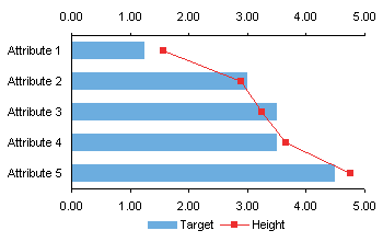
Here is how to compute the values in the Height column. There are five categories (attributes) along the left hand axis, and the XY series markers fall in the middle of each category.Y values for the XY series range from zero at the bottom to 5 at the top of the axis. The first point is for Attribute 1, and is plotted at a height of 4.5. The next one, for Attribute 2, is at 3.5, an so forth, as shown in this chart.
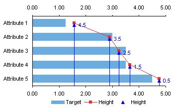
You have to keep both horizontal axes in the chart, and you have to make sure they stay synchronized when the data changes. But you can hide the top horizontal axis: format it so it uses no line and shows no tick labels.

Well, that wasn’t so hard, either.


DaleW says
Jon, thanks, your recipe for that combo chart wasn’t too hard to follow.
For displaying such target-actual data, your Overapping Bar Chart seems like a more intuitive design, plus is easier to create. Just put the target data in back with the wider bars, of course, to provide the bullet chart lite effect.
Martín says
Jon,
once again, thanks for being there !
and once again, I feel sooo dumb…… here’s my problem:
I have 3 columns: Office, Revenue (full figures) and headcount.
I was trying to follow your instructions to create the horizontal bars chart, showing the max revenue at the top.
then I wanted to create a line with the headcounts, but you’ve lost me with the Height column.
Any suggestions?
Thanks ind advance !
Martín
Jon Peltier says
Martin –
How many bars in a series? Call it NThe secondary (XY chart) value axis, the vertical one at the right of the chart, should scale from zero to N. The values should go from 0.5 to N – 0.5. Make sure these values are sorted in the same sense as in my example above.
Martín says
Jon,
there are 12 series.
what I did was to add another column “Height”, and estimate where the dot should go, on the same scale. it somehow worked, but the problem remains as I cannot show the headcount info.
Anonymous says
this is not simplified enough for someone whos just learning what it is to understand
Jon Peltier says
Anonymous – Where do you get stuck?
Anonymous says
I tried both of the solutions and followed step by step, however, the line is on a horizontal way but not vertical direction as showed in your graph. There is no way to change it. Any suggestions? ( I am using Excel 2007).
Thanks you very much!
Anonymous says
Thanks this is Briliiant…was trying to work it out for so long.
Scott says
Thank you this was very helpful. Any idea how to get the data labels on the “Actual” line in the finished product to display the x-values (ie the “actual values”)? When I turn on data labels I can only get it to display the y-values (the “height values”).
Thanks in advance.
Jon Peltier says
Scott –
There are choices when adding data labels that allow you to tailor the content of the labels. But, you have to skip past the lame options on the Chart Tools > Layout Ribbon dropdown, click More Data Label Options at the bottom of the dropdown, and choose from the wider selections in the dialog.
Charles Grace says
Jon, any known problems for this Bar-Line combo chart in Excel 2010. I follow instructions pretty well and but Excel will not plot second column of data on a second x axis I. Only gives me a vertical axis. I assume its operator error (me) but at this point its worth asking about a software issue.
Jon Peltier says
Charles –
This works fine in 2007/2010. In fact, you don’t even need the secondary horizontal axis, because unlike Excel 2003, the later versions know how to use the primary axis for the secondary series. But if you need the secondary axis, go to the Chart Tools > Layout tab, click Axes > Secondary Horizontal Axis > Show Default Axis (or whatever option you need).
Andy says
Jon,
Thanks so much this explanation was a life saver.
Is it possible to do a combination stacked bar line graph where the lines are displayed as a step chart?
I tried using your tutuorial below, but could not figure out how to make it work –> lines not stepped or bars too narrow
https://peltiertech.com/Excel/ChartsHowTo/StepChart.html
Jon Peltier says
Andy –
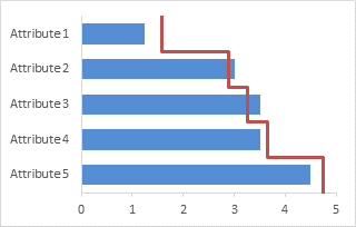
How do you want the steps to look? Like this?
Andy says
Jon,
Thanks for the quick reply. Sorry, but I mistakenly said bar chart when I meant column chart.
Your line graph is showing what I need for the line graph (steps).
Thanks again for your help,
Andy
Jon Peltier says
Andy –
I should have included more information.
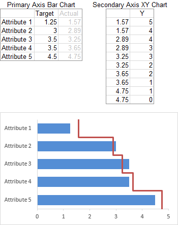
The bar chart with the step chart overlay is a combination chart with the bar series on the primary axis and an XY series on the secondary axis.
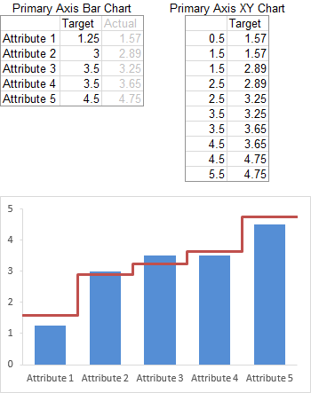
The column chart with the step chart overlay is a combination chart with the column series and XY series both on the primary axis.
Andy says
Jon,
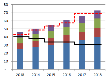
The last post (tip to use separate data source with XY Scatter for steps) helped me figure this out.
Here is a draft version of the end result.
Thanks so much,
Andy
Jennifer Reese says
I am trying to combine chart types on a single graph. I’d like my primary chart/axis to be a scatter plot (many data points – i.e. groundwater level measurements taken every 15 minutes) and the secondary chart/axis to be a column graph showing a limited amount of data (i.e. daily precipitation). I can easily plot this as two scatter plots on the same graph with a primary and secondary axis, but I can’t get the secondary data to plot as a column graph. Help?
Charles Grace says
Jennifer. Assuming you are using Excel 2010 or later. Below is the URL for the solution from Microsoft. I think you are halfway there. Is sounds like you have both series plotted on your chart already. What you need to do is highlight Series 2, which will then launch the Design tab on Chart Tools. On the far left of the tab, you will see the icon for ‘Change Chart Type’. Use that to function to change Series 2 to a column chart. By having only Series 2 highlighted, you are only changing the chart type for that series. Hope it helps. cg
http://office.microsoft.com/en-us/excel-help/add-or-remove-a-secondary-axis-in-a-chart-HP010342149.aspx
Conor says
Jon
Does this only work if the numbers of both series are in the same order of magnitude? I have followed your steps exactly (multiple times) however I am attempting to overlay real numbers (XY) over percentages (Bar) . When I paste special, the X axis changes from 0 – 20% to 0 – 20,000% and I obviously loose sight of the original series.
I have tried playing with the axis etc to no avail. Does that make sense?
thanks
Jon Peltier says
Conor –
Plot the percentages on the primary axis and the large numbers on the secondary.
gary lazarus says
the older version of excel was better for charts requiring bar and line representations for two data series where the units being measured by the two series differ (e.g., series 1 is in % & series 2 is a count). is there a way to prompt excel to offer a second axis? (the examples above do not seem to address this …)
Jon Peltier says
Gary –
The new versions of Excel are the same as the old in this respect. You need to format a series so it appears on the secondary axis, and Excel will draw the secondary vertical axis on the chart. Then on the ribbon you can find the controls to add the secondary horizontal axis, if necessary.
C Grace says
Gary, this link has helped me with similar questions. Although a little simplistic, it should do the trick if I correctly understand your question.
http://office.microsoft.com/en-us/excel-help/add-or-remove-a-secondary-axis-in-a-chart-HP001234165.aspx
gary lazarus says
well, apparently simplistic works for me. thanks.
Diva says
Hi am fairly new to chart, and I am trying create a simple chart that shows month over month volumes of a particular product. For example I want to show apples, oranges, and pears i bought in Jan, and Feb and did I increase or decrease my volume.
Jon Peltier says
Diva –
To plot the volume, put them into a worksheet, select the data, and insert a chart (left). To plot month over month change in volume, calculate the changes in another range, select this calculated data, and insert a chart (right).
Jon Peltier says
Read carefully: “select the Lines with Markers version of the XY chart type”
The XY chart type is the Scatter chart type.
Venkata Murugan Guna says
Hi Jon,
I am an ardent fan of this site & AJP for charts, ever since i learned excel. I always implement these techniques in chart but this one is really breaking my head as i dont see Actual series to right click the moment i pasted the Copied Actual and Height columns of data. If i get this then i think i can move on. I tried many attempts but could not. Please guide.
Murugan
Jon Peltier says
If you don’t see a pasted series, due to axis scales not including the new data or other problem, select a visible series, and use the up/down arrow keys until you have selected the one you want. You can see what’s selected on the Current Selection section of the Chart Tools contextual tabs. Then click the context menu button (between the alt and ctrl keys to the right of the spacebar, or press Ctrl+1 (numeral one) to format.
Venkata Murugan Guna says
Hi Jon,
Thanks for immediate response. I did all the permutations but it did not worked. since you told me that option, I am telling you, when i use up/down arrow keys it is selecting both Actual and height (which means Actual as X series and Height as Y series) and when i use up/down arrow key again it selects Attribute & Target (attribute as X and Target as Y) and later pressing up/down arrow goes out of chart and selects the outside content. Thought of pasting the image but no option available. Please guide. I want this chart to implement in my office.
Thanks
Murugan
Jon Peltier says
It sounds okay.
Attribute (X) and Target (Y) is the bar series; note that in horizontal bar charts, X is vertical and Y is horizontal.
Actual (X) and Height (Y) is the XY series.
Venkata Murugan Guna says
Hi Jon,
I dont think i will be able to accomplish this. I failed to understand the logic here. I will try again and will let you know.
Venkata Murugan Guna says
Hi Jon,
I am sorry, tried hundred times but could not. Is there a way for you show through short length youtube and from there i will pick up?. I desperately need this.
Venkata Murugan Guna says
Hi Jon,
I couldn’t success and finally gave up. I want to replicate this chart into my report. Here is my data. i have Accounts Payable team sitting in Chennai and Banglore and does allocation of work. I want that data to be populated for previous 5 days in bar chart along with FTE count. Chennai on the right side bar and Banglore on the left side. Please help
Date Chennai Chennai FTE Bangalore Banglore FTE
03/11/2014 1115 21 389 7
04/11/2014 929 20 351 7
05/11/2014 1057 19 572 7
06/11/2014 929 21 477 7
07/11/2014 984 19 505 7
Charlie Grace says
Venkata, I have some observations on your chart quest. First, because you have time series data, you should be using a column chart and not a bar charts. Perhaps that is what you meant anyways. Second, here are some steps and images that I used to create a possible solution for you. They are not elegant, but I think they get the job done.
Step 1. Use this suggested spreadsheet layout
Step 2. Create a column chart with two data series, skipping a row to segregate the two cities
Step 3. Using the instructions at the link below, highlight the second or FTE series, and change the chart type for that series to a line chart
http://office.microsoft.com/en-us/excel-help/add-or-remove-a-secondary-axis-in-a-chart-HP010342149.aspx
Step 4. Then, format the second or FTE series to a secondary axis. Add legend, title, labels, and result should resemble this.
Good luck
… Jon, here are the links for the images that you can insert.
Picture 1
https://www.dropbox.com/s/0a31x4rr5iza53u/Picture%201.jpg?dl=0
Picture 2
https://www.dropbox.com/s/ir326ikr4o4yc6a/Picture%202.jpg?dl=0
Picture 3
https://www.dropbox.com/s/vrurikmtvtjql52/Picture%203.jpg?dl=0
Venkata Murugan Guna says
Hi Charlie,
I actually meant bar chart not column chart. but i am stumbled with the way that you suggested me and indeed it was beyond my relief (more happy) as the chart exactly matched my expectation.
Thanks
Murugan
Venkata Murugan Guna says
Hi Charlie & Jon,
I have made a chart but i am unable to upload / send the excel file to you as i have accomplished. Further more, small request, is there a way to hide / remove the data in data table view?. I have made dummy axis to build error bars to differentitate between Chennai and Banglore along with Scroll bar. but dummy axis values are visible in data table. – Sorry to be a pest but thanks for helping me a lot. I could only send the file to your email id [email protected].
Charlie Grace says
Merugan, per the link that follows it is generally not possible to remove a series from a data table. However, a couple of alternatives are proposed. Good luck. Charlie
http://answers.microsoft.com/en-us/office/forum/office_2007-excel/hiding-certain-series-in-an-excel-data-table-but/ffb803cc-3940-48cf-8e97-1914132a91c2
Venkata Murugan Guna says
Hi Charlie, …Ok thats fine..i will do and thanks for your help.