This article was inspired by the Mr Excel forum. A member asked Charts: Any way to make a shape stick to a point in a scatterplot, not an absolute location on the chart?
The answer, of course, is Yes, but you have to know the trick, which I’m about to share. Not for the first time.
The Problem – Shapes Won’t Stick to Points in the Chart
Suppose I have some simple X-Y data:
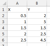
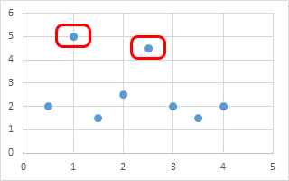
With this data I make a simple X-Y chart:
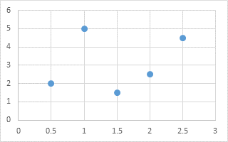
Now I draw a couple shapes on the chart to highlight two points with larger values than the others.
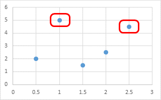
So far, so good. But when I add some more data…
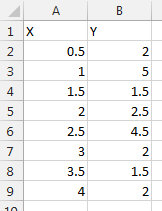
… the chart’s axes rescale. The points move to stay at the same numerical position along the axis, but the shapes stay where they were originally placed.
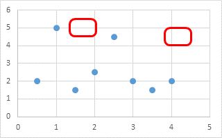
So now I have to drag those shapes around whenever the chart axis scales change.
The Solution – Making Shapes Stick to Points
There is actually a pretty simple way to make the shapes stick to the points. The trick is to add a second series to the chart, with data duplicating only the points you want to draw attention to, and use the desired shape as the markers for this series.
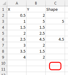
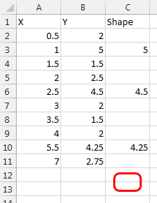
Here is the data, with a third column containing the Y values I want to highlight. Also visible is the shape I’ll use.
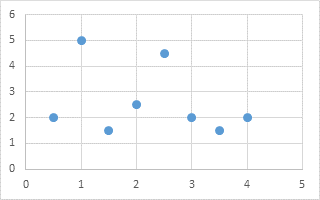
Here is the original X-Y chart, with blue circles as markers.
Here is the same chart with the second series added, as orange squares that indicate which points will be highlighted.
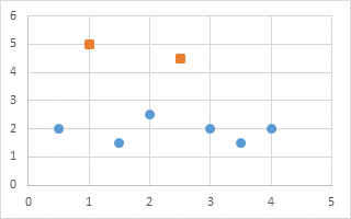
The trick is simple. Copy the shape, select the series that I want to use the shape as its markers, and paste using a simple Ctrl+V.
Now when I add data, including another highlighted Y value in column C…
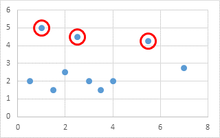
… the chart’s axis rescales, but the highlighted points keep their highlighting shape, and the added Y value is highlighted as well.

Enhancements to the Technique
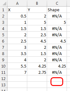
You could use formulas in column C to place values where highlighting is desired, and #N/A errors where it isn’t desired. Below the formula in cell C2 might be
=IF(B2>4,B2,NA())or better, the threshold for highlighting might be placed into another cell, say E2, to make it easier to modify the highlighting:
=IF(B2>$E$2,B2,NA())These formulas are then copied down column C as far as needed.
You don’t even need to draw a special shape if all you want to do is circle selected points. Instead of copying the shape and pasting it onto a series, simply format the series to use large circles as markers. Below the circular markers are size 17, with 2.25 point borders and no fill.
Peltier Tech Update
It’s been a busy few months for me, and I haven’t blogged very much lately. I spent a week in Amsterdam at the Excel Summit, where I met a lot of smart Excel users and Excel MVPs for the first time, and caught up with some old friends. I also did some on-site Excel VBA training for a couple companies, and this has reminded me that I want to do more activities like that.
I’ve also spent some time planning and working on new Peltier Tech products and services. Excel 2016 for both Windows and Macintosh will be released by Microsoft in the next several months, and I will release a major upgrade to the Peltier Tech Chart Utility.
Since traveling to training sites is a pain for me and for trainees, I’ve begun work on some live hour-long video training topics. Topics will include “Tricks to Make Excel Charting Less Painful” (based on a session at the Amsterdam Excel conference), “Getting Started with Excel VBA” (based on my recent training workshops), and advanced topics in charting, programming, and programming charts.


Edmund Crawford says
This is great! Thanks!
Costas says
Nicely done Jon, very clever approach, congratulations
Costas