In an organization it is often informative to plot individual salaries and grades to see how they fall within salary bands for those grades.
This is easily accomplished by constructing a combination chart using a floating bar chart and overlaying the individual points as an XY scatter plot.
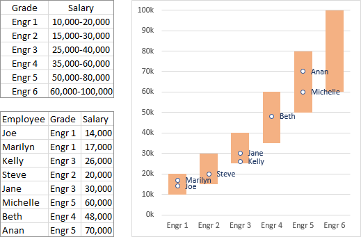
The screenshot below shows salary ranges for six grades of engineers, along with actual salaries and grades for eight engineers, with the desired chart.

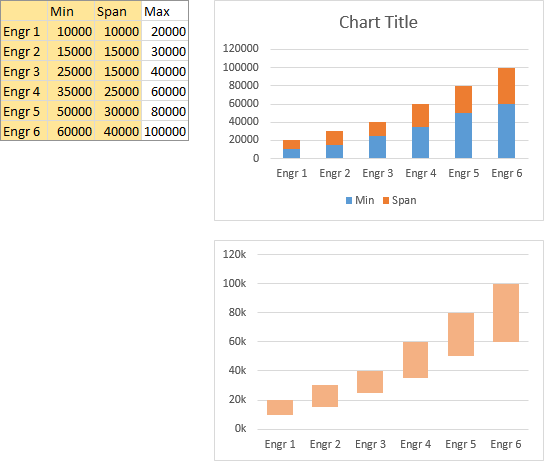
The data needed to construct the floating bar chart is shown below, with Span calculated in the column between Min and Max. The chart is constructed by selecting the orange shaded cells (Grade, Min, and Span) and inserting a stacked column chart (top chart below).
Fix up the chart (bottom chart below) by deleting the legend, formatting Min to use no fill and Span to use a light fill color, and setting a gap width of 50 or 75%. Clean up the vertical axis labels by using a custom number format of
0,"k"The lone zero means display the value without decimal digits, and the comma after the zero means show thousands, not ones. I’ve deleted the chart title, but you should use a title that describes the data being displayed.

Add the individual salary data as follows. Set up the data as shown, using a MATCH formula to find which bar the engineer’s grade falls within:
=MATCH(cell containing grade label,range containing list of grade labels,0)This column should be to the left of the salaries, since it will be used as X values for the XY series we will plot. Copy the shaded range (grade index and salary), select the chart, use Paste Special from the Home tab of the ribbon, and select the options shown in the dialog screen shot below:
- Add Cells as New Series
- Values (Y) in Columns
- Series Names in First Row
- Categories (X Labels) in First Column

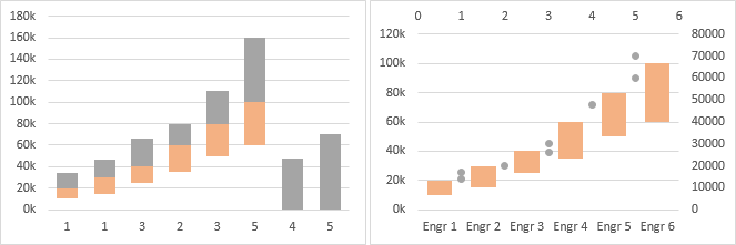
The data is added as another stacked column series (below left).
Right click on the added bars, choose Change Series Chart Type from the pop-up menu, and select the XY Scatter option with markers only (below right).

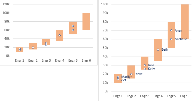
Select the XY scatter series, and press Ctrl+1 (numeral one) to open the Format Series dialog or task pane. Under Series Options, select Primary Axis, then choose a marker color and style that shows up clearly against the floating bars (below left).
Finally, you may like to stretch the chart to improve resolution (below right). Add labels to make it easier to track each engineer. In Excel 2013, add labels, then use the Values from Cells option to use the cells containing the labels. In earlier versions, you can manually change the text of each label, or you can use Rob Bovey’s Chart Labeler, a free add-in, to link the data labels to the cells.

I’ve described these data labeling options in more detail in my tutorial Apply Custom Data Labels to Charted Points.
This tutorial is a rework of my answer to the October 2014 question need to create salary data with salary bands on Stack Overflow.
More Combination Chart Articles on the Peltier Tech Blog
- Pareto Charts in Excel
- Clustered Column and Line Combination Chart
- Precision Positioning of XY Data Points
- Add a Horizontal Line to an Excel Chart
- Horizontal Line Behind Columns in an Excel Chart
- Bar-Line (XY) Combination Chart in Excel
- Fill Under or Between Series in an Excel XY Chart
- Fill Under a Plotted Line: The Standard Normal Curve
- Excel Chart With Colored Quadrant Background


Don says
I will keep this one for future use. Nice and clean. Will Excel 365 come with this type of chart built in?
Jon Peltier says
Office 365 is the subscription licensing service. Office 2013 is the current Windows version of Office (including Excel). Office 2016 is the upcoming Windows version.
That said, Excel 3656 will not have this kind of chart built in, but it’s really not too hard to make it work.
rossa says
Hi Jon, is there an advantage using scatter chart instead of a line chart with markers?
Jon Peltier says
Rossa –
Yes.
A line chart limits me to one point per X value per series. For several of the salary grades, I have multiple employees, so I would need to somehow juggle multiple line chart series to plot all the points.
An XY scatter chart allows me to plot points without regard to X values, since X values are continuous numerical values, not categories. So I can plot all employees with a single series.
eliza says
Dear Jon, thanks a lot for your sharing. if we want to set up a template, let’s say max is to engineer 8, your here max is 6. for different department or company, they can delete the data set based on their own actual situation. For example, template max is 8 engineers, but my company max is 6 engineers, so i will delete the engineer 7 and engineer 8 data set. But if I delete the 2 data sets, engineer 7 and engineer 8 column will disappear, however, the x axis still goes to engineer 8 x value as the end. So my question is how can we set up a formula to autamatically make x values to my max engineers, like in the example, is engineer 6?
I’m not sure if you can understand my point, if not, can you give me your email address to allow me to send you the excel file for a better understanding?
Thx in advance!
eliza says
Dear Jon, thx a lot for your sharing. If we want to set up a template for the company, let’s say the max is engineer 8, but your example here is engineer 6. If based on your company actual situation, I want to delete the engineer 7 and engineer 8 data set, the engineer 7 and engineer 8 column in the chart will also disappear automatically, but the problem is the x axis still goes to engineer 8 x value. So my quesiton is: how can we set up a formula to allow the column chart automatically select the right data source area?
I’m not sure if you can understand my points, if not, can you pls give me your email address to allow me send you an excel file for your better understanding?
Thx in advance!
Jon Peltier says
Eliza –
Which data did you delete? If you adjust the individual data, for the markers in the chart, there will be no markers where you don’t want them, but the bands will remain in the chart. Note in my example, there is a band for Engineer 6 but no individuals in that band.
Also if you changed the range for the Y values of the bands but not the X values, the category axis may still contain labels for the nonexistent bands.
eliza says
Thank you Jon. I’m not talking about the individual data; I’m talking about the bands. Let’s say the default band # is 6, but if my company only needs total 3 bands, and I want to show the X axis end to Band 3. If I delete Band 4&5&6 in the data source, the result showing in the column chart would be X axis still keeps Band 4&5&6 length but without label on it and column of Band 4&5&6 also disappears. My methodology is when I create the column chart, I need to select data for different column manually, can we set up a formula for data selection for the template, if band 4&5&6 data source delete, the column chart data values will automatically go to Band 3 as the end?
Jon Peltier says
If you delete the contents of the cells, but the chart source data still includes the cells, the chart will show blank categories instead of band labels.
Here is the original chart with six bands. I’ve selected the chart so the chart data range is highlighted in the worksheet.
Here is the chart after the contents of the cells for the last three bands have been cleared. Since the chart source data didn’t change, you can see that the blank cells are still included in the chart’s source data, and so in the chart itself.
When the chart source data is adjusted to exclude the blank cells, the chart no longer keeps placeholders for the missing data.
eliza says
Thanks Jon, this is the question I’m asking. In order to show just 3 bands, you need to manually reselect the chart data source area. Can we set up a formula that can automatically to the final band with content in the cell?
Thank you in advance!
David L says
Hi Jon,
This is great stuff. I have followed your directions as much as I could, but I am getting hung up on your match formula. I can’t decipher which data you are using for that piece. Could you elaborate on that a bit more? Maybe explicitly state which cell you are using and which range you are using?
Thanks,
Chris says
Hi Jon,
Thanks for outlining these steps. I have followed them with some degree of success, but I have a question I’m wondering if you can answer?
I get as far as adding the individual salary data to the chart, when I then choose change chart type > XY Scatter no markers, but it’s as if this transforms the data into a line graph (i.e. one data point per X value) and instead of grouping my individual salary data by salary band the secondary axis counts each individual data point. Thus when converting to Primary axis only I get a very confused graph. I’m wondering if there is a step I am missing or if there is a fix you could recommend?
Thanks
Jon Peltier says
Chris –
Make sure the new series knows what to use for X values. If it uses no X values, or if it uses the X values of the column series, you will get one point per category instead of a stack of points.
Neha says
Hi, Jon
Thanks for sharing the information. Can you please explain how you come with figure of Span?
Thanks for your reply.
Jon Peltier says
Span = Max minus Min
Paul Gutierrez says
Hi Jon,
I still don’t know how to format the XY scatter series to be plotted on the Primary axis.
Can you show me?
Thanks
Jon Peltier says
Paul –
Right click on the series, choose Format Series from the pop-up menu, and select the Primary Axis option.
Or, select the series, press Ctrl+1, and select the Primary Axis option.
Paul Gutierrez says
Hi Jon,
I finally got it!
It was because I am using the Excel 2013, and the interface and tools is a bit different from Excel 2010
Once I open the chart in Excel 2010, I got it!
Thanks
Paul
Justin says
Jon – I’ve followed all the steps and when I select the scatter to primary axis, it still has all the data points pushed off to the right and does not overlap the bars. I’m not sure what else to do as I’ve tried everything to get them to overlap properly.
Jon Peltier says
What does your data look like? Can you upload your workbook to a file sharing service and post a link?
Justin says
I can try and get it to a file sharing service. The scatter plot just doesn’t align on the same axis, it shows as pushed off to the right of the bar charts, even though I’ve assigned the employees to the same pay grade titles as the actual spreads. However, I just figured out that if I change the numbers of the grades to 1 – 10 for example it works, as I had them as 5 – 12 before. What would be causing this?
Jon Peltier says
Despite the text of the category labels, the XY data must treat them as if they start at 1 and increase by 1 for each successive category. This is why it works when you use 1-10 instead of 5-12.
Jessica says
I’ve got 8 pay grades and I’m plotting 95 employees in my scatter plot. How do I format the scatter plot data series so they are stacked neatly within their grades?
Jon Peltier says
You need a stacked column chart with eight categories instead of the six in my example. The employees need corresponding X values of 1-8. It’s the same as my example, with a few more pay grades and quite a few more employees. It may become too cluttered to add labels for each.
Amy says
This is really helpful, thank you very much.
One question though, I have about 300 employees, and although I’ve gotten everything to work, a lot of the points overlap so you can’t actually see all the markers or be able to visually see how many employees are in each band/bar (more or less), is there anything that would allow the markers to spread a bit more horizontally but still stay clustered enough to be able to see they are all part of the same band?
Jon Peltier says
Amy –
What you could do is add a small jittering factor to the X values for the markers. So instead of using 1, 2, 3, etc, you would add something like
(RAND()-RAND())/3to each X value, so when the points are plotted, they are offset horizontally by a small random factor:Jerry says
Hi Jon-
I’m trying to do something similar but with multiple positions. For example a Captain with a salary range of $9000 – $13000, Chief Engineer with a salary range of $8000 – $11000, Security Officer with a salary range of $5000 – $7500. I’m assuming I could do the floating bars to show the min and max for each position, but then i would like to show where the employees in those positions stand with plot markers.
Jon Peltier says
Jerry –
It’s exactly the same. Instead of Engr 1, Engr 2, etc., you use your own job titles, along with the min and span to get the floating bars. Then add markers in the same way I did it here.
Katie says
Hey Jon,
1. This is some kind of excel sorcery, you are a wizard.
2. I was able to get the first floating bar chart based off of my job titles and delta, but I don’t understand how to create the scatter plot so the like job titles are on the bar that is titled the same thing. Maybe it’s my match formula?
Please send help.
Thank you in advance.
KT
Jon Peltier says
Katie –
The X values for the scatter chart series are not the category labels; instead, the X values are the category numbers. in the third figure, you see the two columns highlighted in gold: the X values (category numbers 1 through 5) and the Y values (salaries from 14000 to 70000). After the data is pasted on the chart and changed to XY Scatter, when you change them to the primary axis, they will automatically be lined up with the correct categories.
Seb says
Hi! This is great! Could be you so kind as to paste the string of the full formula with the (RAND()-RAND())/3 addition? I didn´t get it. Thanks!
Jon Peltier says
Hi Seb –
In the layout shown below, the formula in cell I3 is
=MATCH(H3,$B$3:$B$8,0)+(RAND()-RAND())/3. Divide by a higher number than 3 to decrease the sideways spread of the points.Paula Morris says
Hi
I keep getting a #name?, not sure where I supposed to put the details of this field in as it doesn’t seem to work
=MATCH(cell containing grade label,range containing list of grade labels,0)
Can you help
The first bit worked but I can’t do the dots for the individual salaries
thank you in advance
Paula Morris says
Sorry I have managed the first bit now, but now I can’t paste special
any tips?
Jon Peltier says
Paula –
So the MATCH formula is working?
What is wrong with Paste Special? Did you copy the range, then select the chart, then get Paste Special from the Paste dropdown on the Home tab?
Charlotte Chapoy says
After pasting the salary and employee on the chart, the salaries come as stacked column.
I tried to change the format to scatter but then it also change the format of my base levels and salary bands.
Any idea how to select only the employee`s data and change them as scatter points?
Jon Peltier says
Charlotte –
Right-click on any series in the chart, and choose Change Series Chart Type. The Change Chart Type dialog will have a list of all series in the chart, and you can change types individually.