In Custom Axis, Y = 1, 2, 4, 8, 16 I showed axes with base 2 logarithmic scales in both Excel 2003 and 2007. In Excel 2003 it is necessary to transform the data to get the intended result. In Excel 2007, the axis can be achieved with the untransformed data.
In the previous post, the data was widely spaced, so it filled a base 10 log scale with two decades with only a reasonable amount of space above and below the data.
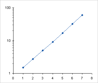
If the data isn’t spread out so nicely, you lose the opportunity to use a regular logarithmic axis. We’ll look at this for Excel 2003 and for Excel 2007, and then we’ll look at native logarithmic axis labeling.
Excel 2003
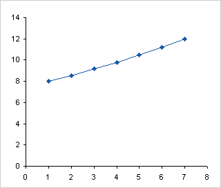
The data in the table below has a narrow range, from 8 to 12, and the range spans a power of ten.

Here is the data charted using a linear axis.
When we apply a logarithmic scale axis, the data spans across 10, so by default the axis ranges from 1 to 100. The data is squeezed into the middle of the chart.
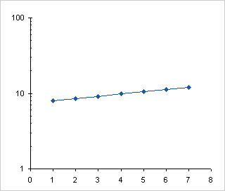
Since Excel 2003 only permits the axis to begin and end at powers of ten, we’re stuck with this, and the fanciest labeling doesn’t make the data easier to read.

Following the steps in Custom Axis, Y = 1, 2, 4, 8, 16 we can plot the logs of the data on a linear scale, from log(8) = 0.903 to log(12) = 1.079.
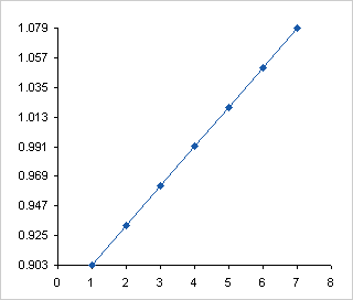
We can hide the default labels, add a series with points where we want our custom labels using log(Y) data, and use the Y values as data labels.

Here’s the chart. With such a narrow spread in the data, it’s not immediately apparent that the Y scale isn’t linear, but if you took out your ruler (you still have one of those, right? you’re not completely digital?) you can tell that the span between 8 and 9 is larger than that between 11 and 12.

Excel 2007
As described in Custom Axis, Y = 1, 2, 4, 8, 16, Excel 2007 makes working with log scales a bit easier.
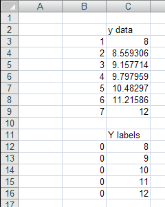
Here is the data plotted on a linear scale.
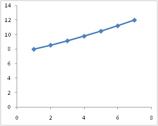
Here is the same chart, with the scale transformed to a logarithmic scale, using the default base 10. Same as Excel 2003.
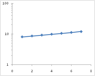
Here the log scale has been changed to base 2.
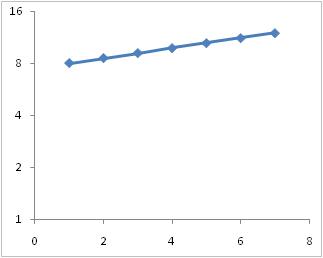
In 2007 we can change the min and max of the log axis to values other than 10 (i.e., other than the base). Here the axis ranges from 8 to 80, still a decade on the base 10 log scale. Instead of the minor ticks being located at multiples of ten (20, 30, 40, 50,…), they are located at multiples of 8 (16, 24, 32, 40,…)
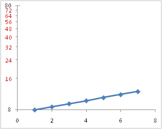
We can also change the maximum so that the axis spans a non-integral number of cycles. Here the maximum is 12 to fit the data. This looks the same using base 10 or base 2.

We don’t get labels other than at the minimum because the axis spans less than a power of base 10 or of base 2, but we can use the same protocol as above to add points with data labels. The advantage Excel 2007 has over 2003 is that we can use the actual values to locate the points, and we can simply use the Y value data label option. In Excel 2003 we had to use the log of the Y positions, and either manually edit the labels, or use a third-party add-in. (Even though the add-in is great, it still is something extra required.)

Finished. Again, just like Excel 2003, only easier.

Log Axis Labeling
Below are a few variations on a log axis that spans six cycles. These were produced in Excel 2003, but they would be the same in 2007. The scales show both major and minor tick marks, which are available for any base except for 2.
The first scale runs from 1 to 1,000,000, and the second from 1/1,000,000 to 1. The third and fourth run from 1 to 1,000,000 like the first, but instead of the default major unit (major tick spacing) of 10, the third has a major unit of 100 and the fourth of 1000. The minor tick spacing is ignored.


If you use the default major unit, minor ticks are placed at multiples of the number at the start of the cycle. In the Excel 2007 chart above that used a base 10 log scale and ranged from 8 to 80, the minor ticks were at multiples of 8 (16, 24, 32, 40,…). In our first axis below, the bottom of the decade is at 1, so minor ticks are at multiples of 1 (2, 3, 4, 5,…). The the second axis, the bottom of the decade is at 0.1, so minor ticks are at 0.2, 0.3, 0.4, and so forth.
In 2003, when the non-default major unit is used, the space between major tick marks is divided up as if it were a single cycle (not two or three. Instead of the ticks being located at 2, 3, 4, etc, for a major unit of two cycles, the minor ticks are located at the square of the one-cycle values, that is, at 4, 9, 16, etc. For a major unit of three cycles, the minor ticks are located at the cube of the one-cycle values, that is, at 8, 27, 64, etc. Interesting.


Excel 2007 does this a bit differently, and for a two-cycle major unit, it makes sense. The first pair of axes below show a scale of 1 to 100, first with the major unit defined by the default one cycle, then by two cycles. I’ve added labels to many of the minor ticks to help illustrate this behavior. The two cycle axis has the first minor tick where the first cycle ends and the next cycle starts, then the rest of the ticks are where they were defined for the second cycle. This puts the ticks at the very logical values of 10, 20, 30, etc.
With larger spans between major ticks, Excel 2007 seems to get confused. The second pair of axes shows three cycles with major units of one and three cycles. The three-cycle axis places minor ticks where the two-axis tick did in the first instance, at multiples of 10 between 10 and 90. There is no tick at 100, nor any between 100 and 1000. Not shown is a four-cycle axis. This puts minor ticks at multiples of 10 between 10 and 90, and at multiples of 1000 between 1000 and 9000, but skips the decade between 100 and 1000.

 – – –
– – – 

This is pretty obscure. It doesn’t make sense to use multiple cycles as the major unit. In a two-cycle major unit, Excel 2007 uses more logical minor tick spacing, while the minor tick spacing is broken for larger major units. Excel 2003 uses a consistent minor tick spacing which is logical in its own way, but not readily understandable.


Sal Paradise says
Just for reference, anyone who uses Excel 2000 for scientific log charts should be very careful. For whatever reason, Excel does not properly space the tick marks. The graphs seem to be fine themselves, but the tick marks are usually shifted a bit, so I end up having to edit them in illustrator with a proper logarithmic scale background.
I don’t know if this is a problem with 2003 or 2007. It appears mostly with many cycles (6 or more) on a dual-logarithmic scale.
Lawrence says
Jon,
Your help with dynamic charts has been absolutely invaluable in the past and I would like to buy you a cup of coffee. Several, if I may. Just need to find that link on your site…remember seeing it on one of your pages.
Anyway, I ran into a VERY SERIOUS EXCEL 2003 BUG and I am hoping you have the solution.
I have a clustered column chart in Excel 2003 with hidden data source rows (which I use for the whole dynamic chart thing). Whenever I save and close the file and then reopen it, the data value labels are randomly reset to their defaults.
How do I stop Excel from resetting those data values to their default formats?
Here is how to reproduce this bug:
1. Create a clustered column chart with at least 4 columns.
2. Format each data column to display its data value.
3. Format each data value label to align vertically (90 degrees) and position “inside end”.
4. Hide 3 or 4 of the source rows and save and close the file.
5. Reopen the file and unhide the rows.
Some of the column labels have their data labels RANDOMLY RESET TO THEIR DEFAULT.
Is there a solution to this bug?
Thanks,
Lawrence
Jon Peltier says
I don’t think it’s a bug, it’s just how Excel stores formatting data.
Say you have five series, then you hide the rows with data for series 2 and 4. Then you only have three series (1, 3, and 5). The chart uses the formatting for the first three series to format them, and forgets the formatting for the last two series. Then unhiding rows applies the formatting for the three series to series 1, 2, and 3, while series 4 and 5 have no remembered formatting, so the default is used.
Ron says
John,
Is there a way to ‘trick’ the logarithmic scale into handling negative values?
Prabhu.A says
How can i calculate Summation functions in Excel 2007. x=0, l=5 limit values for 2 power x. please give a idea for that
Jon Peltier says
Following guidelines in Getting Answers For Your Excel Questions, please submit your question to a dedicated Excel forum.
Larry Caretto says
I encountered a freaky problem with a log-log plot in Excel 2013. Some grid lines would not plot.
I found a discussion about this problem in Excel 2007 and 2010 at http://answers.microsoft.com/en-us/office/forum/office_2010-excel/logarithmic-scale-gridlines-excel-2010/86ee5c3d-311d-4ee1-9c1c-203142af5938. There was no mention about Excel 2013, but the site did suggest a workaround: add gridlines as new data series. The site also referenced this site as a general reference for log plots, so I am bringing my problem here to see if you have any answers.
I posted a screen shot of the original and corrected plots at the following web site:
http://www.csun.edu/~lcaretto/excel2013LogChartGridlineError.pdf
The workbook is available at the same site:
http://www.csun.edu/~lcaretto/excel2013LogChartGridlineError.xlsx
Do you know of any newer information than that on the Microsoft Office Forum web site?
Jon Peltier says
I haven’t heard of this problem. Sometimes in the past there were problems displaying gridlines, either on-screen or as-printed, which can be changed by changing the line thickness or stretching the chart. I haven’t seen these problems in a long time (I don’t use gridlines too much). But I did see the problem in your workbook in Excel 2013. To make it worse, format the vertical axis so the horizontal axis crosses at 1e-20.
Craig says
Jon,
I tried to replicate your “Excel 2007” example above using Excel 2010, but it didn’t work. When I used “Paste Special” to insert the “Y labels” as a new series, Excel doesn’t seem to recognize that they should be placed in a vertical line at the 0 value of the existing x-axis; instead, it seems to assume default x-axis values of 1,2,3,4,5 for the y-labels and then plots them as a completely distinct series. As a result, I get two rightward-sloping lines on my chart instead of the desired y-axis labels…
Any ideas?
Jon Peltier says
Craig –
Use Paste Special, and make sure the “Categories in First Column” option is selected, then convert this added series to an XY type.
Craig says
Ahh, my problem was that I was trying to do it on a Line chart type — when I switched to XY, everything worked.
I don’t suppose there’s an easy way to add minor gridlines to a base 2 axis, is there? I.e., in your example above, is there any way to add gridlines at 9, 10, 11, & 12 in addition to the labels? Obviously, one could add a new series at each desired interval, but that’d be pretty time consuming…
Jon Peltier says
Craig –
Check out Arbitrary Gridlines.
Les Edwards says
I have microbiological data that measure the number of cells in a solution. The values range from 0 (YES, zero is an actual result in our analysis and it is a frequent result!!) to 10^9 cells. I must plot this on a log based axis, but the zero values, of which there are quite a few, do not show up on the graph. Is there a way to set log(0) = 0 so that I can properly graph my data?
Jon Peltier says
Les –
What’s the smallest non-zero value you expect? Select a number another decade lower to represent zero values. In another range, enter formulas that link to the original data, with formulas like
=IF(B2>cutoff_value,B2,false_zero)where
cutoff_valueis somewhat lower than the lowest expected value (or you could use zero), andfalse_zerois the value you’ve selected to represent zero.Make your chart from the range filled with formulas.
Marion says
Hi all,
can somebody tell me how to set up a natural logarithmic scale graph with minor ticks and automatic scaling according to the actual values?
Jon Peltier says
Marion –
Do you want to use powers of e as your major units? What would you use as the minor units? Excel won’t let me pick a base with more precision than 2.7 (and e=2.71828182845905…), and it seems to ignore the setting for minor unit.
It may be more applicable to use a log scale with base 10, and get an axis scale that is easier to read. The data will show the same shape whatever base you use.