In the microsoft.public.excel.misc news group, Flojoe presented a set of data and asked how to present it to show the outstanding growth in revenue over the past few years. I put together a panel chart with stacked columns to compare growth over the prior year’s revenues.
Flojoe’s original data is shown in bold text in the table below, and I’ve added some calculations in regular text. The row called “Base” refers to the prior year’s value. Cell B3 is zero, cell C3 links to B5 (=B5), and cell D3 links to C5 (=C5). The row called “Growth” refers to how much more the current year is over the prior year, so cell B4 contains the formula =B5-B3, and this is filled to column D.
The row called “Labels” will be used to label the “Growth” series once it’s plotted. Cell C7 contains the formula =TEXT(C6,"0%")&CHAR(10)&"Growth", which is copied into cell D7. The formula tells Excel to use the value in cell C6 formatted as a percentage with no decimals, plus a line feed, plus the word Growth.

To start, create a line chart using the green highlighted range, with series in rows. (The yellow range will be used later to label the chart.) Simple enough, but it doesn’t really show anything, yet.

Start to separate the data into panels by formatting the SOW Count series so it is plotted on the secondary axis.

Right click one of the other series (I’ve used Growth, but Base would work as well), choose the Chart Type command, and select a stacked column type.

Right click the other remaining series, and again convert it to a stacked column type. Growth is now stacked atop Base.

Now to format the series. I made the SOW Count marker into a square so it stands out more, I made Base light blue, and I made Growth green. I changed the gap width on the columns to 100 and removed their borders.

It’s time to make the chart into an actual panel chart by formatting the primary and secondary Y axis scales. Make the primary (left) Y axis go from -250,000 to +400,000, and the secondary (right) Y axis go from zero to 130. Each axis has five divisions below and eight divisions above the category axis, so the tick marks and gridlines are in perfect alignment. This sometimes takes a bit of trial and error; see Align X Axis to Y=0 on Two Y Axes (VBA) for a similar alignment.
Format the category (horizontal) axis so that the labels (years) are in the Low position (below the chart) and remove the axis tick marks.

Add titles to the primary and secondary Y axes, and apply custom number formats to hide the scale labels where they are not needed. For the primary (left) Y axis I used a custom number format of $#,##0;;$#,##0 which tells Excel to use $#,##0, a format with a leading dollar sign and commas for thousands separators, for positive numbers and zeros, and ignore negative numbers and text. For the secondary (right) Y axis I used a custom number format of [<=50]0;;; which tells Excel to use 0 for numbers less than or equal to 50, and to ignore anything else. For more details, see Number Formats in Excel.

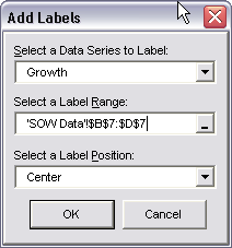
Finally the Growth series needs labels. I use Rob Bovey’s Chart Labeler utility, which supplies a missing capability in Excel: the utility allows you to enter labels into a range of cells, then apply these custom labels to a chart series. When you install this utility, it adds a Chart Labels command to the Excel Tools menu. Choose the Add Labels submenu command, select the appropriate options, and the selected series gets its labels.

The near-finished panel chart is shown below. The SOW Count and SOW Revenues are shown in separate panels so the behavior of each can be observed without one series and its axis scale interfering with the others. Not only revenues, but also year-to-year growth of revenues, are clearly displayed.

The horizontal gridlines serve the same purpose as the Y axis tickmarks, so the tickmarks can be removed.


Ray says
I don’t know how the SOW Count correlates to the SOW revenue, but as a finance guy, I don’t like it, when “sold units” (what I suspect the SOW count to be) grow over 180% and revenue grows only 96% (2007 to 2008)
I think it would be good to show the same chart for the count as well
Jon Peltier says
Ray –
I thought of that too, but I was using figures given to me.
I looked as SOW as “Statement(s) of Work”, meaning the number of projects with negotiated deliverables. I figured that the difference in growth of Count vs growth of Revenue meant that instead of fewer larger projects for fewer clients, the company was pursuing a larger number of smaller projects. While the revenue per unit is declining, spreading work over more clients reduces overall risk, that is, one client leaving has a reduced effect.
The revenue per count is decaying exponentially, and if I fiddle with the numbers very unscientifically, I can make a case that revenue per count is asymptotically approaching a level of $6000. Not knowing anything about the numbers I started with, I can oly guess what it means.
adel leng says
Good post ! I was fascinated by the info – Does someone know where my company would be able to locate a fillable a form example to edit ?