In Using Colors in Excel Charts I discussed a lot of details about Excel colors, predominantly in Excel 2003, and specifically with charting in mind. I mentioned the Color Brewer, a neat little utility for selecting colors and designing color palettes. In ColorBrewer2.org Mark Harrower of Axis Maps announced Color Brewer 2, which updates the 8-year-old Color Brewer (that’s 56 in dog years, and 80 in web years, as Mark says). The new tool is available at ColorBrewer2.org.
After my earlier article about chart colors, I used a ColorBrewer-derived palette in Excel 2003. At this point, though, I’ve decided I’m not terribly fond of this palette: the colors are fine together, but they are not the “pure” colors I’d like. The red has an orange tinge, the green is shaded somewhat towards blue, the blue is a bit purplish, etc.
So I’ve changed palettes to be more in line with the colors that one would expect to find, as set forth by Stephen Few.
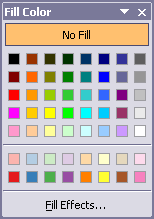
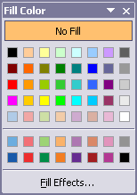
Here are the default Excel palette, my previous palette, and my current palette. Notable changes are the evolution from Excel’s unattractive default charting colors in the bottom two rows of the palette, to the ColorBrewer derived colors, to the Few inspired colors. In the earlier custom palette (center) I also lightened up some grays in the right column of the palette, and also changed the green color (fourth tile in the third row) to something more visible. I replaced some default colors from the fifth row of the palette with the lighter versions of the Few inspired colors, so I moved these replaced colors to the top row, where the default colors are all too dark to distinguish (though I may decide to bring back the brown color).
 – – –
– – –  – – –
– – – 
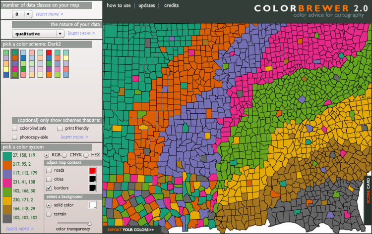
Here is the ColorBrewer2.0 screen for the colors in my earlier palette. Compare the bottom row of the center palette above to the column of colors in the bottom left of the ColorBrewer screen.
And here is an excerpt from Stephen Few’s white paper Practical Rules for Using Color in Charts where he talks about colors. I’ve used Few’s darkest set of colors (middle row) for my dark chart colors, I’ve lightened his medium-dark colors (top row) somewhat for my chart fill colors, and I’ve added highlighting colors which are slightly darker than his light colors (bottom row).

Why am I still worrying about the Excel 2003 color palette? I suppose I should start using Excel 2007 more, especially since the release of the Excel 2010 beta is imminent. But I have not yet become comfortable in Excel 2007, especially for charting, so I would just as soon use 2003. I will keep using 2003 for my chart images, and if a protocol in 2007 differs by enough to confuse readers, I will then capture whatever screen shots are needed.
If you are thinking about colors for a blog or web page theme rather than for Excel, check out the Color Sceme Designer. It is pretty flexible. Its emphasis is on graphic design colors for web page schemes, not for charting (though the two purposes are related).
Update 30 June 2009
I’ve updated the Palette Chooser utility so it includes the original and adjusted Few-inspired palettes. The Palette Chooser was created in Excel 2003, and should also work in Excel 2002 and 2000. I don’t know whether it will work in Excel 97 or in any flavor of MacExcel, and it is irrelevant to Excel 2007.
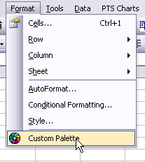
Download and unzip the Palette Chooser zipped workbook. When the file is opened, the Format menu has an added item called Custom Palette; this menu item is removed when the file is closed.
Colors are stored in the Colors worksheet of PaletteChooser.xls. Palettes are laid out in four-column ranges, with the color index, red, green, and blue values for each color to be modified. Follow the same format to define your own color palette, then assign a worksheet-level name to the range containing your definitions. This name is what is listed in the Palette Chooser dialog.
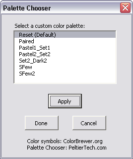
To modify the palette of a workbook, activate it first before selecting the Custom Palette menu item. The Custom Palette command launches the Palette Chooser dialog. The listbox includes a Reset item, which reverts to the palette which was active in the workbook when the dialog launched. The other listbox items are palettes defined by the named ranges containing the color information.
Here are the Set2_Dark2 (my previous palette) and Paired palettes, based on ColorBrewer:
 – – –
– – – 
Here are the Pastel1_Set1 and Pastel2_Set2 palettes, also based on ColorBrewer:
 – – –
– – – 
Here are the original and adjusted Stephen Few-inspired palettes:
 – – –
– – – 


jeff weir says
Color? Luxury. I’m using an old black and white Atari Home Pong console as a monitor. Even worse, as a keyboard too. I can only write comments on blog posts by slowly scrolling through the alphabet using nothing more than the up/down motion of the joystick, and one red input button. It’s so slow, that by the time I’ve finished writing a sentence, I’ve forgotten why I started it. And then I forget what I wrote already, cause the Pong console only displays 30 at a time. Color? Luxury. I’m using an old black and white Atari Home Pong console …
dermotb says
nice post, Jon
Jon Peltier says
Jeff – You should at least upgrade to Excel 4.0! That might be the last version that was compatible with Atari.
Thom Mitchell says
And I thought I was stubborn, cheap and rapidly becoming a cranky, old man using Excel 2000. Of course I can still be all those things, but at least Excel 2000 isn’t the immediate give-away! Great post, Jon; thank you!
Excel training says
I have always been frustrated by the lack of colors in Excel. This is a cool utility
Jon Peltier says
Billy –
There’s really been no *lack* of colors in Excel. 56 colors are way more than are needed for most purposes. The problem is that people don’t know how to select an effective palette of 56 good colors. Even if they know how to use Tools – Options, the average user is hard-pressed to come up with anything much better than the default color palette. This is a gap which resources like ColorBrewer and Stephen Few’s books and white papers fill very well.
General Ledger says
When dealing with colors, please keep in mind that your client/user may be color blind (like me).
Fortunately I am not completely color blind but do have trouble between certain colors. I hate it when the weather man shows maps of swirling colors and says the area of green is clear but red is stormy. Which area is which color?
Other formatting schemes are much more universally recognized such as stripes, checker board, and poka dots, all using black and white of course.
Andreas says
Jon,
Have you had a chance to use the Tamer colors?
https://peltiertech.com/bonavista-releases-chart-tamer/
Maureen Stone (a color expert who designed the colors for Tableau) designed a color palette for Chart Tamer. She used Stephen Few colors (the ones you use in your color picker tool) as a Starting point and created a set colors tables.
Maureen published a nice PDF file where she describes the process of creating the Tamer colors:
http://www.stonesc.com/Vis08_Workshop/slides/Chart%20Tamer%20Colors.pdf
Andreas
Jon Peltier says
Actually, I have that in the back of my mind, but I usually don’t implement it. ColorBrewer does have a colorblind-safe setting, and I’ve come across other web sites that let you submit a palette or image and it will show how it appears to people with various color deficiencies. I should see how my palette sizes up. That’ll give me a topic for another blog post.
Jon Peltier says
Andreas –
I did try out the Chart Tamer, and I did like the colors it uses. The interface was a bit awkward, at least at first, though compared to any version of any Office application it was totally excellent.
One thing that bothered me about the Chart Tamer was the way it applied its color palette without sufficient warning. In general it’s not such a bad thing. However, if I had designed a corporate palette to match the logo of a client, this color scheme was likely to be wiped out by the Chart Tamer’s palette. Even if it were not obliterated, the colors would probably have to be assigned to different color index values, so any affected workbook would have to be recolored.
While this is not really a fault of the Chart Tamer, it was enough of a problem that I decided to uninstall it.
Mike Alexander says
This is very slick Jon.
“it is irrelevant to Excel 2007”
I’m pretty sure even in Excel 2007, the [ColorN] custom number format option still uses the 56 color index. This would help in changing that index spectrum.
So it’s not completely irrelevant. But I get your meaning.
Jon Peltier says
What’s irrelevant is the thought that you can control the 56 color legacy palette in 2007. It seems that Excel 2007 takes every opportunity to revert to the default palette, and there is no way in the UI to adjust the palette colors.
DaleW says
Jon,
I’d probably have used your Palette Chooser and/or the BonaVista utility toolbar(s) and/or the Color Brewer palettes routinely with Excel 2003 if they were compatible with my personal macros dating back to at least Excel 95 to format input cells and shapes my preferred ways — macros which need to work with default color indices. Especially a light yellow, which is 19, right?
It finally dawned on me that another perfectly adequate light yellow, NOT from the default fills, uses index 36. You’d been teaching the merits of changing the default fills and marker colors and leaving most of the other colors alone in classic Excel, and I hadn’t integrated that with how I use Excel . . . until today. Better later than never?
Jon Peltier says
Dale –
I also change the grays in the Excel 2003 color palette to lighter shades, and make the dark green a little less dark. Working with colors in 2007 is much easier and much harder all at the same time. It’s easier because you can choose any color, whether it’s in your theme or not. Harder because you can’t globally change a customized color by simply changing the color assigned to a color index.
DaleW says
Jon –
Alas, my perfect light gray for drawing subtle gridlines on the screen was invisible on my printer!?
I’m now using a lite version of your SFew2, where only your 21 most safely modded color indices vary from classic Excel defaults. It’s refreshing not to have any more chart series (barely) show up as yellow by default.
Thanks again for providing the Palette Chooser utility.
Umar Farooq says
Hi Jon,
I am facing a strange problem in Excel 2007. Though i realize after reading some of your posts that you are not a big fan of Excel 2007 but still i know that nobody else can resolve this problem.
Problem Statement : I have around 10 worksheets in an Excel 2007 workbook. Each worksheet contains a table of fiscal data, based upon which a chart has been created on each worksheet. I have applied “Style 2” to all charts for the sake of consistency. Now the problem is that on first two worksheets the color appear okay, as per the style. But in the later 8 worksheets, the colors appear very dim as if there was a sort of ‘transparency’ or some thing over it, which is blocking original colors to be displayed.
I have tried many options such as customizing styles, playing with colors, deleting / recreating charts, etc, but every time the exact same thing happens that after first two worksheets, the charts show dim colors, no matter what you do.
Thanks in advance. Any help would be greatly appreciated.
Regards,
Farooq
Matt B. says
I had 4 sets of 12 colors (Hues 0 (red), 29 (orange), 43 (yellow), 56 (chartreuse), 85 (green), 114 (teal), 128 (cyan), 142 (azure), 171 (blue), 200 (purple), 213 (magenta), 227 (coral)). Bright has Lum 128, Sat 255. Light has Lum 213, Sat 255. Dark has Lum 64, Sat 255. And greyish has Lum 149, Sat 128. Then I added on 7 shades of grey (Lums 0, 43, 85, 128, 171, 213, 255) and the 56th color was brown (Hue 29, Lum 64, Sat 128). I never had to change them after that (on the rare occasions when I felt like using something different, I used patterns).
But now I have Excel 2010 and had to make my palette as 9 sets of six (every set includes black and white). I think my work computer has Excel 2007, and if I switch sets, it changes colors that were chosen from the old set to the corresponding colors of the new set. It’s frustrating, because that means I either have to restrict myself to 8 colors, or generate every color I want to use–using “More colors…”–every time I open the file.
Brian Adams says
Jon,
I used the macro to change the default colors. The new colors show up on the color palette but when I make a chart I get the same old default colors. Is there some other setting I need to change? I’m using Excel 2010 on a pc.
Thanks,
Brian
Jon Peltier says
Brian –
This changes the colors on the color palette in Excel 2003 and earlier, but has no effect on colors used in Excel 2007 and later.