I’ve written frequently about panel charts, and I’ve made some simple ones, but I don’t seem to have explained the process in enough detail for people to reproduce them with their own data. This is one of several quick tutorials on easy panel charts.
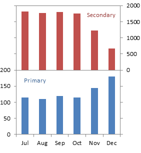
This article also answers the question, “How do I fix a column chart that has some series on the primary axis and some on the secondary axis?” The problem is that the secondary columns obscure the primary columns. Well, you can offset the columns so the primary ones are no longer obscured, but a far better approach is to offset the series, into separate panels for primary and secondary data.
Let’s use the following simple data for this exercise.
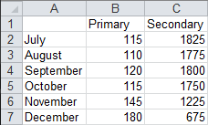
Values for the two data series fall within vastly different ranges, as seen in this column chart.
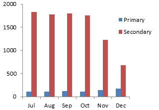
Problems with Primary and Secondary Axis Column Charts
When we move the Secondary series to the secondary axis, we can see all the Secondary points, but only the tallest of the Primary points peek out from behind the shortest Secondary points.
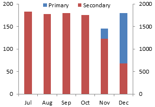
It’s possible to juggle hidden series to offset the primary and secondary data to either side. This doesn’t make the chart any easier to read than the original one-axis-scale chart we started with. Who can figure out, let alone remember, which data should be measured against which axis?
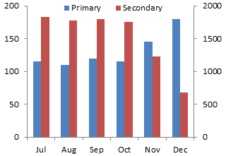
You can play the color-coding game, coloring all the axis labels and legend labels to match the bar colors. And it makes perfect sense to you. But that’s because you made the chart and did all the formatting. Show your handiwork to someone who hasn’t been working with the data, and the color-coded chart is clear as mud. And that’s if you’re showing it to someone with normal color vision.
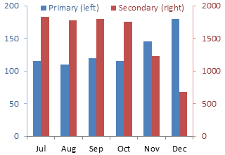
Don’t try to figure out this approach. The chart is just not easy to read.
The Panel Chart, Step-by-Step
Start your panel chart by making a column chart with the data.

Right click the Secondary series, choose Format Series (or similar, it varies with Excel version), and select the Secondary Axis option.

We have primary and secondary Y axes, but only the primary X axis. Add the secondary X axis. In Excel 2007/2010, go to the Chart Tools > Layout tab, click on Axes, and for Secondary Horizontal Axis, select Show Left to Right Axis. In Excel 97-2003, go to the Chart menu > Chart Options, and on the Axes tab, under Secondary X Axis, choose the Category option.

The Secondary series is hanging from the rafters, because the bars reach from the axis, which by default is at the top of the chart, down to the value.
Right click the secondary (right) Y axis, choose Format Axis, and change the Horizontal Axis Crosses setting to Automatic (which means it crosses at zero). In Excel 2007/2010, the secondary axis appears below the primary axis, while in Excel 97-2003, the secondary axis doesn’t appear.

Give the plot area an appropriate line color, so there are lines on all four edges of the chart.
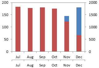
Explanation of Required Axis Formatting
What we want is a chart divided into two panels like the chart below shows. I’ve temporarily hidden the plotted data, but you don’t need to.
The primary axis above spans 0 to 200. To plot the Primary series in the bottom panel, the primary Y axis must span 0 to 200 in the bottom panel, or 0 to 400 overall (the same amount in the top and bottom panels).
The secondary axis above spans 0 to 2000. To plot the Secondary series in the top panel, the primary Y axis must span 0 to 2000 in the top panel, or -2000 to 2000 overall (the same amount in the top and bottom panels). Since the secondary axis crosses at zero, it forms the dividing line in the middle of the chart.
If you have nice data, or if you’re good at algebra, you can pick axis scale parameters that align the axis tick marks on the left and right sides of the chart. The temporary gridlines in this chart show how nicely aligned these tick marks can be.
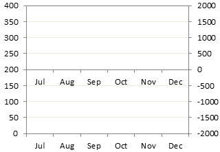
So the Primary series fits into the bottom panel. . .
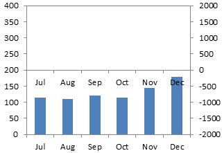
. . . and the Secondary series fits into the top panel.

Apply Axis Settings and Continue
Here is how the chart looks with all of the axis settings applied, and with the data unhidden.
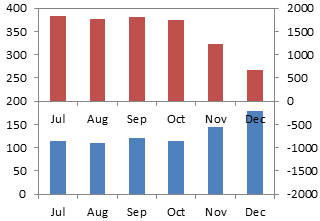
We still need to do some cleanup. The month names in the middle of the chart are redundant, and we only want primary axis labels in the bottom, and secondary axis labels in the top, of the chart.
The unneeded month labels are easy to remove. Right click on the axis, choose Format Axis, and for Axis Ticks and Tick Labels, choose None.
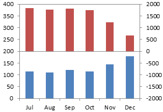
We need to apply some number format magic to the Y axis labels. I’ve written an article about Number Formats in Excel, but there’s room for a quick refresher class.
The secondary (right) axis is easy. We need a format like “0;;0;”. A number format has up to four elements, separated by semicolons. The first indicates what format to apply to positive numbers, the second to negative numbers, the third to zero values, and the fourth to text. A number format of “0” means simply show the numerical value without any decimal digits; “0.0” would mean show one decimal digit, “0.00” two decimal digits, etc. A missing format means don’t show anything. So this format tells Excel to format positive and zero values as whole numbers, and don’t show anything else.
The primary (left) axis is a bit trickier, but we can use simple conditions to turn formats on and off. The format we need is “[<=200]0;”. The expression in square brackets is the condition that sets the format. It says to display any number of value equal to or less than 200 as a whole number, and don’t display anything else. These conditions override the default positive-negative-zero sequence, but we can only apply two conditions, like “[one condition];[another condition];[all other numbers];[text]”.
Right click each axis and choose Format Axis. Select the Number tab of the dialog, click on Custom, and enter the appropriate format into the box (without the quotes). Don’t forget to click the Add button, or Excel will discard your carefully typed format.
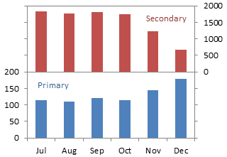
You can stretch the chart if you want more resolution in the Y values.

It would have been easy enough to switch the panels. In the next chart, the primary Y axis is scaled from -200 to 200, and the number format is “0;;0;”. The secondary Y axis is scaled from 0 to 4000, and the number format is “[<=2000]0;”.
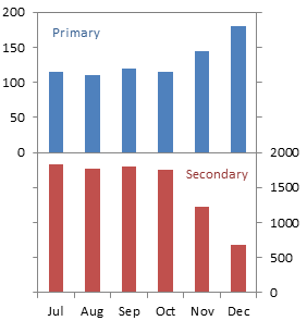
In upcoming articles I’ll show this technique applied to line and horizontal bar charts, but it’s essentially the same protocol, so I’m sure you could figure it out easily.


Andy Kriebel says
Jon,
Thanks for another great tip. I followed your step by step instructions and they worked pretty well, but the one item that really bugged me was having to set the scales manually. How do you handle changes in the data? Do you have to remember to fix the scales each time?
I can see how this chart would be useful as a one off, but wouldn’t it be a pain to maintain?
I wrote something up on my blog in response.
http://vizwiz.blogspot.com/2012/02/how-to-create-two-panel-column-chart-in.html
Thanks again,
Andy
Jon Peltier says
Hi Andy –
Thanks for your response. I’m glad to see some experienced viz people visiting.
I offer this “easy” technique and most of my tutorials for those users of Excel who do not have access to more capable graphing packages. Sometimes an easy technique in Excel takes a lot of steps, but it’s still easier than getting approval from a hierarchy of managers, and it’s better than nothing at all.
Manually rescaling axes is a common problem in Excel. The technique I showed recently for Consistent Axis Scales Across Multiple Charts could be adapted to the axes in this chart. One axis would have a dummy series that included points at ± Y max (for data in the top half of the chart), and the other would have a dummy series that included a point at + 2 Y max (for data in the bottom half of the chart). The axis tick labels in the top half that showed values of zero and greater would work fine. The other axis tick labels would pose a problem. (Of course, I could add a dummy series with points at ticks I wanted to label, with appropriate value data labels.)
m-b says
Great post. An alternative could be creating two charts and then apply the needed formatting and alignment to end up with the same effect. Or are there certain drawbacks to that approach?
Jon Peltier says
M-B –
Yes, this could be done using two charts, and often it doesn’t matter if they are not adjacent to each other. It will actually avoid the axis issues Andy mentioned above, but instead you will find it difficult to keep the two charts lined up.
Haffy says
Genius, Jon! Really clear instructions and a great result. I look forward to the next instalment.
Stephanie Lee says
This is a great technique! I have a follow up question to m-b’s comment: isn’t an alternative to a true two-panel chart to create two adjacent charts with their location on a sheet? What do you mean it will be difficult to “keep the two charts lines up”?
Jon Peltier says
Stephanie –
It is easy to line up the external boundaries of adjacent charts. Hold the Alt key while moving and resizing a chart, and its boundaries will stick to the cell boundaries.
What is difficult is keeping the internal edges (the plot area and the axes) of adjacent charts aligned. As data changes, more or less room may be required for axis tick labels, and Excel modifies the plot area, keeping the overall chart itself a constant size.
m-b says
A ‘trick’ I use is to set the sizes of the charts a little bigger than needed and then line up the plot areas holding the Alt key leaving enough room for changing labels. That way they usually stay aligned.
Jon Peltier says
M-B –
When you hold the Alt key, you are not aligning the plot area, the rectangle which is defined by the axes and which contains the plotted points. While moving or resizing the plot area within the chart area, the Alt key has no effect.
m-b says
@ Jon; I started doubting myself after your comment and apparently it doesn’t work in 2003 but is does in 2007 (and therefore probably in 2010 as well?). Works for legends, titles etc. as well.
Jon Peltier says
M-B –
Well, what do you know. I never noticed that behavior, but I guess I never even expected it. Something that was changed in 2007 charts which was an improvement. Very cool.
Every day I learn a new trick is a day not wasted. Thanks for your persistence.
kb says
I have tried using your tutorial to create a panel chard but when I select my secondary series and move it to a secondary axis my first data series disappears. Advice?
Jon Peltier says
Hi KB –
Could you describe the data?
Simon says
Mr.Jon,
I need to make a chart for a large range of data with higher and smaller values.
The no of rows are around 129 and 2 columns. the value ranging from 100 to 500M.
I try to use your method but not able to include everything in one chart.
Jon Peltier says
Simon –
You don’t say what the difficulty is. I presume it’s a matter of selecting appropriate axis limits for the two panels. In the upper panel, the limits are a high large enough to show all of the data and a low equal to the negative of this. In the lower panel, the limits are a high twice what is needed to show the small values you need to show and a low of zero.
Janne says
“Don’t try to figure out this approach. The chart is just not easy to read.”
This is exactly what I’m trying to do now, cause this is precisely what I need. I only have four bars, two per axis so it makes more sense to make the bars stand next to each other. But I am unable to unstack them, I don’t know how to do that.
Can you help?
Many thanks
Eva says
This is a GREAT post!! In fact, I refer to your posts regularly and they have been very useful, thank you!
I am however encountering a problem is a two panel column chart.
I have been able to follow all the steps and have now made my way to formatting the promary and seconday value axis.
I have had NO trouble formatting the secondary (right) axis, although the left axis does not work, despite typing the correct custom condition. It continues to span the whole left axis (ie from bottom all the way to the top).
My left axis data ranges from 0 to 190, so I can’t see any reason why it does not accept [<=200]0;
Any ideas?
Jon Peltier says
Eva –
It shouldn’t matter, but try
[<=200]0;;;
Jones says
Jon
It’s very helpful. I would like ” to juggle hidden series to offset the primary and secondary data to either side” like what you have done (Chart 4 from the Top). Could you show me step by step how to do it?
Jon Peltier says
Jones –
It’s a tricky technique that results in a hard-to-read chart. That’s why I didn’t show how to do it.
Hassan says
Great Job well done!!!
Siti says
Thank you. Very helpful.
Heather says
Hello,
I’m with Janne! I also need to figure out how to offset the primary and secondary axes, please help!
George says
Great post. Thanks.
Peter Sandiford says
Hi Jon,
How would you create a panel chart with log scale on y axes, and error bars?
Regards,
Peter
Sarah says
Thanks for the tutorial. I had a bit of a hard time completing this step:
We have primary and secondary Y axes, but only the primary X axis. Add the secondary X axis. In Excel 2007/2010, go to the Chart Tools > Layout tab, click on Axes, and for Secondary Horizontal Axis, select Show Left to Right Axis. In Excel 97-2003, go to the Chart menu > Chart Options, and on the Axes tab, under Secondary X Axis, choose the Category option.
in Excel 2013. The solution, for anyone else in the same situation is to:
Click on the chart
Click the plus sign that pops up on the right,
Hover over ‘Axes’ and press the arrow
Select Secondary horizontal.
Michael says
How do you format the number to accounting format on the primary axis when filtering? For example, [<=1000000]0; returns 1000000 to 0, but I want the number format to look like this: $1,000,000 to $0.
Jon Peltier says
Michael –
Do you want a dollar sign, and the millions to be removed? Try this:
[<=1000000]$0,, where each comma cuts off three zeros.
Michael says
Jon, no I want the $ sign and commas to stay. Right now, using your formula of [<=x]0; removes all $ signs and commas. I want them to stay as a lot of my graphs measure dollar amounts.
Jon Peltier says
[<=1000000]$#,##0;;; The dollar sign in the format code places it before the number, the comma in the hash signs means use a comma as thousands separator if there are enough digits to need one, and let's not forget the three semicolons to use nothing if the value to display is greater than the amount in the square brackets.
Michael says
Woohoo that worked! Thank you so much, Jon!
Michael says
Now what about the right side? If I wanted to get rid of negative numbers, but retain the dollar signs and commas. How do I do that?
Michael says
Nevermind. I’ve actually figured it out. It would just be [>=0]$#,##0;;;
Thanks again! That’s been driving me nuts.
marvin says
Hi John
Is it possible to set the number format with vba, e.g. if cell A1 of active sheet contained the minimum value of the top panel?
Have tried:
but it returns run-time ‘438’, “object doesn’t support this property or method”
thanks
Jon Peltier says
Marvin –
Try this and tell us which line fails:
Zak Naz says
Dear Jon,
Can you show how to use the panel chart to produce a waterfall chart?
I am trying to plot the initial budget value and final forecasted budget in hundred millions, while the incremental variations in thousands.
Jon Peltier says
Zak –
When I make a waterfall chart, I usually need primary and secondary axes for the various pieces of the waterfall. May not be necessary, but it makes the construction easier. The panel chart described here also needs both primary and secondary axes. This causes a conflict if you ened the waterfall to go into a separate panel from whatever else you’re plotting.
Sarah Gatti says
I’ve made the chart but now the data on the primary and secondary horizontal axis are not aligned. The bars on the primary axis are wider than the secondary axis. Is there a way to fix this?
Thanks!!
Jon Peltier says
Sarah –
Most likely the two series have a different gap width, because they are on different axes. Select one series, press Ctrl+1 to open the Format Series task pane, and note the gap width. Repeat for the second series, applying the gap width used by the first.