It’s been a busy week, and I haven’t had time to write any new posts. However, in a comment to VBA Conditional Formatting of Charts by Value, Dean asked how to conditionally format points in an XY chart according to which quadrant they fall in, where the quadrants are determined by the mean X and Y values. Rather than writing a long comment in response, I decided to write a short post.

Of course, you can format any chart’s data points with VBA, according to any conditions you want. But some things are easier to do and less complicated to maintain if you use Excel’s built in worksheet functions. I have covered worksheet-based conditional formatting of charts in Simple Conditional Charts and Simple Conditional Charts – 2. But it’s good to write up more examples of suitable formulas to match the formatting criteria, to help people see when they can use this technique.
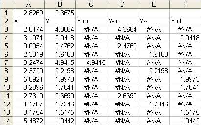
To illustrate my answer to Dean’s question, I generated the following data. Columns A and B have the original X and Y data, which I sampled from normal distributions. The mean values for X and Y are computed in A1 and B1. Columns C through F contain the Y values for each of the quadrants, determined by a simple set of formulas.

The formulas in C3 through F3 are as follows, and are filled down to row 14:
C3: =IF(AND($A3>=$A$1,$B3>=$B$1),$B3,NA())
D3: =IF(AND($A3<$A$1,$B3>=$B$1),$B3,NA())
E3: =IF(AND($A3<$A$1,$B3<$B$1),$B3,NA())
F3: =IF(AND($A3>=$A$1,$B3<$B$1),$B3,NA())
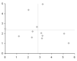
Here is a chart of the original data, using A2:B14 as the chart’s source data range:

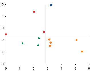
Here is the chart showing the data by quadrant, with one series per quadrant, using column A for all X values and columns C through F for the Y values of the four series:

More Peltier Tech Articles About Conditional Formatting of Excel Charts
- Conditional Formatting of Excel Charts
- Invert if Negative Formatting in Excel Charts
- Conditional Donut Chart
- Highlight Min and Max Data Points in an Excel Chart
- Split Data Range into Multiple Chart Series without VBA
- Conditional Formatting of Lines in an Excel Line Chart Using VBA
- VBA Conditional Formatting of Charts by Value and Label
- VBA Conditional Formatting of Charts by Series Name
- VBA Conditional Formatting of Charts by Value
- VBA Conditional Formatting of Charts by Category Label


Dean says
Thankyou very much for your help Jon, unfortunately, as useful as it may be in the future, for this particular project the data labels for each individual point were needed to feed through, and the gains in having automatic colouring would be lost by assigning labels by hand…
Jon Peltier says
If you can use separate series for formatting of markers, you can also use a separate series without any markers which has the custom labels applied to it.
I hope you’re not applying these labels by hand. Rob Bovey has written an add-in that helps you do this automatically. It’s free from the Applications Professionals web site.
Dean says
Seperate series without the markers was the key! you are an excel genius!!! thankyou very much for your help!!!
Mike Alexander says
Nice one Jon. Definately useful here on my side of the world.
Bob says
Jon is like Elvis Presley of Excel. The King…
Jeff Weir says
And he often goes on the famous Excel crash diet!
frederikf says
How did you add the mean values as a “crosshair” in the center of the x y scatter chart?
Jon Peltier says
Frederik –
I used a series with one point, whose coordinates are the X and Y mean values. The point has custom error bars with values calculated to extend to the limits of the plot area.
Matt Healy says
I’ve cooked up an interactive spreadsheet that demonstrates some of these and other tricks; in my work I do this a lot but of course I cannot use proprietary data for a public blog so for this example I used some international population data from the US Census website: http://mdhealy.home.sprynet.com/WorldPopulationInteractiveEstimates.xls
Have fun, you can do whatever you want with this but drop me a line (mdhealy at sprynet.com) to let me know what you think.
JIJO THOMAS says
Hi Jon,,
need Urgent Help.
I work as a Media Planner in an advertising Firm, therefore my entire day is spent on Excels n Ppt’s.
I am facing a situation here, where in I have to plot a 4 quadrant Graph With only 2 columns .
Column A being BRAND Spends
Column B being GRP’s.
I am aware of the fact that we use a XY scatter graph to plot the same, but for that I need values In a range of -10 to 10 for eg.
But in my case the Spends can never be Negative and hence I am facing a Problem of plotting the graph in the suitable manner.
The Idea is to show relative Brand Spends in a category Vs the GRP’s acheived ( Viewership on TV), the X -axis being High Spends & low Spends
whereas the Y axis being HIGH GRP’s & LOW GRP’s.
For eg brand A Spends 200 Million & acheives 1500 GRP’s to be plotted as Brand With Low Spend- High Grp’s
whereas Brand B spending 600 Million & Acheives 900 GRPs to be Plotted under the Quadrant High Spends-Low GRP’s…
The Problem is how to Fix the range??
cris says
Hi,
This is really helpful for applying the conditional formatting based upon either X or Y value.
But is it possible to add colour code according to a Z value (i.e. X&Y define position and then use Z to determine the colour)?
Thanks
Jon Peltier says
Cris –
You can use anything for your conditional formatting that you can write a formula about.