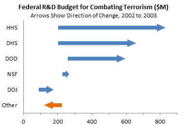
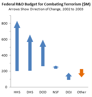
On her Effective Charts blog, Naomi Robbins presents the Arrow Chart as an improvement over the use of two pie charts to show how a set of values changes between one point in time and another. Here is an example of an arrow chart, showing anti-terrorism funding levels for 2002 at the base of the arrows and for 2003 at the tips of the arrowheads. While showing the values for each year, the arrows strongly emphasize the change in the values.
Here is the typical arrangement of dual pie charts. The reader is forced to spend a great deal of time moving back and forth between the pie on the left, the pie on the right, and the legend in between. Despite this investment of time and effort, the huge growth of the three largest components of funding is not obvious.
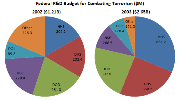
Some might “improve” on this arrangement by scaling the diameter (or rather, the area) of the pies to reflect the sum of each year’s funding. But I think this merely adds confusion. I don’t think the pies improve at all on a simple table of the funding levels.
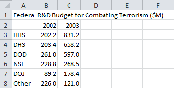
Making a Simple Arrow Chart
An arrow chart is basically a floating bar chart, but the bars are replaced by arrows to emphasize the direction and amount of change. The data below shows the additional columns used to make a floating bar chart. The column Blank indicates where the floating bars should start, and it is simply the minimum of the 2002 and 2003 values for that row. The decrease column shows the difference between 2002 and 2003 if the value decreases in 2003, otherwise it shows zero. The increase column shows the difference between 2002 and 2003 if the value increases in 2003, otherwise it shows zero. I’ve applied some simple conditional formatting to the increase and decrease column for my own benefit while constructing the chart.
In formula lingo:
D3: =MIN(B3,C3)
E3: =MAX(0,B3-C3)
F3: =MAX(0,C3-B3)
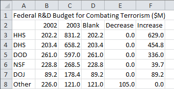
Fill the formulas down as appropriate.
To make the chart, select A2:A8, hold Ctrl while selecting D2:F8 (so both areas are highlighted), and insert a stacked bar chart.
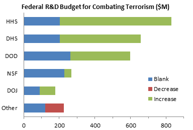
To make it into a floating bar chart, simply format the “Blank” series to be blank, that is, no border and no fill. This chart shows the 2002 and 2003 values well enough, but the arrows really emphasize the direction of change.
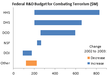
Orange and blue are better choices for plus and minus (or good and bad) than red and green, because red and green are indistinguishable by those who have the most common color vision deficiency.
Create one arrow by choosing Insert tab > Shapes, selecting a suitable arrow shape, and drawing the arrow in the worksheet (not in the chart). Format this arrow: I made it with no border and a blue fill. Create the other arrow by duplicating the first (select it and use Ctrl-D, or just copy and paste it), flipping it horizontally, and changing the fill to orange.

To get these arrows into the chart, copy the blue arrow, select the “Increase” series of bars, and use Ctrl-V to paste the shape into the bar. Repeat with the orange arrow and the “Decrease” series.
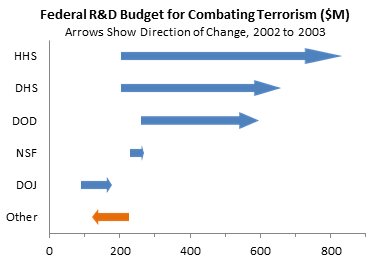
This is a nifty trick to embellish your charts. If you copy a shape, select a bar or area, and paste, the pasted shape fills the bar or area. In a bar (or column) you can set the repeat of the shape, so for example, one apple in a bar chart represents one bushel of apples in the data set. If you copy a shape, select a marker, and paste, the shape takes the place of the marker in a line or XY chart. If you do this with a bubble in a bubble chart, the shape fills the bubble, changing size as the bubble changes size.
If you select an entire series, the pasting is applied to all points in the series. If you select just one point in a series (which takes two single clicks), the pasting is applied to just the selected point.
Be careful with this trick, as it can be overused and abused, resulting in an unreadable chart.
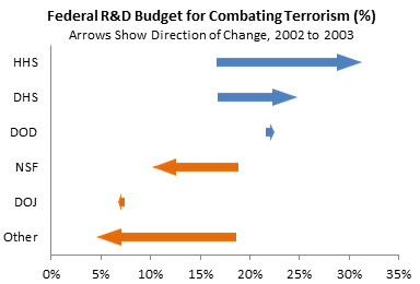
The arrow chart above shows the funding levels and changes in funding, but it can just as easily show percentages.
Making a Compound Arrow Chart
The arrow charts above are pretty effective, but we can improve on them. Notice how the arrowheads are all different. When the arrows are pasted into the bars, they stretch to fill the bars. This means the longer bars have longer arrowheads, while the shorter bars have scrunched arrowheads. We can’t do much about the very short bars, but we can make arrowheads the same size on all but the shortest bars. All it takes is formulas.
Here is the adjusted data. Instead of two floating bars (increasing and decreasing), we’ll use four. When the value decreases we’ll show Left Arrowhead and Left Arrow, and when the value increases we’ll show Right Arrow and Right Arrowhead.
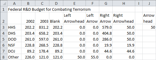
Okay, here are the formulas:
J3: Default Arrowhead Length (in same units as axis)
D3: =MIN(B3,C3)-IF(B3=C3,$J$3/2,0)
E3: =IF(B3>C3,IF(B3-C3>2*$J$3,$J$3,(B3-C3)/2),IF(B3=C3,$J$3/2,0))
H3: =IF(C3>B3,IF(C3-B3>2*$J$3,$J$3,(C3-B3)/2),IF(C3=B3,$J$3/2,0))
F3: =IF(B3>C3,B3-C3-E3,0)
G3: =IF(C3>B3,C3-B3-H3,0)
E3 and H3 set the arrowhead size. The arrowhead will never be more than half the entire arrow length, so if the total floating bar is more than twice the default arrowhead length in J3, we’ll use the default arrowhead size. Otherwise we’ll use half the total arrow length for the arrowhead. You can fine tune your arrows by changing the default arrowhead length in J3 after you’ve made the chart.
F3 and G3 merely subtract the arrowhead size from the entire bar length to get the length of the shaft of the arrow.
The $J$3/2 in D3, E3, and F3 was added to provide a small down and up arrowhead in case a category’s value was unchanged. See comments for a short discussion.
Again, fill the formulas down as appropriate.
We also need to do some magic with the arrows. Here is a freshly drawn arrow, with no border and a blue fill:

There are two “handles”, those yellow diamonds. Dragging them with the mouse edits the shape of the arrow. The handle on the left end of the arrow modifies the width of the arrow’s shaft, while the handle at the edge of the arrowhead changes the relative size of the arrowhead.
We want the shaft to be all arrow and no arrowhead, so drag the arrowhead handle all the way to the right. This gives us a shaft which is only part of the width of the bar it will fill.

We’ll use a simple triangle for the arrowhead. Draw an isoceles triangle and rotate it to the right.
Then copy the two shapes, flip them horizontally, and change the fill to orange.

Select A2:A8, and hold Ctrl while selecting D2:H8, so both areas are highlighted. Insert a stacked bar chart.
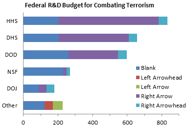
Make the “Blank” series invisible by formatting it with no border and no fill. I’ve also color coded the increasing (blue) and decreasing (orange) bars, with the arrowheads a darker fill than the shafts. Don’t bother doing this on your chart, it’s only for this explanation.
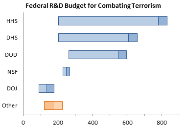
Copy the blue arrowhead, select the “Right Arrowhead” series, and paste. Copy the blue arrow shaft, select the “Right Arrow” series, and paste. The blue increasing arrows are done.
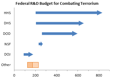
Copy the orange arrowhead, select the “Left Arrowhead” series, and paste. Copy the orange arrow shaft, select the “Left Arrow” series, and paste. Now all of the arrows are done.

Alternatives to an Arrow Chart
The arrow chart is a great way to show how a set of values has changed from one time to another, while strongly emphasizing the direction and magnitude of the change.
Depending on the needs of your analysis, there are other ways to present the same data. It may not hurt to have some alternative charts on hand.
We’ve already seen the dual (or dueling) pie charts, which really isn’t better than any of the alternatives.

Here is a dot plot that shows the same values as the arrow chart. While the arrow chart emphasizes the changes, the dot plot emphasizes the values at the endpoints, without obscuring the changes.
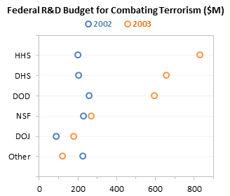
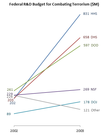
Because of extreme foreshortening of the arrows in the arrow chart, or because of overlapping of points in the dot plot, it may be difficult to resolve categories which are relatively unchanged. In a slope graph (below) all values are shown at both time points. The change is indicated not just by the position of the endpoints along the value (vertical) axis, but also by the slope of the connecting line. Values which are relatively unchanged are represented by nearly horizontal lines, but neither endpoint is obscured. Of course, lines may converge at the endpoints, as the pairs HHS & DHS and NSF & Other do in 2002.
As always, you must consider your audience, your data, and your message when deciding which chart type(s) to use.
Alternative Arrow Chart Method
I’ve developed another approach to making arrow charts. This new approach uses a stacked bar chart with error bars to construct the arrows. The error bars are formatted with arrowheads and dots on their ends.
To see this approach, visit the Arrow Charts in Excel tutorial.


Tamoghna says
Without Peltier Tech Blog, I feel something missing from my life.
Propeller Island says
Thanks, this was very helpful. I’ve been trying to solve the problem of stretched arrowheads myself, without much success. Next step: the arrow waterfall chart.
Andy Cotgreave says
Nice work Jon. I did the same in Tableau – it’s not straightforward there, either!
http://community.tableausoftware.com/message/181732#181732
Jon Peltier says
Follow-Up: Arrow Charts Sorted by Final Value and by Initial Value
Sorted by Final Value
Sorted by Initial Value
Jon Peltier says
Follow-Up: Vertical Arrow Charts
There’s no reason you can’t use vertical arrows in one of these charts. The protocol is nearly identical, using stacked column charts instead of stacked bar charts.
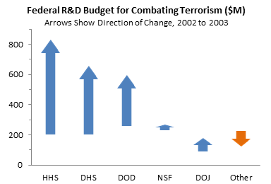
It may look better if you switch the aspect ratio of the chart.
bill says
i haven’t tried it, but it seems to me this would be easier to do using an x/y plot type graph and then using the error bars as the graphic element. Arrow head end-caps are a feature of the error bar line. the size of the error bar line can be in absolute or relative. might also work for the waterfall graph. i certainly do agree that pie charts are one of the more useless chart types ever.
Gerard says
I have made a little adjustment to a single formula.
In case the values in column B, C are equal the formula presents the value from J3 as a result
H3: =IF(C3>B3,IF(C3-B3>2*$J$3,$J$3,(C3-B3)/2),IF(C3=B3;$J$3;0))
The arrowhead for addition (right arrowhead) is then presented in the graph.
Marco says
It was a very helpful post, but I can’t avoid some white spacing between the arrows and the harrowheads… does anybody have a clue about it? I’ve already tried to set the border to “none”, but it doesn’t help…
Thanks in advance!
MZ
Jon Peltier says
Gerard –
That’s a good point. My original chart would not show anything if there was no change, so you wouldn’t know the value for either year. In this chart I’ve included a new category, Test, with 2002 and 2003 values of 250. There’s no sign of the values anywhere.
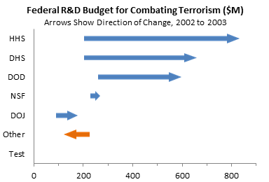
However, your approach is only halfway there. Showing a positive arrowhead implies an increase.
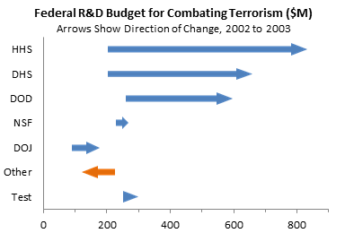
Let’s take the same tack with the negative arrowhead as well. Also, let’s use half the arrowhead length.
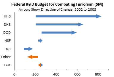
Now the chart shows an ambivalent double arrow at the point of no change.
Jon Peltier says
Marco –
Make the arrow shaft longer, as long as the chart is wide. Sometimes there are edge effects if a shape is stretched a lot to fill a chart element.
Make sure all the shapes (arrow shafts and arrowhead triangles) have no border, which is the border I assume you’ve removed.
Make sure the bars have no border before you paste the shapes onto them.
Now repeat the copy shape, select bars, paste.
Martin says
Jon,
as always, this one was already printed out and stored in my Excel Black Book of Magic !
I used part of this technique to add the variance respect the previous period to a set of info on a Market share (Source:http://www.opswat.com/about/media/reports/antivirus-june-2012). I created a bar chart with the current share and the variance, moving this last series to the secondary axis. Then, playing around a little bit with scales and shapes, ended up with a nice chart, that in a single view, and with no axis shown, tells the story clearly.
Thanks again for sharing your wisdom. !
[I modified the chart slightly, mostly shrinking it to fit the column of text. -JP]
Gerard says
Jon,
Thanks for your reply and adjustment.
It was already looking great but its even better now.
regards
Gerard
Marco says
Jon,
I’ve just tried again. It’s a little bit better now, but the spacing is always there, although very little.
I’ve also tried with small numbers (there were 7 digit numbers), but it doesn’t seem to help.
I’m wondering what’s wrong with my Excel 2007, or with me! :-\
Sandra says
Marco, I had the same problem initially – check that your arrow shapes are rotated to exactly 90° and 270°. It’s a bit fiddly to do manually, you can do it by right clicking on the shapes then choosing “size and properties”.
Jon, thanks for the chart & directions, looks great & very useful
Cheers
S
Mike Solinas says
I tried this tutorial, but my y axis is backwards (Other at the top, HHS at the bottom).
What am I doing wrong? Any fixes?
Mike
Mike Solinas says
Never mind – got it.
Using Excel 2010. Looks like the arrow heads stretch as well.
Josh Scoville says
Very cool, I’ve been looking for a way to do this for a while! But does this not work in cases where you have both positive and negative values? For example, I’ve got a case where the starting value is -0.4 and the ending value is +0.5 and it ends up looking like the starting value is 0 and the ending value is 0.9?
Jon Peltier says
Josh –
Floating bars don’t span positive and negative values. They can only go on the positive or negative side. You can get around this for the arrow chart by plotting everything on a secondary axis, with values shifted so they’re all positive, and then set up the primary axis to display the actual (unshifted) numbers. When I get a chance I should write about it.
Josh Scoville says
Thanks Jon. I was able to do each arrow manually using different parts of the stacked bar for different pieces of the arrow as such:
If the value started negative and ended negative but the value increased over time, blank became the ending value, decrease became the starting value, increase was set to zero, and I copied the up arrow onto the decrease bar, blanking everything else out;
If the value started negative and ended positive, blank became starting value, decrease was set to zero, increase was set to the ending value, and I copied a non-tipped arrow onto the blank bar and a tipped arrow onto the increase bar;
If starting positive and ending negative, blank became ending value, decrease became beginning value, increase set to zero, and pasted non-tipped arrow over decrease bar and tipped arrow on blank bar.
Finally if negative decreasing to another negative, blank set to starting value, decrease set to ending value, increase set to zero, and I pasted a down arrow over the decrease bar.
I’m sure there’s an easier way but that did the job: http://tinypic.com/r/2415tz8/6
Thanks again for your help!
Akrivi says
Hello,
I have two questions related to the above:
1. How can you overlay a line chart series on the arrow charts created above?
2. Is there any way to put data labels outside the bar charts?
Both in Excel 2010
Thanks for your help
Jon Peltier says
Akriki –
1. You probably want an xy chart series. X will be the horizontal values of the points, Y will correspond to height of the points. Select and copy the x and y data, select the chart, and use paste special with the appropriate settings. Select the added series and on the Chart Tools > Design tab, click Chart Type, and select the XY type that matches what you want. You may have to go to Chart Tools > Design tab > Select Data, and make sure the X data you intended is still assigned to the XY series.
2. “Outside”?
Akrivi says
Thank you for you reply and the instructions.
1. I have managed to create a line chart. In addition I need to relay certain upper quartile points in the same chart. Let me explain. A single arrow bar displays the difference from 86% to 82%. I need to also show the upper quartile point of 88% in the same chart. I have managed to create the point with the X Y chart but my problem is that it is not aligned to the arrow bar but sits below it.
In other words I am trying to insert something like the net values in the chart below (used for illustration purposes only):
http://tex.stackexchange.com/questions/64155/pgfplots-need-help-with-complicated-stacked-bar-chart-using-selected-rows-from-d
2. If you try to add data labels to bar charts the options available are: Center, Inside End and Inside Base. I was wondering if there is any way to place labels outside the bar charts as is possible in column charts for example.
Looking forward to your reply.
Kind regards,
Akrivi
Jon Peltier says
Akrivi –
1. The picture you linked to does not clarify your situation. You probably need to plot the quartile value using an additional data series from the data used for the arrow. Part of the problem sounds like you need to adjust X or Y values or primary and secondary axis scales so points in different series line up.
2. Stacked bar and column charts have positions Center, Inside End, and Inside Base. Clustered bar and column charts also has the Outside Base position. You can also use another series with hidden data points to position a label precisely where you need it.