Often you want to add custom data labels to your chart. The chart below uses labels from a column of data next to the plotted values.

When you first add data labels to a chart, Excel decides what to use for labels—usually the Y values for the plotted points, and in what position to place the points—above or right of markers, centered in bars or columns. Of course you can change these settings, but it isn’t obvious how to use custom text for your labels.
This chart is the starting point for our exercise. It plots simple data from columns B and C, and it displays only the default data labels, showing the Y values of each point.

There are a number of ways to apply custom data labels to your chart:
- Manually Type Desired Text for Each Label
- Manually Link Each Label to Cell with Desired Text
- Use the Chart Labeler Program
- Use Values from Cells (Excel 2013 and later)
- Write Your Own VBA Routines
Manually Type Desired Text for Each Label
The least sophisticated way to get your desired text into each label is to manually type it in.
Click once on a label to select the series of labels.
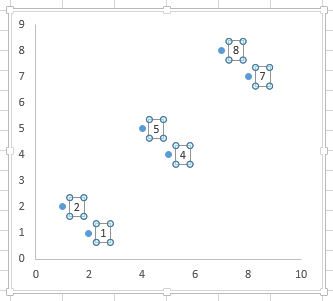
Click again on a label to select just that specific label.

Double click on the label to highlight the text of the label, or just click once to insert the cursor into the existing text.

Type the text you want to display in the label, and press the Enter key.
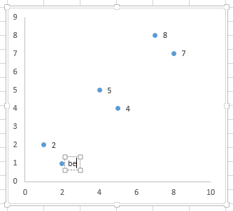
Repeat for all of your custom data labels. This could get tedious, and you run the risk of typing the wrong text for the wrong label (I initially typed “alpha” for the label above, and had to redo my screenshot).
One thing that makes this approach unsophisticated is that the typed labels are not dynamic. If th text in one of the cells changes, the corresponding label will not update.
Manually Link Each Label to Cell with Desired Text
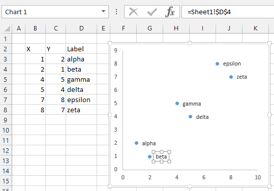
Select an individual label (two single clicks as shown above, so the label is selected but the cursor is not in the label text), type an equals sign in the formula bar, click on the cell containing the label you want, and press Enter. The formula bar shows the link (=Sheet1!$D$3).
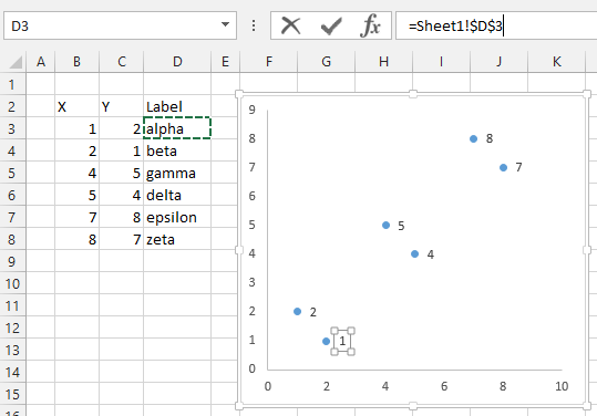
Repeat for each of the labels. This could get tedious, but at least the labels are dynamic. If the text in one of the cells changes, the corresponding label updates to show the new text.
Use the Chart Labeler Program
Brilliant Excel jockey and former MVP Rob Bovey has written a Chart Labeler add-in, which allows you to assign labels from a worksheet range to the points in a chart. It is free for anyone to use and can be downloaded from http://appspro.com. Rob colls it the XY Chart Labeler, but it actually works with any chart type that supports data labels.
When installed, the add-in adds a custom ribbon tab with a handful of useful commands. The tab is added at the end of the ribbon, but being pressed for space I moved it digitally to the beginning.
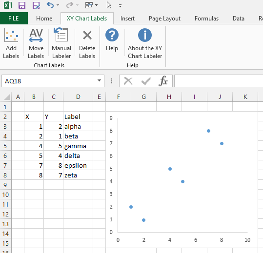
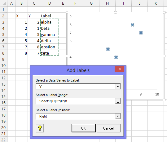
With a chart selected, click the Add Labels ribbon button (if a chart is not selected, a dialog pops up with a list of charts on the active worksheet). A dialog pops up so you can choose which series to label, select a worksheet range with the custom data labels, and pick a position for the labels.
If you select a single label, you can see that the label contains a link to the corresponding worksheet cell. This is like the previous method, but less tedious and much faster.
Use Values from Cells (Excel 2013 and later)
After years and years of listening to its users begging, Microsoft finally added an improved labeling option to Excel 2013.
First, add labels to your series, then press Ctrl+1 (numeral one) to open the Format Data Labels task pane. I’ve shown the task pane below floating next to the chart, but it’s usually docked off to the right edge of the Excel window.
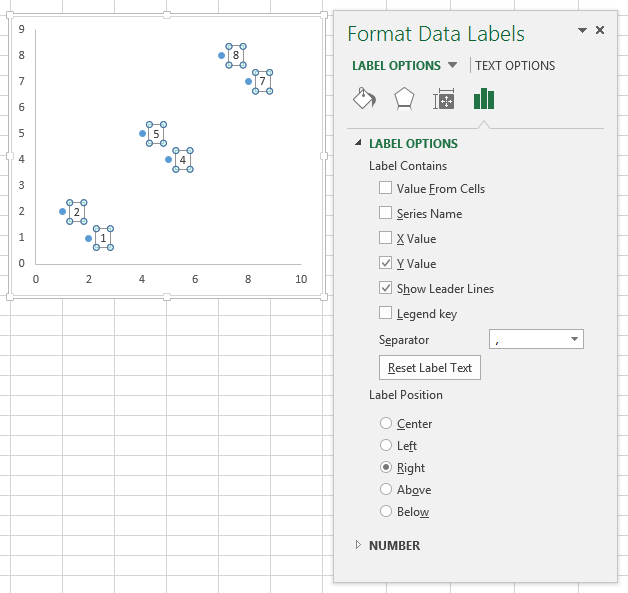
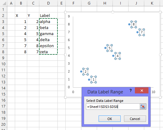
Click on the new checkbox for Values From Cells, and a small dialog pops up that allows you to select a range containing your custom data labels.

Select your data label range.
Then uncheck the Y Value option. I also uncheck the Show Leader Lines option, which is another enhancement added in Excel 2013. Leader lines are hardly ever useful for the charts I make, but many users are happy with them.
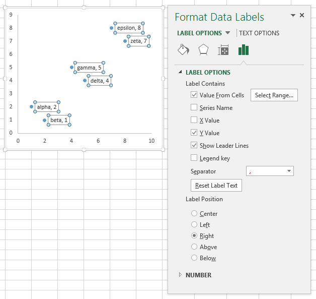
While these data labels are not explicitly linked to worksheet cells as in the previous approaches, they still reflect any changes to the cells that contain the labels.
Write Your Own VBA Routines
I’ve put together a couple little routines that help with data point labeling. These are quick and dirty, because sometimes that’s all that you need. Also, writing your own code allows you to streamline your workflow according to your specific requirements.
Add Data Labels from Range Selected by User
This routine first makes sure a chart is selected, then it determines which series is to be labeled. It asks the user to select a range using an InputBox, and if the user doesn’t cancel it adds a label to the series point by point, linking the label to the appropriate cell.
Sub AddLabelsFromUserSelectedRange()
  Dim srs As Series, rng As Range, lbl As DataLabel
  Dim iLbl As Long, nLbls As Long

  If Not ActiveChart Is Nothing Then
    If ActiveChart.SeriesCollection.Count = 1 Then
      ' use only series in chart
      Set srs = ActiveChart.SeriesCollection(1)
    Else
      ' use series associated with selected object
      Select Case TypeName(Selection)
        Case "Series"
          Set srs = Selection
        Case "Point"
          Set srs = Selection.Parent
        Case "DataLabels"
          Set srs = Selection.Parent
        Case "DataLabel"
          Set srs = Selection.Parent.Parent
      End Select
    End If

    If Not srs Is Nothing Then
      ' ask user for range, avoid error if canceled
      On Error Resume Next
      Set rng = Application.InputBox( _
          "Select range containing data labels", _
          "Select Range with Labels", , , , , , 8)
      On Error GoTo 0

      If Not rng Is Nothing Then
        ' point by point, assign cell's address to label
        nLbls = srs.Points.Count
        If rng.Cells.Count < nLbls Then nLbls = rng.Cells.Count
        For iLbl = 1 To nLbls
          srs.Points(iLbl).HasDataLabel = True
          Set lbl = srs.Points(iLbl).DataLabel
          With lbl
            .Text = "=" & rng.Cells(iLbl).Address(External:=True)
            .Position = xlLabelPositionRight
          End With
        Next
      End If
    End If
  End If
End Sub
Add Data Labels from Row or Column Next to Y Values
This routine first makes sure a chart is selected, then it determines which series is to be labeled. It doesn’t bother the user, instead the routine parses the series formula to find the range containing the Y values, and if this is a valid range, it finds the next column or row, depending on the orientation of the Y values range. The code then adds a label to the series point by point, linking the label to the appropriate cell.
Sub AddLabelsFromRangeNextToYValues()
  Dim srs As Series, rng As Range, lbl As DataLabel
  Dim iLbl As Long, nLbls As Long
  Dim sFmla As String, sTemp As String, vFmla As Variant

  If Not ActiveChart Is Nothing Then
    If ActiveChart.SeriesCollection.Count = 1 Then
      ' use only series in chart
      Set srs = ActiveChart.SeriesCollection(1)
    Else
      ' use series associated with selected object
      Select Case TypeName(Selection)
        Case "Series"
          Set srs = Selection
        Case "Point"
          Set srs = Selection.Parent
        Case "DataLabels"
          Set srs = Selection.Parent
        Case "DataLabel"
          Set srs = Selection.Parent.Parent
      End Select
    End If

    If Not srs Is Nothing Then
      ' parse series formula to get range containing Y values
      sFmla = srs.Formula
      sTemp = Mid$(Left$(sFmla, Len(sFmla) - 1), InStr(sFmla, "(") + 1)
      vFmla = Split(sTemp, ",")
      sTemp = vFmla(LBound(vFmla) + 2)
      On Error Resume Next
      Set rng = Range(sTemp)

      If Not rng Is Nothing Then
        ' use next column or row as appropriate
        If rng.Columns.Count = 1 Then
          Set rng = rng.Offset(, 1)
        Else
          Set rng = rng.Offset(1)
        End If

        ' point by point, assign cell's address to label
        nLbls = srs.Points.Count
        If rng.Cells.Count < nLbls Then nLbls = rng.Cells.Count
        For iLbl = 1 To nLbls
          srs.Points(iLbl).HasDataLabel = True
          Set lbl = srs.Points(iLbl).DataLabel
          With lbl
            .Text = "=" & rng.Cells(iLbl).Address(External:=True)
            .Position = xlLabelPositionRight
          End With
        Next
      End If
    End If
  End If
End Sub


hossat says
Great.
Thank you
Bob says
Hi,
Great post Jon.
For data labels, the best tool by far is the XY chart label add in. I have Excel 2013 and have found that the Excel linked labels are not as reliable when the cells change as Rob Bovey’s add in.
Excel is complicated enough. We don’t need to add complexity.
Cheers,
Jon Peltier says
Bob –
Actually, in some cases, Excel 2013’s Value from Cells is better.
Here I’ve charted X vs. Y and added labels from the Labels column to two charts, one using Excel 2013’s Values from Cells setting, the other using Rob Bovey’s Chart Labeler.
Insert a row with new X value, Y value, and Label. Values from Cells adds the point and label smoothly. The Chart Labeler chart adds the point with a data label, but the label and position are not as expected based on the other points.
I can rerun the Chart Labeler to fix the labels.
Now if I delete a couple rows, while the labels still work in both charts, the Chart Labeler chart uses broken formulas for its labels, so I get the following error.
Nicki says
Thank you!! Knowing nothing about VB and having excel 2007 I was able to copy and paste your code and add labels to my quadrant!
D.Springer says
Thank you so much for “Add Data Labels from Range Selected by User”. Saved me a ton of time!
Tony Barry says
SO MS added the ability in to Excel 2013, but then did NOT include it in Office for Mac 2015. Sheesh!!
Jon Peltier says
As you must realize, since the early or mid ’90s, Mac Excel has always lagged behind Windows Excel. There are several reasons for this. First, it is easier for any programmer to write applications for Windows than for Mac. This is made more difficult by Apple’s rewriting of the Mac’s APIs frequently, and not being concerned with back compatibility of applications written for Mac. Second, the market for Mac Office is a tenth of that for Windows Office (and in fact, for much of the past few decades it was much less than a tenth). Microsoft does not have the resources to build 100% duplicate software for a second platform with such a smaller audience.
Excuses made, it is still very frustrating that Excel is so much different on Mac than on Windows.
Bernardo Lares says
What if I’d like to add the label for new rows added in a Table automaticaly? Is it possible to use a range like Table1[@Something] ?
Jon Peltier says
Bernardo –
You can’t enter a structured reference link into the range selection boxes for any chart elements. Actually, you can, but Excel converts it to its cell address equivalent. But if you are using the Value from Cells option for your data labels, and your chart used all rows of the table, then adding a row will mean any new points get their labels from the new cell in the labels column of the table.
Bernardo Lares says
Wow Jon, thanks! You’re the best. Thaks for your very fast reply.
The thing is that I work on a Mac and, as you already know, the “”Value from Cells” doesn’t exist. I had to open the file on a Windows computer, did the job, re-opened in my Mac again and it worked pretty well. I’d like to add a little tip for Mac users: when you add new information to your cells, the labels will appear automaticaly if you do this (the Mac-PC-Mac stuff). But, when you do so, it will get a strange random format. When you finish entering your new data, there’s a button underneath the options that says “Clone this…” or something like that. If you select a “good label” (as in “that’s how I want all of them”) and you hit this option, they will all be fixed.
Hope you find thi useful :)
Pam G says
Has anybody found that when you view labels that were created using Value from Cell in 2016, if you open the file in 2010 the labels are replaced with empty brackets? [ }
Microsoft has been no help. apparently it’s a bug since 2013.
Jon Peltier says
Excel 2010 doesn’t know anything about Value from Cells. It’s not surprising that the data labels aren’t dynamic with the cell contents, but it’s too bad that it doesn’t simply show the text that had been in the labels.
surendra says
How can I select each PPT data labels by vba and assign those values to a new excel sheet by vba only.
Fernando Guillen says
Absolutely great! Many thanks. I was struggling to get different labels.
jb says
The new features in 2013 messes up the labels. When you make 2 charts, change the labels to represent the name of the series instead of the y-values, and then copy paste one into the other, the pasted into chart series refer again to the y-values. (this was very usefull upto 2010, to combine several chart representing simple ‘drawings’ into 1 overview, still have the individual drawings including labels etc, without having to format charts 2 times).
Using the chart labeler add-in, the labels of the paste in chart will disapear. Using templates doesnt help here either.
Jon Peltier says
Actually, in 2013 & 2016, a lot of custom chart formatting reverts to default when the data changes. It makes me a bit crazy sometimes.
Eric says
Thanks very much! I would never have found the Excel option otherwise.
Alan Jacobs says
Thank you so much for this help and the related app. Its fantastic there are people out there who are willing to help people like me that get stuck without profiteering.
Swanand Sardeshmukh says
Jon,
Many thanks for providing the code. With a small bit of modifications, I am able to do exactly what I wanted. Additionally, a perplexing bug in excel gets taken care of ! I have known this bug on both windows and mac. It shows up when I manually edit series after copying a chart. When I do this, it resets all the scatter symbol characteristics that I had modified in the previous chart. I am not keen on following up on the bug, but certainly welcome the absence of it with the script !
Jon Peltier says
Schwanand –
That’s not a bug, it’s a feature, although it’s different behavior than in past versions of Excel. To prevent your formatting from reverting to default when you change chart data:
Go to File tab > Options
Click on Advanced
Scroll down to Chart
Uncheck ‘Properties follow chart data point for current workbook’
Now change the data. You can recheck that box if you want.
Swanand Sardeshmukh says
Thanks for the clarification. Could you point me to mac equivalent? I did not find options>advanced under the file menu/tab.
Jon Peltier says
I can’t find an equivalent in the Mac user interface. However, you can adjust the setting with VBA.
This is equivalent to unchecking ‘Properties follow chart data point for current workbook’:
ActiveWorkbook.ChartDataPointTrack = FalseAnd this is equivalent to checking it again:
ActiveWorkbook.ChartDataPointTrack = TrueYou can execute either line from the Immediate Window in the VB Editor, or as part of a longer procedure.
Swanand says
Many thanks Jon! Appreciate the pointers to one of the highly powerful (and perhaps not as much recognized) softwares.
Vlad Lee says
Hi. I am adding data labels via another series (column). The text is about a paragraph per data label and the text is being cutoff arbitrarily. It does not appear if the box size is increased. Have you encountered this problem?
Jon Peltier says
Vlad –
I just tried this, in Excel 2016, using the Values from Cells option for the data labels. The labels expanded in size to show the label, up to a point. After the first 135 or so characters, the label stopped at the end of a word, with “…” appended to the abbreviated label.
I could then select an individual label (click once to select the series of labels, then again to select one label), and drag by the corners to stretch the label box enough to include all of its text.