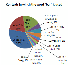
Chandoo says we can Group Smaller Slices in Pie Charts to Improve Readability. Such a pie has too many labels to fit into a tight space, so you need to move the labels around and use leader lines to link the labels to their data points.

An extreme example? Judging from what I see around the web, this is not at all unusual. In fact, 12 points isn’t all that many for a lot of pie charts. They could use a readability improvement.
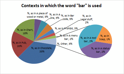
Chandoo’s technique is to convert the chart to a Pie-of-Pie type, which lets you move some slices to a second pie, leaving a bland “Other” wedge in their place. This can be a deceptive chart. Not only don’t two wrongs make a right, the secondary pie is 75% of the diameter and 56% of the area of the main pie, while having an actual value of only 5% of the main pie.

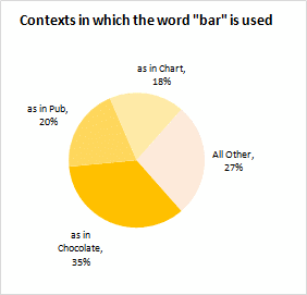
Chandoo cleans up the chart by moving most of the slices to the secondary pie, then shrinking and hiding the secondary pie by formatting its borders and fills to None.

True, this chart has improved readability. But it has left out a lot of data simply because (a) it didn’t fit nicely into the chosen chart type, and (b) the data made the chosen chart type too cluttered.
For those of us with data loss aversion, the above chart is even worse than a pie chart.
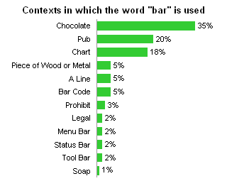
At the risk of becoming a caricature of myself, I’m going to answer Chandoo’s question “Can I use an alternative to a pie chart?” My answer, if you couldn’t guess, or couldn’t at least see below this paragraph, is a bar chart.

This chart takes up about the same space as either pie chart. Readability has been improved compared to both of Chandoo’s pie charts. The text in the labels is large enough for my eyes, which are twice as old as Chandoo’s, to see clearly. Also, there’s no risk of the color scheme troubling a colorblind viewer.
The bar chart improves on the original pie chart by clearly showing all of the data. No points are hidden by their small size, and the labels are next to the data points, not hanging by a thread.
The bar chart is better than the “improved” pie chart because it keeps all of the data in view, not bundled into a mysterious “Other” category.


Robert Kosara says
I actually find myself squinting at Chandoo’s orange-scale pie chart because the colors are so similar. The original ones aren’t pretty, but at least you can see where one wedge ends and the next one begins.
But apart from the usual pie chart criticism, there is also the question of how the chart fits the data. The different meanings here are interesting in their relative frequencies, but it’s not terribly interesting how more of one usage would mean less of the other (there is no limit on how many total uses there can be). Also, I’m sure there are more uses of the word “bar” (bar mitzvah, for example) that the data doesn’t account for.
So my argument against the pie here would not even be about the wedges being too small, but that it’s simply the wrong representation. If I want to know which uses are the most common, and how much more common they are than others, the sorted bar or column chart is simply the way to go. That the numbers can be added up to the total observations you’ve made is just a side effect, and certainly not interesting enough to warrant a pie chart. Just because you can divide numbers by a total doesn’t mean that they add up to a meaningful whole.
Chandoo says
@Robert.. Very good point. I was afraid someone is going to point it out. I did it anyway because I wanted the data to be fun. As you can imagine, it is all fictional and you can easily replace it with something that goes well with pies, like “% of sales by product”
Also, I am sorry the color choice was kind of crappy. I should have retained the original colors instead of beautifying it.
@Jon.. Very well done sir, very well done.
My idea is to show the hidden grouping feature in pie charts. As I clearly state in my article’s last question, if I were to make such a chart, I would make a bar, not a pie. The article was to teach people who are making pie charts that there is such a feature to group smaller pies in to one big chunk and hopefully avoid another 100 sliced pie like this: http://chandoo.org/img/cb/top100-twitter-users-bad-pie-chart.jpg
Mike Woodhouse says
I can’t help wondering if there is ever a situation where a pie chart is the best way to deliver information.
Hmm. I guess it depends on what you consider to be “best”. If your intention is to confuse, obfuscate, cloud* the issue, then we may be in the pie business. Of course, donuts and three-dimensionality should not be discarded lightly, neither should radars (a clarity-denying tool that is sadly-underutilised by unimaginative information-hiders).
So, is there ever a good use for a pie chart? (You’re allowed to say “no”)
* (addle, becloud, bedim, befuddle, bewilder, blind, blur, darken, daze, dim, eclipse, mist, muddy, mystify, perplex, puzzle are also suggested by a quick thesuarus check)
Chandoo says
@Mike.. I will go ahead and answer “yes” to your “So, is there ever a good use for a pie chart?” question.
In my opinion, pies are great,
(1) when there are <4 slices (and labeled well)
(2) when one slice dominate the hell out of other (like may be Google vs. other searches, Windows vs. other OS')
But they get most criticism because they are the easiest kind of charts to abuse.
Jon Peltier says
Mike –
I have stated on this blog that pie charts can be appropriate, but in a very small number of cases. In Political Pie Charts I cite the pies used by FiveThirtyEight to show poll and election results.
These pies work because there are only two or three data points in the chart, and the third, if present, has a value that’s out of whack with the other two (in this case, the third is very small). The effect is to compare two data points, and a pie makes it easy to see which one is greater than half, and roughly how much greater.
Mark says
@Jon Peltier… I made almost the exact same comment on Chandoo’s blog… Great minds… :)
DaleW says
Clearly, pie charts — like cockroaches, whether we like them or not — are survivors.
Abuse them as much as you like, they remain evolutionary winners.
Rather than curse them with megaphones from the rooftops, why don’t we dissect them and figure out why they survive and even thrive in human society?
Some here claim that pie charts tend to confuse and obscure the truth. A few pies do, and those should be stomped out or perhaps collected in glass jars for our amusement, as you do so well, Jon. (Especially those silly slanted 3-D ones, possibly with pies of pies.)
Many here point out that pie charts don’t allow very good resolution or accuracy. That is correct, of course: that is not their niche.
Effective pie charts are like sound bites. They provide a simple, memorable summary of the situation. Even if an audience is distracted and has other things they’d rather focus on, the pie chart delivers its big picture message in a matter of seconds or less. Even a child or busy executive can figure out whether one slice is a lot bigger, a lot smaller, or about the same size as another slice. That same child or busy executive intuitively grasps that the slices of a pie chart must add to 100% of a whole, or someone is cheating. Who knows at a glance whether a given bar chart will bother showing all the pieces, or have multiple selections that add to more than 100%?
Need to provide a quick and easily understood overview of a situation? The humble 2-D pie chart just might work fine. If you want to impress your audience with deep information content or visual effects, try something else.
Steve Thompson says
You are conflating two issues here:
1) Whether Pie charts are useful
2) Whether it makes sense to group the smaller items into one category.
Suppose you had data about days lost to accidents like
Fan Heater Fires 45%
Plumbing leak 38%
Exploded fridge 15%
Broken Window 5%
Screwdriver ailment 1%
Handkerchief mishap 0.3%
Tripping over carper 0.08%
Misreading Pie chart 0.025%
Burnt Toast 0.02%
Other Broken Window 0.01%
Different Screwdriver ailment 0.009%
Handkerchief mishap Again 0.006%
Tripping over carpet type 2 0.005%
Misreading a different Pie chart 0.004%
Burnt bread 0.004%
Hitting thumb with hammer 0.001%
Overloaded wall socket 0.001%
Now, if you are just trying to work out how to reduce days lost to accidents then it makes a lot of sense to trim the ‘noise’ at the bottom. This is true regardless of whether you are using bar or pie charts.