Stephen Few of Perceptual Edge is a reknowned expert on data visualization for analysis and communication of quantitative business information. He is the author of Show me the Numbers and Information Dashboard Design, two books that explain techniques which display information effectively, and why these techniques are an improvement over common practices and over the defaults of common software, such as Excel. The Perceptual Edge web site includes Stephen’s blog, an extensive library of articles by Stephen and other experts in data visualization and data visualization, and much more content.
Stephen recently posted an article which discusses Practical Rules for Using Color in Charts. I certainly can’t improve on Stephen’s article, other than to recommend this article and Stephen’s other resources to those who are really interested in improving their own presentations. I will also point to a couple resources he cites in his article. One is an article by Maureen Stone, an expert in digital color as well as information presentation, entitled Choosing Colors for Data Visualization. The other is Cindy Brewer’s web site which features an elegant Flash application that generates many different color palettes designed to make maps and charts more effective.
I thought a good topic would be a brief discussion of Excel’s color system, followed by a practical Excel-based implementation of the principles laid out in the resources above.
Excel 2003’s Color System
The color system in Excel 97 through 2003 is rather rudimentary. Excel 2007’s color system is very much enhanced, and will not be addressed in this article.
The Excel 2003 color palette consists of 56 colors, accessed through the color palette in dialogs and menus, and through code by a ColorIndex. The user can adjust any of the 56 colors, but these are the only colors available for Excel objects. (Shapes can actually make use of any of the millions of Windows collors, but that’s not germaine to Excel charts.)
The user modifies the color palette by clicking on the Tools menu, choosing Options, and clicking on the Color tab, which displays the dialog below. The 56 colors are arrayed in all their glory. Note that the top five rows comprise the 40 “Standard” colors, which are always visible on the menu palettes. There are also two rows of special colors, one used for default chart fill colors (for bars, columns, and areas) and the other for default line and marker colors.
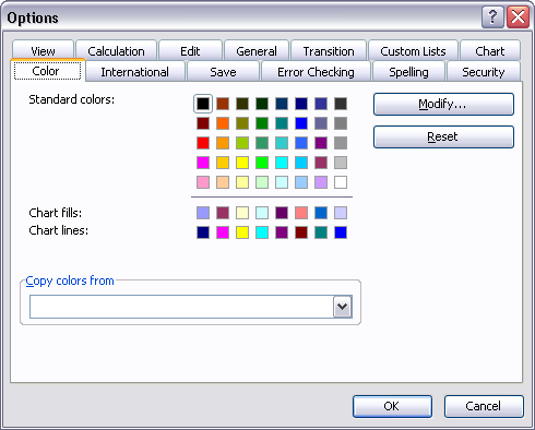
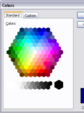
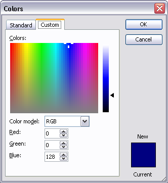
The user modifies a color in the palette by selecting it and clicking Modify. This pops up another dialog with two tabs. From this dialog (see below), the user can either select a color from a wider selection of “standard” colors, or define a color by dragging a cursor or entering precise red, green, and blue values. (The user should look up the definition of colors in terms of red, green, and blue. The only hint I’ll give here is that you can make millions of colors by varying each of these three components from 0 to 255.) Changes made in this dialog are specific to the active workbook only. From the dialog, the user can also reset the palette to Excel’s default palette, or copy a palette from another open workbook.
Standard Chart Colors
When you make an Excel chart, it starts out looking something like one of these:
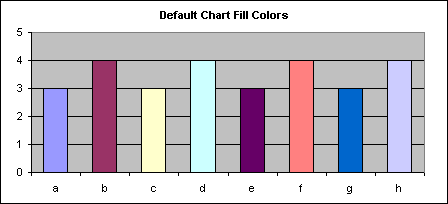
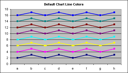
There are a few things we can change right away. First, the ugly gray plot area background should be changed to white. Second, if gridlines are necessary at all, they chould be changed to the lightest gray available. The black border around the entire chart can be removed, while the plot area border, axes, and axis tick labels should be changed to a medium gray, so their appearance does not draw attention from the data. The borders around the columns should be removed as well.
In the charts below, I’ve also made a minor adjustment to the color palette, changing each of the gray shades in the right column to a shade two clicks lighter in the standard color modification dialog. Since the default greens in the palette are either too dark or too bright, I’ve sacrificed the intermediate green and changed it to something that’s a nicer shade, definitely green, but between kelly and forest greens. I have not yet changed the default chart colors in the palette. The charts do look better, but the default series colors leave much to be desired.

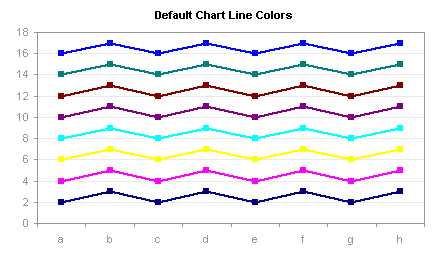
Better Excel Chart Colors
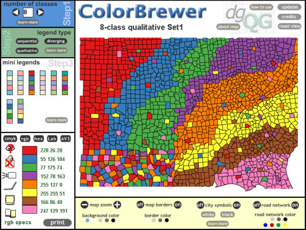
This is what the Color Brewer utility looks like:
You can select a number of classes (i.e., different colors in the palette), and a type of palette. Sequential means graduated shading from dark to light; Diverging means gradually changing from one dark color to white or a light shade in the middle to another dark color; Qualitative means the colors are defined with similar intensity so that no one color appears more important than any other. For typical charts the qualitative style palette is the best choice.
For fills in chart columns, bars, or areas, light to medium colors work best, unless you want to emphasize a small number of points. For lines and markers, medium colors work well.
I’ve spent a little time with the ColorBrewer, and used it to define a few sets of custom chart colors. The default palette and two of my custom ones are shown below. The names “Paired” and “Set2 Dark2” derive from names of the color combinations from the ColorBrewer. I’ve slightly modified a couple of the colors, but most are as defined by the ColorBrewer.
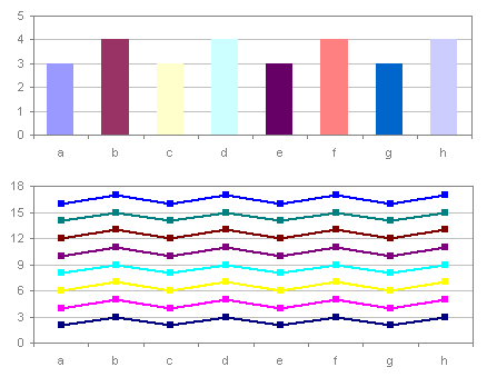
Default Excel Charting Palette
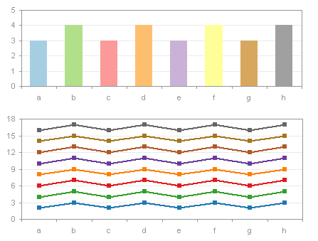
Custom Charting Palette – Paired

Custom Charting Palette – Set2 Dark2 (my favorite)
Update 23 June 2009
An updated version of the Color Brewer has been released: ColorBrewer2.org.
Palette Chooser Utility
To reward persistent readers who have made it this far, I’ve built a small utility to apply a few of these palettes to the active workbook. It is located in the zip file PaletteChooser.zip. Unzip this file, and open the workbook PaletteChooser.xls with macros enabled. The workbook was created in Excel 2003, and should also work in Excel 2002 and 2000. I don’t know whether it will work in Excel 97 or in any flavor of MacExcel, and it is irrelevant to Excel 2007. When the workbook is opened it adds an item called “Custom Palette” to the Format menu; this menu item is removed when the file is closed. Colors are stored in the Colors worksheet of PaletteChooser.xls and displayed in the Prelim worksheet; for each palette, most of the changes are based on ColorBrewer colors, but I’ve also included my adjusted grays and greens. To modify another workbook, activate it first before selecting the Custom Palette menu item. Invoking this menu command will pop up the following dialog:
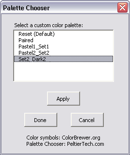
The custom palettes stored in the Palette Chooser workbook are listed in the dialog. Clicking Apply or double-clicking on a palette entry in the list box will apply it to the active workbook. When you find one you like, click Done. If you want to cancel the changes, click Cancel. If I get ambitious I will post instructions here for anyone who wants to define their own palettes; clever Excel users may figure it out on their own.




Ross says
Hi John,
Nice post, colours in excel have sucked for a long time, I agree 2007 is better.
I have some 1/2 decent colour tools, some in VBA some in .Net, my laptop die a while a go but if i can find a copy of the dll I will try very hard to knock up some sort of addin with all the bit togther – I’ll try and add you colour pallet idea too – it’s some thing I’ve been think about doing for a while also.
I’ll have a look tonight when i get home and try and send you what i have – if i can find it!
cheers
Ross
PS will link soon too. !
Sandy says
I couldn’t agree more, as just yesterday I received a copy of another seemingly expensive report that resulted from a roundtable think-tank on the education of technology. It included absolutely horrible charts.
Obviously we need people to read posts like this.
I’ve also written similar pieces (http://excelwithmonarch.com/xlreport/making-your-excel-reports-unique, and http://excelwithmonarch.com/xlreport/better-excel-color-management which also includes a free color tool for Excel).
Clearly the roundtable report authors didn’t read my piece. Here’s hoping they, and others like them, find yours.
Sandy
Jon Peltier says
Sandy – That looks like an extensive site you’re building. I’m not familiar with Monarch. From context, I can presume it’s some kind of data manipulation tool that can interact with Excel. Unfortunately I didn’t see any links to Monarch from your blog, even in the What’s Monarch section of your welcome post, other than the tucows link for the free download of the older version. Is it the product from DataWatch? Can you provide links to information about Monarch?
Sandy says
Thanks Jon, the site’s coming along, though sometimes it feels like I have more ideas for the site than I do time.
I often refer to Monarch as a sort of universal data translator. It is published by Datawatch ).
While it does specialize in extracting data from report files, it can extract from Access and ODBC compliant databases, HTML files, PDF files and more, all without custom programming.
But for the adventurous types, Monarch offers a COM interface so you can automate your work with VBA. Even the command line accepts multiple parameters that are often enough to automate the work.
I have a couple of videos posted (more on the way) that show some of what Monarch does, and just how easy it is to work with.
One of the reasons that I started the site was because so many experienced Excel users such as yourself had never seen, much less even heard of Monarch, and I thought that I could, in fact should, help people get introduced to it.
alderaic says
I did use monarch a lot to get old fixed width report multi line nightmares organized.
it is indeed very cool to use with VBA and worked line almost no other software did ie : no bugs no hassle, good manual, product support forum and easy to use functions.
on another note, wonderful post about color management, I definitely needed a tool to manage swatch tables, only one thing missing that I might do someday is saving the color table as well to define new combinations (often big companies have their own color charts for reporting so it can come in handy)
And a very interesting website to read (perceptual edge, didnt knw that one)
Thanks Jon,
another nice blog to read!
Jon Peltier says
You could probably figure out how to add another custom palette. Set up another four column range anywhere on the Colors worksheet, define a worksheet-level name that refers to this range (the name is what is used in the listbox). Then list the color indices (1 to 56) and the corresponding red, green, and blue values for each index. Indices need not be in order, and any you do not list will revert to Excel’s default for that index.
Eric says
Nice work with the Palette Chooser, Jon!
I made some slight modifications to (attempt to) make it a little easier to define your own palette, although you still have to define the range name as you’ve said in the above post.
I modified the “Colors” sheet to show current colors, moved the indices to a single column, and permitted all the additional colors in the palette to be added quickly. Also, I modified the Apply button function to make it work.
Download here:
(if anyone likes this, feel free to host it more permanently; this host only persists files for 30 days)
Eric says
Oops, Aqua’s color index should be 42, not 24!
Better download this version instead:
Jon Peltier says
I’ve made a good number of palette editors over the years. I built one (shown below) which allows partial but not full control, for a client with very specific requirements. I was thinking of punching it up to handle the entire palette, but with the release of Excel 2007, I though, why bother. The one I built for this article is not as interactive and not as visual, but it will in fact change any color in the palette.
The above dialog went hand in hand with the following report formatting wizard, which allowed the user to select Excel objects (e.g., ranges, chart elements) and format them simply using the entire palette and using a quick two-click process. The colors that the palette wizard can modify are larger and have a dark outline in the report formatter. A dialog like this, on a modeless user form, would actually solve many issues with the loss of productivity introduced in Excel 2007. That gives me an idea….
Nile says
For your reference, here’s a ‘thermal gradient’ colour palette, running from ‘cold’ dark blues to ‘hot’ orange and red. This adds a lot to 3-d charts and surfaces, but it’s an effort to create all the colours in a sequence that presents constant ‘teps’ in colour: human colour perception isn’t a regular RGB sequence.
There’s a picture of it in use here:
http://pics.livejournal.com/hairyears/pic/000adesg
I’m not embedding the image in the text as it’s quite large.
The colur palette is created in code, but can certainly be captured and saved by your utility:
Set wbkNew = Application.Workbooks.Add
With wbkNew
‘Thermal Colour Gradient
.Colors(9) = CLng(“&H0060FF”)
.Colors(46) = CLng(“&H0080FF”)
.Colors(12) = CLng(“&H00A0FF”)
.Colors(10) = CLng(“&H00C0FF”)
.Colors(14) = CLng(“&H00D0FF”)
.Colors(5) = CLng(“&H00E0FF”)
.Colors(47) = CLng(“&H00F0FF”)
.Colors(3) = CLng(“&H00FFFF”)
.Colors(45) = CLng(“&H40FFE0”)
.Colors(43) = CLng(“&H80FFB8”)
.Colors(50) = CLng(“&HA0FF70”)
.Colors(42) = CLng(“&HE0F040”)
.Colors(41) = CLng(“&HFFE000”)
.Colors(13) = CLng(“&HF8D000”)
.Colors(7) = CLng(“&HF0C000”)
.Colors(44) = CLng(“&HE8B000”)
.Colors(6) = CLng(“&HE0A000”)
.Colors(4) = CLng(“&HD88000”)
.Colors(55) = CLng(“&HAA3030”)
‘Pale green colour gradient
.Colors(8) = &HD0E0B0
.Colors(33) = &HB0C090
.Colors(54) = &H90A070
‘Pale grey-blue colour gradient
.Colors(38) = &HFFF0D0
.Colors(40) = &HF0E0C0
.Colors(36) = &HE0D0B0
.Colors(35) = &HD0C0A0
.Colors(34) = &HC0B090
.Colors(37) = &HB0A080
.Colors(39) = &HA09070
‘medium violet colour gradient
.Colors(17) = &HFFE0F8
.Colors(18) = &HF0D0F0
.Colors(19) = &HE8C0E8
.Colors(20) = &HE0B0E0
.Colors(21) = &HD8A0D8
.Colors(22) = &HD090D0
.Colors(23) = &HC880B0
.Colors(24) = &HC07080
‘Pale grey colour gradient
.Colors(25) = &HF0F0F0
.Colors(26) = &HE0E0E0
.Colors(27) = &HD0D0D0
.Colors(28) = &HC0C0C0
.Colors(29) = &HB0B0B0
.Colors(30) = &HA0A0A0
.Colors(31) = &H909090
.Colors(32) = &H808080
Application.ScreenUpdating = True
End With
Fred L Johnson says
I’m still finding that the RGB function in VBA does not produce the color I specify using Excel 2007. The macro I wrote assigns the Interior color of a cell based upon variable values of R, G, and B. Excel 2003 seems to pick the nearest in the palette, but Excel 2007 seems to do the same thing. Is this a bug?
Jon Peltier says
Nile –
Thanks for the thermal gradient palette. I should try to include it in my little toy palette formatter.
Fred –
I really haven’t spent enough time with Office 2007’s color system to understand how it works. I’ve used it enough to be confused, but not enough to be frustrated. There are a couple of blog posts by Tony Jollans which discuss colors in Office 2007:
Colours in Word 2007, Part 1
Colours in Word 2007, Part 2
Tony has played with colors in Office 2007 enough to be frustrated, and finally enough to be knowledgeable.
Bob says
I have a dumb question, how can I set the default pallet that is used for all new workbooks in Excel 2003.
Does it go in book.xlt?
Does it go in personal.xls?
Thanks
Jon Peltier says
Bob –
Create a custom palette, and apply it to Book.xlt in your XLSTART directory.
James Cooper says
Thanks for the article, download and link to ColorBrewer. Very useful and educational!
Cami says
Thank God for helpful people like you – just wanted to say thank you – if I hadn’t have googled this I’d have spent ages trying to figure out how to get a certain colour!!
Sian says
I was wondering if anyone could tell me how to reset to the default Excel 2003 chart colors. I didn’t backup beforehand as I didn’t really know how and as much as I like the different colours, I am under strict instructions, however I don’t know how to get the colours back.
Thanks
Jon Peltier says
Sian – Go to the Tools menu > Options > Colors tab, and click the Reset button.
Mark says
Interesting post. I’m just downloading the Office 2010 Beta demo – will your tools work with that version, I wonder??
Jon Peltier says
Mark –
I haven’t tested everything, but my commercial apps will work in 2010. Customers with earlier licenses may need an update.
Adam says
What Color is a series that is defined as Automatic.
It seems like it must be possible but I can’t figure it out and would welcome some help. I’d like a macro to add trend lines to an XY chart and color the lines to match the data series color. I know I can get the color of the marker with Color = Selection.MarkerForegroundColorIndex and can then assign “Color” to my trend line but when automatic is selected for the marker’s color I get -4142. In this case how do I determine what the color index is for the series?
Jon Peltier says
Adam –
This can be more complicated than it seems.
I can only knowledgeably describe Excel 2003 and earlier.
In a chart using fills (bar, column, area) the fill color starts at color index 17 (the first color in the row labeled Chart Fills in Tools menu > Options > Color tab). In a chart using markers or lines (line, XY) the marker and line color starts at color index 25 (the first color in the row labeled Chart Lines). Though it seems easy, series 1 = 25, series 2 = 26, etc., when a series is deleted, the next series added fills in the missing slot. For example, if series 1 is deleted, series 2 becomes series 1 but it keeps color 26. Add a new series which becomes series 2, and it assumes color 25.
You can find which series number Excel thinks a series is by selecting it and running this in VBA:
? ExecuteExcel4Macro(“Selection()”)
VBA returns a string starting with “S” followed by the series index, e.g., “S1”, “S2”, etc.
Maurice says
In Excel 2007, the Conditional Formatting Data Bars are restricted to only being graduated.
I need them to appear solid. Or atleast “reversed” where the end point is the dominant density.
A solution is much appreciated.
Jon Peltier says
Maurice –
This is one of the design flaws in Excel 2007’s data bars. It was corrected in 2010, but there’s no good workaround in 2007.
Rick Gilbert says
Jon,
I’m trying to help some colleagues over the Excel 2007 charting hurdles (converting rom ’03), and I’ve been struggling with colors in Excel 2007, specifically with the Theme Colors. I’ve found what appears to be a bug in the named constants for “Dark” and “Light.” If I look at the Theme Color Customization dialog, The Dark1, Light1, Dark2 and Light2 appear in that order at the top of the list. If I color cells using VBA and reference xlThemeColorDark1, xlThemeColorLight1, xlThemeColorDark2, and xlThemeColorLight2 in that order, it appears that the vba constants refer to values that reverse the Dark & Light orders. Using VBA to color a set of four cells, I get cells colored in an order that appears to match Light1,Dark1,Light2,Dark2 from the Theme Color customization dialog. I haven’t found this referenced elsewhere (via all-powerful Google), and I wonder whether or not you had observed this apparent mix-up.
You, sir, are an Excel charting Master, and I thank you for all your tips and postings.
Jon Peltier says
Rick –
I have not used Excel 2007 enough to have made sense of the new color system. In some ways it’s an improvement over the old system, but in other ways it has lost functionality. For example, it has broken the old techniques used to color features throughout a workbook by changing the color associated with a tile in the palette.
The problem I’ve heard of most recently is that when the 7th or 8th series is added to a chart, all the previously added series change colors one level darker or lighter (I forget which direction), so your carefully designed theme shows a different appearance for charts with fewer vs. more series.
Alex says
The color system is kind of tricky in 2007, but it is much better than previous versions of Excel.
I did find a site that actually design a compatible color palette for Excel 2003 or earlier…
http://www.techronology.com/index.php?pageID=004002&prodID=temp003
Jon Peltier says
Alex –
In some ways the new color system is better, but in other ways it has lost functionality.
One huge example of this is when designing templates. In 2003 I could recolor my template, changing the appearance of every instance of a color from the palette to another color. This was very nice for customizing reports for a given client: Blue for IBM, Red for Honeywell, Brown for UPS. In 2007, once a custom color has been applied, it is not linked to anything, so I can’t globally change it to another color. Perhaps this can be accomplished by using a custom theme, but these themes have only like 8 colors, and the others are all lighter and darker variations on these 8.
I know there are gajillions of colors in 2007, but I never encountered an occasion in which the 56 color palette of 2003 was insufficient.
wynand says
Jon
Your “Comment from Jon Peltier
Time: Friday, February 22, 2008, 3:23 pm I’ve made a good number of palette editors over the years….” post refers.
The utility pics shown in this comment looks very interresting, where can I get a copy?
Mike says
Dear Jon.
Although I’m new to using VB in excel2003, what I’m trying to do should be quite simple, however no matter what ‘solution’ I try from the web inc. MSDN, I am simply unable to get the desired result.
I want a (VB based) button to change the color of the automatic curve drawn on an XY chart. My excel spreadsheet has a number of worksheets. The chart is in worksheet labeled ‘Graph’ There is only one chart in this worksheet.
This is what I’d like to do:
Private Sub CommandButton1_Click()
Worksheets(“Graph”).ChartObjects(1).Chart. _
SeriesCollection(1).Line.Color = RGB(255, 0, 0)
End Sub
I’m sure you can read what my intention is. I have problems looking for the child-properties for ‘Chart’. I can’t identify the further sub-properties that get to the actual ‘line’ part and also, the methods to get at line color.
Looking for line width properties which might have given me the ‘route’ to the line property/pathway haven’t been successful.
I’d really appreciate some help.
Thanks.
Mike.
Jon Peltier says
Mike –
If you are using Excel 2003, you can use the macro recorder to tell you the code you need. (The macro recorder in 2007 doesn’t capture any of the formatting in a chart, but that’s been restored in 2010.) I turned on the macro recorder and colored the line of a series red. Here’s the code:
Note that the relevant object is the Series.Border, not Series.Line.
These two lines can be condensed into:
or, combined with your example code:
You could also use
Keep in mind, though, that Excel 2003 uses the color index, and if there is no match to the RGB color in the active workbook’s palette, Excel will try to guess which palette color best matches the RGB color.
Mike Wengal says
Hi… I’ve got an obscure Excel color question… I’m adding a lot of new comments to several 100 Excel documents… to make the review process easier, I’m manually changing:
1. BKRD Color — the comment’s standard background color (pale yellow) to lite blue for the boys and lite pink for the girls…
2. Border Weight — I’m manually changing the thickness of the comment box’s border line from the standard .75 to 1.5…
Is there anyway to change the default settings of the Excel comment box? It would save me a lot of time and effort with this volume of work…
P.S. Approximately 80% have a lite pink background and 99.9% would have a 1.5 thickness…
Many Thanks!
Mike W
Jon Peltier says
Mike –
I know of no way to set the default formatting of a comment. A comment doesn’t use a color from the palette, and it ignores autoshape default formatting.
wynand says
Mike,
This might help, allthough probably not entirely what you’re looking for:
http://www.contextures.com/xlcomments02.html
Mike says
Jon.
Thanks very much for the very clever method in your Monday, November 29, 2010, 9:28 am comment. I am very grateful that you took time out to help me with my problem. The solution works like a gem and has instantly given me a much more powerful command of VB in Excel.
Very much appreciated.
Mike
Pam Dodge says
I amusing 2010 and do not find the Options/ Color screen as shown for 2003 above. I want to set font color for any time I add data. Please assist.
Jon Peltier says
Pam –
The Excel 2007 and 2010 color system is vastly different than that for Excel 97-2003. I don’t even really understand it yet.
My colleague Tony Jollans has written an article about using colors in Word 2007, and the information is completely relevant to Excel 2007:
http://www.wordarticles.com/Articles/Colours/2007.php
Alan says
Hello Jon…………was wondering if you have ever come across a way to color a point or bar on a chart and have that color stay with the point as its source data table is sorted from low to hi or hi to low. Any input would be most appreciated !!
Thanks
Alan
Jon Peltier says
Alan –
Use the technique in Simple Conditional Charts. Your formulas are whatever you need to plot just the point in question in the second series.
Chris says
Hi Jon,
I’m looking for a way to print the rgb # of a chart series to a cell. I have about 20 charts and need to ensure colors are consistent throughout all charts…but I’m fairly colorblind and don’t have discretion to change the colors to something more discernible. Is there a way to do this, vba or otherwise?
John Chuang says
Dear Excel experts:
Would you so kind please teach me how to assign the line color in the xlXYScatter chart type? there are Makerforeground.colorindex and markerbackground. colorindex, But there is no line…. please help!!
Jon Peltier says
John –
It’s perfectly logical. You need to use:
.Border.ColorIndex
John Longo says
Jon
Thanks a lot for the clear answer to ‘Mike’ on Nov 29, 2010 about how to change the line color of a chart. I needed it for a Ternary trianular plot that is common in Geology. John
Jon Peltier says
John –
As a metallurgist, ternary phase diagrams were a common research tool. I’ve never tried them in Excel, though we mostly worked close to a corner, so an XY chart was sufficient.
Ken Weavers says
Thanks for a useful web page. I am trying to write an Excel spreadsheet that works in both current and 97-2003 versions, such that, when someone saves “xlsx” as 97-2003, they do not get a “minor loss of fidelity” message, caused by using an incompatible colour. But I do not have Excel 97-2003 any more, so I cannot find out what the 56 colours that it uses are expressed as the equivalent code in “xlsx”. For example, I am finding that one yellow can be used in 97-2003 as 255/255/153 in RGB numbers – but what of the other 55? Is there a list somewhere? Many thanks.
Jon Peltier says
It might be easier to just tell your Excel 2003 users to upgrade their version of Office. But you can get information about the indexed colors in a workbook using the following code. Paste this code into a regular code module, insert a blank worksheet, then run
ShowColors. The blank worksheet will be filled with a list of the 56 colors, their indices, their color values, and the corresponding RGB values.Ken Weavers says
Hi Jon, thanks for your reply.
The code looks great but when you say “Paste this code into a regular code module” I do not know how. Is this a feature of Excel? If so, how do I find it – if not, where do I find such a module? Is it possible for you to run it, and just email me the results please? Ta, Ken (from England, if you didn’t guess).
Jon Peltier says
Hi Ken –
If you’re not afraid of learning something new, you can follow this tutorial, starting from a blank workbook and the code I provided above.
How To: Use Someone Else’s Macro