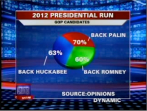
Has anybody not seen this unique pie chart? This famous graphic is purported to compare Sarah Palin’s favorability to that of Mitt Romney and Mike Huckabee. I have seen it dozens of times already, but I think the first place I saw it was in Fox’s Fuzzy Math: 193 Percent Of The Public Support Palin, Huckabee, And Romney.
This was intriguing, so I downloaded the original data (pdf), which after cleaning up and pivoting looks like this:
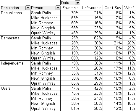
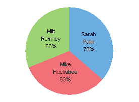
The data is the result of a telephone poll conducted last month, and shows the favorable and unfavorable ratings of four potential candidates for the 2012 Republican presidential nomination. The Fox report showed only the top three candidates in their pie chart, reproduced below. The intrigue of this chart rests in the sum of 193%, which makes it 1.93 times more effective than your typical pie chart, which adds up to only 100%.
Candidate 4 was not far below, so in fairness, he should be included. This pie chart is even better, since the segments add to 251%.
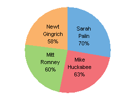
Obviously the results for these candidates are not exclusive: people are free to favor multiple candidates, so the sums are not expected to add to 100%. Not only is the pie chart a poor data visualization choice in general, even with a data set that shows parts of a whole, in this specific case it’s not even relevant to the data.
So, class, what’s the proper chart type for this kind of data?
Right, a bar chart. This simple shart shows the relative approval ratings of the candidates very clearly. For a typical Fox news audience, this is about as much data as you can afford to show in a half hour of news. As we’ve seen, it’s too much data for a Fox News broadcast team.
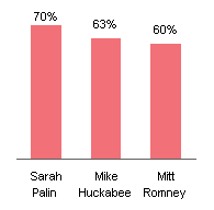
For completeness, let’s include poor Newt.

These charts so far only show the results among Republican survey respondents. We get a broader view if we include the responses from Democrats. The data labels were removed in favor of the vertical axis to reduce complexity.
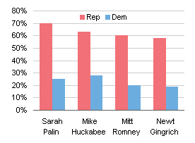
We can even display results from independent respondents without sacrificing any clarity.

Let’s add a weighted average of all responses, using a set of horizontal lines. Using another bar for the averages would be confusing. Note that none of the candidates has an approval greater than 50%.
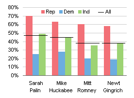
This chart is too much for a television audience, but it would probably not be too confusing for most readers of national “news” magazines.
The published survey results also included ratings for Oprah Winfrey, who is definitely not a candidate for nomination for any position in the Republican party. I suspect her inclusion is an indication that many people were included in the ratings, but only the top four Republicans were included, and some overworked intern has now been fired because Oprah wasn’t deleted.

The unfavorable and other ratings could also be incorporated into a set of charts, but this is more than enough for the purpose of the newscast.


teylyn says
Great post. Good read. Funny, witty, and a tad sarcastic. Keep at it! You may even have a career in writing humourous columns for an appreciative audience. I don’t know how many times I’ve sent pie charters to your site to show them alternatives, and I’ll keep doing it.
cheers
teylyn says
Addendum: quote fresh from the microsoft newsgroups:
I am trying to make a pie chart that has 50 slices. Each slice of the
pie can have values that vary from 0 to 5. On the finished graph I
want a solid pie color of red color for all 50 slices set at 2.5 and a
variable color set at another color that will overwrite the red if it
exceeds 2.5 and show red and green if the variable is less than 2.5.
Any suggestions?
♫ ♪ When will they eee–he–ver learn?….♫ ♪
ikkeman says
50 slices – that’s either an huge pie or a crummy party!
Naomi B. Robbins says
I enjoyed the post. However, I’d like to see more cleaning up. There are too many percent signs in the table and the axis labels. They make it more difficult to read the numbers.
Gregory Bankos says
“The PTS Blog is my blog, and I maintain it in a manner that is professional, courteous, friendly, and honest” Please explain to us stupid Fox News viewers how insulting millions of people who watch Fox News is Professional, courteous, friendly and honest? I watch Fox News, yet somehow I understood that the chart was not meant to add up to 100. And I also know that pie charts are the devil.
Quite frankly, you owe many of the people an apology for insulting them. If you do not apologize, you are not living up to the first sentence of your policy.
Jon Peltier says
Naomi –
I should also label the chart axes and add a chart title, but the whole article talks about approval ratings, and I’m making a point about the chart, not about the data.
But I’ve cleaned up one of the charts as an example. To make this chart, I had to convert the percentages in the source data into whole numbers (i.e., multiply by 100), then use a custom number format of [<80]0_%;0"%" for the axis labels.
Naomi B. Robbins says
Big improvement! Thanks for showing how to do the custom formatting. The lazy way is to use whole numbers and then put percent in the axis label.
Thom Mitchell says
I enjoyed the post and the initial comments. Indeed, when will “they” eee-he-ver learn? I hope you had as much fun writing the post as your fans are having reading it!
Jon Peltier says
Gregory –
I’m a Fox News viewer myself. Not the national edition of Fox News, because I don’t watch any national television news. I watch the local Fox News out of Boston because of all of the local news shows, Fox has the personnel that seem less like plastic talking heads and more like real people.
Fair or not, it is a national pastime to make fun of Fox News. To illustrate, run Google searches on [___ News is a joke], inserting various identifiers in the blank. Only Fox News has the complete search phrase intact in the search results. Not ABC, NBC, CBS, MSNBC, CNBC, or CNN.
My comment was as much about television news shows in general as about Fox News, about television viewers in general, and about the apparent decline in viewers’ IQs while the idiot box is energized. However, you’re correct that some people may have taken my attempt at entertainment as an insult. To those readers I say:
I apologize for any comments that you may have found offensive.
As always, people are free to visit the sites they want, and to read the pages they want. If anyone unsubscribes from my blog for this or for any other reason, I will not be offended.
David Gerbino says
Gregory Bankos,
wow, you are a bit upset over Jon’s comments. I am a news junkie and watch as much as I can of ALL networks. I get insulted when they pass off the kind of junk that Jon showed us. I am in the minority because I know better. Based on your comments you know better. Good for you.
When Jon says “My comment was as much about television news shows in general as about Fox News, about television viewers in general, and about the apparent decline in viewers’ IQs while the idiot box is energized. ” I have to agree. The sad reality is, most people of the world do not know how to read charts and graphs correctly nor do they know how to create them.
Jon Peltier should be applauded for showing these horrible data visualizations.
As far as insulting people watching TV news and the professionals creating the poor data visualizations, maybe Jon should. But that is just my opinion.
@dmgerbino
mrt says
Jon –
On pie charts –
http://www.militarytimes.com/blogs/broadside/2010/05/12/greenside-of-the-week-may-12-2010/
…mrt
AnnMaria says
I liked your inclusion of Oprah! You touched on one of my very sore spots in statistics, which is the cavalier acceptance that whatever assumptions we make about the data are true, for example, one would think that a chart showing who is favored in a presidential race asked the question, “If the presidential election were held today, for whom would you vote?”
If those assumptions are false, whether we use a pie chart, bar chart or generalized linear mixed model, our results are no more likely to be true than just asking the magic 8-ball.
RichD says
It’s amazing how bad some of the discussions against pie charts are. This isn’t a problem with the pie chart — the alternative bar chart doesn’t make any more sense. It’s a problem with the data. Don’t uphold this article as ammunition against pie chart. I’m looking at you, http://www.darkhorseanalytics.com/blog/salvaging-the-pie.