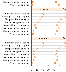
 Trellis plots (aka panel charts) split plotted data series up into cells of a grid. The resulting small chart invoke the principle of small multiples by using the same axis scales. Putting series into separate mini-charts eliminates the clutter that occurs when too many points are plotted together in the same chart, while still displaying comparisons and trends. In this post I revisit ineffective stacked bar charts, show better graphical display using bar- and dot-based panel charts, and finally show dot-based panel charts of this data produced with the new Peltier Tech Panel Chart Utility.
The Original Chart and My Panel Charts
Last year I proposed some alternatives to the stacked bar chart used in a Gartner report to compare how BI programs were used by their customers. My alternatives included various panel bar charts. That was followed by a guest post by Naomi Robbins, who used panel dot plots to show the same data.
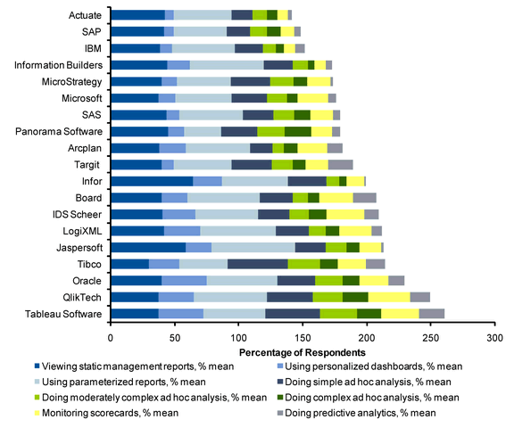
The chart that kicked off the discussion was a stacked bar chart. Stacked charts have their difficulties, because only the bottom series and the total of all series share a common baseline among their points. The other series’ points start wherever the lower series end, making comparisons more difficult. In this chart, the categories (vendors) are sorted from low to high by total score. but the series (activities) are unsorted.
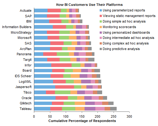
My contribution to the stacked bar chart genre was to sort the series, and to put the legend in the chart instead of under the chart, which made it somewhat easier to use.
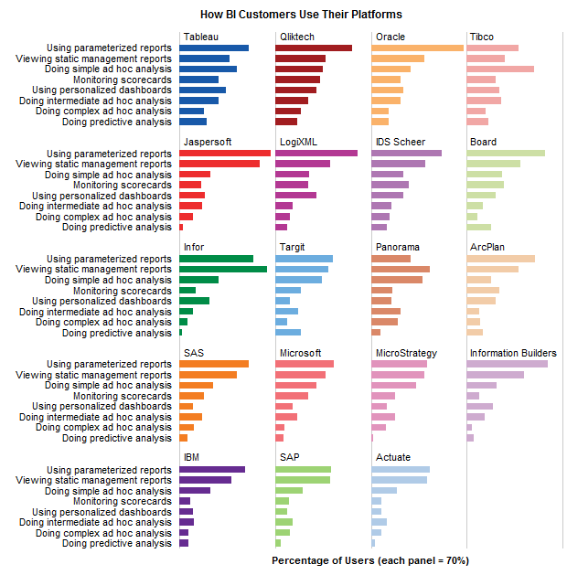
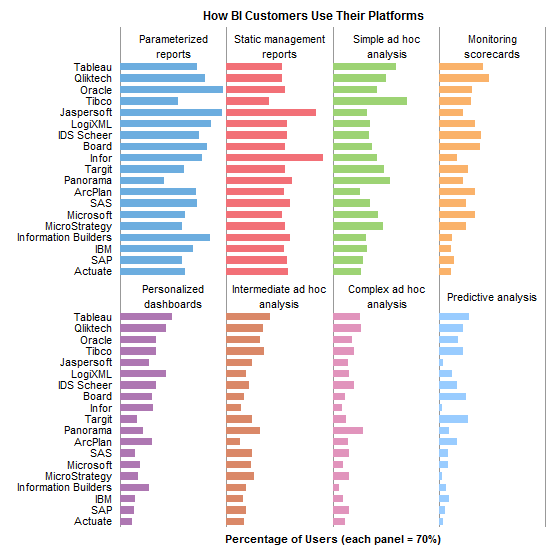
I finally made a pair of panel bar charts, which is possible but a lot of tedious work in Excel.
Naomi Robbins’ Trellis Dot Plots
Naomi used the same data to make dot plots which are essentially equivalent to my last two bar charts. She used S-Plus 6.2, an old version of S-Plus, to create the charts.
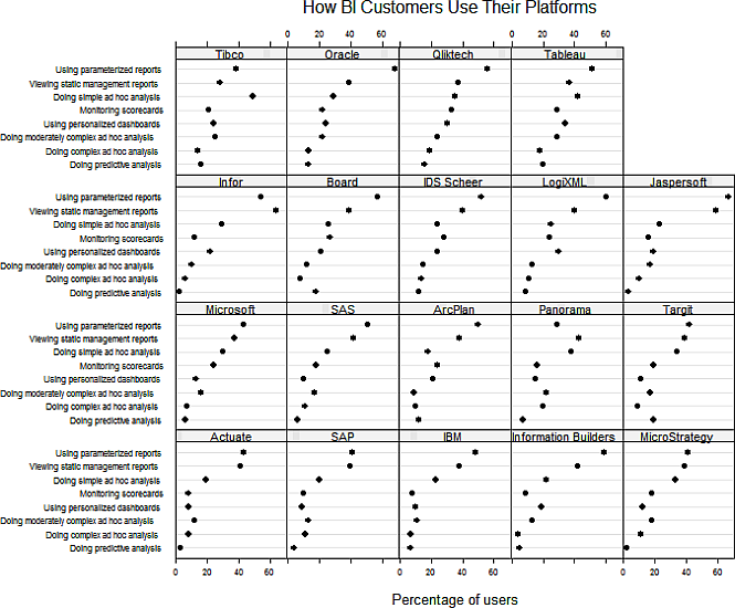
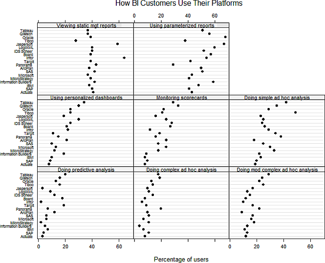
There is a slight difference in sorting between my charts and Naomi’s. I put the panel with the largest average values in the top left, with panels of decreasing average values to the right, moving to the next row down when I reached the end of a row. The convention used to draw most trellis plots is to put the panel with the lowest average values in the bottom left, with panels of increasing average values to the right, moving up a row when the end of a row is reached.
The standard trellis convention makes sense, since it puts the lowest values panel in the bottom left, close to the origin, and the highest values in the top right, furthest from the origin. If the data were to be presented without sorting, for instance in the order listed in an associated table, then the order I had used is probably easier for the reader to grasp.


ezra abrams says
I was really confused by this post, which seems way longer then necessary…
where do I go to get a trellis plot utility, if such a thing exists ?