In Gartner’s Customer Survey Results: Customers Using Vendors for BI Activities, Elissa Fink of Tableau presented a stacked bar chart that showed how BI customers use their BI products.
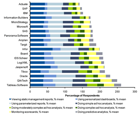
Good first cut through the survey data, perhaps, but stacked charts leave something to be desired. The only common baseline is along the left axis of the chart, so we can only reliably compare values in the first series and for the sum of all series.
This chart has another issue. The percentage items do not sum to 100%, so it is harder to understand what this tells us. 260% of Tableau users perform these eight tasks? What does that mean? It’s reminiscent of last December’s infamous Fox News pie chart.
I decided to examine some alternative charting approaches. I am in no way criticizing Elissa or Tableau, I’m simply using this chart as the basis for a discussion of alternative charting approaches. Tableau is a great product. My experience with it is limited to playing with Tableau Public examples on the internet, and staring longingly at full blown analyses created by other people. Tableau is on my short list of things to work on, but even this short list exceeds my available time.
Recreation of original stacked bar chart
The first step was to recreate the original chart. Actually that was second, first I had to extract the data from the original chart. I used a technique called Manual Digitization, also referred to as Eyeballing It. Once I had the data, it was easy to make the chart.
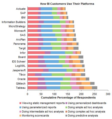
Repositioning legend on original stacked bar chart
I was not fond of the legend. I like to put legends below the chart where they’re out of the way, but the order of the legend entries is by row, and it’s confusing to go back and forth from the chart to the legend, because your eye automatically goes first to the wrong column of legend entries. To fix this, you need a legend with one row or one column of entries. I chose the one-column approach, and stuck the legend to the right of the chart.
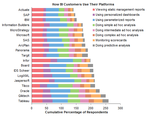
Sorting series in stacked bar chart
I noticed that the vendors were sorted from lowest to highest cumulative percentage, but the series were not sorted in a way that I could fathom. I decided it made sense to stack series from largest to smallest starting at the bottom (okay, on the left).
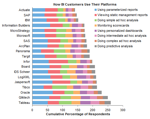
Converting stacked bar chart to panel bar chart
Incremental improvements so far. Let’s convert this stacked bar chart into a panel bar chart so each series has its own common baseline. That’s better, though we’re still stuck using a legend.
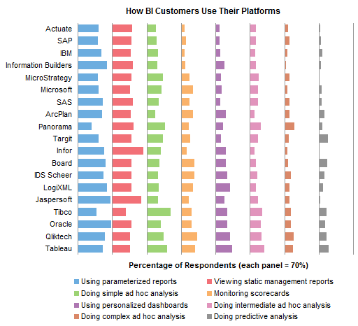
Panel bar chart with series labels
We can easily add labels to each panel. To make the labels fit, they were rotated 90°. This isn’t ideal, but it might be better than forcing the labels off the chart into the legend. The labels obscure the ends of the longest bars, but to make room for the labels would require either stretching the chart sideways or making each panel account for a larger percentage (e.g. 100% instead of 70%), reducing resolution. You can click n the chart to see a larger version which makes room for the labels.
Panel column chart with series labels
To make the series labels easier to read, I converted the last chart into a panel column chart. Now the vendor names are rotated 90°. You can’t win, but I guess you can try both and decide which is least problematic. As above, the labels overlay the tops of the longer bars. Click on the chart to see a larger version which has more room for the labels.
Dot plot
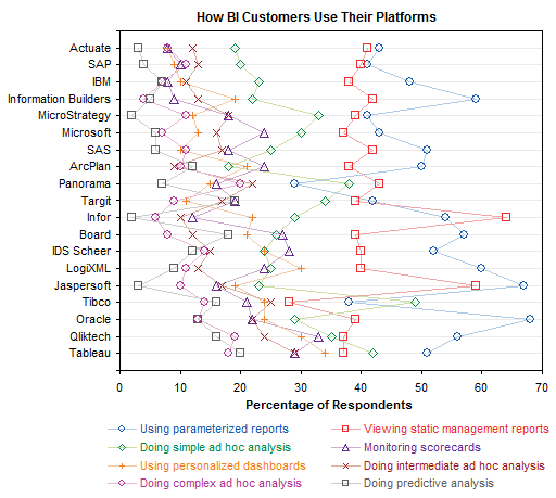
An alternative to the bar or column panel charts is a dot plot. The advantage is that all points are plotted in the same XY space, allowing for easier comparisons. The disadvantage is that all points are plotted in the same XY space, leading to clutter, especially in the lower percentage region of this chart.
Dot plot with fewer series
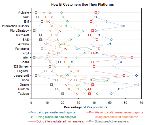
I decided to perform triage on the data. The largest item is “Doing intermediate ad hoc analysis”. Two smaller ones are “Doing complex ad hoc analysis” and “Doing simple ad hoc analysis”. The way to address this is to convert these three into “Doing ad hoc analysis”, but without the full set of survey responses, I can’t just add these three together, because I don’t know which respondents answered to more than one of these options. For simplicity and for the sake of illustration, I kept “intermediate” and deleted the other two. This has reduced the clutter in the dot plot, but it’s still too busy. I’ve found that without sufficient separation between series in a dot plot, you should keep to three series or fewer.
Single vendor bar chart
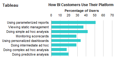
I thought it might be nice to compare the different tasks for each vendor. The relative percentages may lead to insights regarding the capabilities of each software package, the sophistication of each vendor’s target audience, and the emphasis of each vendor’s advertising campaigns.
For example, a package with extensive interaction would likely have more ad hoc analysis. A package with less sophisticated users may not see much predictive analysis or parameterized reports. A package marketed as a scorecard tool would likely have greater scorecard-related usage.
Here is such a chart, a simple bar chart, for a single vendor. We just need a total of 19 of these for this analysis.
Panel vendor bar chart
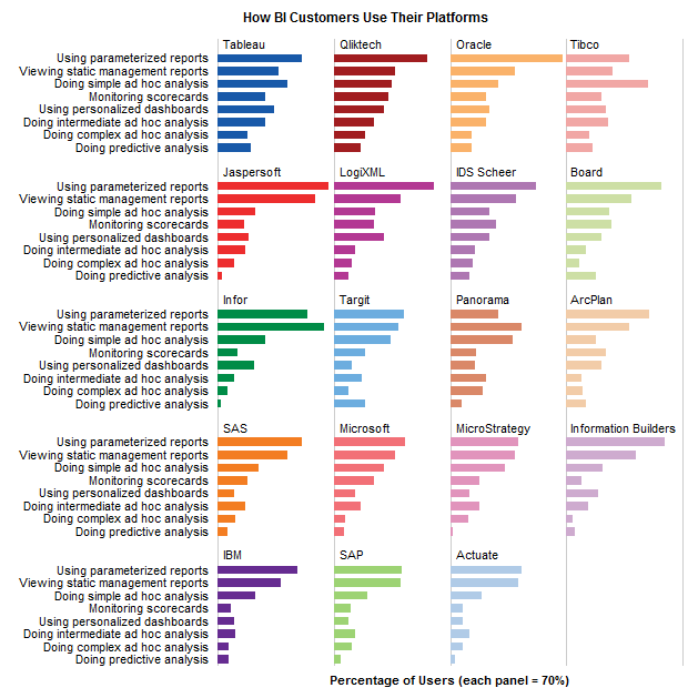
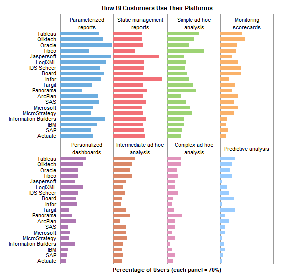
Rather than 19 individual bar charts, I rearranged my data and came up with panel chart consisting of a matrix of bar charts. I’ve done this with one panel for each vendor and tasks as categories, and also one panel for each task and vendors as categories.
These might be my favorite graphs in this whole article.
Summary
There are many ways to display a data set, even one as simple as this set of survey results. All of the charts I made in this study were done in Excel, but the rationale for the steps I’ve taken should be platform-independent. If the platform influences the course of the analysis, there may be shortcomings in its ability to do certain necessary tasks.
Excel isn’t the most flexible or powerful graphics package, but it’s the most widespread. It seems that my role has become one of helping people use Excel to perform unexpectedly complete visual analyses. With the advent of Tableau Public, I may find this role in less demand.
To make my analysis more flexible, I put the data into a simple list, and based a number of pivot tables on this list. This allowed simple interactive features, like sorting and filtering. I also made only regular charts, not pivot charts, because they offer much greater flexibility, and allow the use of many helper series (i.e., dummy series or invisible series) to produce flexible labeling, gridlines, and other effects.
Presumably Tableau and other worthwhile packages make my Excel gyrations easier for the layman to accomplish. Perhaps one telling test of these packages would be to give regular users of each a data set such as this one, and see how easily they could come up with a series of charts like these.



dermotb says
nice work, Jon
Andy Kirk says
Hi Jon
Thought you might be interested in my post on this item last week (http://www.visualisingdata.com/index.php/2010/03/tableau-graph-showing-gartners-customer-survey-results/) and also (importantly) this follow-up (http://www.visualisingdata.com/index.php/2010/03/follow-up-to-tableaugartner-graph-post/) which includes a clarification from Elissa.
Regards
Andy
Przem says
Hi,
The last bit is really good. It readable and clean. I can imagine using that with many other “qualities-by-object” cases, but also in games (speed, accelerate, strength, accuracy by player :) The usage seems very wide.
Thanks for that,
your blog is superb
Vincent says
He Jon,
Do you have the data somewhere such that we can play with it ?
Don’t want to spend time extracting the data behind the graph…..
Thanks
Vincent
Jon Peltier says
Andy –
Thanks for your links. Since I couldn’t click on the chart in Elissa’s post to activate a Tableau Public exercise to perform my own manipulations, I assumed that the chart was not hers but came from Gartner.
Vincent –
The data is in this file: stackbardata.csv.
Andy Kirk says
No problem Jon – yes, good point, they normally present their own charts using Public rather than statics. I’ll observe that rule of thumb in future before I jump down their throats!
Cheers
Naomi B. Robbins says
Your panel chart is certainly my favorite. Cleveland calls charts like these trellis plots. They are very easy to produce in R, S-Plus, or Tableau. These programs would include a scale on the horizontal axis but only on the bottom row of panels.
I am a fan of dot charts but would never use a dot chart such as the ones in your example. Even the stacked bar chart is preferable to them. I might use dots instead of bars on the panel chart.
Your panel chart makes it easy to compare tasks for a given company. It may also be interesting to compare companies for a given task. Therefore, it is sometimes useful to present both sets of panels: the one that you showed with the companies held fixed and the other with the tasks held fixed.
Jon, check your labels. It look s to me as if parameterized reports are one of the larger categories in the original but not in yours. Comparing the original to yours is more difficult since you changed colors.
“but the series were not sorted in a way that I could fathom.” I think that if you read the tasks by row they are ordered by increasing complexity from simpler, more passive tasks like viewing a static report to much more complex tasks like predictive analysis.
Jon Peltier says
Naomi –
Thanks as always for your observations. How much do you charge for technical editing?
I messed up the labels. I read them by column in the original chart, while they were actually listed by row (as in Excel). I’ve fixed the charts. Except for putting scales on the panel (trellis) charts, which is more of a job in Excel than I wanted to do. If it were part of a report, I’d have used labels.
I’ve also added a panel chart with the alternate alignment: panels for each task with vendors as categories within each panel.
You might be right about increasing complexity of tasks; “monitoring scorecards” sounds less complicated than any of the ad hoc analysis options, but maybe in my old job we didn’t do it right.
Andy Cotgreave says
Hi Jon
Great post, and thanks for creating a dataset! I’ve done the Tableau equivalent of your Single Vendor Bar chart here:
http://bit.ly/cunLH5
Enjoy!
Vincent says
Hello,
I like your graphs but I think that none of them really deliver any clear message .
I still don’t know which BI-tools is the most used and in which cases.
I’ve tried to come with my own graph:
– I started to categorise the different usages (beginners , medium, expert)
– I extracted the median, percentile 25% and 75% to show the best and worse tools and used colors to make it clear
The result might seem a complex graph but there are many data and the messages are complex.
Here my attempt :
http://www.imageno.com/vq5ez8kojtedpic.html
Vincent
Elissa Fink says
Hi Jon et al,
This post and the community responses show why I’m such a fan of Jon’s blog and the people responding.
Thanks, Andy Kirk, for noting that the original graph was Gartner’s not Tableau’s. I should have made that more clear in my blog post. Gartner is very particular about how their work is represented and I had to adhere to certain requirements.
It’s tough to pick which works the best for me – like Naomi, I like the panel charts. The best choice probably depends on the question you’re asking. For example, is it the overall functionality you want to know about or the specific functionalities isolated? I live Andy Cotgreave’s attack on it – but I’m biased since he used Tableau Public.
And Jon, thanks for pulling the data out. I’m going to play with it later today. I’m sure I’ll learn something I didn’t see in the original graph.
Best,
Elissa
Jon Peltier says
Andy –
Nice. Is it possible to use a listbox instead of slider to select categories? It’s a nice user feature to show all categories that can be chosen from.
Jon Peltier says
Vincent –
Good point, the panel charts don’t really show which tools are used most for which types of analysis. I didn’t care for your implementation (no offense): it was a little confusing, the colors weren’t friendly, you placed simple between medium and hard, and you put some items into different categories of difference than I would.
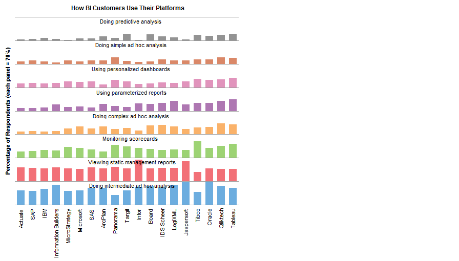
I went back to the panel approach, but I made a few changes. I ranged the tasks from hardest (Predictive Analysis) at the top of each list to easiest (Static Management Reports) at the bottom. I wanted to normalize the values so that the more difficult tasks didn’t have the shortest bars. Starting with each value, I subtracted the minimum from its category, then divided by the span (maximum minus minimum) within its category. This gave normalized values from 0 (lowest) to 1 (highest). This gave a somewhat more quantitative value than if I’d simply ranked the vendors.
The chart shows that Tableau and Qliktech are mostly at the top of each category, except the easiest), with Oracle and Tibco mostly in the middle to top of each category.
Joel says
Jon, good article as always. I’m starting to prefer blogs with less-frequent, longer-posts because chatter can get tiring.
Since you and commenter Vincent both mentioned manual digitizing, I wanted to suggest a handly little utility to do just that
http://www.frantz.fi/software/g3data.php
There’s a windows exe in the middle of the page.
It is a GNU licensed free software that lets you digitize data points and axes off an image and then spits out a table of values.
I use it extensively to pull data from older, scanned academic articles that don’t include source data and it’s been a great help.
Keep up the good work
Mathias says
Jon,
Just a brief comment on your first step, the modification of the legend. It’s a minor modification, but it makes a world of difference for someone who is color blind – like me. The original legend forces me to do lots of guess work as to what maps to what, whereas yours has an unambiguous order, which makes it way easier to figure out the series labels.
Mathias
Jon Peltier says
Mathias –
I did that to avoid guesswork on my part, and my color vision is “normal”. It simply makes sense to put legend entries into a linear patter in the same order as the series they are labeling. Any benefit for color-deficient vision is a bonus. In fact, when I first did the analysis, I was looking at the Gartner chart, and I couldn’t distinguish several of the colors in the teeny little legend squares. If you see my exchange with Naomi, you’ll see that I mis-correlated the legend to the data.
paresh shah says
Yes Jon, Tableau is without any doubt a great product – I am sure this data could have been easily presented as a panel chart in Tableau, no limitation in the tool. Please check out a panel chart that I have posted on my blog http://www.visualquest.in The data set too is quite interesting – from the Mindless Eating web site.
Andy Cotgreave says
Hi Jon
Yes, I could have (and probably should have) used a listbox. I was in a rush, and trying to get the view to fit a certain size; the quicker and dirtier way was with a slider. I accept your point about a slider’s usability issue.
To do the small multiple approach as you’ve done in Tableaus is actually difficult using the dataset as it is. In Tableau, a small multiple is created when each column and each row is a distinct category within a dimension. There is nothing to distinguish any of the vendors from one another – why should Tableau appear in column one instead of column two, for example?
It could be done using calculated fields to group each vendor into artificial columns/rows, which is a little fiddly.
Jon Peltier says
Interesting. I fiddled a bit with the data. I had to normalize it so I could explore all the factors properly (i.e., fields for Sex, Order, Sequence, ID, Bowl Size, and finally Number). This helped to show the uneven distribution of buckets and also of blank cells (are these missing data or zero values). Also there are six possible sequences and you’ve sampled three. But it’s a start. Maybe I’ll have some time later to look at it.
Jon Peltier says
Andy –
Couldn’t you just insert a couple dummy fields, Row and Column, for each vendor’s position in the grid? I’m starting to think of how to accomplish this in an Excel macro, and that’s one approach to sort it out. The other is just to put them into cells in order.
Andy Cotgreave says
@ Jon
Yes, that’s what you’d do – maybe I exaggerated how “difficult” it is!
Andy
Jeff Weir says
Hi Jon. Nice post. Any chance you can repost your panel charts side by side against the same chart but with the series all the same colour?
I’d like to see if the colours of the series are distracting or distorting when comparing between vendors.
Cheers
Jeff
Jon Peltier says
Jeff: How’s this?
paresh shah says
Hi Jon,
An interesting discussion indeed.
Well how about a heat map to visualize the data, I have plotted one on my blog,
In my visualization I have coupled the heat map with a data table to facilitate precise comparison.
The heat map does a great job I think. Take a look.
Jon Peltier says
Paresh –
Thanks for your comment. I’ve appended your dot heat map. It’s not a bad approach, but I think it is less effective than the panels using bars, at least for this data set.
If the data for each task had more similar distributions, the heat map would be effective. Note the chart in one of my comments that used normalized data instead of raw percentages. What your graph shows is that many more people do the easier tasks with all packages, and many fewer do the harder tasks. I think we just need to understand people to know this, and not take a survey. Using the heat map, it’s more difficult to distinguish between vendors than between tasks, and I think the distinction between vendors is more important.
Jeff Weir says
Thanks Jon…must say I prefer the uncoloured version if you want to compare directly across vendors.
Mind you, if you want to compare directly across, here’s my interpretation: A matrix where you can compare differences across platforms compared to the particular platform you select using a data validation list.
For instance, you can see how the other platforms compare to Tableau.
From this, we can see that all platforms make equal or more use of their static management reports than Tableau users, with the exception of Tibco. Note that Infor and Jaspersoft users make significantly more use of this function. We can also see that the closest match to Tableau across all measures was Qliktech.
Lets see how all platforms compare to the average platform.
Tableau (and also Qliktech and Tibco) stand out on most measures bar static management reports, but Tableau is only slightly above the average in terms of parameterized reports.
My spreadsheet (Excel 2007) is at http://cid-f380a394764ef31f.skydrive.live.com/self.aspx/.Public/Panel%20chart%20matrix%203.xlsm if anyone wants to play around with it.
Stephen Few says
Jon, et. al.,
It’s quite useful to watch graph designs evolve through discussions like this. If Gartner’s BI Magic Quadrant data was actually reliable, which is not the case (it’s true magic in the “smoke and mirrors” sense), then I would vote for Jon’s final versions of the trellis chart (the ones with the single bar color) as the most useful in general. Different designs, of course, are useful for different purposes. I’m glad that Naomi chimed in with the conventional name for this type of display–“trellis” (or what Tufte calls “small multiples”). The terminology is confusing enough without introducing a new name for a chart that’s been around for years.
I want to correct a couple of small errors that were made in the discussion.
1) It was stated that Tableau can produce trellis charts. In fact, this is not the case. In a trellis chart, the graphs can be arranged into both columns and rows, but the variables that are displayed are the same throughout (that is, in all the graphs). If the number of graphs is not equally divisible by the number of rows, you can end up with a final row that isn’t filled with graphs. This is the case with Jon’s example, which has only three rather than the usual four graphs in the final row. With Tableau, when a series of graphs is arranged into both columns and rows, the graphs vary along one variable by column and along a different variable by row. To distinguish this from a trellis display, I usually call this a “visual crosstab”, because it is like a regular crosstab in Excel, but it displays the values graphically rather than as text. Some of the products that support trellis charts cannot support visual crosstabs, and at this point, Tableau is not designed to support trellis charts. If I had to choose between these two types of displays, I would go with the visual crosstab, but I’d rather not have to choose, because both are quite useful.
2) What Paresh referred to as a heat map is not in fact a heat map. What makes a chart a heat map is the fact that quantitative values are encoded as variations in color, such as from light to dark colors. What Paresh designed is not a dot plot either, which uses the position of each dot to encode its value. I’m not sure that there is an official name for the chart that Paresh created, but it can be described as a crosstab (or matrix) arrangement of bubbles (what we call data points when they vary in size to encode differences in values). I’m glad that Jon pointed out that bubbles in this case are inferior to bars, because visual perception is not tuned to compare areas, but highly tuned to compare differences in the lengths of bars.
(By the way, is this the same Paresh Shah who posted the only negative review of my book “Now You See It” on Amazon? If so, the only explanation for your 1 out of 5 star rating is that the book is very basic. Yes, it is intentionally very basic. Most people need the basic skills that it teaches. I’d love to hear your thoughts either directly via email at [email protected] or on my discussion forum or blog at http://www.perceptualedge.com.)
Jon Peltier says
Stephen –
Thanks for your thoughtful comments. I don’t know much about the reliability of the so-called magic quadrants, I guess it depends on the quality of the surveys and results. I once contracted for a competitor of Gartner’s, and concluded that the whole industry is at its best when smoke and mirrors are involved.
I do not mean to confuse the issue with new terminology. I understand that the term “trellis chart” has been trademarked, and to me, these charts are a bit more than simply small multiples. Some time ago I adopted Kelly O’Day’s term “panel chart”, and it has stuck in my mind.
I’m working on a utility to generate this type of matrix graphs in Excel. One option will be between trellis and crosstab, and as far as the underlying framework is involved, they are the same. The “secret” is in the way the data has to be arranged. Since Excel does neither natively and I’m the programmer, I can do them in the way that makes most sense. I have not used Tableau enough to have realized they don’t include trellis displays in their toolbox, and I’m a little surprised. I would not be surprised to find it on their to-do list, because they strike me as conscientious followers of good graphics practices.
Stephen Few says
Jon,
If the term “trellis chart” is trademarked, it shouldn’t be. As I understand it, the people who coined the term originally meant it as the name for this type of chart, not of a particular vendor’s implementation of it. Trademark law gets a bit silly at times and I find myself flaunting it on occasion and encouraging others to do the same. For example, a vendor has apparently trademarked the term “visual analytics”, but I’ll be damned if I’m going to stop using the term just because some vendor decided to put a lock on it. I’ve had editors caution my about using the term for fear of being sued. Words are words, and in my opinion it is wrong to legislate the use of language in this way.
I’m glad to hear that you’re developing a utility for creating various forms of small multiples (trellis charts and visual crosstabs) in Excel. You can rest assured that they won’t be built into the charting capabilities of Excel for at least three more years, and probably well beyond that.
I believe that Tableau doesn’t support the trellised version of small multiples because the tabular (or crosstab) paradigm is fundamental to their architecture, thus the name “Tableau”. They probably have a few visualization techniques that they refrain from supporting until they decide it’s time to break the boundaries of this paradigm. So far, it has served them well.
Vincent says
According to me, the last graph from Jeff (comparison to average) is by far the clearest graph generated in this post. You really get a message out of it. I like it very much.
You see the graph and you can immediately take a decision on which tool should I use.
Grest Job !
Vincent
Jeff Weir says
Vincent: You see the graph and you can immediately take a decision on which tool should I use.
…that tool being excel, of course ;-)
Thanks for the feedback. Be sure to check out Chandoo’s blog over at http://chandoo.org/wp/2010/04/01/incell-panel-chart/ where he’s used an in-cell approach.
Would be simple enough to amend his approach to show differences, or even have a check box that swaps between absolute values and differences.
Naomi B. Robbins says
I’m afraid that I’m to blame for the confusing terminology of trellis, panel, etc. since I told Kelly O’Day that the term “trellis” was trademarked by the Insightful Corporation. Insightful was the company that produced S-Plus, a supported and enhanced version of the S language developed at Bell Labs. Tibco has since acquired Insightful. I was not alone since the R language calls these charts lattice; their team also thought that the term trellis was a registered trademark. In any case, Kelly decided to introduce the term panel to avoid trademark infringement.
from http://www.uspto.gov/web/offices/tac/doc/basic/register.htm
“Any time you claim rights in a mark, you may use the “TM” (trademark) or “SM” (service mark) designation to alert the public to your claim, regardless of whether you have filed an application with the USPTO. However, you may use the federal registration symbol “®” only after the USPTO actually registers a mark, and not while an application is pending. Also, you may use the registration symbol with the mark only on or in connection with the goods and/or services listed in the federal trademark .”
Trellis is not on the list at the government site for registered trademarks. Tibco lists it as TM and not as a registered trademark.
For more comments on trellis watch for an article I wrote on trellis to appear in the Wiley Interdisciplinary Reviews: Computational Statistics. And speaking of that article, thanks Steve for correcting me about Tableau and trellis. I think I may have included Tableau in the list of software that can produce trellis. Let me see if it’s too late to change it.
paresh shah says
Since Stephen has y pointed out that the chart that I have created is not a ‘heat map’ and that possibly no official name exists for such charts, I would like to name the chart – “bubble-matrix chart.”
Let me point out however that a similar chart appeared in “Me, Myself and BI” , Bissantz’s blog in his posting on “criss crossing circles.” http://blog.bissantz.com/criss-crossing-circles . As he writes “Circles are usually annoying because it is harder to estimate the area than the length of something. Although they generally have a bad reputation, there is one good thing about them: Circles can be compared in two directions, vertically and horizontally or by rows and columns.”
I also believe that this charts would be useful in studying patterns and for identifying exceptional instances. They may not have comparative accuracy but this could possibly be overcome by providing a data table.
Jon Peltier says
Paresh –
These bubble-grid style charts are not uncommon. I showed one recently in Crosstab Heat Map. They are used far more than their effectiveness would dictate. Use of a data table simply underscores their lack of effectiveness.
These and similar charts can be used to show patterns, as in Derek Cotter’s “spot matrix” chart that I used in Spider Chart Alternatives. However, panel/trellis arrangements of bars as well as color-coded heat maps and even humble old line charts are at least as effective.
Andy Cotgreave says
When Stephen Few says “Tableau can’t do tellis charts,” I see that as a challenge! Check this out:
http://bit.ly/aXXmci
The thing is, Stephen is correct – what I’ve done isn’t really a a trellis chart. I had to create hard-coded Row and Column Groups to artificially place each Vendor into a particular cell on the matrix. On first look, this seems okay, but the stand out problem is that because of Tableau’s design, there’s no practical way of labelling each cell with the name of the vendor (I could do it using manually created annotations, but I don’t have time!).
Because I can’t label the cells, I need to use a colour legend, which is totally unsatisfactory.
And, should another vendor be added to the dataset, it won’t automatically appear.
It’s been interesting following the story of this viz, but the more we investigate, the more we digress from the point that Gartner were originally trying to make. Their point was that Tableau and Qliktech have the highest variety of uses by their customers. The more I look at the original chart, the more I think that, well, yes, you can’t sum percentages, but you know, it did at least come up with a way of combining marks to show which vendors were most versatile. All the ones we’ve come up with are more “pure” but I increasingly wonder if they are harder to interpret?
Andy Cotgreave says
PS: I redesigned my original sheet to show all the filter choices:
http://bit.ly/cunLH5
Jon Peltier says
Andy –
You and I both love a challenge, I see. Your challenge is “Tableau can’t do trellises” while mine is “Excel can’t do ___ charts”, or more generally, “Excel charts suck”.
The Gartner chart is somewhat informative, if all you care about is the total of all bars. It’s not easy to use if you want to look at the individual tasks. It becomes inaccurate if there are any tasks left out of the chart or if any two tasks really mean doing the same thing. The fact that some vendors are more highly rated for simple tasks may also skew the totals.
The trellis displays help show which platforms are more widely used for which tasks, that is, comparing the items that Gartner merely piled up to get a cumulative rating. A trellis display is not overturned if a new task is included, because the other bars retain their relative standings. And trellis displays are not all that difficult to interpret.
Stephen Few says
Paresh,
By taking advice from the Bissantz blog, you’ve placed your faith in a source that has a limited understanding of data visualization. I once responded to a claim made in Bissantz’s blog that a series of bar’s could be read more efficiently if enhanced by giving each bar a different musical note and then playing the series. Anyone who knows the difference between auditory processing in the brain (a serial process) and visual processing (a parallel process), however, knows that you don’t speed something up by switching from parallel to serial processing.
The claim that a matrix of circles has the advantage over a matrix of bars in that it can be compared in both directions simply isn’t true. You can compare bars in both directions as well. If the bars are horizontal, then comparing them across a row works less well then comparing them in a column (the bars share a common baseline in the column), but comparing the bars in a row still works better than comparing the circles in either direction. To read and compare circles in either direction, we’re still forced to compare areas, which we can’t do well. Even when arranged end to end, we can still compare bars more accurately.
Naomi B. Robbins says
Steve, Andy, et al.,
Tableau can produce SOME trellis graphs. After all, Figures 3.15, 5.7 and others from Now You See It were created with Tableau. Maybe we should be saying that Tableau cannot create trellis plots with both rows and columns.
Steve,
What software did you use for Figure 3.29 and others like it?
Stephen Few says
Naomi,
I created the trellis display that appears as figure 3.29 in my book “Now You See It” using Excel, but it involved a painstaking process of copying/pasting and chart alignment.
Naomi B. Robbins says
I’ve also created trellis plots in Excel by cutting and pasting. Jon, we need your upcoming utility.
Jon Peltier says
Naomi – It’s in my short list, which unfortunately is also rather long.
Jeff Weir says
Stephen…have you also seen Naiomi’s post at https://peltiertech.com/some-comments-on-dot-plots-guest-post/ on dot plots?
Note that the chart I posted above in the comments was done in Excel, and I agree this was a rather painstaking way to create such a chart in terms of aligning the charts to the labels underneath (the labels and grey stripes are in spreadsheet cells, not actually chart elements).
John Walkenbach’s utilities package could have probably saved me some time here… see http://spreadsheetpage.com/index.php/pupv7/utilities#3. There’s a resize charts function that makes it easy to make a chart an exact size, or make all charts the same size; and an Object Align, Size & Space option that provides an easy way to precisely align, size, and space a group of objects or embedded charts (although for some reason I couldn’t get this to work in this particular worksheet. I’ll have another go)
However, without using this addin, I used a few shortcuts: after I got the first chart right, I just copied it, and pasted it where I wanted the 2nd chart, and changed where the series point. After I got the first row right (i.e. the top 5 charts) I just copied the rows where these charts sat, and pasted below the first row multiple times.
While this saved some time, it was still pretty fiddley.
But the chart I posted in the comments over at https://peltiertech.com/some-comments-on-dot-plots-guest-post/ used formulas to do the charting, rather than chart objects themselves (although I used smiley faces instead of dots as a joke.)
There’s some screenshots and a link to a download there.
Regardless how fiddley it sometimes is to create non-standard charts, you can usually easily amend something you’ve done previously rather than create the whole thing from scratch. Or you can often find and download someone’s how-to guide (or even better, a working spreadsheet template) off the net.
Jon Peltier says
Jeff –
The problem with using John’s routine to resize your charts is that it resizes the outermost shape that contains the chart. The inner plotting rectangle can only be resized indirectly, because Excel reserves space around it for axis tick marks and labels. I’ve used indirect routines to reshape the inner charting rectangle, but any small change seems to knock it out of kilter; changes like font name and size, axis scale limits, and whether you’ve visited print setup recently. This is why I try to do as much as possible in a single Excel chart, that is, in a panel chart.
Naomi B. Robbins says
While we’re complaining about creating these plots in Excel, I’ll mention that I just posted how easy they are to draw in R on the dot plot post. To get another similar plot, I’ll just edit the code I used before (or someone else’s code).