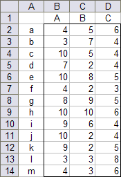
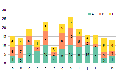
When you create a stacked column chart, the columns are stacked in the order that the series are added to the chart. When the simple data shown below is plotted, Series A is on the bottom, Series B is stacked on A, and C is stacked on B. This order disregards the individual values of the points at each category.
 – – –
– – – 
It is often desirable to sort the individual stacks so that smaller values are plotted on larger values. Last week I was asked how to do this, and I thought I’d try doing it with worksheet formulas, and if that became too complex then I’d work something up in VBA.
Worksheet Formula Approach
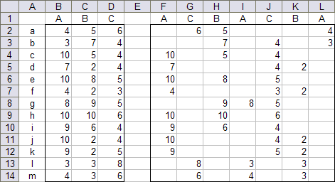
The worksheet formula approach requires more than three series, each series having some values and some zeros, so that stacking thee values and zeros together shows the visible data points in order of size. The data range is duplicated below, with a second range constructed with formulas to plot the visible data in the proper order.

For three visible series, seven series are required. The formulas, derived with careful algorithms and especially with trial and error, are listed below. These formulas go into row 2, and are copied down to fill the range.
$F$2     =IF(AND(B2>=C2,B2>=D2),B2,"")
$G$2     =IF(AND(D2>B2,D2>C2),D2,"")
$H$2     =IF(OR(C2>B2,C2>=D2),C2,"")
$I$2     =IF(OR(AND(B2>=C2,B2<D2),AND(B2>=D2,B2<C2)),B2,"")
$J$2     =IF(OR(D2<=B2,D2<=C2),D2,"")
$K$2     =IF(AND(C2<=B2,C2<D2),C2,"")
$L$2     =IF(AND(B2<C2,B2<D2),B2,"")
Create a chart with the calculated values, and use the same formatting for all series with the same name.

Remove redundant legend entries: click once to select the legend, then once more to select the legend entry (the text, not the colored box), and press Delete.

Three is about the most distinct series you could easily do with this technique. If three series required seven columns of calculations, four must require eleven or more (I got too tangled up to sort this out).
An upcoming post will show a VBA technique that is not limited to three series.


Scott says
Interesting, but I think I would see more value in dynamically sorting left to right by the size of each series. There are occasions where it is nice to quickly evaluate the order of series in a column.
Also, your 7 columns didn’t consistently deal with ties (e.g. columns H & L ). When A&B are tied and they are the largest values they stay in A/B order, but if they are tied and C is the largest value, they swap to be B/A based on the order of your 7 comparison columns.
I would have probably attacked it with three columns (one per series) with functions for the RANK in the row. Followed by nine columns of (A,B,C),(A,B,C),(A,B,C) with logic of if A is rank 1 it’s value goes in the first A column, if it is rank 2 it goes in the second A column etc. After that the same plotting can be done that you show with deleting the legend entries etc.
Jon Peltier says
Scott –
Your approach seems somewhat simpler to construct and follow than mine. See, like I tell people, sometimes it’s smarter to use a couple extra columns than try to write some massively clever formulas which only save a column or two.
When I get a chance I’ll rewrite my blog entry using your setup.
DMurphy says
You like setting a challenge, Jon, so here is my solution to the 4-series problem. I’m not a great fan of embedded IFs/ANDs/ORs, so I went down the line of using MAX, MIN and LARGE functions (SMALL could also have worked):
http://www.box.net/shared/mm3i06ql3r
Please feel free to share.
Jon Peltier says
I started with LARGE, but got tripped up by duplicate values. I’ll have to check out your workbook to see how you handled that.
DMurphy says
Sorry folks – just noticed that it fails if there are triplicates! Needs further thought!
DMurphy says
…but here’s a version which appears to work if there are 3 or 4 identical values.
http://www.box.net/shared/mm3i06ql3r
Jon Peltier says
One trick. if you need to preserve order when sorting duplicates, is to add a small amount to each value according to position. If columns are A to Z, left to right, add something like (value+column())/10000 to each. It means maintaining an extra data region, but you need an extra anyway to contain the sorted values.
Bob says
Hi,
Wouldn’t the same information be better presented in a standard cluster chart?
Or perhaps a panel chart?
Just a thought.
Cheers,
Bob
Jon Peltier says
Bob –
The more I look at this chart, the less effective I think it is. I think I’d prefer a clustered column chart.
Bob says
Hi,
Just because it is possible to build this chart in Excel. Doesn’t mean you should. :)
Although, well crafted VBA is always fun to look at for inspiration.
Cheers,
Bob
mo hicks says
Before Word 2010, I could easily edit a misspelled legend entry in a graph. Now I can’t seem to change the spelling to the preferred one. I know I must be able to do this simple function but it is not a right click choice under EDIT ENTRY as it should be! Please Help! When I hit the little graph to enter the original data, I still don’t find a way to edit the spelling of an entry.
Jon Peltier says
Mo –
Chart Tools > Design tab > Select Data. Select the series under “Legend Entries (Series)”, click Edit, then click in the Series Name data entry box. Select a cell containing the series name, or type the name you want.
AK74 says
I seem to be getting a mismatch runtime error ’13’ on this. Is there something that I might be doing wrong?
Jon Peltier says
AK –
I assume you mean you get an error running the code in https://peltiertech.com/stack-columns-in-order-of-size-with-vba/
At what line of code does the error occur? I just ran the code for the first time in years, in Excel 2013, with no problem.