I recently posted about Stacked Bar Chart Alternatives and included some rather cluttered charts with markers and lines, which I referred to as “Dot Plots”. I was called to task by none other than Naomi Robbins, author, researcher, consultant, and renowned expert in the field of data presentation graphics. Briefly, Naomi recoiled at the thought of my ugly graphics being grouped with the clean and effective Dot Plots that she has written about extensively. I requested that she follow up her comments with a blog post, and she has graciously provided the following article.
Some Comments on Dot Plots by Naomi Robbins
Jon Peltier posted a blog entitled “Stacked Bar Chart Alternatives” which generated active discussion. One of the alternative charts that Jon presented and then rejected as being too cluttered was called a “dot plot”. Since I am a major fan of dot plots, I cringed when I saw this and was further disturbed when I saw other blogs about stacked bar chart alternatives picking up on this. This post presents trellis dot plots of the data from the stacked bar chart and provides some comments and references about dot plots.
Bill Cleveland and his colleagues at Bell Labs introduced dot plots after conducting carefully controlled experiments on human perception as it relates to decoding information from graphs [1]. Cleveland uses dot plots extensively in his two books: The Elements of Graphing Data and Visualizing Data. I also make frequent use of dot plots in Creating More Effective Graphs. Stephen Few invited me to write an article about dot plots for the February 2006 issue of the B-Eye newsletter [2]. However, you will not see a figure that resembles the tangled mess of the example in the Peltier Tech Blog labeled dot plots in any of the references above.
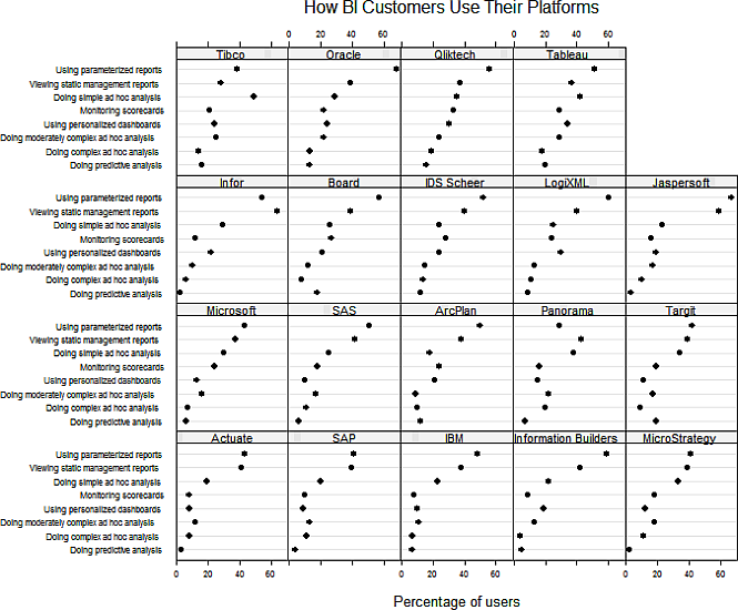
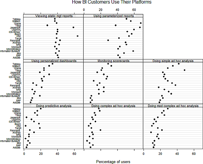
These two figures show the type of graphs that appear in Cleveland and my works. I show them more to explain what we mean by dot plots and trellis dot plots than to add another alternative to the stacked bar chart. As many of the comments point out, the best chart depends on the purpose the designer has in creating the chart. I might choose a trellis chart if my point was “Here are the results of the survey” while I might prefer Jeff’s version if I represented Tableau and wanted to show its capabilities. I am a big believer in showing data more than one way since each presentation highlights a different aspect of the data.
Of course, I could have used color but I wanted to emphasize the fact that these charts do not depend on color the way that the stacked bar chart does. There still are many publishers that don’t allow color and many people reproduce charts on black and white copiers.
These figures were created using S-Plus 6.2, an old version of S-Plus. If any of you are R users, contact me at naomi at nbr-graphs dot com if you’re willing to help me figure out what’s wrong with my R code (the grid lines don’t show even though I copied and pasted code from another figure where they do show.)
Dot Plots or Bar Graphs
Both bar charts and dot plots are used when there are both categorical and quantitative variables. Which of these should we use?
Stephen Few says :
Because the endpoints of bars encode quantitative values, points (e.g., dots) at the same locations as the bars’ endpoints could replace the bars and convey the same meaning. So why use bars at all? Bars do one thing extremely well: due to their visual weight, they stand out so clearly and distinctly from one another that they do a great job of representing individual values discretely. [6]
I repeatedly have said that bar charts get more cluttered than dot plots. At first glance it would seem that we are in disagreement. However, if you look more closely, you will notice that many of Few’s examples have four or five data points such as the four quarters of a year or the four regions of the country while many of my examples have around 50 data points such as the 50 states. I have seen documents by Few where he uses dot plots with more data points and I will readily admit to using bar charts if I only have a handful of data to plot. Therefore, as with most issues, Steve and I agree on this one. See [5] for a discussion of advantages of dot plots over bar charts. Dot charts are appropriate when it is desirable not to include zero on the axis, error bars show up better on dot plots, and logarithmic scales work better with dot plots.
Dot plots and lines
You will notice that Jon used lines to connect the dots of the different vendors while my dots are not connected. In general, I feel that it is much more important to connect the dots to their labels than to other data points, although with as many series as Jon used, the lines were needed to distinguish the data series. Also, the pattern that you get by connecting the points is arbitrary; a different ordering of the labels would produce a different pattern. Obviously, I do not like connecting the points. However, I am well aware that many graph experts I respect disagree with me on this issue. One example is Dan Carr who connects the points on his linked micromaps (see page 136 of [4]).
Dot plots and Excel
I am unaware of utilities to draw dot plots in Excel that were available before Creating More Effective Graphs was published. I asked Ken Klein, an Excel user, to write a macro for me to provide to readers of the book. Kelly O’Day wrote one of the first Amazon reviews of the book and posted instructions on his Web site for creating graph forms that I recommend in Excel. Then Charlie Kyd and Jon provided instructions and/or utilities to produce these plots. Links to their sites are available at http://www.nbr-graphs.com/trainframe.html. Thank you, Jon, for providing this much needed service to Excel users.
1. Cleveland, William S. and Robert Mc Gill. 1984. “Graphical Perception: Theory, Experimentation, and Application to the Development of Graphical Methods.” Journal of the American Statistical Association 79:531-554.
2. Cleveland, William S. 1994. The Elements of Graphing Data. Revised edition. Hobart Press, Summit, New Jersey.
3. Cleveland, William S. 1993. Visualizing Data. Hobart Press, Summit, New Jersey.
4. Robbins, Naomi B. 2005. Creating More Effective Graphs. Wiley, Hoboken, New Jersey.
5. Robbins, Naomi B. 2006. “Dot Plots: A Useful Alternative to Bar Charts,” http://www.b-eye-network.com/view/2468
6. Few, Stephen. 2005. Show Me the Numbers: Designing Tables and Graphs to Enlighten. Analytics Press, Oakland, California, page 59.
About the Author
Naomi B. Robbins is the author of Creating More Effective Graphs, published by John Wiley (2005). She is a consultant, keynote speaker, and seminar leader who specializes in the graphical display of data. She trains employees of corporations and organizations on the effective presentation of data. She also reviews documents and presentations for clients, suggesting improvements or alternative presentations as appropriate. Naomi received her Ph.D. in mathematical statistics from Columbia University. She had a long career at Bell Laboratories before forming NBR, her consulting practice.
I recently picked up Naomi’s book Creating More Effective Graphs. I’m a bookaholic, so it’s surprising that I’ve known of the book for so long without getting a copy. It was worth the wait. It’s an easy read, and because of its simple approaches, clear explanations, and good examples, I’ve rated the book two thumbs up.


dermotb says
To be honest, I found Naomi’s dot plots very cluttered. The first set of plots summarises by product, but it is practically impossible to make a comparison with other products.
The second set of plots does this, but it is difficult to pick out which dot belongs to any product, because the rows are closely bunched and the charts are very wide, and the results are spread across three rows of plots. It’s difficult to quickly get an overall impression of the comparative use of one product against another.
IMHO, a simple heat chart (a table of numbers, coloured to indicate extent of use relative to competitors) would do a much better job of presenting both aspects of the data (each product on its own, and comparatively), effectively and compactly.
Jeff Weir says
I really like the dot plots. I think they are very easy on the eye, and make it much easier to compare between graphs than the bars.
The problem with Jon’s original stacked bar graph and in my reworking of it is that a few optical distortions. You get the Hermann grid illusion where black spots are seen at the intersection of the bars. I’m also seeing something not unlike a Rubin’s Vase effect caused by the big blocks of colour with white gaps between (see http://screencast.com/t/Y2EwZmY5MmYt for Rubin’s vase or wiki him). (Maybe I’ve been visiting too many bars)
But the dot plot is nice and clean, yessiree.
I’m pretty sure that if I changed all my chart types to scatterplots I should be able to replicate the charts I posted pictures of in Jon’s original post at https://peltiertech.com/stacked-bar-chart-alternatives/ in excel. I’ll give it a go as time permits. Unfortunately line charts with the lines removed won’t do it, because the charts are oriented left to right rather than north to south.
Thanks for the insight and the reading references, Naomi.
Jeff Weir says
Actually, Chandoo’s in-cell graphs at http://chandoo.org/wp/2010/04/01/incell-panel-chart/?utm_source=feedburner&utm_medium=feed&utm_campaign=Feed%3A+PointyHairedDilbert+%28Pointy+Haired+Dilbert%29&utm_content=Google+Reader would be fairly easy to convert to dot-plots.
Perhaps he’ll post an updated version.
Naomi B. Robbins says
Thanks to Richard Cotton who looked at my R code and found my careless mistake. Just write to me if you’d like the R or S-Plus code.
cesc says
I like the dot plots. They are very clean. Maybe the graphs can be better if she increase the space of categories and use other colors/symbols for maximun and minimun values in each comparison.
Jeff Weir says
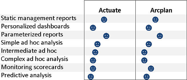
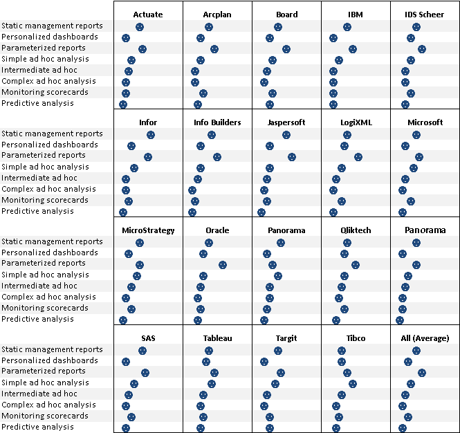
I’ve invented a new type of graph…the smiley face plot.
Just uploaded a revised display using this to http://cid-f380a394764ef31f.skydrive.live.com/self.aspx/.Public/Dot%20plot%20matrix.xlsx
(Sorry, can’t post a screenshot from here).
Jeff Weir says
Okay, here’s a screenshot (closeup) http://screencast.com/t/NDFhMTc1
And here’s the whole dashboard: http://screencast.com/t/ZWZiYzUwZmUt
Jon Peltier says
Jeff –
You ought to color code the smileys, and use different expressions (smile vs frown, eyes open vs shut, etc.) to encode more information. Oh wait, that produces glyphs, which are remarkably useless.
The different panels don’t seem scaled to each other, at least not obviously enough to allow comparisons.
Naomi B. Robbins says
cesc: Thank you for your suggestion. Here is the figure with space added. Your comment emphasizes a point that I often make: A small change in a graph can make a big change in its clarity.
dermotb: Does the simple change suggested by cesc make the figure less cluttered?
cesc: I’m not sure that I understand your second point. Are you suggesting that I color code the maximum and minimum within each panel? Are you suggesting this for both charts or just the top one by vendor?
Jeff Weir says
Jon, you’re a hard graphmaster.
Just realised that not everyone might have unicode fonts installed. So here it is again in a common font:
http://screencast.com/t/OWRmODA4
cesc says
Thank you for your answer Naomi. In my second comment the idea was to propose something like the last graph posted by Jeff. It’s amazing.
Jeff Weir says
cesc…I was just joking with the faces. You don’t need different symbols…the whole point of the dot plot is that your mind is pretty good at picking out different patterns with dots alone, and adding another thing to ‘decode’ is probably just going to slow your mind down.
Jon Peltier says
Jeff –
I was taking your joke to its illogical conclusion. Ever see a plot using distorted faces as glyphs? Also called Chernoff faces, some (Chernoff Faces) think they’re an effective way to pack information densely (though their examples demonstrate otherwise, at least to me), but Bob Kosara argued otherwise in A Critique of Chernoff Faces. I’m 100% with Bob on this one.
Jeff Weir says
Yes, another 1970s folly…although arguably I’m the same.
It was the best of times, it was the worst of times; it was the age of Star wars, it was the age of Sky Lab; it was the epoch of pet rocks, it was the epoch of Platform shoes, it was the season of Grease, it was the season of the Rocky Horror Picture Show; it was the spring of the oil crisis, it was the winter of Burt Reynolds; we had watergate before us, we had waterbeds before us.
There were a king with a large jaw and a queen with a plain face, on the x axis; there were a king with a large jaw and a queen with a fair face, on the y axis.
Ahhh, the 1970s.
Naomi B. Robbins says
I was asked to provide the R-code for the dot plot. Since many of you don’t know R, I will try to give some explanations.
I put the data from Jon’s file into a dataset I called BIS for Business Intelligence Software.
The next two lines order the vendor and data variables by the mean of the percentage variable.
reorder.factor is a function in S-Plus that I copied to use in R.
reorder.factor<- function(Factor, X, Function = mean, …)
ordered(Factor, levels(Factor)[order(tapply(X, Factor, Function, …))])
Next I tell R that I'm using the lattice package and I don't want color.
The rest says that I want the dotplot function with the ordered variables. cex < 1 just reduces the fontsize. Notice that the tick mark labels alternate between the top and the bottom so that we don't have run-on labels. The scales parameter took care of that. The layout parameter lets you specify how many columns and rows you want.
I stored the results in ans and then showed ans.
BIS <- read.table("G:\\Rdata\\stackbardata.csv", header=T, sep=",")
oVendor <- reorder.factor(BIS$Vendor, BIS$Pctg)
oData <- reorder.factor(BIS$Data, BIS$Pctg)
library(lattice)
trellis.device(color=F)
ans <- dotplot(oData ~ BIS$Pctg | oVendor,
cex=0.8,
scales= list(y = list(alternating = 1, cex=0.8)),
par.strip.text = list(cex=0.8),
xlab = list("Percentage of users", cex=0.8),
main = "How BI Customers Use Their Platforms",
layout=c(4,5),
trellis.par.set(list(fontsize=list(text=10))))
ans
pompadourofdataviz says
An alternative to method to creating these dot plots and any other in-cell graph is simply shrinking down a normal excel chart. The allows one to leverage all the power and flexibility of excels charts without requiring any hacks. This approach is explained at:
http://pushindatalikeweight.com/2009/12/05/excel-2010-sparklines-v-small-multiples/#comments
-PDV
Jeff Weir says
pompadourofdataviz : I use shrunken charts as sparklines a lot in my work, and agree they are very helpful. If you’ve got excel 2007 or later, they far surpass what you can do with the Excel Sparklines functionality introduced in 2010. (I commented on one of Jon’s posts at
https://peltiertech.com/sparklines-for-excel-vs-excel-2010-sparklines-guest-post/ regarding this, if you want to see an example of how I’m using them. I love ’em)
But for a solution such as the above one I’d prefer to whip up 160 incell formula-based graphs, rather than shrink lots of fully-fledged graphs down to one cell and then spend all that time pointing each graph to the appropriate series. Although excel will certainly let you do it.
In regards to your comment on Chandoo’s related blog post about these sparklines not natively having dot markers for the first and last points only of the graph series only, I’ve just started using some array formulas that feed off my graph series to whip these up on the fly.
Here’s a screenshot by way of explanation:
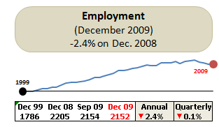
For this particular chart, new data is added to the spreadsheet every quarter, but I only ever want to graph data for the last 10 years. As you can see, I added markers just for the first and last entries as well as a line horizontal to the first point so that you can easily judge how the series has moved over time (10 years) relative to that first point.
Normally I’d add 2 more series on my data sheet for these below where the original graph series sits, and reference them with a dynamic formula to take into account additional data additions. For the markers, I’d use one with a whole heap of =NA() formulas except for the first and last data point which would point to their corresponding data for the first and last dates. Then I’d format that series so that it had round markers, and no line. For the horizontal line, I’d put an absolute reference to the first data point and just copy it along.
But when you’re using lots of graphs with lots of data points, adding 2 extra ‘helper’ series per graph is a pain. And if your ranges change size, the formulas for the marker series would have to be respecified so that they are the correct length with the correct first and last data points specified.
So the other day I created some dynamic arrays to do this. First I defined a dynamic name called Employment_Series that returns the last 10 years data from the spreadsheet.
Then for the markers series I then define another dynamic named range called Employment_Series_Markers that creates a new series the same length as the Employment_Series, but with #N/As for every number except for the first number and last number in the series. This range has the formula:
=(IF(- – (Employment_Series = OFFSET(Employment_Series,0, MATCH(Last_Cell,Employment_Series)-1,1,1)) + – – (Employment_Series=OFFSET(Employment_Series,0,0,1,1)) =0,NA(),1))*Employment_Series
…with the name Last_Cell defined as the constant =9.99999999999999E+307
This creates an appropriately sized series on the fly. If the Employment_Series data reference expands, contracts, or moves, my Employment_Series_Markers array adjusts accordingly.
Then for the horizontal line series (horizontal from the first point of the Employment_Series series) I use the following formula:
=(–(Employment_Series=Employment_Series)*OFFSET(Employment_Series,0,0,1,1))
So if my range Employment_Series is an array such as {10,5,6,7,8,0,2} then the Employment_Series_Markers array is {10,#N/A, #N/A,,#N/A, ,#N/A, #N/A, 2} and the Employment_Series_Line array is {10,10,10,10,10,10,10}
And if the Employment_Series array expands, contracts, or moves, the helper series do the same.
However, Jon Peltier rightly pointed out to me that a down side of this is that the approach is a bit obscure to anyone else who tries do decypher your approach, or even to yourself a year later.
pompadourofdataviz says
Jeff,
The example you linked to is great. How are you toggling the different graph overlays with the controls? Do you have any other work posted on the web?
You note that creating small multiple graphs can be prohibitively time-consuming, but this does not need to be a manual process. Once you have your first row of graphs, then copy and paste that until you have enough rows for all your data. This leaves all the graphs referencing the first row, but this can be corrected with a macro. In the following example, I have 3 graphs per row that need to be corrected. There is likely a more elegant solution, but this is not too unwieldy.
Sub multiply_graphs()
With Worksheets(“viz”)
r = 9
For n = 3 To 424 Step 3
.ChartObjects(“Chart ” & n).Activate
ActiveChart.SeriesCollection(1).Values = “=viz!H” & r
r = r + 1
Next n
r = 9
For n = 4 To 425 Step 3
.ChartObjects(“Chart ” & n).Activate
ActiveChart.SeriesCollection(1).Values = “=viz!J” & r
r = r + 1
Next n
r = 9
For n = 5 To 426 Step 3
.ChartObjects(“Chart ” & n).Activate
ActiveChart.SeriesCollection(1).Values = “=viz!M” & r & “:X” & r
ActiveChart.SeriesCollection(2).Values = “=viz!Y” & r & “:AJ” & r
r = r + 1
Next n
End With
End Sub
Jeff Weir says
Just noticed a bug in Excel 2007 whereby
1) if you have a range filled with #N/A errors, they don’t show up in a graph (which is what I expected) BUT
2) if you have a named range filled with #N/A errors, they show up as zeros.
Very annoying! This means for my array-based approach in the comments above, if your axis includes zero then you’re going to get a point plotted, even though the formula evaluates to #N/A
Anyone know if this happens in other versions?
Jeff Weir says
…by named range, I meant if you go to name manager, and input say ={100,#N/A,#N/A} and point your graph series to this named range, then excel actually plots this as {100,0,0}. But if you either input 100, =na(), =na() into three cells on the spreadsheet, excel only plots the first point.
Jeff Weir says
@pompadourofdataviz I’ve posted an example at http://cid-f380a394764ef31f.skydrive.live.com/self.aspx/.Public/example%20of%20dynamic%20sparklines.xlsx showing how I toggling the different graph overlays with the controls
Basically i just use three different series, with the ones I want to toggle pointing to a cell that returns =NA when a checkbox is checked.
Jeff Weir says
I forgot to say that one series chart type is set as a line graph, the other as an area graph, and the last as a bar graph.
Jon Peltier says
Jeff –
That’s a nasty bug. I’ve never noticed it, but just to be certain, I tested it out.
The named array works fine (plots 100 only, no faux zeros) in Excel 2003 and I’m certain it works fine in earlier versions. The named array also works fine in Excel 2010 Release Candidate. The named array works wrong, that is, in the manner you describe, in Excel 2007 SP2.
Anyone using 2007 should demand a free upgrade to 2010 because of the extreme flakiness of 2007. You won’t get it, of course. . . .