I’ve written several tutorials about creating box and whisker charts, including Horizontal Box Plots and Vertical Box Plots. I’ve also created a professional Box Plot Utility that generates box and whisker charts from raw observations. These techniques are complicated, since they are built using bar or column charts, with extra sets of series to accommodate data sets with positive and negative numbers. There is a simpler technique that works for vertical box plots with positive and negative values, without loads of column series.
This simple approach uses line charts, and the up-down bars and high-low lines that can be added to line charts. I’ve described these embellishments in Microsoft Excel Stock Charts (scroll down to “Home-Made OHLC Candlestick Chart”) When two or more line chart series are present in a chart, the up-down bars draw vertical bars from the first line series to the last, and the high-low lines are drawn behind the up-down bars (if present) from the lowest to highest line series value. The formatting of up bars (the last series is greater than the first) is distinct from that of down bars (the last series is less than the first).
A stock chart is simply a line chart that uses these embellishments. When data is entered in Open-High-Low-Close order, the up-down bars and high-low lines are used to create candlestick-style stock charts in Excel. Excel 2003 also accepts data in Open-Low-High-Close order, while Excel 2007 insists upon OHLC. Excel 2003 allows the price data to be arranged in columns (as such data is usually provided) or in rows. Excel 2007 insists on price data in columns only. If you start with a line chart and add these graphic features, the arrangement of data is ignored.
Excel 2003 and Earlier
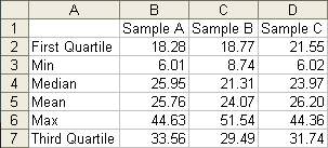
We’ll start with this set of calculations, based on three samples of a larger population that has mean of 25 and standard deviation of 10. The First and Third Quartiles are listed first and last so the up-down bars represent the inner quartiles of the box plot. The Min and Max will be used by the high-low lines, and the intermediate Mean and Median have no effect on the added features.
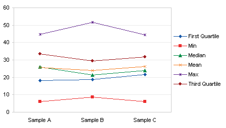
Here is the line chart produced from the data. (You could instead start with a candlestick stock chart using First Quartile, Min, Max, and Third Quartile data, add the Median and Mean data, and rearrange the series, but I think the way I’ve done it is easier and more straightforward.)
In Excel 2003, the Format Series dialog with any of the lines selected offer Up-Down Bars and High-Low Lines on the Options tab.
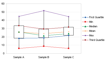
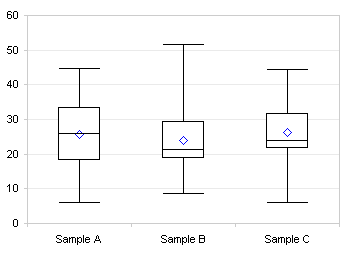
Hide all of the series lines, and all markers except for Median and Mean, and we have a serviceable box plot. Here the “Dash” marker is used for median.
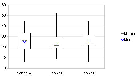
If desired, the Min and Max series can also be formatted with a dash marker to provide end caps for the whiskers (high-low lines).
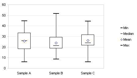
The dash marker is a horizontal line, with a minimum thickness of 2 pixels. The markers above are 14 points wide and still 2 pixels high. At 15 points, the markers expand to 3 pixels. At the size required to match the width of the up-down bars, the dashes are ridiculously thick (and even the two pixel thickness above is too thick).
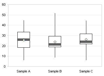
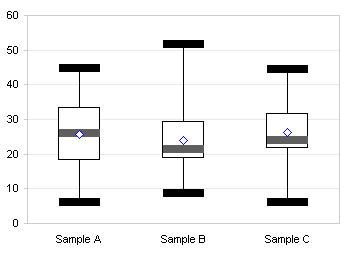
Particularly ridiculous when used for the end caps too.
Horizontal median lines are relatively easy to obtain. Change the chart type of the median series from Line to XY, and if necessary format it to appear on the primary axes with the line series. Remove its marker, and apply positive and negative horizontal error bars with a value of 0.2.
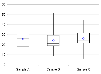
The default gap width for the up-down bars is 150% of a bar width, the bar is 100% of a bar width, and the gap plus the bar are 250%, so half the bar is 50%/250% or 0.2.
You can add duplicate Max and Min series, convert them to XY series, and format them with no marker and error bars of ± 0.2, to get matching end caps for the whiskers (high-low lines).
Excel 2007 (and Later?)
The protocol in Excel 2007 is similar. Create the line chart.
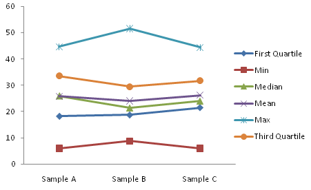
Add up-down bars and high-low lines using the Chart Tools > Layout tab of the ribbon. Don’t panic if the Mean and Median markers disappear. In Excel 2003 markers always appear in front of the up-down bars, and lines behind them, but in 2007 if the series has lines, then the markers stay behind the bars with the lines.
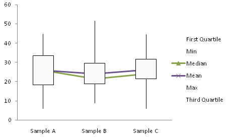
Remove the series lines, and the markers appear.
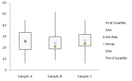
Change the markers, and use the dash for Median. The dash gets wider in 2007 than in 2003, so it looks silly sooner.
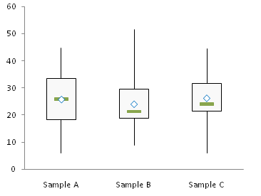
As in 2003, the median series can be changed to an XY type, moved to the primary axis, and given horizontal error bars. Adding error bars in Excel 2007 is a trick, though. You have to add them using the Chart Tools > layout ribbon tab, and this adds both vertical and horizontal error bars, with the Format Vertical Error Bars dialog showing. Clear the dialog, select the vertical error bars, and press Delete. Then select the horizontal error bars, which have a default length of 1, press Ctrl+1 to open the Format Horizontal Error Bars dialog, change the value to 0.2, and remove the end caps.
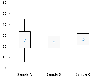
Likewise, you can add duplicate Min and Max series with error bars, to provide end caps to the whiskers (high-low lines).
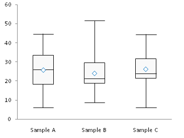
Box and Whisker Charts in Peltier Tech Charts for Excel
This tutorial shows how to create Box and Whisker Charts (Box Plots), including the specialized data layout needed, and the detailed combination of chart series and chart types required. This manual process takes time, is prone to error, and becomes tedious.
I have created Peltier Tech Charts for Excel to create Box Plots (and many other custom charts) automatically from raw data. This utility, a standard Excel add-in, lays out data in the required layout, then constructs a chart with the right combination of chart types.
The utility creates vertical Box Plots …
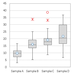
… horizontal Box Plots …
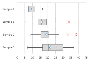
… and Grouped Box Plots …
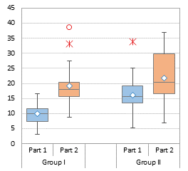
Outliers can be shown or hidden, and a number of quartile definition options are available.
This is a commercial product, tested on thousands of machines in a wide variety of configurations, Windows and Mac, which saves time and aggravation.
Please visit the Peltier Tech Charts for Excel page for more information.


Bob says
My 2 Canadian cents,
I think the error bar functionality in Excel 2007 is a defect, masquerading as a feature.
If it were not for the kind souls, like Jon here, we’d all be up the creek without a visible means of propulsion.
Bob
Matt Healy says
Pretty cool use of the stock chart and error bar features. My own habit has typically been to use an XY chart and basically draw everything with lines created by making auxiliary data series to the spreadsheet. I can remember making plots with old fashioned pen plotters where I had to calculate the coordinates of every point in Fortran, so using Excel as a glorified etch-a-sketch comes naturally to me…
Rachel says
You literally saved my life (and my science project) with this one. Your other tutorial didn’t work for me (I don’t know if its because I have Excel 2010, or if I was just doing it wrong), but this tutorial not only got me on the right track, but afterwards I understood it enough to plot my 20 other data points and still make it look pretty. Thanks!
BS says
Hi, I’m a newbie. I’m using Excel 2007 for this tutorial. I succeeded adding up-down bars and high-low lines. But, I can’t find a way to remove/hide series lines, i.e. no connecting line between two samples. Please guide me how to hide/remove the series lines.
Thanks in advance for helping me.
Jon Peltier says
BS –
Select a line, press Ctrl+1 (numeral one) to open the formatting dialog, and choose No Line for line color. Repeat for all lines.
tom says
Thanks for these handy tips. I have been following them but my mean result is obscured behind the up/down box. If I was editing a powerpoint slide i would left click and send to back but this method will not work here.
Any suggestions?
Jon Peltier says
If you show just markers and no lines for the mean and median series, the markers will appear in front of the bars.
Mike Dixon says
I can’t seem to get the horizontal error bars to even be an option for a line chart in 2010, only vertical are made, there is no “Series “Median” X Error Bars” only “Series “Median” Y Error Bars”. I can make error bars for both y and x if the graph is a scatter plot, but then the “up/down bars” and “Lines” are greyed out. Any hints and suggestions for doing this in Excel 2010? My students all have 2010 and I’d love to teach them your technique if we can work this out.
Jon Peltier says
Mike –
If you want horizontal error bars, you need to convert only the series (not the whole chart) to XY/Scatter. Select just the Median series before changing chart type.
Mike Dixon says
Thanks for your reply Jon, I was able to make it work. I created a YouTube video outlining your process using Excel 2010. I added a little more by adding confidence intervals around the mean. Feel free to share the video with your readers. Thanks again. The link is here: http://youtu.be/tAUbMrXhqsE
JF says
When I change the max/min to scatter in order to add the horizontal bars to them, the High-Low lines disappear. I’m working on Excel 2013.
Jon Peltier says
JF –
As the article states, you can add duplicate min and max series. The original ones remain line chart type to maintain the high-low lines. The new ones are XY scatter type so you can add horizontal error bars.
Shawn says
Works great – I’d be embarassed to say the number of failed attempts I had before I did a search and found your solution. The one suggestion I have is for the excel 2007 steps, I didn’t include the min and max as lines at the start, but added them as error bars at the end (lower error bar added to 1st quartile as difference between 1st quartile value and minimum value; upper error bar added to 3rd quartile as difference between maximum value and 3rd quartile).