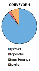
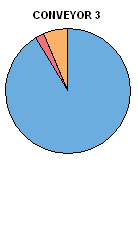
An Excel user asked how to produce pie charts of different sizes, so that the total of the wedges comprising each pie dictates its size. The idea behind the different sized pies is to provide a qualitative display of the whole pies and the individual wedges.
I pointed out the generally poor ability to judge areas, and proposed a bar chart alternative that provides not only a qualitative3 display, but also a quantitative display.
The user posted the following sample data showing the hourly costs of operation of three conveyors, broken down into four constituent cost elements.

The user envisioned a display of pie charts similar to the following. Conveyor 2 has the greatest costs. Conveyor 1 has the lowest costs, only 35% that of Conveyor 2, and Conveyor 3 has nearly the same costs, 43% those of Conveyor 1. If we make the area proportional to cost, the diameter of the pies will be proportional to the square root of cost, so Conveyors 1 and 3 have pies with diameters 59% and 65% as large as that of Conveyor 2.


You can see that Conveyor 2 is the most expensive to operate, and you may get a sense that conveyor 1 is the cheapest. But it is at best a qualitative view. You cannot easily compare the magnitudes of the operating costs of the conveyors. You can roughly judge that Power is a somewhat larger proportion of Conveyor 2’s operating costs, but you cannot compare the relative costs of operator and parts.
The ineffective comparisons offered by the pie charts can be fixed by using a single bar chart. In fact, a simple clustered bar chart is sufficient, with one cluster per conveyor showing the total and constituent costs of operation. We can readily compare the total costs of operation, and we can see that the costs of operator and parts make up only a tiny and nearly invariant portion of the total.

Some labeling of the bars can help if we need to show precise values or percentages. The total bar labels below show simply the corresponding values, while the percentages of the other bars have been computed in the worksheet, and added to the bars using Rob Bovey’s free and indispensable Chart Labeler add-in.


Bilsko says
The pie-chart vs other chart formats thing has been kicking around for a while now – Tufte gave it some attention and others have picked up on it too. Good to see a practical application here.
What I don’t get is why you didn’t go straight for a stacked column/bar chart instead of the $ total bar plus %breakdown bars for each series. It would have been a lot cleaner with a single bar for each series with the % breakdown shown as a separate segment of each bar. Granted, some of those elements have tiny %s and those will be a bit of a headache when trying to figure out where best to put the labels, but better to use a single bar for each series than the 4 % bars and the single $ total bar, no?
Naomi B. Robbins says
To Bilsko: No. The difficulty of judging the lengths of bars without a common baseline has also been kicking around for a while now. Many experts consider stacked bars as much of a no-no as pies.
To Jon: I find consistency helpful when comparing graphs. It is confusing when maintenance is green and parts orange in the originals and the reverse is true in the redo.
Even when I don’t like the original colors, I tend to use them with redraws to make the comparisons clearer.
DaleW says
Sometimes the best visual is a table.
Pareto the costs from biggest to smallest, switch the TOTAL to a bottom line, and we’ve got a simpler and more obvious and more accurate display of business information than any of these charts.
Need to gain the attention of a tired audience with a graphic? Well, if you’re not into graphical correctness for its own sake, why not use a stacked bar chart or even the much maligned pie chart array to communicate the big picture message quickly and intuitively? (Whatever you use, you can still Pareto it.)
By including the total as its own bar, it seems to me that Jon’s cluster bar chart creates the wrong first impression of two comparably big expenses. By contrast, a stacked bar chart or even lowly pie chart screams that Power is the overwhelming expense, Parts an order of magnitude behind in second, and Operator another order of magnitude behind. That’s a pretty simple message, so simple charts can work.
For this simple dataset, there aren’t any close calls, so the extra potential accuracy of a bar chart with a common baseline is moot. Anyone who wants high precision should rely on the table, which can be augmented with %’s at least as easily as the charts can be labeled with them.
Note: none of these linear charts can reveal that minor expenses Operator and Maintenance are identical in $ terms across conveyors, but the table does, if that fact matters to the presenter or anyone in the audience.
DaleW says
In Show Me the Numbers, Stephen Few repeatedly helps bar charts of percentages replace stacked % bar charts (or the disgraced pie charts) by making it obvious with labeling that — for the bar chart in question — its values do sum to 100%.
No 100% bar; just a final 100% label, almost adding a little table to the chart.
Jon, why don’t we use the XY Chart Labeler add-in to implement this — perhaps with a hidden dummy series on the axis for the % labels if we want to keep engineering unit labels on the original bar chart or column chart series! — to create aligned % labels “Inside Base” and then also move these labels over outside even the category labels, so the % labels align and we have room to add an extra text label claiming that they sum to 100%?
This should also work for a cluster bar/column chart, where each group could be shown to sum to 100%.
Jon Peltier says
Naomi – Good point about color consistency. I missed it completely.
Jon Peltier says
Dale –
For this simple case of three conveyors, a table would be fine. However, a table doesn’t lend itself to the immediate visual impact of orders of magnitude differences in values. I should have sorted the bars a la Pareto. I’ve corrected this oversight, and the color consistency Naomi brought up, in this chart:
There are a couple ways to show the total cost without displaying it as a bar like the others. For example, it can be drawn as a lighter bar in the background, and the formatting sets it and its data labels apart:
Taking the Pareto display further, the items can be stacked, and since what’s most important is the order of magnitude, the lack of a common baseline isn’t too critical:
There are numerous variations. How’s this waterfall-like approach?
This applies alternate labeling in place of the legend:
DaleW says
Jon, good improvements, especially (IMO) using the light gray boxes to denote totals.
With such customizations, I agree that a simple or cluster bar chart can convey a part-to-whole relationship very effectively.
If we are limited to standard Excel charts that modestly skilled users can create without your Waterfall Chart utility, then I would ask:
Does a Stacked Bar Chart Beat a Simple Bar Chart
(When We Don’t Want To Resort To a Pie Chart)?
I vote yes – for this dataset. (Feel free to use my stacked bar chart as a good or bad example. )
Jon Peltier says
Dale –
The lack of a common baseline reduces the effectiveness of the stacked bar chart. If the comparison of items is either very easy due to huge differences in magnitude, as in this example (power is upwards of 90% of the total), then a stacked chart illustrates that one group of items is much larger or smaller than other groups of items. I don’t think it conveys this any better than a clustered chart with the short items adjacent to the long items.
DaleW says
Jon –
There are trade-offs. The advantage of a common baseline for comparisons (as well as space for labeling) should not *always* be enough to tip the decision to favor simple or cluster bar charts.
Sometimes, the advantage in compactness and in obviousness of an underlying part-to-whole relationship should tip the decision to favor stacked bar charts.
You could survey and chart {how many of your readers use pie charts, and how many of your readers use dot plots} in the same cluster of a bar chart. It wouldn’t be kosher to show those numbers in the same stack (or the same pie) because these categories overlap rather than add up towards your whole readership. Thus the stack immediately, even subconsciously, communicates more information than a cluster to an aware audience.
Jon Peltier says
There are always trade-offs. To follow up on your survey, instead of reporting the number of people who use pie charts and the number who use bar charts, a better view is of those who use pies only, those who use bars only, those who use both, and those who use neither. These values add to 100%, and might actually not suck in a pie chart.
Alan Dick says
Jon,
I have just stumbled across this blog while trying to find out how to make a multiple pie chart exactly like the one described above. Funnily enough the reason I want to use a multiple pie charge with each pie scaled to represent relative size is because it is a complex and confusing way to show data. When we start advising clients they often have multiple investment portfolios spread across a range of different asset classes. This makes it hard to see exactly where their assets are invested. I want to show a chart that illustrates the chaos of the current situation and then compare this to the simplicity of a coherent investment portfolio (using a simple bar chart).
I note that you say this can be done. How would I go about designing such a table? Also, if it turns out that this doesn’t work as well as I envisage, how do I create the 2nd Pareto chart you show above with a lightly shaded area to represent the total portfolio and colored bars inside this to represent the individual asset classes.