Last spring, FastCompany published an analysis of National Public Radio, which has taken off in the past decade. Will NPR Save the News? discussed NPR’s revenues and compared its audience with that of two other major news outlets, newspapers and television news.
Yeah, NPR is great and all, I even listen occasionally. But this is a Chart Busters column, so I’m going to talk about the visualizations that accompanied the FastCompany article. Specifically I want to draw attention to the following two graphs.

Look at the first graph: it’s a pie chart, in 3D, not only exploded, but with the pieces rearranged. At least they’re in order, but how are we supposed to interpret it?
You could put the pie back together, and take a bird’s eye view.
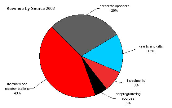
Yeah, not much better, but at least we’re not distracted by the thickness. The pie isn’t really much different than a set of labels. Here is the misaligned non-tabular table that results when we hide the pie pieces.

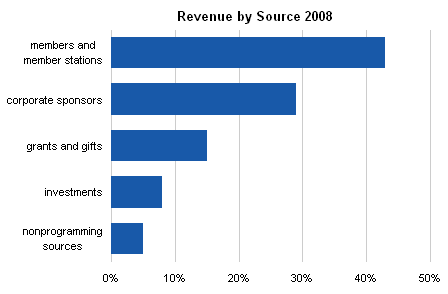
Time to revert to an old standby. This bar chart clearly shows the relationships between the five revenue sources, and if we look very carefully at the Y axis labels, we see that they are formatted as percentages, so it’s no huge jump to realize they all add to 100%.
The revenue data isn’t all that fascinating, but the audience statistics tell an interesting tale.
The second FastCompany graph is another 3D wonder, a bar chart rendered in isometric view. The angles make the bar comparisons difficult, and also make the labels less readable than if they’d been printed straight. And in fact, the use of huge bars for percent change in audience takes away any analysis of audience size itself, which is an interesting variable in its own right.
Let’s compare the audience sizes. In this line chart we can tell at a glance that NPR as increased greatly, while TV and newspapers have gone down.
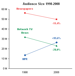
This stacked bar doesn’t show the relative audience sizes as clearly, but it shows that the overall audience has declined a bit, and we can still tell that NPR’s audience has nearly doubled.

We can compare share of the market, that is, share of the total audience. Again, in this line chart, the trend over the past decade is clear. NPR’s share has doubled at the expense of newspapers and especially television.
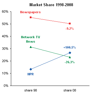
A stacked bar chart of audience share shows much the same trend.
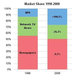
There are obviously more than three sources for news. Newspapers and television stations have web sites, and there are numerous blogs reporting news. I would think overall that the audience is much greater than the approximate 100 million shown in my first line chart.
The decline in television news is not surprising, and I’m sure the television outlets are not too worried. They have plenty of so-called reality programming now, which is cheap to produce and generates huge advertising revenues.
From all of the gloom and doom stories, I would hve expected to see a much greater decline in newspaper audience. I no longer get a daily paper, and in many cities, the number of major papers has declined. If we re-examine these numbers in five years, we may see another 11% drop in newspaper audiences.


David Scrimshaw says
For “Audience Size”, I like the line chart, but am leery of the stacked bars.
That is because they give a total audience number close to 100 M when I suspect that the overlap among NPR listeners, newspaper readers and TV viewers gives an audience number significantly lower.
jeff weir says
I like the way your line chart and stacked bar chart reports the name in the first point/bar and then the actual movement of market share in the 2nd point/bar. Nifty.
Jon Peltier says
David –
Very good point. I alluded to other news outlets (web sites, blogs) but didn’t take into consideration overlap. It’s possible the survey results asked for the respondent’s primary news source. But to be save, the line chart showing audience numbers (which was my favorite anyway) is the one to rely upon.
Jon Peltier says
Jeff –
I like that too, but I’m glad someone else pointed it out. Somewhere I have a blog post about labeling the last point of each series in the chart with the series name, so today’s labeling is a variation on that theme.
Matthew D. Healy says
For me at least NPR has a unique advantage over most other media: my car, where I spend about an hour most days, is one of the few places where I cannot go online. Usually I have my car radio set to NPR.