The Problem
I encountered a new blog recently called HelpMeViz.com, which was recently established to give the visualization community a forum to discuss their projects, and give and receive advice and feedback about their work.
In Excel: Multiple Lines Across X-Axis Categories, Lars Verspohl described a column chart with columns forming 12-month time series of some variable for nine countries. Lars wanted to plot another variable on this chart as a set of line chart time series. This is his sketch of the chart he envisioned (click on the image to see it full size). Maarten Lambrechts suggested using lines for both variables, dispensing with the original column chart. I agreed, and since the description of how I would do it was much too long to fit into a comment, I have written this tutorial.
Data
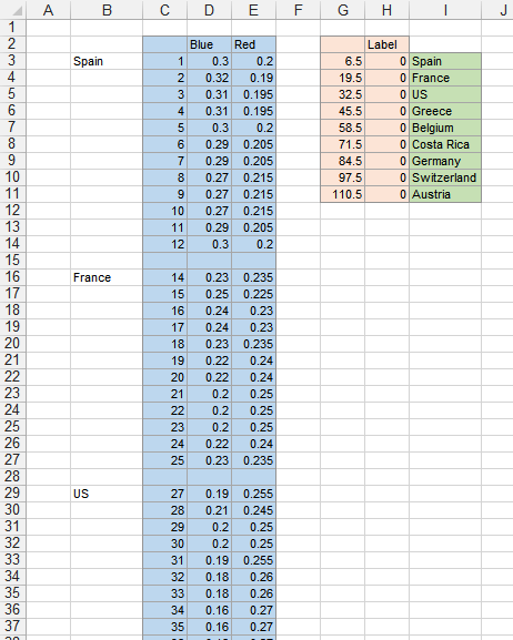
The data I used in my example is shown below. Since I made up the values, I didn’t bother showing all 118 rows of the worksheet, just enough to see the pattern. The blue shaded range has the values we want to plot. There are 12 monthly values for each country, plus a blank in between countries. The blank leaves a gap between the connected points of one country and the next. The pink shaded range contains data for a dummy series which will anchor the country names along the bottom axis. The X values (6.5, 19.5, etc.) are centered within each country’s monthly points (6.5 is between June and July for Spain, etc.). The Y values are zero so the points are located along the bottom of the chart. The green shaded range contains the country names which will be used as data labels for this dummy series.
The Chart
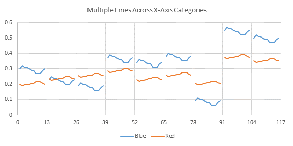
Select the blue shaded range, and insert an XY Scatter chart, the style with lines and no markers. I’ve already fixed the X axis so it has a tick label (and vertical gridline) every 13 units, from 0 to 9×13=117.
The Labels
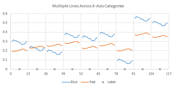
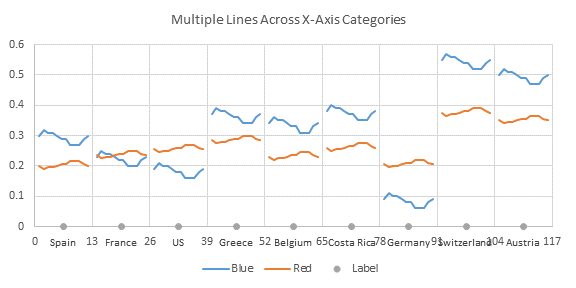
Select and copy the pink shaded range, then select the chart, and use Paste Special to add the data to the chart as a new series, by column, with X values (categories) in the first column and series name in the first row. I’ve formatted this new data as round markers without a line, so you can see how it all works. If you have Excel 2013, select the added points, and add Data Labels, using the Below position, and the Labels from Cells option, selecting the green shaded range with country names for the labels. If you don’t have Excel 2013 (or even if you do) you can use Rob Bovey’s Chart Labeler add-in to add these labels. It’s free, but you’ll need to download and install the Labeler before you can continue. Again, position the labels below the Label series data points, using the labels in the green shaded range.
Clean Up
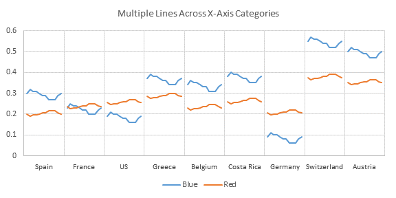
Hide the Label series by formatting it with no line and no markers. Choose No Labels for the X axis. Delete the Label legend entry by clicking on it once to select the legend and again to select the legend entry, then pressing Delete. That’s pretty good, and it didn’t take all that long.
Secondary Panel
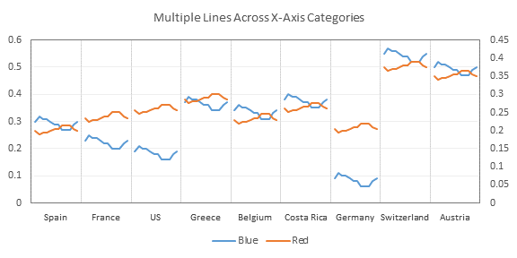
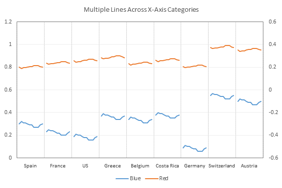
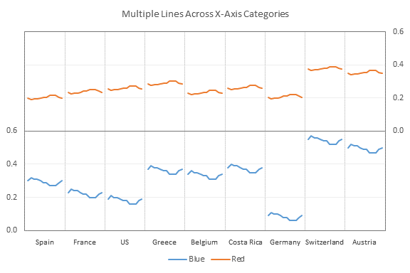
Most of the time, the two different variables will have much different magnitudes. It is tempting to stick one of the variables on the secondary axis, and let the two series just lie across each other. But there are many more good reasons not to overlap the data than good or bad reasons to overlap them. So we’ll put the secondary variable into a secondary panel of the chart. We’ll start by formatting the Red series so it is on the secondary axis (ignore the fact that Red and Blue values are not so different). I’ve gotten a head start here by giving the plot area a slightly darker gray border, and giving the horizontal gridlines a lighter gray. Now we need to fix the scaling. The Blue data spans 0 to 0.6, and to fit it into the bottom panel, we will scale the left hand axis from 0 to 1.2. The Red data really spans 0 to 0.4, but I’ll use 0 to 0.6 as its range to make things work out nicely. To make Red fit the top panel, we’ll scale the right hand axis from -0.6 to 0.6. The scales work out nicely, and the primary horizontal gridlines fit both axes. Sometimes this requires more trial and error. Now we need to neaten up the axes. We don’t want the primary axis ticks to extend across the secondary panel, and vice versa, so we’ll use custom number formats to hide the labels we don’t want. The right hand axis is easy. Format the axis so it has a custom number format of 0.0;;0.0; which has four elements separated by semicolons. The first element tells Excel to use one decimal digit for positive labels. The second element is actually absent, telling Excel not to show negative labels. The third element tells Excel to display zero labels with one decimal digit. The fourth element is also absent, indicating that text labels should not be shown. The left hand axis is a bit trickier. Format the axis so it has a custom number format of [<=0.6]0.0; which has two elements separated by semicolons. The first element has a conditional expression in square brackets which tells Excel to use one decimal digit for labels less than or equal to 0.6. The second element is absent, telling Excel to omit labels that do not meet the first condition. Finally, we need a line to separate the top and bottom panels. Let’s use the horizontal axis, which so far has remained at the bottom of the chart. First, I formatted this axis to match the plot area border. Then I formatted the left hand axis so that the horizontal axis crosses at 0.6. Separating the series into distinct panels clarifies the data even when they don’t need different axis scales.
Keeping the Column/Line Style
In a follow-up comment to the original article cited at the top of this tutorial, Lars Verspohl indicates that he wants to keep the columns, and not convert everything to lines. This is also possible.
The Data
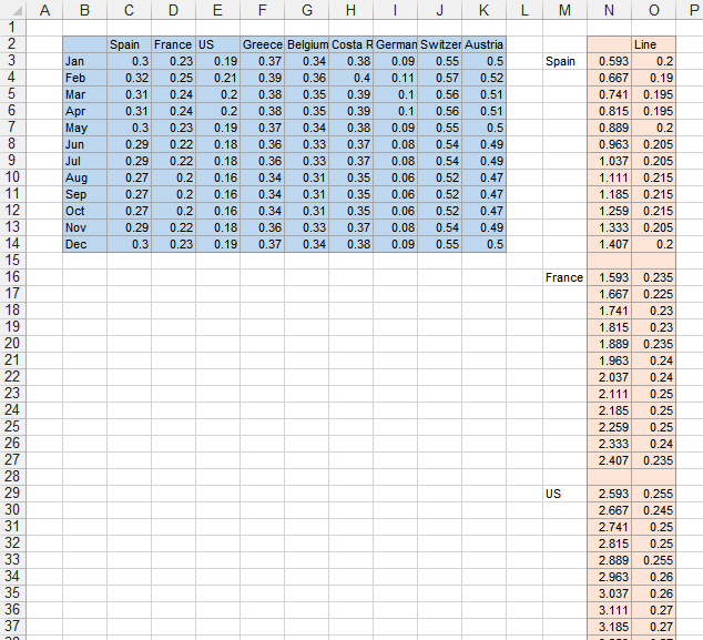
The column chart data is a simple grid of months by countries, shown in the blue shaded range below. The data for the lines is given in the red shaded range below. I’ll explain the calculation of X values in column N in a moment.
The Column Chart
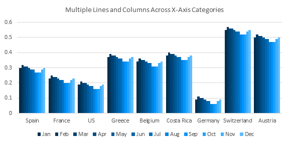
The column chart is easy. Select the blue shaded data, and insert a Clustered Column chart. Switch rows and columns, because Excel by default wants to plot fewer series of more points each. The most tedious part of making this chart is formatting all the graduated shades of blue.
X Values for the Added Lines
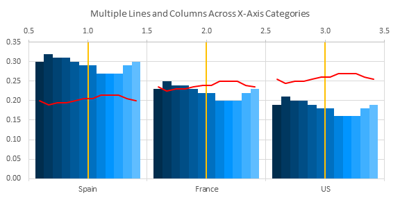
I’ll use a subset of the data below to show how to compute the X values. The column chart by default has a gap width of 150%. That means the gap between the clusters of columns is as wide as 1.5 individual columns. This means there is a gap of 0.75 columns to the left and to the right of each cluster, and the entire width of a category is 0.75 columns for the gap on the left + 12 columns for the months + 0.75 columns for the gap on the right, or 13.5 columns. The categories are internally numbered starting at 1 for the first category up to N, the number of categories. These whole numbers are the X values at the center of each cluster (at the vertical yellow lines in the chart below). By extension, the X values between clusters are the halves. Rather than 0 to N, then, the X axis effectively runs from 0.5 to N+0.5, as shown by the numerical labels at the top of the chart below. The first data point for the red line is in the middle of the first column, so it is 0.75 columns for the gap and 0.5 columns for the half of a column to the right of the vertical axis, which itself has an X value of 0.5. We want X to go from 0.5 at the left of the first gap to 1.5 at the right of the first gap. So the first X value is 0.5+(0.75+0.5)/13.5, or 0.59259. The second data point is in the middle of the second column, one column to the right of the first point, so its X value is 0.5+(0.75+0.5+1)/13.5, or 0.66667. The third X value is 0.5+(0.75+0.5+2)/13.5, or 0.74074. Continue to the last X value for the first continuous line, at 0.5+(0.75+0.5+11)/13.5, or 1.40741. There is a blank row between countries, so there will be a gap in the plotted line. The next set of X values is calculated by adding 1 to the first set of values. Continue for the rest of the countries.
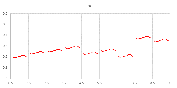
When this data is plotted by itself in an XY Scatter plot, the result is shown below. I’ve set the axis scale to 0.5 to 9.5 to match the internal X values in the column chart. A quick comparison of this chart with the column chart indicates that our calculations are correct.
Adding the Lines
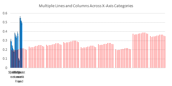
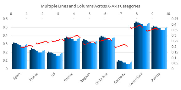
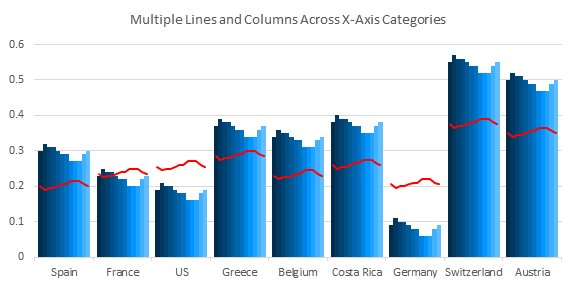
Adding the lines will take a few steps. First select and copy the red shaded range which includes our meticulous calculations. Then select the chart, and use Paste Special to add the data as a new series, by columns, with X values (category labels) in the first column, and series names in the first row. This temporarily scrunches the existing columns way to the left of the chart, and makes all of the columns very thin. Right click on the skinny red columns, choose Change Series Chart Type, and select the XY Scatter style with lines and no markers. Excel automatically places the XY series on the secondary axis. The secondary X axis (top) runs from 0 to 10, so the red lines are not in alignment with the blue columns. The secondary Y axis (right) is also not in alignment with the primary Y axis (left). The last step is to format the XY Scatter series so it is plotted on the primary axes with the Clustered Column series. This brings all the data into alignment.


Trevor R Bird says
When I want complex charts that are difficult to construct within a single chart I create individual charts for each series and then overlay them. I’ve got one with candlesticks on one chart which overlays another with two line series and a third with yet a column chart. The charts are overlaid on each other with their backgrounds set to transparent, except for the base chart which is at the back of them all. I’m using this arrangement with the same date scale on all chart.
Jon Peltier says
Trevor –
I’ve used this approach, but only for charts that normally cannot be combined. The notable example was an XY Scapper plot overlaid on a contour plot to show certain regions in XY space.
When you overlay charts, you are unable to select the data in the charts below the top one, and unable to even get the little chart tip popups. When you overlay charts, it takes a lot of effort to make sure all the layers line up and stay lined up if you have to change the data or the sizes of the charts. This is less of a problem with later versions of Excel than with Classic Excel (2003 and before), but the problem remains.
It’s fine to use multiple semitransparent charts and overlay them, but it’s good to know what the pitfalls are and how you can avoid them in a single chart.
Jeff Weir says
Does any of your add-ins do this, or close to it?
Jon Peltier says
Jeff –
I have some routines in various stages of incompleteness which could do charts similar to these. I’m awesome at starting stuff.
derek says
I was surprised at your using data labels in a dummy series to do it, as I thought leaving blanks in the categories would do the job. Nope. So I contrived a multi-level category label setup that sort of worked, but didn’t look good enough to be worth the hassle.
roberto mensa says
The chart I prefer is the first (the two lines on the same axis) very good indeed.
Second (double panel) I do not like very much, too hard to read.
Third (column and line) is almost as good as the first.
Jon Peltier says
Roberto –
I like the first one with the lines, too. It’s pretty clean. But sometimes they are hard to read if the data overlaps too much. Splitting into separate panels sometimes helps, sometimes not
The lines and columns is a bit too much color everywhere, but that’s my opinion.
roberto mensa says
Regarding column and line: true the color is too much, I think it is not necessary to use that gradient-like blue. If we know what is the data (month) the color could be the same.
I was thinking about the chart solutions, unfortunately I did not find the file here … so we remade the whole thing from scratch … starting from the original tables … The method is very simple and combines both of the types (line-line and line-column). It is too much to say about how we did so we wrote a post with lots of pictures. … Here is the link:
https://sites.google.com/site/e90e50fx/home/multiple-lines-chart-step-by-step-guide
We added referenc to this post in the downloadable files too.
I would like if you could take a look at it
Jon Peltier says
Roberto –
That’s a very good guide. You also went one better than me: you found the original data for your example, but I was too lazy, so I just made up my data.
roberto mensa says
@Jon
First of all thank you, is uncommon to hear you say very good
I am very lazy too, maybe I just look in a better way infact the data were in the file at the beginning of the discussion
However, data is normally in a tabular form, this is the reason because we have described so as transpose the data in an easy way, ready to be used in the chart … and we tried to make this step as easy as possible, in this case we were less lazy, I admit :-)
Jon Peltier says
Roberto –
Sorry, I didn’t realize I was being such a grouchy old man.
A quick look at the original post, and now I can’t understand how I missed the original data. Maybe my eyesight is going, too. I should redo the charts with the actual data.