In Challenge – Show Market Share Changes I suggested a panel chart in response to Chandoo’s Visualization Challenge – How to show market share changes? In Explore Your Data With Pivot Tables I showed how a simple pivot table analysis could lead to this type of chart. And in this post I will show the data arrangement and techniques I used to create this chart.
Panel Chart Data
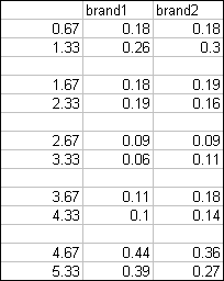
The data used for the chart is shown below. This first table contains data to be plotted in two XY chart series. The lines stretch across category labels at X values 1, 2, 3, 4, and 5. I arbitrarily selected ±0.33, which produces the pairs {0.67, 1.33}, {1.67, 2.33}, etc. In fact, these values are not hard coded. Outside of the range shown here I have the X values for the category labels {1, 2, 3, 4, 5} and the value 0.33. Formulas produce the X values; if I want a change, I can merely change the vaue from 0.33 to something different, and all of the X values update. Blank rows in the data will produce gaps in the otherwise continuous series. For example, a line is plotted between 0.67 and 1.33, a gap is present between 1.33 and 1.67, a line is drawn between 1.67 and 2.33, and so forth.
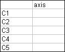
The data for my dummy category axis labels is shown below. I will make a simple column chart with this series. Excel will place the C1 to C5 labels at X=1 to 5. The Y axis range is blank, so the column chart will have bars with zero height. (I could have used zero values as well.)
Building the Panel Chart
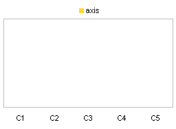
Start by selecting the axis data and creating a column chart. I temporarily inserted values of 1 so it’s obvious what is going on. I’ve also already changed the axis and plot area lines to gray.
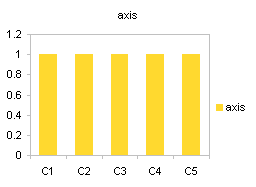
Clean up the chart. Since we’re concerned with relative trends, and because these are tiny little charts, I have removed the Y axis labels. I also removed the title and the X axis tick marks, and moved the legend to the top of the chart.
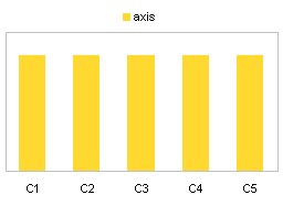
Now I’ve removed the “1” values in the axis data range.
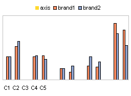
Add the brand 1 and brand 2 data. Copy the range, select the chart, and use Paste Special to add the data as new series, with categories in the first column (but not replacing the existing categories) and series names in the first row. These series are added as more column series.
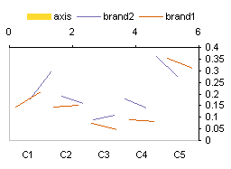
Select one of the added series, and change it to an XY type (right click on it, choose Chart Type or Change Chart Type, and select the type from the dialog). Excel helpfully (NOT!) adds secondary axes, because nobody could possibly want XY and column series on the same axis. Except us.

In Excel 2003 or earlier, immediately select the other added series, and press the F4 function key to repeat the previous action. In Excel 2007, the F4 key has lost most of its former glory, so you’ll have to use the right-click approach to change it to an XY type.

Select one of the XY series (‘brand1’ below) and format it so it is on the primary axis.
Select the other XY series, and in Excel 2003 or prior, click F4 again. Excel 2007 users, you know the drill.

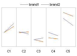
Well, that’s lines up the way we want. Let’s tidy up, shall we? First, select the legend entry for the ‘axis’ series (the text label, not the colored rectangle), and press delete.

Add vertical (X-axis) major gridlines (Chart menu > Chart Options > Gridlines tab in Excel 2003, one of the contextual Chart Tools tabs in 2007). Format them the same gray as the border.
Finally, use formatting to make the brand data stick out a bit. I used brighter colors and a thicker line.
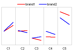
Not too tricky. We needed a little hint about data arrangement, and one dummy series to handle the X axis labels.


zuzana says
Thank you for this, it is a really helpful tutorial. However I can’t figure out how to make it work for 100% stacked column charts, is it possible?
Jon Peltier says
Zuzana –
Sure it’s possible. You need to use the secondary axes (unlike with the XY chart). Put the stacked bars on the secondary axis, add the secondary X axis if Excel doesn’t, then hide the secondary X axis. The primary axis has the dummy series with its category labels centered under the secondary axis stacks.