In a recent post, I showed a technique that allowed Repeated Tasks in an Excel Gantt Chart. An Excel Gantt chart consists of a bar chart series showing the duration of a task, stacked on a transparent bar that pushes the visible bar out to the start of the task. My technique added two more series for each repeated task, one for the gap between repeats, the other for the duration of the repeat.
Ever vigilant reader Derek pointed out that this approach necessitated multiple series, and if more instances of a task were added to the data, more pairs of series would have to be added to the chart. A maintenance headache. The simplification Derek suggested makes use of a characteristic of date scale axes in Excel line, column, area, and bar charts: Multiple data points for a given date are plotted in the middle of the slot for that date. Adding a repeated task means adding another row to the data and extending the chart source data to include this new row: Excel will align this repeated task with the others it belongs with. The only trick now is getting a date axis where the categories are text labels.
Gantt Charts in Excel
Gantt charts are made in Excel using stacked horizontal bar charts. The first series in the stack is hidden via formatting (no border and no fill), leaving the upper series to show the duration of each task, floating between its start and finish. I’ve written two tutorials about Gantt charts, Gantt Charts in Microsoft Excel and Advanced Gantt Charts in Microsoft Excel.
First Try
The data from the previous example showed times that ambulances were sent on calls and returned, with columns for the ambulance number, time out, and time in. We’ll add a single column showing the duration of the call, time out minus time in.
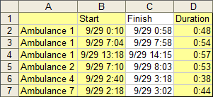
We can use the yellow shaded region and make a stacked bar chart, which results in the following Gantt chart. I’ve already fixed up the chart, hiding the “Start” series, reversing the categories on the vertical axis, and so forth.
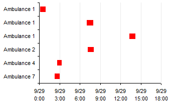
Now we convert the vertical (category) axis to a date-scale axis. Excel 2003: Chart menu > Chart Options > Axes tab, change Category (X) Axis from Automatic to Time Scale. Excel 2007: Right click axis > Format Axis > Main tab, change Axis Type to Date Axis.

Well, the repeats don’t line up, so that’s not going to do it. Since the category labels are text, Excel assigns them a numerical value of zero, and replaces them in the chart with the counting numbers 1, 2, 3, etc. We need to use actual numbers for category axis data.
I’ll admit, I knew this would happen, but I had to justify the steps taken to get a useful category axis below.
Second Try
For the category axis labels, I’ll need a dummy series using the data in A9:B13. I’ve also inserted a column with numbers that I’ll use for the X values in the chart. This is column B, and it uses a lookup formula to assign a number to each ambulance label in column A. The formula in cell B2 is =MATCH(A2,$A$10:$A$13,0), and this is filled down through B7. The formula simply inserts the row within the list below where the label is found.
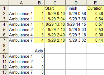
Starting from scratch, I made a stacked bar chart from the yellow highlighted region. So far I’ve only applied changes to the lines and fills. I’ll wait until later to make the “Start” series invisible.
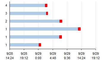
Here I’ve reversed the order of categories on the vertical (category) axis, and set my horizontal (value) axis scale parameters.
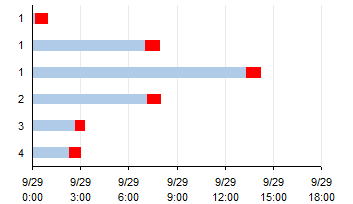
Here’s the trick. I convert the vertical (category) axis to a date-scale axis, and all items with a category value of 1 are plotted in the same line. (Thanks, Derek!) The nice wrapping of the axis labels between the date and time comes naturally in Excel 2003; I don’t know how to achieve it in Excel 2007.

Now we just need to add the informative vertical axis labels.
I copied the data in the lookup table data in A9:B13, selected the chart, and used Paste Special to add the data as a new series, series names in first row, category labels in first column. It looks the same as above (zero value bars stacked on other bars just don’t appear). But when I assign this new series to the secondary axis, the secondary value axis along the top of the chart appears. In Excel 2007, the bottom axis seems to disappear, but it really has just shifted below the bottom edge of the chart area. Select the plot area and drag up the bottom edge, and it will reappear. No such wackiness in Excel 2003.
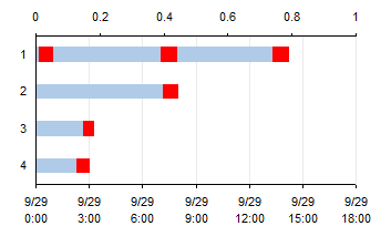
Now we need to add the secondary category axis. Excel 2003: Chart menu > Chart Options > Axes tab, check the box for Secondary Category Axis, and the Automatic type is fine. Excel 2007: Chart Tools > Layout tab > Axes > Secondary Vertical Axis > More Secondary Vertical Axis Options, which adds the default axis and brings up the Format Axis dialog; Check Categories in Reverse Order, and it should be fine.

The right axis is ordered top to bottom automatically in Excel 2003, I assume because Excel applied the same categories in reverse order setting as in the primary vertical axis on the left. In Excel 2007, going through the dialog as described reverses the labels. If you didn’t go through the Format Axis dialog, you need to do so to reorder the labels.
Now the vertical axes need to switch positions. Format the bottom horizontal axis so the category axis crosses at the maximum value, then format the top horizontal axis so the category axis does not cross at the maximum value.
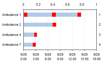
Finally, hide the top and right axes (don’t delete them). Format them so they have no line, no tick marks, and no tick labels.

And here it is with the “Start” series hidden.
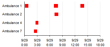
Thanks, Derek. That will be much easier to maintain.


derek says
Thanks for the compliments! Commenter Bob’s scatter-chart-and-error-bars method also totally works, and I’ve used it in the past for very high data densities, where bars start to look a bit grungy.
I also like the wrapping effect, but it only works automatically when the labels are crowded, and you know how I feel about crowded labels on scales. I wanted the effect to work even when the labels are far apart.
ExcelTips came to the rescue: the trick is to type Alt-0010 into your custom format (or use a character map facility). Character number ten is the new line code, so your labels will always wrap there.
http://excel.tips.net/Pages/T002895_Creating_TwoLine_Custom_Formats.html
Jon Peltier says
Derek –
Thanks for the link to the custom format. I think I used to know that one, but the synapses are aging.
Note that the Excel 2007 chart number format dialog is New & Different (and flaky), while the worksheet number format dialog is the same familiar and reliable one from Excel 2003. The Alt-0010 trick does not work in the new chart number format dialog, so you have to apply the format to the data in the worksheet, then in the chart dialog check Linked To Source.
Leah says
Thank you very much for this explanation!! After days of frustration, I finally came across this tutorial and successfully built the chart management was looking for.
AND, I’ve added your site to My Favorites for future reference.
I sincerely appreciate the help.
-Leah
Britni says
Is there a way to do this in Excel 2010 without creating the dummy list or having the column B match formula? I am trying to create a Gantt chart-looking thing for sequencing of the moves of a robot and I have a HUGE list (1027 actions) of actions and some of them repeat (and the function to remove duplicates doesn’t work with the action descriptions I have…it deletes the majority of the actions, which is incorrect). I can get them to display in a large list, no problem, but I want them to display where repeated actions display on the same action line (my y-axis). Please help! I’ve been researching this for a few hours already and I just can’t get it to work! :(
Jon Peltier says
Column B is necessary because it provides a numerical index, which when plotted on a date axis puts all items with the same index on the same horizontal level. It doesn’t need to be a Match formula, but entering values manually for over 1000 actions will be tedious and error-prone.
Britni says
Thank you Jon! I did take the first set of my data and graph it using the method you mentioned with the match formula and such, but my problem with that is that I am basically getting this Excel document ready for a handoff and I want to make it as easy as possible for people to add, delete or change rows if needed (we’re trying to determine the best sequence for the robot to be efficient). Do you have any suggestions for how to do this so that the output still looks like what you have in this article?
Thanks again!
Jon Peltier says
Britni –
As you already know, it’s a complicated setup, and making it adjustable to track a varying number of items is not totally easy. It’s a bit beyond a blog post and its comments; I’m thinking it’s the kind of small project that might take me half a day or so. If you’re interested in following up you could email me: jon at peltiertech dot com.
Britni says
Thank you Jon! I actually ended up breaking the whole sequence up into little, manageable parts (in tabs). Your method above actually makes it easy to manage when breaking it down into chunks. I’ve been creating smaller sequences (since the robot itself is part of a larger sequence) by just copying the tabs and it’s been working out perfectly. I’ve got them all tied together based on the total duration for each tab and I’m pretty happy with the results.
Thank you again for posting this and for your responses! Definitely a very good way to display repeating tasks on a gantt chart-like chart!
Jon Peltier says
Britni –
Smaller bites are definitely easier to digest.
Rajat says
I just wanted to thank you to have made a seemingly difficult task so easy.
Thank you and Cheers !
ganttchartnewbie says
Great site, and I found this very useful for creating a similar sort of chart. Thanks!
I’m just wondering if there’s any way of adding a scrollbar to such a chart (i have daily dates on the horizontal axis stretching over 5 years), and data is viewed on a month to month basis?
All the options I’ve come across for creating a dynamic scrolling chart require dates to be ordered from earliest to latest, which is something that is difficult to achieve with such a dataset (with multiple date ranges).
em says
I have been trying for five days to build a similar chart but where the vertical axis is days and the horizontal axis hours and there are about ten events a day but only 6 of them are repeated…still trying to figure it out.
Jon Peltier says
What does your data look like? How far have you gotten?
em says
Got it! I wanted this with dates vertical, times horizontal, repeated tasked, but day/dates are irregular. so made a helper column and put “R” for repeated tasks on the dates that tasks is repeated. Then another column to return “dd mmm yy r” for repeated tasks and “dd mmm yy” for days without tasks not repeated. then made the dummy axis, and followed all other instructions and it worked…at least it seems to work…
Lau says
I’m still unsure of the explanation of how to add the informative vertical axis labels. As it stands I still have an x-axis made up of numerals and I’m unsure of how to convert it to text after adjustment. :(
Hortense Maskens says
Hi Lau,
I had the same problem. Try this tutorial from step 6 onwards : http://ksrowell.com/blog-visualizing-data/2013/05/16/how-to-make-a-gantt-chart-for-repeated-tasks/
It helped me to figure it out, hope it helps!
Jon Peltier says
Hortense –
Thanks for the link. Kathy uses the same approach in her tutorial, but she broke the added series step into more pieces, so perhaps it’s easier to follow.