Some time ago I wrote about Surface and Contour Charts in Microsoft Excel in Dian Chapman’s now defunct TechTrax Ezine. In that article I outlined the data requirements for surface and contour charts, and described some of the formatting idiosyncrasies of these charts. That article was valid for Excel versions 97 through 2003, but like so many other aspects of charting, Excel 2007 changed all that.
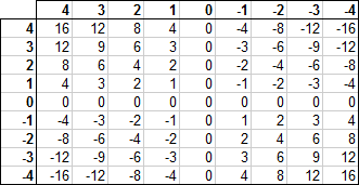
For these examples, let’s use this simple dataset. Each value in the grid is the product of the corresponding row and column headers.
Excel 2003 Contour and Surface Charts
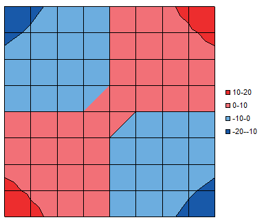
Select the data and insert a contour chart, and you will get something like this. I have removed the horizontal and vertical axis features (actually, the “category” and “series” axes), and selected a simple color scheme for the data bands. To format the bands, you format the legend key for that band, the small square in front of the label.
Scale
That scale is a bit coarse, and symmetrical features like the saddle point and the shapes of the colored bands in the corners are not symmetrically rendered. You can’t do much about the asymmetry; I used to insert rows and columns in the source data, and interpolate values, to double the resolution. This didn’t cure the strange rendering, but at least improved it a bit.
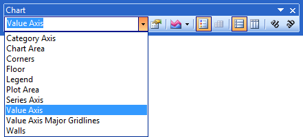
To change the scale of the bands, format the legend. The Format Legend dialog has a Scale tab just like in a typical Format Axis dialog. You can’t see the “value” axis, but you can select it in the Chart toolbar’s Chart Element dropdown, and format its scale directly.
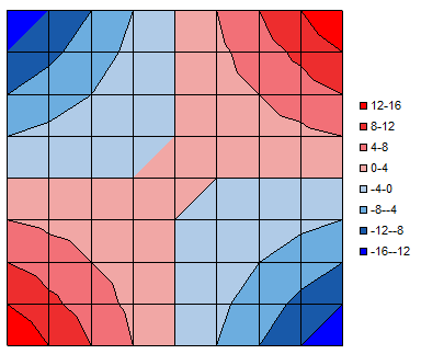
Here is the contour chart with a finer scale and more shades of blue and red.
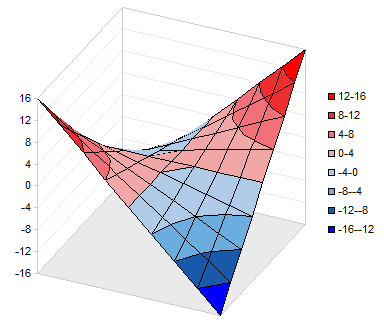
Below is the corresponding surface chart. The value axis is now evident, and the saddle-like shape of the surface is perhaps easier to envision than in the contour plot. The downside is that part of the surface, the far dark blue corner, drops far enough that it is obscured by the saddle point in the middle of the chart.
Orientation
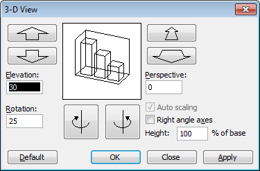
You can adjust the orientation of the surface chart using the 3-D View dialog, available by right-clicking on the chart.
In Excel 2003, you can also click on a corner of the box enclosing the chart…
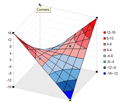
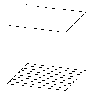
… and drag the corner to reorient the chart. While dragging, just the outline of the box is visible, showing how the orientation is changing.
Excel 2007 Contour and Surface Charts
To make a contour chart in Excel 2007, like 2003, you select the data, and insert the chart.
Scale
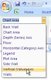
You can’t format the legend to adjust the scale of the colored bands, but you can select the value axis using the dropdown on the Chart Tools > Layout or Format tab.
To change the colors of each band, select the legend entry (the legend keys in 2007 cannot be selected) and open the formatting dialog. The tabs for fill and border color refer to the formats of the legend key and the corresponding band.
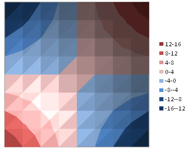
Here is the contour plot with the same scale as the 2003 example above.
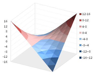
And the corresponding surface chart. Asymmetric rendering of the saddle point and other features has not changed since Excel 2003.
Orientation
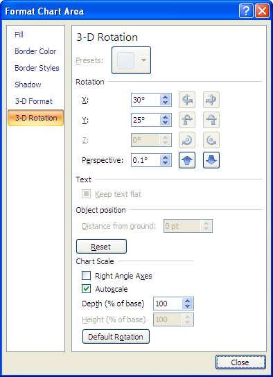
The Format Chart Area dialog in Excel 2007 includes a 3-D Rotation pane to allow adjustment of the surface chart’s orientation. Like many 2007 dialogs, it is much larger than the corresponding 2003 dialog without much difference in actual function.
You can also select the corners in the Excel 2007 surface chart, but you cannot drag them to adjust the orientation of the chart.
Formatting
Like much other formatting in Excel 2007, especially in Excel 2007 charts, the shading of the contour and surface charts is rather over-the-top. The charts have excessive color gradients, apparently to represent the reflections and the brighter and darker illumination caused by a light source located at some oblique angle.
The gradients are not too severe in a surface chart, but in a contour chart, they interfere with interpretation of the values in the bands. You’d think since the contour chart is “flat” it would not be affected by an offset light source. But the contour plot is really just a top view of the surface chart, so all shading appears in both charts.
The variations in color would not be half bad if there were a way to tone down the differences. I searched for a while, though, and could find no way to reduce the variation within a color band. Nor could I find any kind of texture or other feature that improved the appearance of the charts.
It is possible to remove the light and dark regions in the 2007 charts, rendering them with flat colors as in their 2003 counterparts. You have to dig pretty deep to find the trick, so I am pleased to share it with you here.
You need to format the band of color. To do this, click once on the legend, then click once on the label of the band you want to format. Then right click on this label and choose Format Band from the pop-up menu.
In the Format Band dialog, click on 3-D Format, then click on Material, and under Special Effect, select the Flat option.
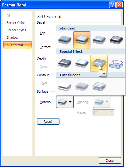
This removes all of the textures within the band. Repeat for every band in the contour plot…

… or surface chart.
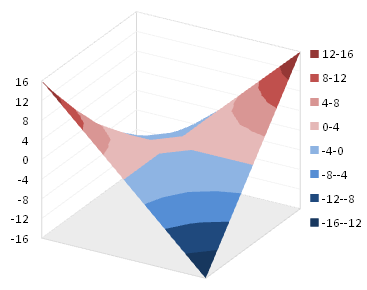
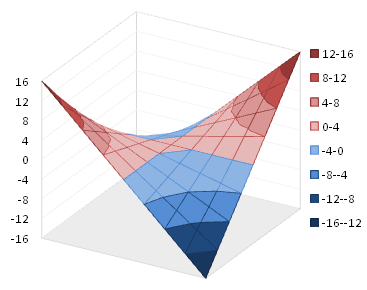
While the default texture with all of the shading and gradients was excessive, it provided a bit of detail missing in the flat-colored charts. In 2003, this detail was provided by borders on the bands. Add a border using the Format Bands dialog.
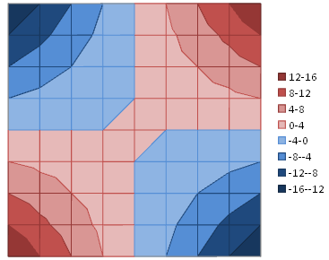
The border seems to help the surface chart more than the contour plot.


Andy Pope says
Hi Jon,
Previously I have used the VBA approach to remove the lighting effect, which is,
activechart.ChartGroups(1).has3dshading = 0
Jon Peltier says
Andy –
Thanks for that piece of code. It’s the kind of thing that belongs on a button somewhere.
TV says
It bothers me that the depth axis can’t be made a Date Axis… Of course, now that I’m trying it, even the horizontal Category axis doesn’t seem to be behaving correctly (XL2007). I switch to Date and it switches back to ‘Automatically select based on data’. I guess I need to always interpolate to evenly spaced coordinates?
Jon Peltier says
Many people would like a true 3D XYZ surface chart, but the surface charts in Excel are not so powerful. Despite what the documentation may say, both axes along the floor behave as category axes, and only the Value axis (perpendicular to the floor) is a continuous value axis. This is clear in Excel 2003, but 2007’s format axis dialog pretends to allow a date-scale axis.
Amanda Siegel says
THANK YOU (sorry to shout, been trying to figure this out for years).
Anna Kamphaus says
How to edit the legend scale:
Change surface chart to 3-D view, then edit the vertical axis
Changing the min and max values will change the legend values, also you can edit the interval.
Then change back to 2-D
:-)
amit says
hi
i am trying using vba to mark the “right angle axes” option in 3-D formating of a chart – can any one help please?
Jon Peltier says
Amit:
Libby says
Hello,
thank you for the help, I have been struggling with contour maps for ages.
BUT….. my drop down menu does not have the field ‘vertical (value) axis’… its just not there!!
I would appreciate any help on this.
Thanks,
Libby
Jon Peltier says
Libby – What are the names of the three axes in the drop down?
Libby says
Hello,
I solved it!! I thought I had the VBA tool pack installed, but I didn’t!! So I have done that now, and it does show up.
Thank you!
Ben Martin says
Trying to update some code that worked in XL 2003. Specifically, would like to have ActiveChart.Legend.LegendEntries(i).Interior.ColorIndex = 13 still work (deprecated in XL 2007, and crashes after a while). Any suggestions? Thanks.
Ben
Jon Peltier says
Ben –
The documentation was rather slim (it’s post-2003 Office, after all), but I came up with this:
ActiveChart.Legend.LegendEntries(i).LegendKey.Interior.ColorIndex = 13
john cockayne says
Jon,
It appears that there is a ~32,000 colorized pixel limit for the contour surface chart because the plot height produced automatically varies as I supply 5 columns of values with 15, 30, 60 rows that are interpolated to color the values in the box with my 75, 150, 300 values.
Am I understanding some subtle aspect? Or having an ID-10-T issue? john
Yourii says
Jon,
I am trying to get rid of 3D lighting effects in contour plot, so your tip is very valuable. Unfortunately, I cannot find Format Band dialogue where you recommend to set the option. How do i get there?
Jon Peltier says
Yourii –
Yeah, I left out that part.
Click once on the legend, then click once on the label of the band you want to format. Then right click on this label and choose Format Band from the pop-up menu.
I just tried writing a little macro to do all of the bands in the chart, but the command that the macro recorder recorded produced errors when it was executed. Wonderful.
Yourii says
Hi Jon,
Thanks for clarification. Yes, indeed that works but it is pretty cumbersome to adjust every single band in the plot.
Here is a VBA code that I found in
http://www.pcreview.co.uk/forums/3d-shading-t3069203.html
that seems to work for me
ActiveSheet.ChartObjects(“Chart 6”).Activate
ActiveChart.ChartGroups(1).Has3DShading = False
Yourii
Jon Peltier says
Thanks Yourii, I knew there was a way. It’s frustrating when the exact same syntax from a recorded macro fails.
David says
I am trying to change the values on a contour plot using Excel 2007. I am graphing a problem in electromagnetism, and I want to instruct Excel to allow me to change the scaling it displays.
Right now, it displays the values from 0 to 150 in increments of 50; I would like Excel to display the values from 0 to 150 in increments of 15.
Can you instruct me on how to make this change?
Thank you,
David
Jon Peltier says
David –
The vertical axis is still there, but you can’t see it or click on it.
Select the chart, then click on the Chart Tools – Layout ribbon tab. Select the Vertical Axis in the current selection dropdown at the top left of this ribbon. Press Ctrl+1 to format the axis.
Dan says
Is it possible to build a surface graph mapping 2 or more different surfaces on the same chart? If so, it would be helpful to know how to set the suface properties, like color and transparency, so you could see “above” and “below” intersecting surfaces, as well as being able to set the format of the intersecting curve of the surfaces.
Jon Peltier says
Dan – You only get one surface in a surface chart.
Mark says
Hi Jon,
Have a contour plot set up, and would like to show irregular increments. i.e. instead of 5, 10, 15, 20, 25% etc would like to be able to show 5, 10, 20, 40% only. Is there a way to do this?
Thanks!
Mark
Jon Peltier says
Mark –
Maybe the best you can do is use 5% increments, but then format 15 and 20 the same, 25 through 40 the same, etc. It’s not exactly what you want, but it’s all these axes can do.
Mark says
Good idea – thanks for that.
Mark
Bill Turner says
Great explanation. It all worked fine. BUT I have square crosshatching over part of all of one band and part of another. It is not gridlines, as I have changed them to red and they are not this cross hatching. It is not patternd fill as I have put red paterned fill in and it is not it.This cross hatching corresponds to the axis tick marks, but adding and removing tick marks only changes bits across the axis. Clicking on a hatch line selects the chart area.
What a pain.
Bill Turner says
Found it. I had a solid border colour line set for one band.
Roberto says
Hi, great blog. I would like to know if it is possible to show irregular increments for the HORIZONTAL & DEPTH axes grid lines (floor axes) for a contour chart? (someone already asked for the vertical axis).
I can see excel plots equally spaced intervals no matter what the numbers of the labels are, which for me it’s not an accurately visual representation of what I want to plot (labels are 0.25, 0.5, 0.9, 1.3, 2.1, …). Do I need to insert rows and columns and interpolate the data? I hope there’s another way.
Thanks for your help
Jon Peltier says
Roberto –
Those are category axes, which means you’re stuck with equal spaced intervals.
Roberto says
It’s sad to hear that, but many thanks for your response Jon.
James says
Hey, thanks for this advice, i spent a number of hours to find out how to flatten that sh*tty contour. Much appreciated !!
bruining says
It is not clear where To change the scale of the bands, format the legend. The Format Legend dialog has a Scale tab just like in a typical Format Axis dialog. You can’t see the “value” axis, but you can select it in the Chart toolbar’s Chart Element dropdown, and format its scale directly.
The example that you give cannot be found by me
In every village, when asking for directions it is straight on and very near. That you have to go around the church, cross the canal in a boat and walk for three miles is no longer clear to the villagers. I am afraid that many of you suffer from the same syndrom
Jon Peltier says
You need to read more closely. In Excel 2003 and earlier, to change the scale, format the legend, as stated in the article. In Excel 2007 and later, it’s not so easy. You need to select the vertical axis (which you can’t see) using the Chart Element dropdown on the Chart Tools > Layout or Format tab, and format this axis.
Prakash says
I need to adjust the vertical (value) axis to refer to cell(dynamic)…i.e max to A1,min to A2 and major axis/minor axis unit to A3(lets say)…how can it be done…thanks
Salah Al Wahieshi says
Dear Jon
Thanks a lot it was very usefull
Bob Jordan says
There was a question about the spacing of the grids in the contour plots. They are not quite as they seem and in fact I believe the original programmers fell for the ‘fencepost problem’ when working out how to arrange the grid.
I was trying to reverse engineer this and made an interesting discovery. It goes like this:
Excel wants to maximise the contour plot into the window available (in fact into the PlotArea).
So it takes the available plotarea height and width removing the space required for axis labels etc and sees which one is the constraining one in terms of the grid of points to be plotted. Lets say it is the height.
So if there were 8 rows of data it divides the available height by 8 to get the height of each cell – but they SHOULD HAVE divided by seven not eight.This will be the width of the horizontal cells. But then they realised that the new size vertically does not quite fill the space so they multiply the height by 8/7 to fill it up. They did a similar rescaling of the width.
The long and short of it is this. If you have a grid of M rows by N Columns of data that should make a plot of M-1 by N-1 ‘squares’. But the cells will be of size:
CellHeight=TotalHeight / (M-1) CellWidth = TotalHeight / M * (N/(N-1))
If the fence post problem had been known the formula for the width should have been
CellWidth = TotalHeight / (M-1) ie the same as the height
Cells would then have been square.
As it is a cell in a plot will have a height to width ratio of M/(M-1) * (N-1)/N :1
If M=N no problems, but as M and N become more different the ‘squares’ approach 2:1 or 1:2 in size
So M=2 and N=6 gives a shape of 5:3 N=9 gives 16:9 N=18 gives 17:9 etc.
Crazy
Jon Peltier says
Bob –
I haven’t worked with contour plots in a long time. My first impulse was to say you’re crazy, and the grids are always square. But in my old age I’m more inclined to listen to what people say, and see if it has any merit.
So I set up as series of contour charts using a data range with four rows of data (capital letters along each contour chart’s vertical axis) and four to fourteen columns of data (lower case letters along each contour chart’s horizontal axis). The data is irrelevant, but the charts are shown below. The first chart has square grids, but in each successive chart the grid cells are progressively taller than they are wide.
I’ve summarized in the following table. The third column shows (R-1)/(C-1), the ideal height-to-width ratio of the plotting region of the chart, and the fourth shows R/C, which is uncorrected by consideration of the fencepost problem. The seventh column shows H/W, the actual height-to-width ratio of the chart. You can see that this ratio is within a couple percent of R/C instead of (R-1)/(C-1). The last column, “Distort” shows the ratio between the incorrect and correct aspect ratios. This distortion reaches 24% in the last chart.
I last worked with contour charts extensively in Excel 97. My computer that had Excel 2003 on it (with the same ancient chart engine as Excel 97) gave up the ghost earlier this week, so I can’t easily check this analysis. I have to think those charts had square grids, or I would remember from my earlier work.
Jon Peltier says
I couldn’t stand it, so I fired up an old laptop and tried out the contour charts in Excel 2003. The results:
I just did the extreme examples. You can see, though, that in Excel 2003, the aspect ratio of the cells matched the ideal 1:1 within a couple percent. The grid is obviously square.
Bob Jordan says
Wow some work done over night.
Unfortunately I read the 2003 version reply first – interesting. I am using 2011 so it seems the engine must have changed on both platforms about that time. I just checked with an Excel Mac 2004 and indeed I get square grids on that version.
The reason for the exercise was to try and create an overlay of an XY plot on a contour plot. This cannot be done ‘naturally’, but by creating two plots (A contour and an XY) of the same chartarea dimensions (well actually similar not same) and setting the XY backgrounds to transparent one can achieve this manually. But could one automate? Pretty messy I decided. Even more so by this M/N vs (M-1)/(N-1) issue
Thanks for the effort Jon – have always admired your work.
Bob Jordan
Blaine Bateman says
Thank you for the detail about how to “flatten” the colors. I had tried the “material” but unfortunately was frustrated and didn’t systematically try them all. I was starting to think it was an optical illusion. I painstakingly mapped colors from a thermal plot I liked, using RGB and transparency, then with further pain adjusted the color of every band (I had 7). It was not right. You should have seen me. I was holding my hands up to my screen to mask out little squares to see if the color looked right in isolation. As I noted, I thought it was in my head. Thanks again.
Doug Jenkins says
Thanks for this, it seems to be still the best guide to getting a half-way decent contour plot out of Excel.
Whether it is worth the effort is another matter!
Peter says
Hi, does anyone know how to adjust the colours on the ranges using VBA?
ColorIndex isn’t any good, I don’t want different coloured bands, I want graduated density of a single colour..
If I record a macro it selects the appropriate Legend Entry and then does this
With Selection.Format.Fill
.Forecolor.TintAndShade = 0
ForeColor.Brightness = -0.05
End With
but when running that code back, it fails with various errors and the object model doesn’t seem to support it.
THanks
Jon Peltier says
ColorIndex is not a good choice for Excel 2007 and later. TintAndShade doesn’t work properly for charts and shapes, so delete it from recorded macros.
You can specify an object theme color and brightness, or simply an RGB value.
Theme colors are found in the color picking mechanism.
The top row, from left to right, are the theme colors xlThemeColorDark1, xlThemeColorLight1, xlThemeColorDark2, xlThemeColorLight2, msoThemeColorAccent1, msoThemeColorAccent2, msoThemeColorAccent3, msoThemeColorAccent4, msoThemeColorAccent5, msoThemeColorAccent6. That’s right, light and dark seem reversed. Brightness makes these colors lighter (positive brightness) and darker (negative); mouse over each tile to see what combination of theme color and brightness produce each color.
To specify the color of a band in the chart using theme color and brightness:
To specify the color of a band in the chart using an RGB value:
Using the “Flat” material type removes the crazy shading intended to help show the terrain of the contour chart, but I find it really confusing.
I used this code to generate the chart format below.
I added a couple more lines of code to put a white outline around the legend keys.
Peter says
Excellent, thanks Jon, I will give that a try.