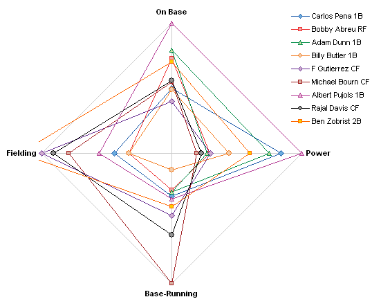
Another baseball-related post today, and again I’m highlighting Justin Bopp’s Beyond the Box Score blog. And no, Justin, I’m not picking on you, I just have an alternative way to show the same information. In Introducing DiamondView Composite Player Evaluation, Justin describes a technique for graphing a player’s capabilities in four skill categories, on a scale of 0% (worst score in that category) to 100% (best score in that category). The DiamondView Composite Evaluation chart for Tampa Bay slugger Carlos Pena looks like this:
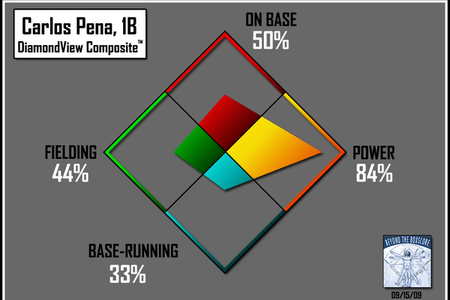
It’s a striking graphic – The colors capture your attention, and you can decipher quickly what the chart is showing. A weakness is that the use of bold fill colors precludes direct comparisons of players on the same graph. You could use side-by-side diamonds, but that’s not as clear a comparison as overlaying the data.
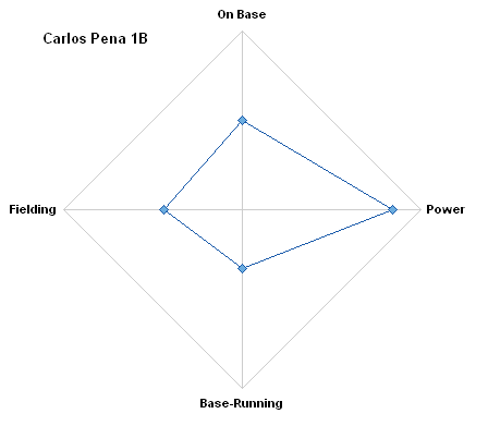
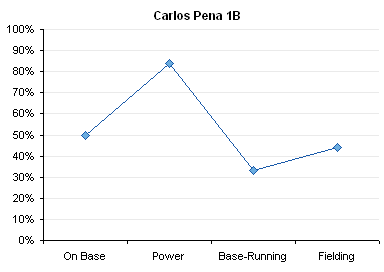
What if we used an unfilled diamond for each player? Carlos looks no less impressive in this less colorful chart:
This type of chart is called a radar chart, because it has its origin in the center and the data sweeps around the periphery, like a radar screen. It is also called a spider chart, because with more spokes and with circumferential gridlines between the min and max, it looks like a spider’s web.
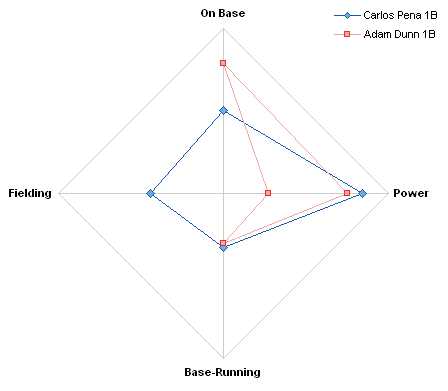
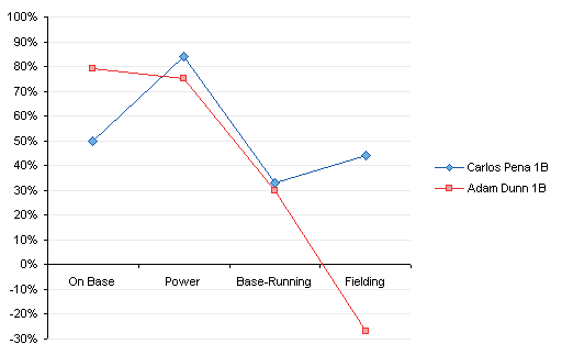
It is easy in this case to make comparisons between a couple players. Adam Dunn does not have two Power ratings, of course. His fielding is so bad, the corresponding rating is negative. Apparently something about his ratings means he’s worse than the worst fielder at 0%. Not unusual, I remember teammates like that in Babe Ruth ball.
Suppose we have a whole set of players to compare:
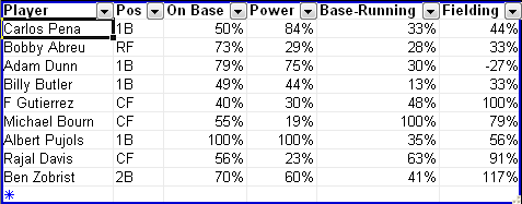
Conceivably you could compare many players in this diamond chart.
There are a couple of problems with this kind of chart, as discussed in Radar Charts are Ineffective. The resolution is worse at the lower numbers, and any zeros make interpretation more difficult. The negative value for Dunn’s fielding is difficult to pick out, and we see a similar calculation glitch with Ben Zobrist’s fielding score, which is greater than 100%. Maybe he could give Adam Dunn some lessons?
Where have we seen this style of chart before? Perhaps when we discussed Spider Chart Alternatives. Among the alternatives we’ve evaluated is the Parallel Coordinates chart, developed by Alfred Inselberg and described in Interactive Parallel Coordinates Chart and in Sample Parallel Coordinate Chart. Stephen Few discusses parallel coordinates charts in Multivariate Analysis Using Parallel Coordinates (html) and Multivariate Analysis Using Parallel Coordinates (pdf).
Justin has already done the hard work for us: the ratings are compiled and scaled to 0%-100% (with a couple computational irregularities). All we have to do is unwind the chart, that is, convert it to a line chart. Here are Carlos Pena’s ratings again.
Because the coordinates are parallel, we can compare the scores in different categories more easily than in the radar plot. We can readily compare a couple players, and any off-scale values can be represented by enlarging the scale.
We can add more players, and the resulting chart is arguably less cluttered than the spider chart equivalent.

That’s still not easy to read, if you want to compare two players. In Interactive Parallel Coordinates Chart we embellished the chart above in order to let the user select any two quarterbacks from a list. We’ll apply the same techniques here: Color all series light gray for background, Add two more colorful series, Incorporate a couple of dropdown controls, and link the pieces together.
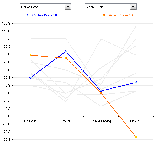
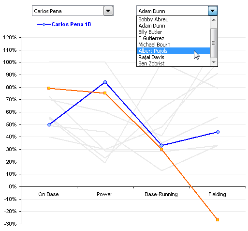
In the following chart, we can compare Pena and Dunn to each other, but also see how they fall within the larger population.
To change our comparison, we need only select a different player, Albert Pujols for example, from a dropdown list.
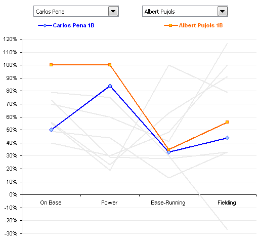
And the chart shows our new comparison.
I’ve posted the zipped Excel 2003 workbook on my web site at Composite_Player_Evaluation.zip.


Bob says
Hi Jon,
As always, a great tutorial. What would be neat is to figure out the $ associated with each skill/ability.
Martín says
Jon,
Great post!!. Just yesterday, after working with the olympic medal chart, I neede to create another chart, similar to the one you posted the last. Even while it took me a time to customize it (colored background, type of lines and so on), it ended up great. but this one….. just blowed my mind !! I am thinking now using the comparison between 2 players, to apply it on my case comparing, for instance, against the average and the total.
Again, a great post.
Rgds.
Martin
Mike Woodhouse says
The problem I have with radar charts, and to a lesser extent with the line chart alternatives you offer, is the connecting lines. They seem to be implying a relationship between the various attributes that isn’t really, er, real. How related is Fielding to the other three, for example?
This would, I’m realising, carry a lot more weight if I could offer a whizz-bang alternative that addresses all issues. But I can’t, although I’m thinking some sort of souped-up stacked columns or bars might offer something.
P.S. As a Brit, I’m obviously not steeped in the lore, but I’m confused by this: “in order to let the user select any two quarterbacks from a list” – what does a quarterback do in baseball?
;-)
Jon Peltier says
Mike –
It’s true that connecting lines in a chart are used to indicate a connection between adjacent points along the independent axis, as in a time series. In this case, the slope is a rate of change of the dependent variable.
In charts like the radar or parallel coordinates charts, the lines also indicate a connection between the points but not between adjacent categories, in that a series relates to values representing a given record. In this case, each series represents scores for an individual player, and any slope in the connecting lines is in itself meaningless. However, without the connecting lines, it would be next to impossible to distinguish related points, unless there were only a trivial number of series.
I mentioned quarterbacks because in the earlier post I’ve cited, I was looking at American football, not baseball. Sorry for the confusion.
Marcus says
Sorry for making a harsh point – but the resulting chart is a great mess. Since the connected data points imply continuous data it’s at least misguiding. To be clear: It’s wrong representation of data. When going from “On Base” to “Power”, there’s no “increase” or “stagnation” – it’s simply incomparable.
Jon Peltier says
Marcus –
Convention says to use bars for data when the points are important, lines when the trends are important. However, a bar chart withmore than two players would become difficult to read. As I mentioned in my response to Mike’s comment, the lines are important to indicate the data for a specific player over all categories.
Parallel coordinates analysis is widely used for much more complex data sets than I show here. If you want a more detailed explanation, please read Stephen Few’s article, Multivariate Analysis Using Parallel Coordinates.
jeff weir says
Jon…when do you manage to get any paid work done? Another fantastic tutorial. When is your book coming out? You gotta monetarise this stuff, man!
There’s a really cool macro on the web called ‘Label Last Point’ that would work well with your reworked chart – it would do away with that nasty legend. Now, where did I see it again? Ahh, that’s right…it’s at https://peltiertech.com/label-each-series-in-a-chart/ . Only problem is that sometimes the labels overlap.
Also, it’s very easy to add another series that shows the difference between the 2 highlighted series. Perhaps this makes it slightly easier to judge the relative skills at a glance…although you then have to rescale the axis to fit in both positive and negative difference ranges thanks to Adam Dunn’s fielding.
Pity that Excel does’nt allow you to easily line up the tick marks on the y axis with the data points. If you change the ‘Position Axis’ setting to ‘On tick marks’ then the points line up, but the first y axis label intersects the x axis, which looks really awkward.
Only way I can think to get around this was by first changing the “Interval between tick marks” setting to something large (anything above 4 in this case) so that you get no tick marks at all, and then adding 4 new dummy series (one for each point on the Y axis) and using data labels on each of these series to put a tick mark in the place where I want it.
I’ve added these to your example and posted my spreadsheet at http://cid-f380a394764ef31f.skydrive.live.com/self.aspx/.Public/Composite%20Player%20Evaluation%20with%20additional%20series.xls#resId/F380A394764EF31F!134
There’s a picture of my example at http://screencast.com/t/YQduptUS
Jon Peltier says
Jeff –
1. I thought about labeling the last points, but there would have been too many overlapping series. I guess it would work for the two highlighted series in the last chart.
2. I also thought about aligning the tick marks with the labels. I didn’t want the first category lined up with the Y axis, so I didn’t do that (though hiding the Y axis line and tick marks and using horizontal gridlines would remove the awkwardness). I would have hidden the X axis tick marks, then added a dummy series, using crosses as markers, but decided enough was enough.
3. I’ve been monetizing this stuff via the charting utilities, and I have more of these to build. I’ve also started “my book” on several occasions, but it’s nowhere yet. One of these days….
jeff weir says
Whoops, just realised that I’ve mixed up my x and y axis in my comment above.
Sal Paradise says
Bob,
Monetary values for various skills can actually be found on fangraphs — another baseball site.
The problem is that On-base percentage and power are combined, though you could do the math to divide them using linear weights or the like (with quite a bit of effort). Also, it would cause some serious problems since OBP and SLG have a lot of overlap (generally speaking) since each home run also gives you points toward on-base.
Also, because of the difference in scales (defense is worth roughly half of offense, and base-running is even less important), the graph won’t line up even for the ‘average’ player.