Cole Nussbaumer wrote about displaying survey results Logic in Order in her Storytelling with Data blog last week. You have to love the goal of her blog, which is “to help rid the world of ineffective graphs, one exploding, 3D pie chart at a time.” She writes extensively about communicating effectively with data.
The point of her article was that you should plot your data in some kind of logical order. If the values are plotted by month, sort the months chronologically, not alphabetically. It’s a good article, with a point I know I’ve often tried to make; go read it.
Stacked Bar Charts
To illustrate her points, she used sanitized results of a survey that asked users whether they were completely satisfied, very satisfied, somewhat satisfied, not very satisfied, or not satisfied at all with a number of features, or whether they used them at all. I’ve recreated Cole’s first chart below. .
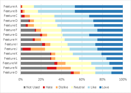
I’m going to let Cole go off on her tangent about presenting such data, while I go off on my own.
I thought, first of all, survey responses should be symmetric, meaning equal numbers of favorable and unfavorable responses plus a neutral response. (I’ve abandoned surveys that forced me to choose sides when I really was neutral.) I’ve changed the vaguely satisfied response to “Neutral”, and shortened the others to “Love”, “Like”, “Dislike”, and “Hate”.
Second, “Did you use a feature?” is a different question from “How did you like a feature?” The first has follow-ups to find out why a feature wasn’t used (didn’t need it, couldn’t find the button, didn’t understand the instructions); the second to find out why a feature was liked or disliked (whether it worked as expected, whether the output was acceptable).
I think we should split out the “Did not use” responses, then recompute the other percentages based on the fraction of users who used each features.
The following chart sorts the features in decreasing order of “Not used”.
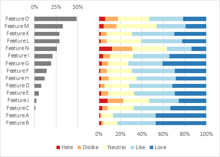
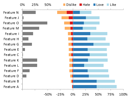
The stacked bar panel on the right of the chart shows results from negative on the left to positive on the right, like the number line you learned in elementary school, or maybe high school. The only thing is, the central value of zero, between the negative and the positive responses, isn’t centered on the number line.
Diverging Stacked Bar Charts
Why not stagger the bars left or right until the neutral bar is centered on zero, as shown below:
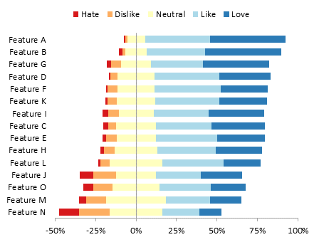
This is called a Diverging Stacked Bar Chart, which I first read about in Plotting Likert and Other Rating Scales by Naomi Robbins and Richard Heiberger. My commercial add-in Peltier Tech Charts for Excel can build these charts. I’ll also post a tutorial soon.
The following combines the diverging stacked chart with a panel showing the “Not used” data.

There doesn’t seem a strong correlation between “Not used” and the ratings, other than the two most widely used features being the most liked, so it was probably wise to separate the data in this way.
Here is the same chart, plotted by the sum of positive responses.

On the other hand, if I’m concerned with making improvements in a product, It might be more informative to sort by sum of negative responses…
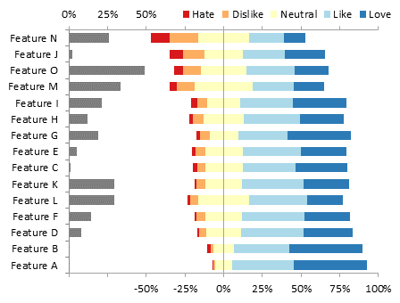
… or even by the percentage of strongly negative responses (“Hate”).
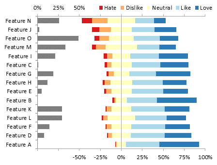
The diverging stacked chart shares a drawback with most stacked charts, including the plain stacked chart at the opening of this article. Since the bars are irregularly stacked, they do not begin at a common baseline, so it is not easy to compare individual values.
“Converging” Stacked Bar Charts
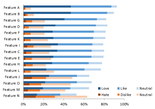
Let’s take the diverging stacked bar chart, and turn it inside out. Instead of the neutral responses straddling the vertical axis, let’s place the strongest responses on either side of the axis, then the weaker responses further out, and finally split the neutral responses on the outside of the stacks. Since it inverts the Diverging Stacked Bar Chart, I’m calling this the “Converging” Stacked Bar Chart.
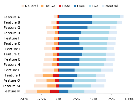
When comparing these results, we want to see the strong responses (Love and Hate), then more than the weak responses, we’d most likely want to see the cumulative responses (Love + Like as well as Hate + Dislike). The chart above uses the vertical axis as a baseline for the strong responses as well as for the cumulative responses. Without much effort, we see that the chart above is sorted by the sum of positive responses (Love + Like), the dark blue and medium blue bars.
Since the neutral bars are merely padding the ends of the stacks, let’s just leave them off.

The following chart combines the “Not used” responses with the feature ratings, sorted by increasing usage.
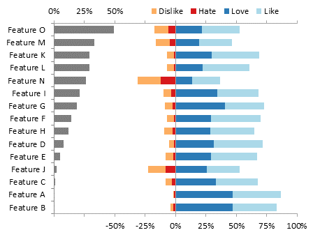
Here the chart is sorted by total positive responses (dark plus light blue).
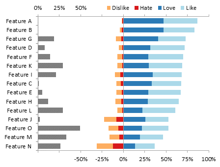
Now we’ve sorted by total negative responses (red plus orange bars) to help focus on the features that people don’t like so much.
Finally, the chart is sorted by strong negative responses, which is substantially the same as above.

These “converging” charts make it easier to rank the responses by eye. However, if we want to directly compare positive and negative responses, we shouldn’t draw the bars in opposite directions. I’ve written about this weakness of tornado diagrams, and suggested ways to improve such charts.
Clustered-Stacked Bar Charts
Now let’s start with the “converging” chart above, and fold it on its vertical axis so the positive and negative bars both extend to the right. Of course we offset the bars so they are stacked next to each other without one set obscuring the other. I wrote a tutorial about these Clustered and Stacked Column and Bar Charts, and I already have a Chart Utility that cranks them out.
The chart above still has the neutral responses padding both positive and negative stacks. If we leave off the neutral responses, we can reduce the area needed for the chart while reducing clutter. Obviously the chart is sorted by total positive responses. This data set was easy: the positives far outweigh the negatives; if the responses were closer, the side-by-side stacking here would make it easier to tell whether more people liked or hated certain features.
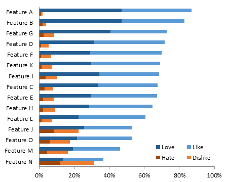
Here I’ve sorted by total negative responses, and to make the negative values stand out, I’ve used a lighter tint for the fill of the positive bars.
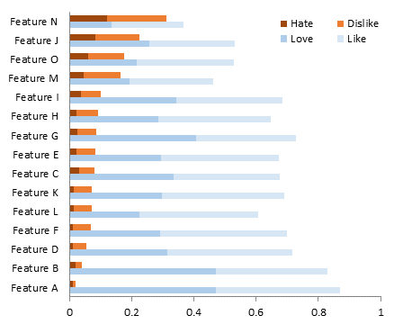
Here I’ve sorted by strong negative responses, and lightened the weak negative responses.

For completeness, here I’ve combined the “Not used” panel with the clustered-stacked bars, sorted by feature usage.

The same sorted by total positive responses…

… by total negative responses…

… and by strong negative responses.

Dot Plots
There is a problem with legibility in clustered-stacked charts when there are a lot of categories and the bars become thin. If you look back at the first couple of clustered-stacked charts in the preceding section, you may feel that the charts are dense, heavy, dark. This is simply because there are many dark bars in close proximity, and such saturation of ink is overwhelming. Not only does the chart feel heavy, it is difficult to make out all of the series of data, unless some of the colors are lightened to emphasize certain other colors (as in the later charts).
Dot plots solve this issue by only placing a marker at the data point itself, rather than a bar spanning the entire distance from the baseline to the data point. This leaves plenty of refreshing white space, while making all of the data clearly visible, particularly the smaller values. You can read about Dot Plots in Dot Plots: A Useful Alternative to Bar Charts, by Naomi Robbins.
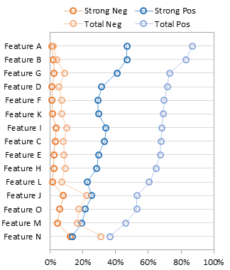
The dot plot below shows Strong Negative (e.g., Hate), Total Negative (Hate + Dislike), Strong Positive (Love), and Total Positive (Love + Like). We really don’t need to see the weak positives and negatives, since the totals are more interesting.
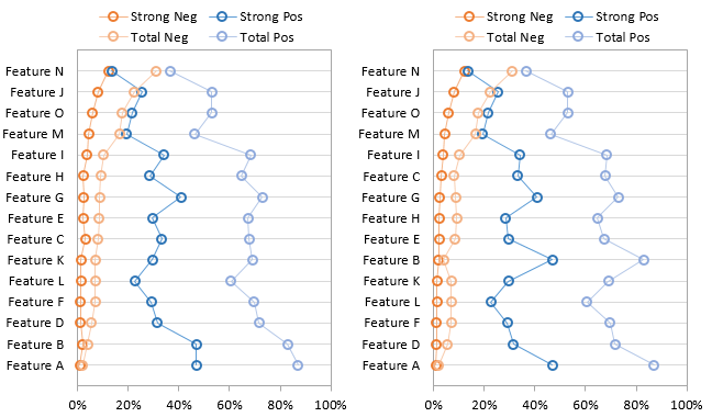
These dot plots are sorted by Total Negative (left) and Strong Negative (right).
Dot plots can be combined in a panel chart with the “Not Used” bar chart seen in the other panel charts. This chart is sorted by “Not Used”.
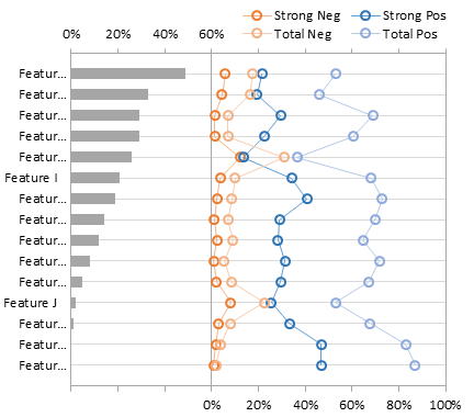
This dot plot panel chart is sorted by Total Positive. It’s much easier in this chart than in the clustered-stacked chart to see how the negatives are increasing while the positives decrease.

For consistency and because I’m paid by the column-inch, here is a dot plot panel chart sorted by Total Negative…

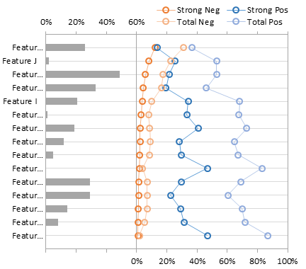
… and here’s one sorted by Strong Negative.
Summary
There are numerous ways to evaluate survey responses. I took a sample survey and separated out two types of responses: whether users used features, and how much users liked the features they did use. Since these responses asked different questions and lead to different follow-up questions, it is beneficial to consider them separately. In many cases I plotted the “Not used” responses in a separate panel from the user ratings of the features.
Simple stacked bar charts allow us to show survey responses ranked from worst on the left to best on the right.
Diverging stacked bar charts keep the stacking order the same, and align the bars so that positive responses all lie to the right of a vertical axis, and negative responses lie to the left.
“Converging” stacked bar charts keep the alignment of the diverging bars (negative to the left and positive to the right of a reference line), but locate the strongest responses next to the reference line so that both strong responses and total cumulative responses use the line as a baseline.
Clustered-stacked bar charts stack up positive and negative responses to the right of a common reference line, so that positive and negative responses can be directly compared.
Dot plots show the data in the same way as clustered-stacked bar charts, except there are only markers and not entire bars in the chart. This makes the chart more open and allows easier reading of smaller values.
Panel charts can be used to show different types of data, such as the “Features Not Used” and “How Users Liked Features They Used” panels in these charts.
As always, your choice of chart type depends on your immediate requirements. For example, if I wanted to use these results to drive development of a software package, I might simplify the plots, and only plot “Not used” and either strong negative or total negative. This would show the development team which features need better visibility, so more people would use them, and which features need improvement, so fewer people hate them.
Diverging Stacked Bar Charts in Peltier Tech Charts for Excel
This article shows how to use Diverging Stacked Bar Charts to display survey results. This manual process takes time, is prone to error, and becomes tedious.
I have created Peltier Tech Charts for Excel to create Diverging Stacked Bar Charts (and many other custom charts) automatically from raw data. This utility, a standard Excel add-in, lays out data in the required layout, then constructs a chart with the right combination of formatting and chart types.

This is a commercial product, tested on thousands of machines in a wide variety of configurations, Windows and Mac, which saves time and aggravation.
Please visit the Peltier Tech Charts for Excel page for more information.


Alex Kerin says
Jon, I’m a huge fan of the diverging stacked bars, especially when you add another mark per row to help show the ‘average’ to make very easy comparison between rows: http://www.datarevelations.com/likert-scales-the-final-word.html
Great post.
Jon Boeckenstedt says
Wow. Thanks for such a comprehensive analysis of what appears to be such a simple topic. I’ve sent this to all the staff in our research and analytics area, for two reasons: First, of course, is the practical application to the work we do every day; but perhaps more important is the meta-lesson about understanding the underpinnings of how data viz helps people get insight from data. The latter is far harder to tell people about, but this is superb in that regard.
Very nicely done.
Cole Nussbaumer says
Great post, Jon! I’m going to link to this from the comments on the post on my blog. Thanks for spending some brain time on this. :-)
Charles Davies says
HI Jon
Great post.
I like the use of Dot Plots and as I’m curently building a survey results dashbaord my use them. I’d look at removing the lines joining the plot markers to remove a potential perceived relationship between the catagories (e.g. is Feature G related to Feature E?), but would still display the pattern/differences in the values.
Cheers
Charles
Jon Peltier says
Charles –
I like using connecting lines to help me easily identify the points in each series. Notice the lines are lighter and thinner than the defaults.
But the dots are not necessary to convey the information, and I’ve been told I shouldn’t use them by none other than Naomi Robbins, who wrote Dot Plots: A Useful Alternative to Bar Charts.
Dave Pao says
John, I love this article! I’m trying to plot a 7-point Likert-type scale, and want to use a converging stacked bar graph. Is this available on your utility?
Dave