Worst Pie Chart Ever?
The other day I encountered a tweet with a common theme: “Worst Pie Chart Ever.”

So I had to follow the link. It was an article in Atlantic Cities, 2011 Major League Baseball Regular Season: Attendance by Team, which stated that combined attendance at all Major League Baseball (MBL) games was fifth highest in history. The article was accompanied by a chart, not showing a time series of attendance by year, which you might expect after seeing the “fifth highest in history” statement. Instead, the chart compared the attendance of the MLB teams. And it compared the teams using an unexpected approach.
Pie Charts
Here’s the MLB attendance chart. It’s not the worst pie chart ever, but it has substantial deficiencies.
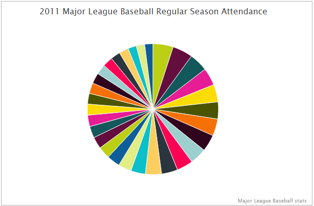
The choice of chart type was strange. When you think about a team’s attendance, you think of total numbers. Showing the teams together as a portion of the league total is unusual, and the actual numbers are obscured.
Comparison of the sizes of the wedges is not easy, especially with so many data points, but at least the data is sorted.
A big problem with this chart is identification of the data points. As the tweet indicated, the randomly assigned colors did not make use of team colors to aid in identification of the slices. There is no legend, but a legend is a poor way to label a chart, because you have to drag your eyes back and forth between chart and legend. In any case there are repeated colors, which would reduce the legend’s effectiveness.
This chart addresses the labeling problem by popping up a single label as the mouse passes over each pie slice. Unfortunately you have to wander around the pie to find your favorite team, then wander around again to see how other teams compared, then try to remember what you found before. This cognitive load overpowers the ability to interpret the data.
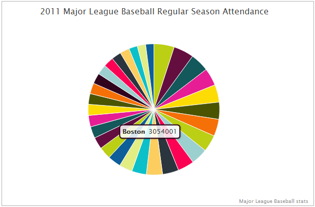
Since the screen capture didn’t capture the cursor, you don’t even know from this image which slice corresponds to the label. It’s the key lime pie slice in the lower right of the pie (it was black in the first view above).
Interactivity is a nice way to let a user find additional information that would otherwise clutter a graphic. However, forcing a user to interact with a chart simply to extract necessary information is a waste of the user’s energy and a waste of interactive effects.
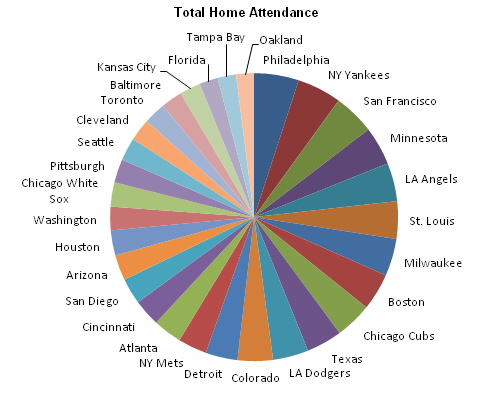
Granted, showing each category label in a 30-point pie chart takes up lots of room, as you can see in my recreation of this chart below.
If you want to show the actual attendance values, well, the labels take over the chart, almost becoming chart junk themselves (see below). The chart has essentially become tabulated data, but not in a nice tabular grid.
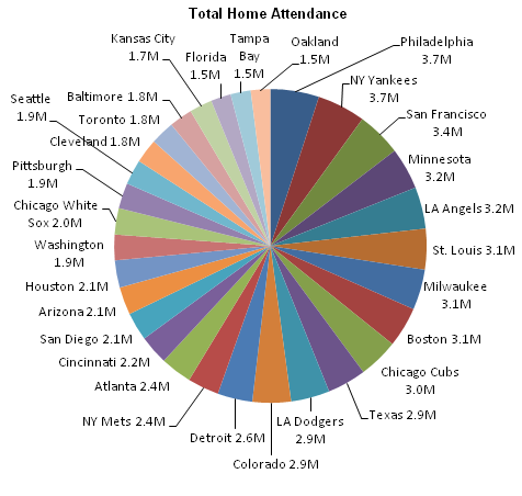
Without showing the attendance values, you have no way to estimate attendance, since the wedges range from 2% to 5% of the total pie circle. Do we expect the reader to multiply an estimated percentage by the posted league total? I just don’t think that a percentage of league total is the best way to display attendance values.
How do we label the categories (the teams), and also provide a numerical measure of attendance?
Bar Charts
A bar chart lines up all the names in a neat list, and encodes attendance by the length of bars along a horizontal scale. Now without mousing around the pie, I can easily see how the teams rank. I can see that Philly had around 3.7 million attendees and Boston had just over 3 million.
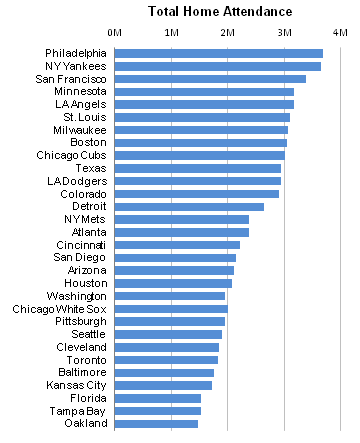
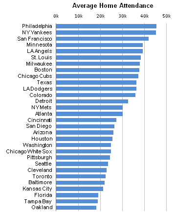
The data was sorted, but by average home game attendance, not by total attendance. Because of rained out games which were not rescheduled, the relative rankings by the two measures are slightly different. In the total attendance chart above, Washington is listed higher than Chicago but has a shorter length bar, while in the average attendance chart below, the bars are ranked according to length with no exceptions.
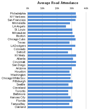
We can also look at average road attendance. This chart is also sorted by average home attendance. Notice that there is much less variability in the data. Each team plays in each other team’s parks, and it’s the home team’s demographics (population and fan rabidness) that drive attendance.
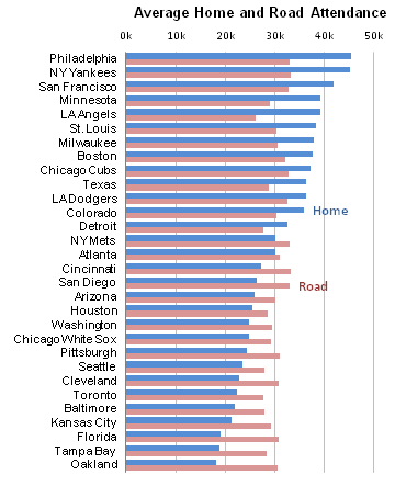
We can plot both series together to compare average home and road per-game attendance by team. I don’t find bar charts very well suited for a dense chart like this: the shorter bars are obscured by the longer bars of the other color.
Of course, a pie chart is much less effective at this kind of comparison. One pie chart wouldn’t be enough, you’d need two side by side. This requires a great deal of eye movement and short-term memory to recall the individual values while switching from one pie to the other. When I see two pies side by side, it reminds me of bicycle tires and spokes, and I want to draw in the bike frame.
Is there a better way to compare data like this?
Dot Plots
We can show this data effectively using a dot plot. The values are encoded by horizontal position of a marker rather than by length of a bar. Longer bars do not obscure shorter bars, and even overlapping points can be resolved.
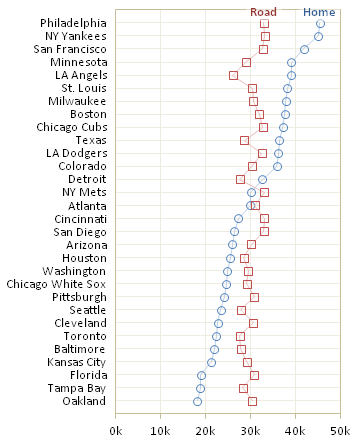
Dot plots can be used for any of this data, not just for comparisons. Below is a dot plot showing total home attendance by team. It’s as effective a graph as the bar chart in the previous section.

Worst Pie Chart of the Week?
I stated that the MLB attendance pie chart was not the worst pie chart ever. In fact, it wasn’t even the worst of the week. That honor is bestowed on an organization that has the ironic initials “BI”. In CHART OF THE DAY: Goldman Reveals What You’re Getting For Christmas, Business Insider reported results of a Goldman survey about planned Christmas giving. The pie chart shows which percentage of respondents planned on giving which category of gift for Christmas. What’s wrong with this chart?
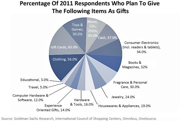
Somebody forgot that pie charts are supposedly good for showing portions of a whole, that is, they show values that add to 100%. Since each respondent could provide multiple answers, not a single answer, the sum of the percentages in the chart above was 434%. Oops.
This data should have been presented in a bar chart or dot plot.
Well, we might have lowered our expectations, had we noticed the Engage-O-Meter gauge in the sidebar of the Business Insider site. Such a gauge is totally useless, since we don’t know what the minimum and maximum values are around the circumference of the gauge.
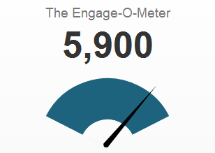
Without the large number above the gauge, we would know nothing. I suspect the needle never moves, and only the number updates. Even if the needle moves, it’s only gratuitous animation, because only the number has meaning.


Peter Flom says
I think the baseball pie chart is even worse than the toy pie chart (although both are very bad). The toy pie chart at least is of some thing that is sensibly broken up into portions of a whole, and the text adds information. Labeling the slices of pie with the actual proportions is an error, I think, in that it tries to use a chart for what should be in a table – precise number.
Dot plots are altogether much better.
Jeff Weir says
The other day I encountered a tweet… Where? On the street? At a party? ;-)
C’mon Jon…admit it…you’re tweet-stalking, aren’t you!
Very nice dot plots.
Joe Mako says
How about this for an alternate version:
http://public.tableausoftware.com/views/MLBAverageAttendance/MLBAverageAttendance
using the data found at http://espn.go.com/mlb/attendance
(I think you are sorting your Dot plot on Total Home Game Attendance, and not the Total Average Attendance)
Jon Peltier says
Joe –
Look at the Total Home Attendance for Washington, which is smaller than the two teams on either side (Houston and CWS). There is no dip in the Home Average Attendance plot. Tampa and Florida are also switched in the Total Home Attendance chart. So the data is sorted by home average.
Note that “Total” Attendance means Total Home Attendance in this study, not combined home and road attendance. I’ve never seen anyone discuss average overall attendance (road & home) or the difference between home and road average attendance. I’m not sure what these mean in any case. It makes more sense to discuss (and sort by) home attendance, since that is what teams have some control over, and it reflects the size and interest of their markets.
Your charts look good, being in Tableau. Nice default formatting means not having to work so hard. The mouseover labels are nice to have, not essential as in the original pie chart that got me started.
Joe Mako says
Thank you Jon, I did not realize that Total Home Attendance was the better metric to sort on. I have updated my chart above to include Total Home Attendance, and provided an option to select the sort by metric.
Jon Peltier says
Nice job, Joe.
Sharryn says
I just want to know if teams get a percentage of the attendance. I thought I heard an announcer say that teams like coming to play in Milwaukee because they have great attendance. Making me think they get money from the attendance.
bedste e cigaret says
I was just looking for this info for some time. After six hours of continuous Googleing, finally I got it in your site. I wonder what is the lack of Google strategy that don’t rank this type of informative web sites in top of the list. Normally the top sites are full of garbage.