Dick Kusleika‘s a fan of House, and so am I. Last week in Charting House, Dick analyzed the commercial breaks in an episode that he’d recorded for later viewing. Dick’s first cut at the data was a stacked bar chart, which basically tracked the segments of actual show and commercial breaks in sequence through the duration of the episode. I’ve recreated Dick’s chart below.

The segments of actual show start large (assuming the Opening credits are a vital part of the show), and are broken into segments of decreasing length, until the last segment before the closing credits, which is medium sized. I guess the writers needed a little extra time to finally show just how brilliant House really is to tie together all the symptoms and save the patient (well, most of the time the patient seems to survive the treatment).
What follows is a stream of consciousness voyage through various chart types, assessing their effectiveness in showing different aspects of the distribution of ads within this episode of House.
Overall Breakdown
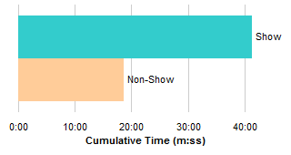
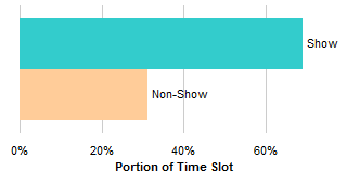
A few of the comments indicated that amount of ads in the show was painfully high. When the show segments are piled up on one side of the bar chart, and the non-show segments to the right, we can see that

the show takes up only a bit more than 40 minutes of the hour, or

the show takes up a bit less than 70% of the time slot.
Stacked bars make it a bit difficult to compare values because the bars are not lined up starting from a common baseline. It’s not so bad in this case, because we are comparing two very different values, but we rectify this shortcoming using clustered bars. Whether we track total time of the segments, or percentage of the hour, we see that the Non-Show segments total almost half as much as the Show segments. That’s a lot of ads.
No portion-of-a-whole discussion is complete without showing the obligatory pie charts.
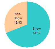
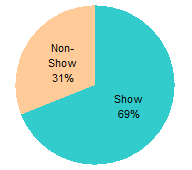
These work as well as the stacked bars above, because there are only two values, and they are greatly different in magnitude. In general, though, the clustered bar is a better approach for comparing parts of a whole, even though everyone learned in second grade to use pie charts. For example, it would be fruitless to try to show the individual segments of the televised hour.
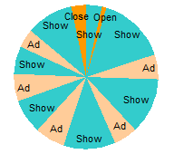
Segment Analysis
Vincent suggested staggering the stacked bars, with Show-Ad pairs grouped together.

You could also float all of the segments separately.
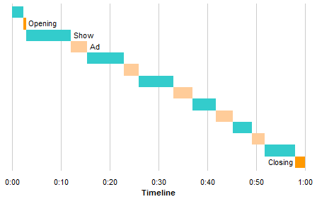
These floating variants of the stacked bar chart might be eye-catching, but they don’t show anything more than the stacked chart, and they take up more space.
Dick made a bar chart comparing the individual durations of the show segments, which I adapted to show the non-show segments as well.

You can compare lengths, and you can read the starting times, but you can’t visually judge the starting times. You can see the trend of long starting segment, shorter and shorter middle segments, and medium last segment.
If you want to visualize the starting time as well as the segment duration, you could always use an XY chart. Mathias suggested this, but left the task to someone else. Here’s my XY chart:

Tushar Mehta suggested a Pipeline Chart and even included a sample in his comment. I’ve built my own here.
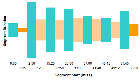
I’ve seen these charts before, and always wondered why the bars had to be vertically centered. Is it to hide the fact that it’s basically a bar chart? Or is it to use the analogy of a pipe that has different diameters where the pipeline has different capacities, and thin sections represent bottlenecks?

With the same effective resolution, this half-pipe takes up much less room. Like the other bar chart variations above, you can read the starting times, but you can’t really visualize them. You may as well use dumb labels.

You could also add some kind of vertical axis labels so readers can get an idea what the segment durations are.

Now it’s a bit more readable, and look, it’s the same as the bar chart a few screens ago, transposed by 90 degrees. The times on the segment start axis are still not proportional, though.
I went through the tedious exercise to build a chart that had bars with heights proportional to the segment duration, as above, and also with widths proportional to the segment duration.

Since the heights show the segment durations, you can compare them easily in this chart. At the same time, the widths are proportional to elapsed time, just like in the stacked bar chart that started this magical journey through chartland.
You could tweak the scales so that each minute on the X axis and on the Y axis are the same length.

That looks pretty slick, but you lose resolution on the segment duration scale.
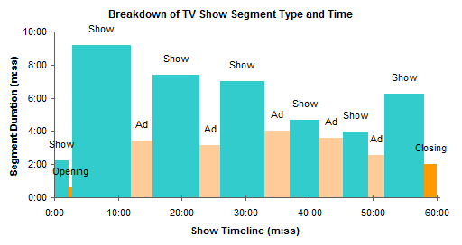
After I spent too much time on these variable width bar charts, I realized that my Cascade Chart Utility could have done this for me in a few moments. This is what the utility gave me (after a minute or two of adjusting the formats).
If you want to compare the distribution of segment durations between show and non-show, you could construct a box plot.

My Box and Whisker Utility makes it very easy to construct these charts.
Summary
The chart type that’s most effective depends on your purpose in making a chart.
If you merely want to show that we watch too many commercials, one of the simple two-point charts would do, stacked bar, clustered bar, or even (gasp!) pie chart.
To see how the different segments change in duration throughout the broadcast, the regular bar or column charts and the XY chart show this well.
The cascade chart is well suited to compare the duration of the segments and to visualize their places in the program. The XY chart also shows both of these variables.
A box plot works well to compare the distributions of ad and show segment durations.


Ed Ferrero says
Hi Jon,
Nice post. House demands a bit more analysis, and you need a pie chart :)
DaleW says
While I can see a certain advantage to the cascade chart, it’s also visually misleading here — the eye is distracted by the areas, since the actual linear signal is encoded in both the length and width of the rectangles. At first glance, a cascade chart minimizes the quantity of the ads much like the CBO minimizes the future cost of new entitlement programs.
The humble, if segmented, pie chart is at least honest, and depicts the division of the hour just like a familiar clock face.
Rather than a cascade chart, I’d suggest combining the initial simple stacked bar chart with tee markers whose length represents the segment length in minutes. This avoids the distorted area effect, but still shows both dimensions of a cascade chart.
Jon Peltier says
Dale –
Here’s my version:
Here’s Dale’s, which I didn’t see in my inbox until I’d posted mine:
Here’s another by Dale, which proves he’s as bad a tweaker as I am: