In Graduation Rate and Federal Spending [Chart Reviews] Tony Rose of Support Analytics and DSA Insights shows two charts from Business Week.
Federal Spending on Education and Training
The first compares two years of Federal education spending data using side by side pie/donut charts, which commits two sins: using one pie/donut charts, and using more than one of these charts. Tony recommends using a table instead, while I’ve created a line chart instead. Tony’s table and my chart contain all of the data from the Business Week charts, with additional display of percentage changes.
The Original Business Week Donut Charts

Tony’s Tabulated Data

The Peltier Tech Line Chart
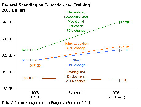
Tony’s table is certainly the most compact display of the data. The Business Week dual donuts are eye-catching, perhaps, but the line chart shows the trends best of all.
Percentage of Children Living in Poverty
The second chart is a simple bar chart of poverty rates by state, ranked by the rate of high school graduation in each state. Tony likes this chart, and I don’t think it’s too bad either, except that it’s divided into three sections because of its aspect ratio.
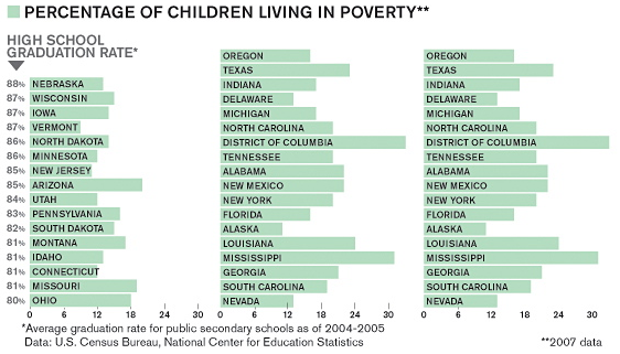
Before merely duplicating the chart above, I thought the individual graduation and poverty rates deserved some investigation. I think a heat map on a geographical state map would be interesting.
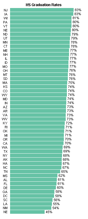
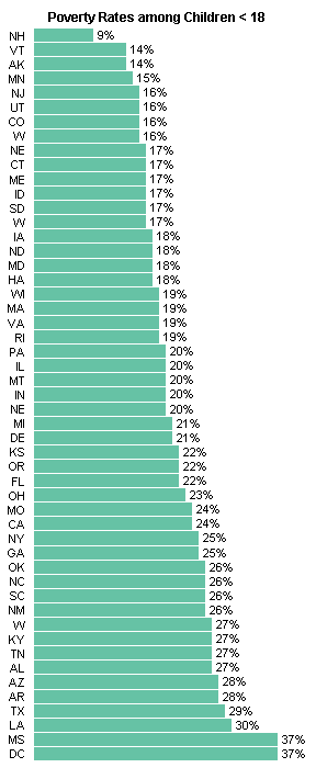
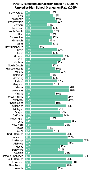
Here is my rendition of the Business Week chart, differing only by not splitting mine into three panels. It’s pretty tall, but it tabulates the data clearly. I say “tabulates” because it seems to show a trend between graduation and poverty rates, it does not allow an easy determination whether there is a correlation between these rates.
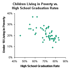
Being the geek that I am (did I say I used to be a scientist?) I decided to plot the two variables against each other. As expected, there’s a general inverse relationship. As poverty goes down, high school graduation goes up. I plotted it both ways, because there’s only a correlation, and I’m sure there are conflicting models for which variable causes the other.
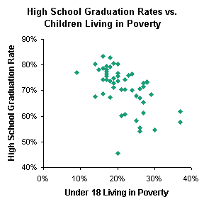
I picked the latter XY chart, because I think that economic stress leads to higher drop out rates, and replaced the markers with labels showing the state abbreviations. I enlarged the chart significantly to reduce overlap of state abbreviations.
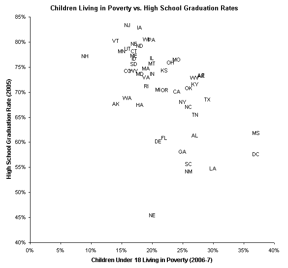
This chart is more cluttered that I would like because of the overlapping state labels, but I think it’s better to show correlations between measurable quanitites, rather than to simply list them in a table, or in a chart that is essentially like a table. What do you think?


Colin Banfield says
Hi Jon, a few comments:
The line chart exhibits a couple of disadvantages:
1) The text adds clutter to the chart. One should be able to interpret a chart without having to mentally filter out clutter. You could use a legend, which would remove the clutter, but at the expense of the user having to shift between the graph and the legend.
2) Because of the text, the line chart doesn’t work at all below a certain size. If you need a chart somewhat smaller, another approach would be needed. I think that Nixnut’s “Coffee & Tea” charts In the “Challenge – Show Market Share Changes” work well here. Since we have only two data points, the “trend” is obvious (the second point is either higher or lower than the first) and the line chart adds nothing you don’t already know (well, it does show the steepness of the change, if that’s critical to the analysis).
Poverty Rates vs Graduation Rates:
The correlation chart is an excellent way to show the data. If space is not a problem, then the labeled XY chart works well. If space is an issue, I’d consider the state detail as a “drill-down” level below the higher level of the unlabelled XY chart. At the detail level, you could show the labelled XY chart or the bar charts – either as separate charts as you’ve shown or perhaps descending graduation rates with poverty rate bars within the graduation bars (depends on how you want to show the data).
Reading through this post, it occurred to me that sometimes the choice of chart depends on the output mechanism. On a PowePoint slide, the labeled XY chart (even the labeled line chart) might work well. However, on a dashboard, these choices are not viable options.
Jon Peltier says
Colin –
Thanks for the thoughtful response.
I am painfully aware of the clutter in the line chart. One way to reduce clutter would be to use only the most simple labels on the line chart, and remove any numerical labels to a chart like Tony’s. The chart and the table together aren’t completely redundant, since a graphical view of slopes is always a helpful addition to a table of numbers.
You also have raised a good point, which I was thinking about but didn’t mention. Choice of medium is very important. PowerPoint allows for large graphics, without all but the simplest animation and no interaction. A dashboard generally requires small graphics, but the ability to drill down to details of the chart, either through dynamic labeling or through the use of auxiliary displays, adds a great deal of flexibility.
Tony Rose says
Jon –
The line chart is pretty good, but a bit cluttered with the labels. It does show the segment changes much better than the pie does. Even though the table takes up less space, the line chart is able to show the trends much better. Maybe a combination of chart and table (beneath the chart) would be optimal?
In the second section, I had noted that the print version of BusinessWeek showed the bars in one column versus the three columns online. As I had suggested, the only change I would make to your bar chart is to sort descending versus alpha for the poverty rate when the graduation rate is the same.
The heat map can be easily done using Many Eyes if you have the data.
The XY charts are an excellent addition and tell more of the story. I am always analyzing versus presenting data. I want to know the story, trends, correlations, etc. and not just a percent change. Also, the XY chart using the states is a nice variation. What are NJ, VT and NH doing so right compared to NE, which is atrocious. A 45% high school graduation rate, really???
Jon Peltier says
Tony – Thanks for your comments. None of the graduation rates are quite the same, by the way, I just didn’t show any decimal digits.
I also am always analyzing the data, looking at many more views than ever make it into any deliverable form. In some of my posts on this blog, I try to show some of the paht through the data that ultimately results in a display.
Matt says
I think the table maximizes the information density for the Federal spending data. It seems making a chart, while easier (or maybe faster) to interpret, forces the creator to make a compromise about what to emphasize. Is the the total spending, % of total, change??? If you try to show them all, the chart gets busy. If it is just one of these, then perhaps focus on that. If you want the user to decide/interpret, then maybe just leave it as a table. I suppose a lot depends on the audience. (On a side note I think the line chart is a bit deceiving. You only have 2 points in time. 2 points always make a straight line which may not be the case with this data. If you have no information about the interim period, you shouldn’t imply it by connecting the dots.)
The second chart I think is right on. It seems to me that the whole point of the original chart is to evaluate if there is correlation between poverty and graduation rates. An x-y chart is the proper tool to show that. The specific state information, while perhaps interesting, is secondary to the issue of correlation and doesn’t need to be shown.
Naomi B Robbins says
I always prefer both a table and a chart when there is room for both, but if forced to choose, I’d choose the line chart. I’d be interested in comments on this alternative.
The percent change can be added as labels without needing the segment part of the label in the line chart or we could add a similar chart based on percents if desired. Since this emphasizes the beginning and end points and the amount of change, it’s not assuming linear growth.
The main advantage would be seen if we had many more than four categories. In that case the lines might all cross one another and it would be hard to determine which category a line was associated with, but the arrow chart allows any number of categories. On the other hand, lines can accommodate more than two time points which this chart cannot.
Both Jon’s line chart and Tony’s table are cluttered with unnecessary percent signs, dollar signs, or B for billion. I’d prefer an axis label saying billion dollars with the labels just being 0, 10, etc. The numbers are clearer when not surrounded by the clutter of $ and B. In the table I’d keep the % sign in the column label and with 100% but eliminate the others.
Jon Peltier says
Naomi –
Thanks for chiming in. I feel the oxygen level increasing.
The arrow chart is effective, because the colors and arrowheads both indicate the direction of spending change. This is essentially all the information that I had in my line chart, but the arrow chart eliminates a couple of drawbacks to the line chart. As you and others have pointed out, the line chart as drawn implies linear growth over the ten years, and the way I’ve executed my line chart, the labels add a lot of clutter.
I’m already thinking of ways to have Excel draw bars with arrows…
Naomi B Robbins says
Although I do not consider myself to be primarily an Excel user, I drew this chart in Excel since it was for Jon’s blog. To turn the bars to arrows I just drew arrows, copied them to the clipboard, and then selected the objects to be replaced by arrows and copy/pasted.
I did this the first time I used arrows and then Ken Klein, a brilliant lawyer who knows more about Excel than most Excel gurus, generalized what I did and wrote a macro for me to use in the future. Anyone who wants a copy of the macro can send an email to me at naomi at nbr-graphs.com.
Jon Peltier says
Naomi –
If you and your lawyer friend Ken don’t mind, perhaps I could write about that macro some day. It’s not a complex topic, well, not for someone who has been around Excel and VBA as long as I have, but it’s a good way to discuss more uses of Excel and VBA together.
Nixnut –
I was suspecting that Naomi was using a select-the-point-and-paste approach, but I was thinking about something that used a bar chart and an XY point with a custom marker where the arrowhead goes. This keeps the shape of each arrowhead consistent despite the changing lengths of the arrows.
I’ve written VBA procedures that create a chart, plot X and Y based on two fields in a data set, then adjust a shape according to one or more additional fields, and apply the shape to the chart. I’ve done this to illustrate a vector field, that is, an array of arrows which have varying length and orientation. I’ve used it to make custom bubble charts, where the bubble is something too complex to render in a simple bubble chart (like a pie chart, but don’t tell anyone).
Javier says
Dear Jon,
For the xy chart, I think it would be very nice to avoid the labels overlapping. I copied some vba code for attaching labels to the xy chart, but came with the same problem about overlapping. I was wondering whether you know how to solve it, and would be very grateful if you could share it.
Jon Peltier says
Excel’s labels are not cognizant of each other, so there is no out-of-the-box mechanism to prevent their overlapping. Pie charts have a best fit setting for label position, but it’s not particularly elegant.
I have seen routines to adjust the positions of individual labels until there is no overlap, but these have been rudimentary, and I cannot locate the specific one I’m thinking of on the author’s web site.
You can position the data labels manually: click once to select the series of labels, and a second time to select the individual label, then drag it into position. It is not easy to control the position closely using the mouse. Rob Bovey’s Chart Labeler has a feature that gives you closer control over positioning of data labels.