In Get a Clown Suit, my colleague Jorge Camoes bemoans the overuse of the phrase “professional looking charts” to describe an ever expanding selection of gaudy and distracting visual effects. The particular graphic that set Jorge off was this chart from SmartDraw showing population of the ten most populous countries:

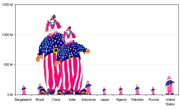
Although this chart used some kind of androids to represent the data, Jorge was envisioning the following chart in his head.
Choice of symbol to encode data
There are a number of things about this chart that should be adjusted. First, the clowns are distracting, perhaps even a little bit more so than the characters in the first chart. Whenever images like this are used, they really fill a rectangle, but the missing parts of the rectangle around the image cause us to misinterpret the true height of the bars. Let’s remedy this by replacing the clowns by rectangles of the same height and width. If you notice, even in the chart above, the value axis labels are more concise: 1500 M instead of 1,500,000,000.0 (who needs one decimal place precision on a billion and a half?).

Okay, much better, at least we can better judge the extent of the numbers. There is a lot of overlapping, though. In the first clown chart above, you may have missed the Brazilian clown behind the huge shoe of the Chinese clown. In the rectangle plot above I’ve used white outlines to highlight boundaries of the rectangles which are placed in front of larger ones, but it’s better not to overlap bars.
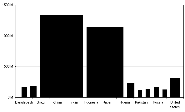
Now the neat alignment of the axis labels and the bars is lost, with the wide bars pushing the narrower ones aside.
Use of color (brightness and contrast)
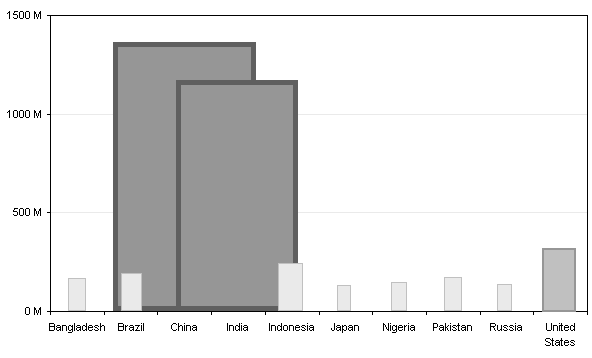
Another issue with the SmartDraw chart is that the larger bars are bolder than the smaller bars. They are darker in color and less blurry. This emphasizes the larger values more than dictated by just the heights of the associated figures.

In fact, the larger androids have a thicker, darker border as well as a darker interior. If the intention was to show that China and India are enormous and nothing else matters, well, that was achieved.
Aspect ratio of data points
In addition to the color, the width of each bar distorts the perceived value it encodes. The height of each bar is proportional to the value it represents. So is its width. The area therefore is proportional to the value raised to the second power. The color difference probably makes the whole effect proportional to the value raised to the power of 2.5.
We can improve the clown chart by making each clown the same width.
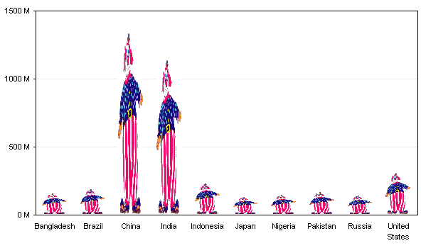
But that distorts the clowns so that they are hardly recognizable. Just as the clowns themselves distort the data so that it is hardly recognizable. We can address this by retaining the aspect ratio of the clowns, and stacking them to heights that represent the different values.

The poor Brazilian clown has been decapitated. I suppose that’s why he was hiding in the first chart. The partial clowns may be even more distracting than the stretchy clowns above.
Finally, a bar chart
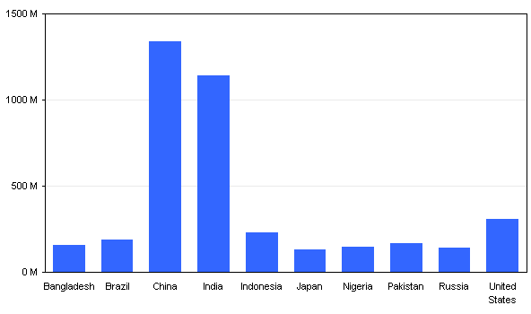
We can eliminate the distraction of the clown symbols by using a plain rectangle.
Sorting order
One thing that would help us to compare values across the chart is removing the arbitrary alphabetical sort of the country names with a more meaningful sort based on the values being charted. All of these charts use up lots of room, and without the fat clowns, we no longer need so much space.
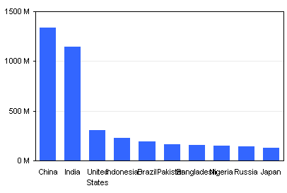
See, China and India are much bigger than the other countries, but the US still accounts for 20 to 25% of the population of each (not 1/50 of the emphasis provided by length, width, and color).
Chart Orientation
The labels overlap because of the shrinking of the chart. This can be remedied in several ways: use abbreviations for the country names, rotating the labels so the reader must turn the page or tilt his head, or rotating the chart so the labels and the values can be read without contortions. Excel will volunteer to omit some labels, but this is not useful if the data are not numeric and proportionally spaced.
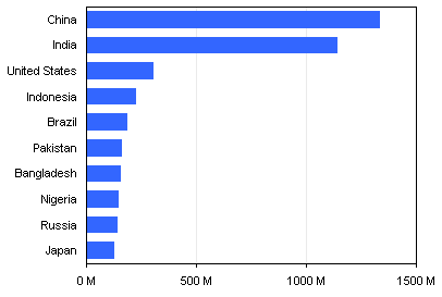
The nice thing about this chart is that it scales nicely if we decide to plot the top 25 countries.

A little embellishment won’t kill you
If you still need to resort to colorful images to draw attention to your chart, you can still add your clown, but a bit to the side so you can still make out the data. Remember that less can be more.
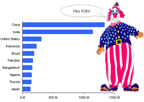
But to paraphrase Professor Tufte, if your data isn’t interesting, you need other data.
Summary of charting badness
Here are some things you should be aware of in your own charting efforts.
- Axis labels are too long, and show excessive precision. All of the text in the original was too small.
- Distracting symbols were used instead of bars.
- Symbols encode data in their length, width, and color, where only length is needed, and where only length should be used.
- Varying width bars overlap each other, partially hiding data.
- Values are sorted arbitrarily, not by value.


Andreas says
Thx for yet another great post. I am currently having troubles with labels, and maybe you’d care to help out. I find it impossible to control e.g. the label width in a rotated barchart.
Say you had a legitimate reason for having e.g. 15 labels of 200 charachtters, in a
vertical barchart, taking up an a4 page. How to control the labelwith and spacing? When i drag the inner plot area, it only results in empty white space – not any change in labelwidth.
Sorry to the F1 question. Just could’nt control my self :-)
Gordon says
I just got some funny looks from the office when I explained that the thing I was laughing at was a blog post about charting best practice. I am King Dull of Geektown according to them now!
After following your blog (and others) for a while, I think it’s funny how almost every type of data set can be represented best, or at least fairly well, by a humble bar chart.
Jon Peltier says
Andreas –
Excel is flaky this way. You can drag the plot area to make it thinner and thinner, and nothing will happen, until finally a major change in appearance happens. Sometimes this appearance will not ever change adequately.
If you want better control over the appearance of your labels, including position, alignment, line breaks, etc., your best option is to remove the default labels and use text boxes instead.
A horizontal bar chart, with horizontal labels, will overall be easier to read.
Gordon –
That’s the KISS principle in action. Bar charts, line charts, and XY charts are about the easiest charts to create, and also to read and understand.
Andreas says
Cheers Jon. I’m happy there is no obvious technique that I had overlooked. Sad that excel works this way though. One of the reasons I’m trying to learn R. But then again – for some data excel is the best tool.
thanks again, – for the answer to my question and for a great blog.
Andreas
Jon Peltier says
Andreas –
You’ve probably seen Kelly O’Day’s tutorials on R? I’ve looked at them, and even downloaded R, but I haven’t done anything with it yet.
Alex J says
To be (admittedly) picky, why could we not use 0.0 B to 1.5 B instead of 0 M to 1500 M?
Andreas says
Jon, thanks again! – I have seen the page and have charts and graphs in my google reader next to peltiertech :-). Just yesterday I recieved a nice package from amazon containing Andrew Gelmans book on multilevel regression with r. It looks good – but it IS a statistics book – not a graph book like “R Graphics” by Paul Murrell.
I am beginning to use R, but it’s difficult because my organization relies so much on excels wysiwyg approach.
Cheers – and thx again.
Andreas
Jon Peltier says
Alex –
I thought of that, but the chart images had already been exported, so I skipped it. 1500 M is still better than 1,500,000,000.0, isn’t it?
Rene Tenazas says
Jon,
Another great post. I did have a question: how would you recommend showing what percentage of the total world population is represented in the graph? The one thing missing in the data is that we don’t know whether we are looking at a graph showing 99% of the global population or just 50%.
Like you and most people, I dislike pie charts. However, the one thing they do have in their favor seems to be that they impose a discipline on the chart-maker to include the total of the entire series. They will feel obligated to include a slice for “all others”. If not, the audience will object to the misrepresentation (at least, I would).
The bar chart doesn’t have that feature. Notice how even you didn’t question the lack of an “all others” data point.
What are your thoughts on having a rule that bar charts showing comparisons in values among members of a population should include some indicator of how much of the total population is represented?
Rene
Alex J says
Jon: Indubitably :-)
Jon Peltier says
Rene –
“[Pie charts] impose a discipline on the chart-maker to include the total of the entire series.”
One would think so, but did you see my post Pie Chart Plotting Deficiency earlier this week?
If the chart maker wants to show how the bars in a bar chart compare to the total, then there is a certain obligation to indicate percentages (on a secondary axis or in data labels) or or to state the total (in a caption). In this case the intent of the chart was merely to show how many more people there are in China and India than in any other nations.
dbb says
nice work (again)
Matt Healy says
Another fine example of chartjunk from SmartDraw is the following, which I’m sure Jon will love (and if somebody points it out to Tufte he’ll blow chunks):
http://www.smartdraw.com/examples/preview/index.aspx?example=Pie_Chart_-_Assets_Under_Management
Jon Peltier says
Here’s the chart Matt cited. The title is “Assets Under Management”.
Because of the patterns, it’s hard to see all the gaps between wedges. Also, I’m not sure how to interpret the different years on the labels, unless it designates the “class” of the assets. At least the percentages add to 100%.
I think Professor Tufte might say, “The only thing worse than a pie chart, is one that looks like this.”
Aron Szucs says
This is my first visit to your site. I found myself laughing hysterically at this post.
Excellent site overall. Many thanks for sharing.
Aron
CW Campbell says
Thanks for this, Jon. I’m just switching into this field and have found your site very helpful.
savithri.v says
I made column chart, bar charts overlapped / stacked with separation, dot plots, line etc. but still not able to figure out the one chart that would best represent 5 sets of data compared in 15 categories. I’ve sent you the file with the data. I am not jumping the queue & would also post this in your Chart Doctor. (Feel like copying your clown in the presentation if nothing else works..)
savithri.v says
Hi Sir,
I tried doing a chart with dual category axis & broken value axis using similar data, like the one sent to you.
I need to break the Y axis as one of the series has large values dwarfing the rest.
As the sophisticated algebra that you have used in your ‘broken Y axis’ example was beyond my comprehension, I used a very rudimentary procedure for finding out X values for the cut off series.
I tested this by inflating some values here & there in the data – the cut off marker gets plotted on the required point in my chart.
But when I tried to apply the same primitive logic in your example, I get slight differences in the X vales. Most likely, I’ve messed up the concept.
Mailed you the file. It would be nice if this could also get into the queue seeking your attention.
savithri